Before You Begin
Purpose
This tutorial shows you how to create a theme to define the look and feel of an Oracle Visual Builder Cloud Service application.
Time to Complete
Approximately 40 minutes
Background
A theme is an HTML fragment, along with one or more related CSS stylesheets and images, into which the content of an Oracle Visual Builder Cloud Service application is injected. Typically the theme defines the look and feel of the application, as well as the header, footer and page menu. You can inject other dynamic content into areas of the theme to display the logo, title, copyright message, language switcher, and menu structure defined by the application developer.
You can apply the theme you create to the application in which you create it. You can also share it and make it available to other applications. Finally, you can publish the application as a template so that other applications can use it.
The images in this tutorial show the standalone version of Oracle Visual Builder Cloud Service. If you are using the Oracle Integration Cloud version, you will see an additional menu at the top of each page that lets you switch between Visual Builder and Integration Cloud.

What Do You Need?
-
Access to Oracle Visual Builder Cloud Service
-
A thorough knowledge of JavaScript and web application development
-
A supported browser (see Known Issues for Oracle Visual Builder Cloud Service for more information)
Creating a Theme
In this section, you'll create a simple application using an application template and then create a theme using an extension template.
Creating a Simple Application
-
In the web browser, log in to Oracle Visual Builder Cloud Service.
-
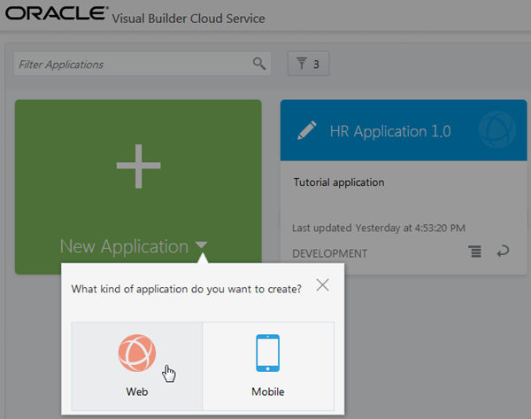
On the Home page, click + New Application and select Web.
Description of this image -
On the first page of the Create Application wizard, enter the following:
-
Application Name:
Theme Application -
Description:
Theme
                                          tutorial application
The Application ID text field is automatically populated based on the Application Name.
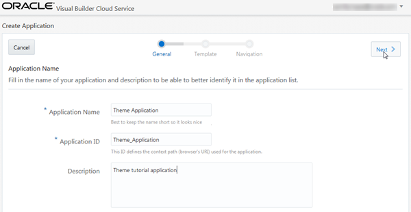
Description of this image Click Next.
-
-
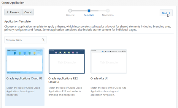
On the next page, select the Oracle Applications Cloud UI template, and then click Next.
Description of this image -
On the last page, click Finish.
By default, one tab with
Homeas its label is available.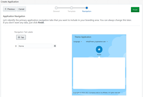
Description of this image -
Your application is created and opens in the Page Designer. Click the Themes palette to view the currently available themes. Three themes are provided by default: Oracle Alta UI, Oracle Applications Cloud UI, and Oracle Applications Cloud UI R12.
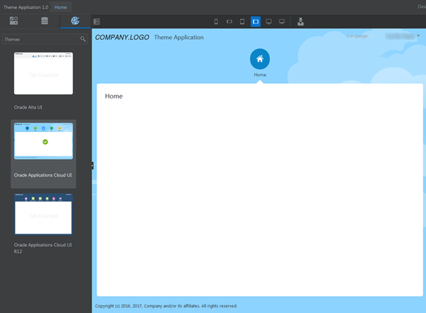
Description of this image
Creating a Theme
-
Click the
 icon and select Application
Settings.
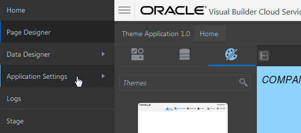
Description of this image -
Click the Extensions tile.

Description of this image -
On the Extensions page, click the Theme tab.
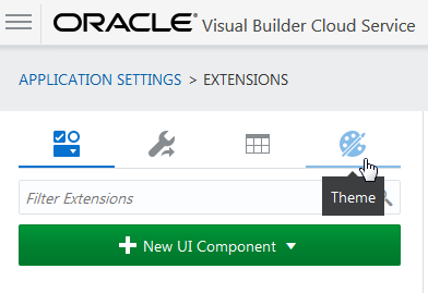
Description of this image -
Click + New Theme and select Create new.
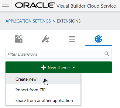
Description of this image -
On the first page of the Create New Extension wizard, enter the following, then click Template.
-
Display Name:
MyTheme -
Extension ID:
com.example.MyTheme(at least two groups of letters or numbers separated by a period) -
AMD Package Name:
com.example.MyTheme(automatically populated) -
Description:
My
                                          example theme
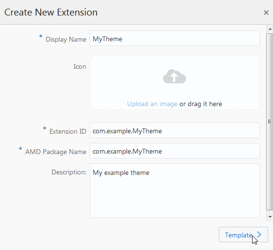
Description of this image Note: AMD stands for Asynchronous Module Definition.
-
-
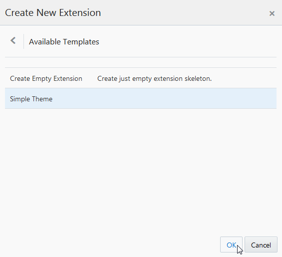
On the Available Templates page of the wizard, select Simple Theme, then click OK.
Description of this image -
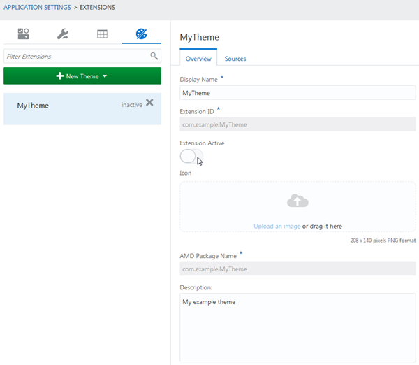
The Overview tab of the theme opens. Toggle the Extension Active icon to enable the theme. A message reports that the extension has been enabled.
Description of this image -
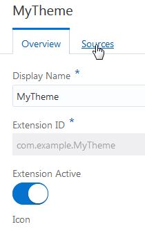
Click Sources to open the files in the Resource Browser.
Description of this image -
If necessary, expand the nodes in the Resource Browser and view the file names (you may need to widen your web browser window to see them).
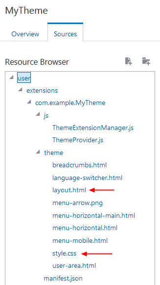
Description of this image You can perform most simple theme customizations by modifying two of the files,
layout.html(the HTML source of the theme) andstyle.css(the associated CSS file). You'll make these modifications in the next section. -
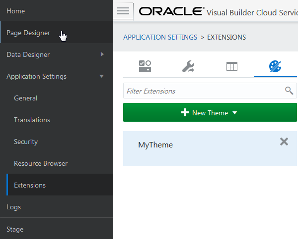
Click
 and select Page Designer
to return to the Page Designer.
Description of this image -
Click the Themes palette. Scroll down to see the new theme,
MyTheme, in the palette. It has a default icon.
Description of this image -
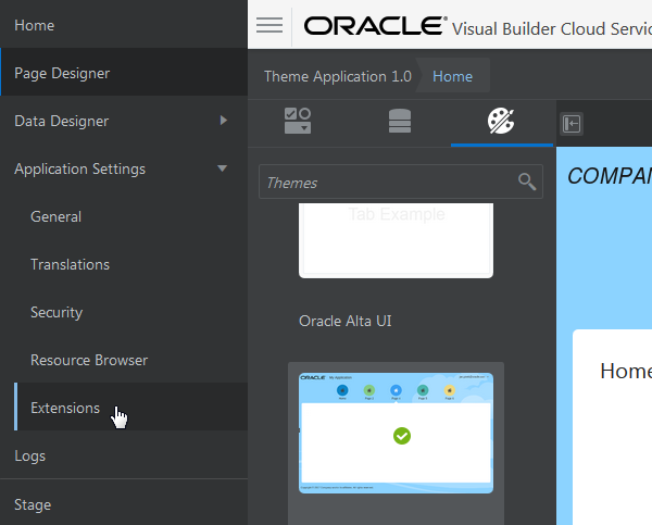
Click
 and select Application Settings,
then Extensions, to
return to the Themes tab on the Extensions
page.
Description of this image
Customizing a Theme
In this section, you'll customize the layout and
the style of your new theme. You'll modify layout.html
to add a new help panel that floats to the side of
the main content window. Then you'll modify style.css
to change the color scheme and add some styling to
the help panel.
The Sources tab provides a basic editor. If you
want to do more extensive editing, you can export
the extension to your system as a ZIP file, edit the
files in a local editor, and then use the Resource
Browser under Application Settings to import the zip
file to the extensions directory. You
could also select and copy the contents of an
individual file, edit it in a local editor, and then
paste it back into the Sources tab editor.
Customizing Theme Layout
-
From the Overview page for
MyTheme, click the Sources tab.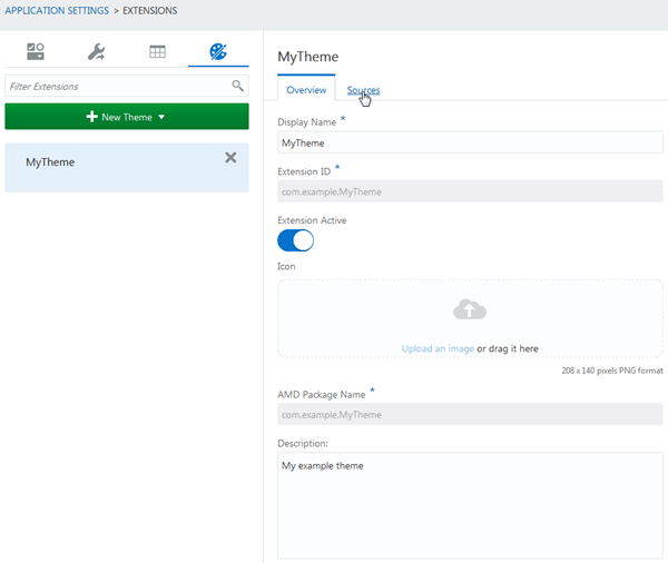
Description of this image -
In the Resource Browser, expand the nodes (if necessary) and navigate through the directory hierarchy to find the
layout.htmlfile, underuser/extensions/com.example.MyTheme/theme/.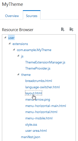
Description of this image -
Click the
layout.htmlfile to display its contents.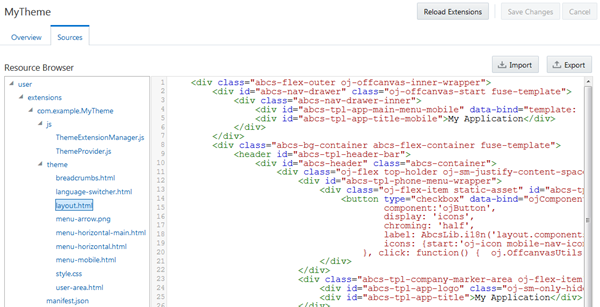
Description of this image -
Select the
divelement with the ID value"abcs-app-content". It's almost at the end of the file, between the header and the footer.<div id="abcs-app-content"> <!-- page content placeholder --> </div>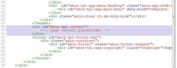
Description of this image -
Replace that code with the following, which moves it under a higher-level
divelement with the ID value"my-layout-container". Don't worry about the formatting.<div id="my-layout-container"> <div id="abcs-app-content"> <!-- page content placeholder --> </div> <div class="help-panel"> Help! This is where you could add basic information on how to use the application. </div> </div>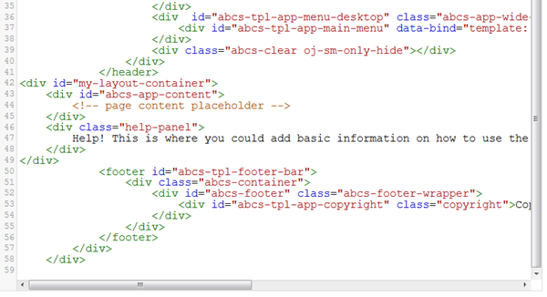
Description of this image -
Click Save Changes.
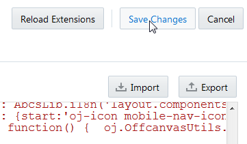
Description of this image
Customizing Theme Style
-
Click the file
style.css, in the same directory aslayout.html, to display its contents.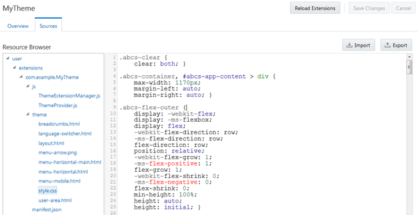
Description of this image -
Locate the following section, at lines 27-28.
.abcs-bg-container { background-color: #F0F0F0; } -
Replace the background color setting with the following to change the background color to yellow.
.abcs-bg-container {
    background-color: #fcde8a; }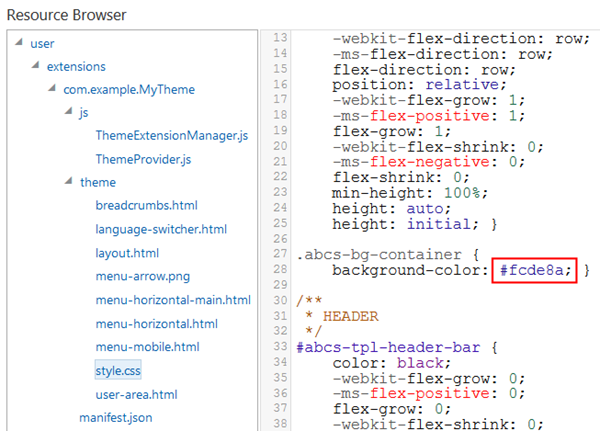
Description of this image -
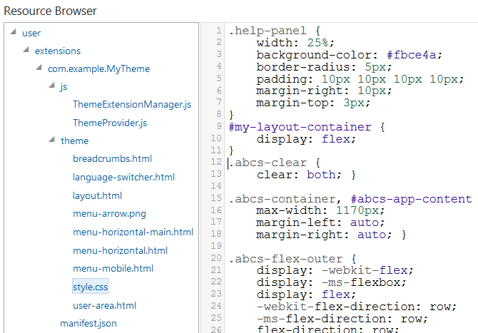
To style the new help panel, add the following at the start of the file.
.help-panel {
    width: 25%;
    background-color: #fbce4a;
    border-radius: 5px;
    padding: 10px 10px 10px 10px;
    margin-right: 10px;
    margin-top: 3px;
}
#my-layout-container {
    display: flex;
}
Description of this image -
Finally, make the main application content narrower to fit in the help panel. Find the section for
#abcs-app-content(line 261) and add a line that sets the width to75%.#abcs-app-content { width: 75%; margin-bottom: 10px; padding: 0px 10px 10px 10px; -webkit-flex-grow: 1; -ms-flex-positive: 1; flex-grow: 1; -webkit-flex-shrink: 0; -ms-flex-negative: 0; flex-shrink: 0; }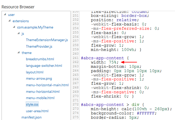
Description of this image -
Click Save Changes, then click Reload Extensions.
Description of this image -
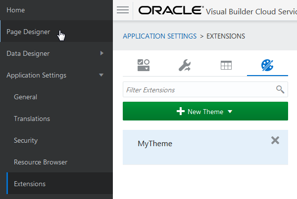
Click
 and select Page Designer
to return to the Page Designer.
Description of this image -
Click the Themes palette and select MyTheme.

Description of this image The application is re-rendered with the new layout. You may need to refresh the browser to see the help panel.
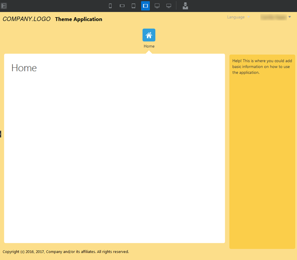
Description of this image The new help panel you created is not part of the content area of the application, but only part of the wrapper around the content area. In the Page Designer, you can drag components only into the content area specified by the ID
"abcs-app-content". To add content to the help panel, you would have to edit the theme in the Extensions page, modifying the contents of thedivelement that has the ID"help-menu".
In the next section, you can examine the source files in the theme you created by returning to the Themes tab on the Extensions page under Application Settings. After you finish, you can exit Oracle Visual Builder Cloud Service by clicking the user menu in the top-right corner and selecting Sign Out from the menu.
Developing a Theme
This section describes the structure and files that make up a theme and how you can customize them to create your own themes. This graphic shows the files that are created for themes based on the Simple Theme template.
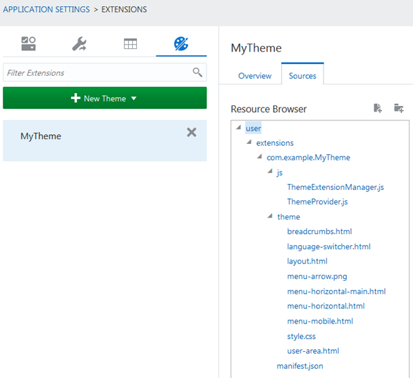
The following table lists and describes these files.
| File | What's the File For? | Why Would I Change It? |
|---|---|---|
ThemeExtensionManager.js |
Adapter to make the theme available as an extension | You shouldn't need to change this file |
manifest.json |
Lists information about the theme extension, including all of the files it contains | To add or remove files used in the theme |
ThemeProvider.js |
JavaScript file providing metadata about your theme | To add or remove files that are used in the theme, or if you want to write JavaScript code to be invoked when the theme is initialized |
layout.html |
The main layout HTML of the theme | To make a layout change to the HTML for the theme (for example, to add a new panel to the page) |
style.css |
The main stylesheet for the theme | To make a styling change to the theme or to the application content |
preview.png |
The preview image displayed in the Themes palette | To provide a preview image for your theme to be displayed to the user in the Themes palette |
language-switcher.html |
Specifies menu that allows user to change languages | To make changes to the way the menu is displayed |
menu-horizontal.html |
Layout HTML used to render the menu area | To make changes to the way the menu area is rendered |
menu-horizontal-main.html |
Layout HTML used to render a single menu item in the menu area | To make changes to the way the menu area is rendered |
menu-arrow.png |
Triangular image used as part of the menu | You should not need to change this file |
menu-mobile.html |
Layout HTML used to render the menu area rendered for mobile devices | To make changes to the way the menu area is rendered |
user-area.html |
Layout HTML used to render the user drop-down menu | You should not need to change this file |
breadcrumbs.html |
Specifies navigation breadcrumbs | To make changes to navigation breadcrumbs |
If you decide to create your own theme and select Create Empty Extension in the Create New Theme wizard, you must at a minimum provide implementations of the following:
ThemeExtensionManager.jsThemeProvider.jsmanifest.jsonlayout.htmlstyle.css
The following subsections provide more detail on
the files created by the simple
template.
ThemeExtensionManager.js
The ThemeExtensionManager
implements the ExtensionManager
Service Provider Interface (SPI), which provides
hook points that are invoked when the extension
is initialized and destroyed. The ThemeExtensionManager
is responsible only for registering the ThemeProvider
with the ThemeProviderRegistry
during initialization (which makes the theme
available to the current application), and for
deregistering it during destroy. Part of the
file looks like this:
ThemeExtensionManager.prototype.initialise = function (dependencies) {
    ThemeProviderRegistry.registerThemeProvider(ThemeProvider);
};

ThemeExtensionManager.prototype.destroy = function (dependencies) {
    ThemeProviderRegistry.unregisterThemeProvider(ThemeProvider);
};
The implementation generated from the simple theme template should generally not need to be modified.
manifest.json
The JSON manifest file provides metadata about
the extension, including its ID, name,
description, type and package name, as well as a
list of all the assets provided by the
extension. It also specifies the ExtensionManager
that this extension should use. The format of
this file is common to all extension types and
is not theme specific. The manifest.json
file provided by the template is generated from
the information entered by the user in the
dialog when creating the extension, and the list
of assets is correct for the initial state of
the theme. For the theme you created, the file
looks like this.
{
    "description": "My example theme",
    "displayName": "MyTheme",
    "extensionManager": "com.example.MyTheme/js/ThemeExtensionManager",
    "id": "com.example.MyTheme",
    "image": "",
    "package": "com.example.MyTheme",
    "runtime": {
        "resources": [
            "theme/language-switcher.html",
            "theme/layout.html",
            "theme/menu-horizontal-main.html",
            "theme/menu-horizontal.html",
            "theme/menu-mobile.html",
            "theme/user-area.html",
            "theme/breadcrumbs.html",
            "theme/style.css",
            "theme/menu-arrow.png"
        ]
    },
    "type": "theme"
}
As you add or remove assets from the theme, you
must update the manifest.json file
accordingly.
ThemeProvider.js
The ThemeProvider is the
implementation of the main theme SPI. This file
provides Oracle Visual Builder Cloud Service
with all the information it needs about the
theme, including the display name of the theme,
which HTML file represents the overall theme
layout, which areas of the template should be
injected with dynamic content from Oracle Visual
Builder Cloud Service, and the types of the
assets supplied by the theme. There are also
hook points provided to create any custom view
models that the layout may provide.
The ThemeProvider generated when
you create a theme based on the simple theme
provider will be configured correctly for the
simple theme. As you make changes to the theme
to customize it, you may need to make
corresponding changes in the ThemeProvider
code. The functions that ThemeProvider
must provide are described in the following
subsections.
getDescriptor()
The getDescriptor() function must
return an instance of ThemeDescriptor,
which provides information about the theme for
presenting to the user, such as the ID, name and
description. It is also possible to include a
link to a preview image for the theme. When you
create a theme using the simple template, the getDescriptor()
method is implemented using the details supplied
in the wizard. The getDescriptor()
function for the theme you created looks like
this.
    var ThemeProvider = function () {
        var self = this;

        var manifest = JSON.parse(manifestJSON);

        self.descriptor =
            new ThemeDescriptor({
                id: manifest.id,
                title: manifest.displayName,
                description: manifest.description,
                preview: manifest.image,
                link: null,
                linkText: null});

        self.template = theme;
        self.package = manifest.package;
    };

    ThemeProvider.prototype.getDescriptor = function() {
        return this.descriptor;
    };
Notes: The id
value specified in the ThemeDescriptor
must match the extension ID. The link
and linkText properties are not
currently used.
getAssets()
The getAssets() function must
return an instance of ThemeAssets.
Call ThemeAssets.addAsset() for
each asset that your theme provides, including
templates (HTML), images and stylesheets.
You must also specify the type of the asset,
using constants from ThemeAssets.Type.
The getAssets() code for the theme
you created looks like this.
    ThemeProvider.prototype.getAssets = function() {
        var assets = new ThemeAssets();
        assets.addAsset(ThemeAssets.Type.STYLE, 'style.css');
        assets.addAsset(ThemeAssets.Type.TEMPLATE, 'language-switcher.html');
        assets.addAsset(ThemeAssets.Type.TEMPLATE, 'layout.html');
        assets.addAsset(ThemeAssets.Type.TEMPLATE, 'menu-horizontal-main.html');
        assets.addAsset(ThemeAssets.Type.TEMPLATE, 'menu-horizontal.html');
        assets.addAsset(ThemeAssets.Type.TEMPLATE, 'menu-mobile.html');
        assets.addAsset(ThemeAssets.Type.TEMPLATE, 'user-area.html');
        assets.addAsset(ThemeAssets.Type.TEMPLATE, 'breadcrumbs.html');
        assets.addAsset(ThemeAssets.Type.IMAGE, 'menu-arrow.png');

        return assets;
    };
getComponentMap()
The getComponentMap() function
must return an instance of ThemeComponentMap.
The ThemeComponentMap defines the
element IDs within your HTML that Oracle Visual
Builder Cloud Service will replace with dynamic
content selected by the application developer --
for example, the application title, logo image,
and copyright message. It also defines an
element to be used for the menu; a menu view
model will be bound to this element by Oracle
Visual Builder Cloud Service. Finally, it also
allows one or more elements to be specified
which will invoke the layout property inspector
in the Oracle Visual Builder Cloud Service Page
Designer when the user clicks on that area in
the design view.
Each theme HTML must contain a div
element with the ID "abcs-app-content".
Oracle Visual Builder Cloud Service will inject
the actual application into this div.
Currently it is not possible to specify a
different ID for this div, so it
does not need to be included in the component
map.
The following is an example getComponentMap()
implementation, with some explanatory comments.
    ThemeProvider.prototype.getComponentMap = function() {
        var componentMap = new ThemeComponentMap();

        componentMap.addFavicon('abcs-tpl-app-favicon');

        // Areas that will invoke property inspector when clicked
        componentMap.addThemeArea('abcs-tpl-header-bar');
        componentMap.addThemeArea('abcs-tpl-footer-bar');

        // Element to be replaced with title text
        componentMap.addTitle('abcs-tpl-app-title');

        // Area to be replaced with application logo uploaded by application designer
        componentMap.addLogo('abcs-tpl-app-logo');

        // Area to be replaced with copyright text
        componentMap.addCopyright('abcs-tpl-app-copyright');

        // Area to be replaced with language switcher
        componentMap.addLanguageSwitcher('abcs-tpl-app-language-switcher');

        // Area to be bound to user view model
        componentMap.addUserArea('abcs-tpl-app-user-area');

        var options = {boundIds: ['abcs-tpl-phone-menu'],
                       alternateIds:  ['abcs-tpl-app-main-menu-mobile']};

        // Area to be bound to menu view model
        componentMap.addMenuArea('abcs-tpl-app-main-menu', options);

        return componentMap;
    };
The ThemeComponentMap.addMenuArea()
function can be specified with only one
argument, 'abcs-tpl-app-main-menu'.
The additional options parameter
of addMenuArea()allows more
complex configuration of the menu. The
options parameter is a plain JavaScript
object with up to three properties:
options.alternateIdsis an array of alternate element IDs into which alternate versions of the menu, such as a mobile-friendly version, can be bound. The simple theme template uses this option to create a flyout mobile menu.options.boundIdsis an array of element IDs for elements that do not render menus, but should be displayed if and only if a menu is available. For example, thesimpletheme template uses this option to render a hamburger menu that will display the flyout mobile menu when clicked.options.maxDepthdetermines the depth of the menu tree that should be bound to the menu element. If this property is omitted, the entire menu tree is bound. This property should be set to 1 for themes that can't display a hierarchy, and omitted otherwise.
getTemplate()
The getTemplate() method must
return a string that comprises the HTML markup
for the theme. The best way to do this is to
place the markup in its own file, and then
require it with a text! prefix in
the ThemeProvider. For example:
define([
    'layout.dt/js/api/ThemeAssets',
    'layout.dt/js/api/ThemeComponentMap',
    'layout.dt/js/api/ThemeDescriptor',
    'text!com.example.MyTheme/theme/layout.html',
    'text!com.example.MyTheme/manifest.json'
], function(
        ThemeAssets,
        ThemeComponentMap,
        ThemeDescriptor,
        theme,
        manifestJSON) {

    'use strict';

    var ThemeProvider = function () {
        ...
        self.template = theme;
        self._package = manifest.package;
    };
    ...
    ThemeProvider.prototype.getTemplate = function() {
        return this.template;
    };
getAssetPath()
The getAssetPath() function
returns the base path to the assets within the
theme. For example, if you have created a theme
from the simple template, the assets will be
under the theme subdirectory. The
asset path must also be prefixed by the package
name; this is done for you if you create the
theme from the template. For example:
    ThemeProvider.prototype.getAssetPath = function() {
        return '' + this.package + '/theme';
    };
generateViewModelRuntimeCode() and initializeViewModel()
For themes that require their own view model, these functions provide hook points for initializing and binding the view model to the required theme elements. You must supply two implementations of this code, one for use at run time (returned as a string to be inserted into the generated application code) and one for use at design time (which will be called directly). For example, for a theme that displays a real time clock, the two methods could be implemented as follows:
ThemeProvider.prototype.generateViewModelRuntimeCode = function() {
    return 'var initTheme = ' + function() {
        var timeViewModel = {
            theTime: ko.observable('Loading time...')
        };
        var tick = function() {
            timeViewModel.theTime(new Date());
            setTimeout(tick, 500);
        }
        ko.applyBindings(timeViewModel, document.getElementById('my-time-element'));
        tick();
    }.toString() + '; initTheme();';
};

ThemeProvider.prototype.initializeViewModel = function() {
    var timeViewModel = {
        theTime: ko.observable('Loading time...')
    };
    var tick = function() {
        timeViewModel.theTime(new Date());
        setTimeout(tick, 500);
    }
    var timeElement = document.getElementById('my-time');
    ko.cleanNode(timeElement); //Ensure not already bound
    ko.applyBindings(timeViewModel, timeElement);
    tick();
};
The simple theme defines these
functions, but not their content.
    ThemeProvider.prototype.generateViewModelRuntimeCode = function() {
        // insert method to return view model runtime code here
    };

    ThemeProvider.prototype.initializeViewModel = function() {
      // insert code to initialize view model at design time here
    };
Theme Assets
Theme assets are the HTML files, images and
stylesheets that go to make up the theme. They
are located in the extension directory at the
location specified by ThemeProvider.getAssetPath(),
and you can place them in subdirectories by
adding the subdirectory path when building the AssetMap
in ThemeProvider.getAssetPath().
Note: All assets must be
listed both in manifest.json and
by ThemeProvider.getAssetMap()
(where the type of each asset is specified).
HTML assets
One HTML file is designated as the template for
the theme, and its content should be returned by
ThemeProvider.getTemplate(), as
outlined in the section on getTemplate().
This HTML file must contain a div
element with the ID abcs-app-content.
Oracle Visual Builder Cloud Service will inject
the main application content into this div
element, replacing any contents, so it makes
sense to leave the element empty.) The HTML file
can contain any other markup required, but it
must not include html, body,
or head elements, since these are
generated by Oracle Visual Builder Cloud
Service.
Elements in the layout can be styled by classes
from the CSS file or files included in the
theme. It is recommended, but not required, that
the element IDs and CSS class names used by a
theme are namespaced by the theme name or ID;
for example, <div
class="myTheme-style1">.
Dynamic content selected by the application
developer can be injected into areas of the
layout by Oracle Visual Builder Cloud Service at
run time. The process of registering element IDs
where content should be injected is done by
means of a ThemeComponentMap,
described in the section on getComponentMap().
You can load additional HTML files into the
theme as templates, using Knockout. Elements
that use Knockout templates must be bound to a
view model, either implicitly (by assigning them
to be menu or user areas in the ThemeComponentMap)
or explicitly in ThemeProvider.initializeViewModel().
The simple theme template uses
Knockout templates for the menu and user areas.
Note: you cannot use a relative path to reference other assets within the theme, because the template HTML file will be included into a document loaded from a different location.
You can reference other assets within the theme
extension, if required, using Oracle Visual
Builder Cloud Service's custom Knockout bindings
src and href, which
are provided for accessing static resources in
extensions. An element using a custom binding
must be bound to a Knockout view model, although
that view model can be trivial. For example:
<div id="theme-image">
    <img data-bind="src: 'com.example.MyTheme/assets/images/mycompany.gif'">
</div>
and then in the initialization code:
ko.applyBindings({}, document.getElementById('theme-image');
If the asset is an image, consider loading it using a relative path in the CSS file instead, for simplicity.
CSS Assets
CSS files provided by a theme must be declared
in the AssetMap returned from ThemeProvider.getAssets(),
and will be loaded via a link
element in the head section of the
application HTML at run time. Theme CSS files
can include styling for elements within the
theme HTML, and also elements generated by
Oracle Visual Builder Cloud Service, including
Oracle JavaScript Extension Toolkit (JET)
components. CSS files can reference images and
other assets within a theme using a path
relative to the location of the CSS file itself.
This is the recommended way to load images into
the theme markup.
Warning: Do not include type selector rules in your CSS files. These rules will apply to the Oracle Visual Builder Cloud Service Page Designer markup as well as to the application itself, and may prevent Oracle Visual Builder Cloud Service from functioning correctly.
Images
A theme can include images. These images can be
used within the theme layout, and additionally a
image can be designated as the preview image for
the theme (the image that will be displayed for
this theme in the Themes palette). The preview
image is defined as part of the ThemeDescriptor
(see the section on the getDescriptor()
function), and other images should be referenced
via a relative path in the CSS file.
Menu Areas
Elements that are mapped as menu or user areas
by a ThemeComponentMap are bound
to view models containing menu and/or user
information. Currently, the recommendation for
building a menu is to base it on the menu markup
generated for the simple template,
as described below. This works using two nested
templates, one representing the entire menu
area, and one representing a single menu item.
This approach is useful because it ensures that
the menu is properly reloaded as the menu
changes at design time.
The main theme HTML file, layout.html,
has the following fragment.
<div id="abcs-tpl-app-main-menu" data-bind="template: { name: 'menu-horizontal'}"></div>
This fragment includes the menu-horizontal
template, which looks like this.
<div class="abcs-main-nav">
    <div id="mainAppNavConveyor">
        <div id="mainAppNavButtonset" aria-label="Use arrow keys to move between menu items." data-bind="ojComponent: {component: 'ojButtonset', create: function() {
                var timeout = $('#dt-application > div').length  ? 2000 : 100;
                setTimeout(function() {
                    $('#mainAppNavConveyor').ojConveyorBelt({ 'contentParent': 'mainAppNavButtonset'});
                },timeout);
            }}">
            <!-- ko template: { name: 'menu-horizontal-main', foreach: items } -->
            <!-- /ko -->
        </div>
    </div>
</div>
This code creates an Oracle JET buttonset, and
in turn, includes the menu-horizontal-main
template for each menu item (items)
in the view model. The menu-horizontal-main
template looks like this.
<button data-bind="click: function() { $root.handleClick($root, this); },
            attr: {id: getId()},
            ojComponent: {component: 'ojButton',
                          label: getMenuItem().getTitle(),
                          icons: {start: getMenuItem().getIcon() ? getMenuItem().getIcon() : ''}}"/>
The key features here are the $root.handleClick()
call, which invokes the Oracle Visual Builder
Cloud Service navigation when the menu item is
clicked, and the access to information about the
menu item through getMenuItem().
It's not necessary to use Oracle JET to render the menu bar; it's possible to use simple HTML. As another example, the outer menu template could contain an unordered list element:
<ul>
    <!-- ko template: { name: 'menuItem', foreach: items } -->
    <!-- /ko -->
</ul>
Then the menuItem template
implements each menu option with a list item as
follows:
<li>
    <!-- ko if: ($root.selected() === $data) -->
    <div data-bind="click: function() { $root.handleClick($root, this); },
                    text: getMenuItem().getTitle(),
                    attr: {id: getId()}"
         class="menu-selected">
    </div>
    <!-- /ko -->
    <!-- ko if: !($root.selected() === $data) -->
        <div data-bind="click: function() { $root.handleClick($root, this); },
                        text: getMenuItem().getTitle(),
                        attr: {id: getId()}">
        </div>
    <!-- /ko -->
</li>
This code also illustrates a way to obtain the
selected menu item from the view model, using $root.selected().
Language Switcher and User Areas
The language switcher element is responsible for displaying a menu that allows you to change languages, if you supply language bundles for more than one language. The menu isn't enabled until you stage the application.
The user area element is responsible for
displaying the currently logged in user, along
with login or logout links. It also renders the
help menu item. You should use the user-area.html
file created for you, with minor cosmetic
adjustments if required.
Breadcrumbs
Breadcrumbs display a user's navigation path
through a multi-page application and allow the
user to go back to a parent page. The breadcrumbs.html
file specifies breadcrumbs for an application.
To use it, you need to specify it in the layout.html
file and also in the ThemeProvider.js
file.
In layout.html, specify a custom
div element to include the
breadcrumbs file where you want it. Here, for
example, it's placed between the header and the
main content.
</header>
<div id="abcs-tpl-breadcrumbs"></div>
<div id="abcs-app-content">
In ThemeProvider.js, specify the
same ID as the argument to the addBreadcrumbs
method in the getComponentMap()
function. The ID can be anything as long as it's
the same in both locations.
componentMap.addBreadcrumbs('abcs-tpl-breadcrumbs');The getAssets() function of ThemeProvider.js
already has an addAssets call that
specifies the breadcrumbs.html
file.
In addition, you will probably want to add
styling for the breadcrumbs to the style.css
file. Some simple styling for breadcrumbs is
already provided.
/* BREADCRUMBS */
.abcsBreadcrumbs {
    padding: 10px 16px;
    list-style: none;
    font-size: 17px;
}
.abcsBreadcrumbs .breadcrumbs-root > .oj-button-icon:first-child:before {
    display: block;
    height: 24px;
}
.abcsBreadcrumbs li {
    display: inline;
}
.abcsBreadcrumbs li+li:before {
    padding: 8px;
    color: black;
    content: "/\00a0";
}
.abcsBreadcrumbs li a {
    color: black;
    text-decoration: none;
}
.abcsBreadcrumbs li a:hover {
    cursor: pointer;
    color: darkred;
}
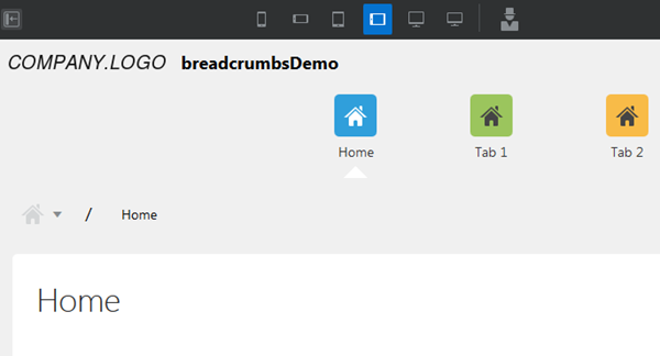
The result might look something like this.
Want to Learn More?
-
Using Oracle Visual Builder Cloud Service in the Oracle Help Center
-
Known Issues for Oracle Visual Builder Cloud Service in the Oracle Help Center
-
JavaScript API for Oracle Visual Builder Cloud Service in the Oracle Help Center