Before You Begin
Purpose
In this tutorial, you will learn how to use some of the data visualization tools in Oracle Visual Builder Cloud Service.
Time to Complete
Approximately 40 minutes.
Background
Oracle Visual Builder Cloud Service is a visual development tool for creating web and mobile applications by simply dragging and dropping UI components onto a page. You can create business objects at the click of a button and add data by importing data to your application. You do not need any programming experience to develop an application.
Scenario
You will create a simple application and import data into it. You will then add several charts and gauges to display the data.
What Do You Need?
-
Access to Oracle Visual Builder Cloud Service
- A supported browser (see Known Issues for Oracle Application Builder Cloud Service for more information)
Creating a Simple Application
In this section, you will create a simple application with three pages, then import data into it.
Creating an Application
-
In the web browser, log in to Oracle Visual Builder Cloud Service.
-
On the Home page, click New Application and select Web.
-
In the Application Name page of the Create Application wizard, enter the following values:
-
Application Name:
Charts Application -
Description:
Charts
                                          and gauges tutorial application
The Application ID text field is automatically populated based on the Application Name.
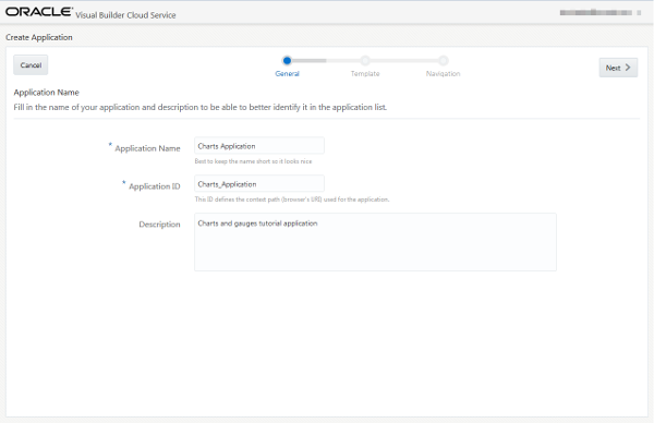
Description of this image Click Next.
-
-
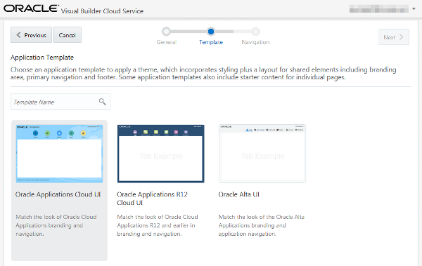
In the Application Template page of the Create Application wizard, select the Oracle Applications Cloud UI template (the default) and click Next.
Description of this image - In the Application Navigation page of the
Create Application wizard, create the
application tabs.
By default, one tab with
Homeas its label is available. Replace theHometext in the Label field withSummaryto rename the tab label. Click + Tab to create another label field and enterSales Regionsas the label. Click + Tab to create a third label field and enterSales Objectivesas the label.
Description of this image - Click Finish.
Your Charts Application is now created and opens in the Page Designer.
Adding Business Objects to the Application
In this section you will use Data Palette of the Data Designer to create three business objects. These will be used by the charts and gauges you create later.
-
If necessary, click the
 Main Menu icon in the top-left corner and
select Page Designer.
Description of this image -
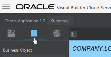
In the Page Designer, click the Data palette.
Description of this image -
Click + New Business Object.

Description of this image -
In the pop-up box, enter
Region.
Description of this image -
Click the
 icon.
icon. The
Regionbusiness object is created with some fields.
Description of this image -
Click + New Field. In the pop-up box, enter the following details:
-
Default Display Label:
Name -
Field ID:
name(automatically populated) -
Field Data Type:
 Text
Text
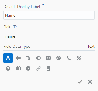
Description of this image Click the
 icon to create the field.
 -
-
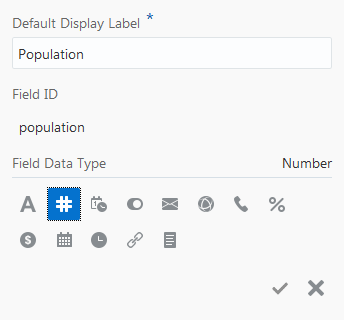
Click + New Field. In the pop-up box, enter or select the following details:
-
Default Display Label:
Population -
Field ID:
population(automatically populated) -
Field Data Type:
 Number
Description of this image Click the
 icon to create the field.
 -
-
Click + New Business Object and create a
Salesbusiness object in the same way you created the Region business object (steps 3-5). -
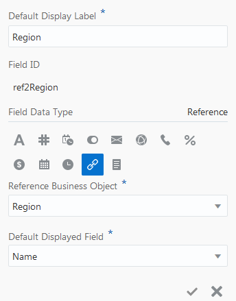
Click + New Field. In the pop-up box, enter the following details:
-
Default Display Label:
Region -
Field Data Type:
 Reference
 -
Field ID:
ref2Region(automatically populated) -
Reference Business Object:
Region(automatically populated) -
Default Displayed Field:
Name
Description of this image Click the
 icon to create the field.
 -
-
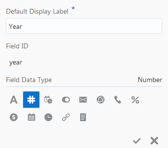
Click + New Field. In the pop-up box, enter the following details:
-
Default Display Label:
Year -
Field ID:
year(automatically populated) -
Field Data Type:
 Number
Description of this image Click the
 icon to create the field.
 -
-
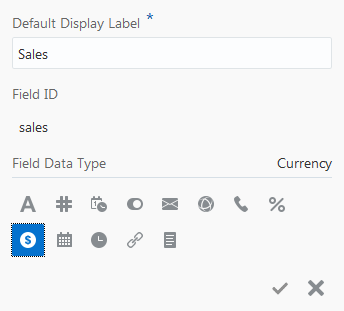
Click + New Field. In the pop-up box, enter the following details:
-
Default Display Label:
Sales -
Field ID:
sales(automatically populated) -
Field Data Type:
 Currency
Description of this image Click the
 icon to create the field.
 -
-
Click + New Business Object and create a
Summarybusiness object in the same way you created the Region business object (steps 3-5). -
Click + New Field. In the pop-up box, enter the following details:
-
Default Display Label:
Region -
Field Data Type:
 Reference
 -
Field ID:
ref2Region(automatically populated) - Reference Business Object:
Region(automatically populated) -
Default Displayed Field:
Name

Description of this image Click the
 icon to create the field.
 -
-
Click + New Field. In the pop-up box, enter the following details:
-
Default Display Label:
Year -
Field ID:
year(automatically populated) -
Field Data Type:
 Text
Text

Description of this image Click the
 icon to create the field.
 -
-
Click + New Field. In the pop-up box, enter the following details:
-
Default Display Label:
Sales -
Field ID:
sales(automatically populated) -
Field Data Type:
 Currency
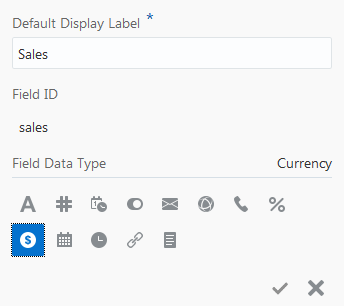
Description of this image Click the
 icon to create the field.
You have now created the business objects and can import data.
-
Importing Data
In this section you will import data from a zip file to all business objects of the application.
Before you start, download the Chart_Application.zip
file to your machine. Right-click this
link and choose Save As to
download the zip file. The zip file contains CSV
files for the business objects of the Charts
Application. Feel free to review the contents of
the zip file.
Note: You cannot add new fields to a schema or edit their properties by importing data from a file. The names and data types of columns in the imported data must match the names and data types of columns in the schema.
-
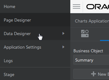
Click the Main Menu icon
 in the top-left corner and click Data
Designer.
Description of this image -
Click the Data Manager tile.

Description of this image -
Ensure that Development is selected in the Database menu.

Description of this image -
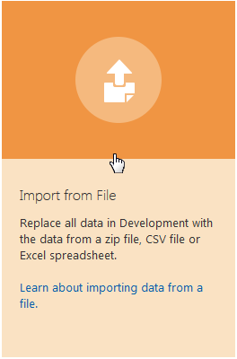
Click Import from File.
Description of this image -
In the Confirm Import Data dialog, click Upload a file, browse, and select the
Chart_Application.zipfile.
Description of this image -
Click Import.
-
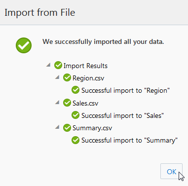
In the Import from File dialog, click OK.
Description of this image -
You have now imported data to the application, and can create charts and gauges that display that data.
Adding Charts and Gauges
In this section, you will add several charts and gauges.
Add Charts to the Summary Page
You will start by adding a bar chart and an area chart to the summary page.
-
Click the
 Main Menu
icon in the top-left corner and select Page
Designer.
 -
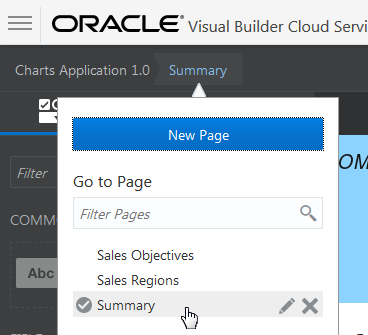
Open the page menu and select the Summary page if you are not already there.
Description of this image -
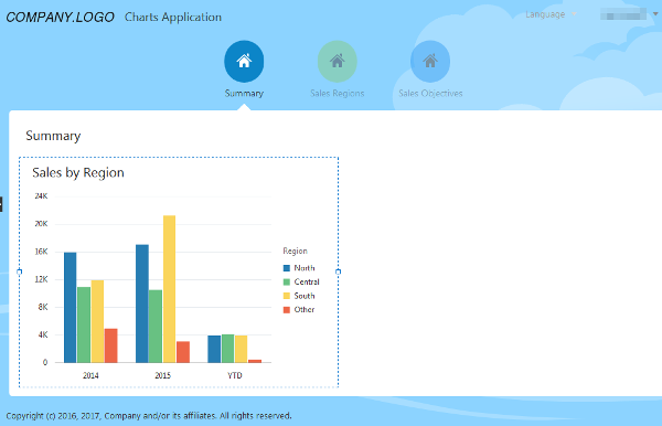
Now you will create a bar chart that will display three years of sales data for different sales regions.
Drag and drop a bar chart from the Component palette to the canvas area of the Summary page.

Description of this image -
In the bar chart pop-up box, select:
-
Business Object:
Summary -
Bar Values (Y Axis):
Sales -
Categories (X Axis):
Year -
Colors (Series):
Region

Description of this image Click the
 icon to create the chart.
 -
-
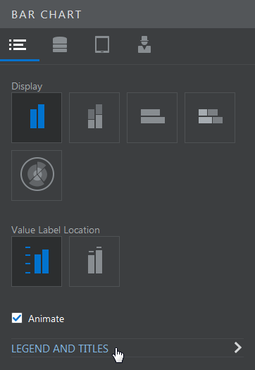
In the Properties tab of the Bar Chart Properties Inspector, click Legend and Titles.
Description of this image -
In the Legend and Titles page, set the Title to
Sales by Region.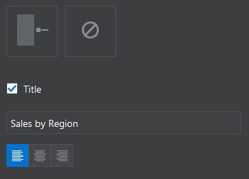
Description of this image -
The Summary page should look like the following image. You may need to adjust the size of the chart.
Description of this image -
Now you will add an area chart to display regional sales data for the last twenty-five years of sales.
Drag an area chart to the canvas area of the Summary page, and drop it next to the bar chart.

Description of this image -
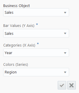
In the pop-up box, select the following details:
-
Business Object:
Sales -
Bar Values
(Y Axis):Sales -
Categories (X Axis):
Year -
Colors (Series):
Region
Description of this image Click the
 icon to create the field.
 -
-
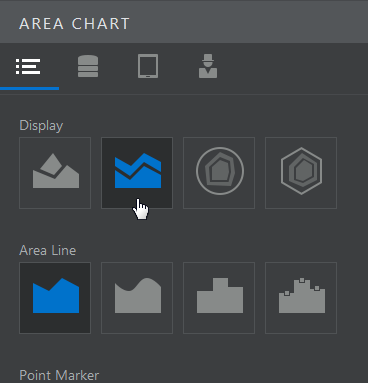
Click the Properties tab in the Area Chart Properties Inspector, then set the Display to Vertical Stacked.
Description of this image -
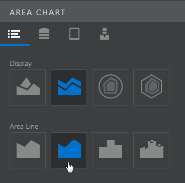
In Area Line, Select Curved.
Description of this image -
Click Legend and Titles and set the title to
Sales.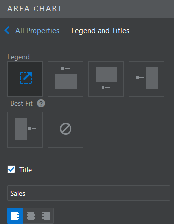
Description of this image -
The Summary page now looks like the following image. You may need to adjust the size of the chart.

Description of this image
Add Pie Charts
Now you will add two pie charts to the application. These will be used to display different information about the same regions, making it easier to compare the data.
-
Open the page menu, and select the Sales Regions page.

Description of this image -
Drag and drop a pie chart to the canvas area of the Sales Regions page.

Description of this image -
In the pop-up box, select the following details:
-
Business Object:
Region -
Slice Values:
Population -
Slice Colors:
Name

Description of this image Click the
 icon to create the chart.
 -
-
In the Properties tab of the Pie Chart Properties Inspector, set the Slice Label Content to Percent.

Description of this image -
Set the title to
Population by
                                      Region
.
Description of this image -
Drag and drop a second pie chart to the canvas area of the Sales Regions page. You may need to adjust the size of the first chart before you do this.

Description of this image -
In the pop-up box, select:
-
Business Object:
Sales -
Slice Values:
Sales -
Slice Colors:
Region

Description of this image Click the
 icon to create the chart. The
pie chart that you have just created has too
many slices to be easily legible. You will
adjust this later.
 -
-
In the Properties tab of the Pie Chart Properties Inspector, set the Slice Label Content to Percent.

Description of this image -
Set the title to
Sales by Region.
Description of this image -
Set the Subtitle to
2015.
Description of this image Click
 to
return to the Property Inspector.
 -
Click the Data tab of the Property Inspector.

Description of this image -
Because this pie chart has so many slices, it's difficult to interpret. You will need to narrow the range of data it displays. Click the Default Query Edit button.

Description of this image -
In the Default Query pop-up box, select Year from the drop-down.

Description of this image -
Set the default query value to
2015.
Description of this image Click the
 icon to update the query.
 -
The Sales by Region pie chart now displays data only from 2015. You may need to adjust the size of the chart.
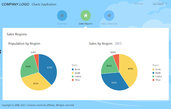
Description of this image The two charts let you easily compare a region's population with its sales. For example, you can see that the South region has sales proportionally greater than its share of the population.
Add Gauges
Now you will add some gauges. A
gauge visually represents a single
value. Here, you will add gauges that
show sales as a percent of the sales
objectives.
-
Open the page menu, and select the Sales Objectives page.
-
Drag and drop a List View on the Sales Objectives canvas. List View can be found in the Collection section of the Components palette.

Description of this image -
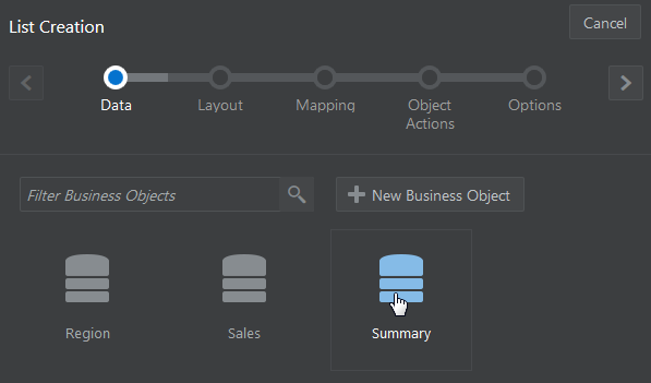
In the Data page of the List Creation wizard, select Summary.
Description of this image -
In the Layout page of the List Creation Wizard, select the Four Column layout, then click
 .
. 
Description of this image -
In the Mapping page, drag and drop Year on the first column of the list. Select Output Text from the component dialog.

Description of this image -
Drag and drop Region in the second column.
-
Drag and drop Sales in the third column and select Output Currency from the component dialog. The fourth column is now on the next line, but you'll fix that soon. Click
 .
. -
In the Object Actions page, click Off for all default actions and click
 .
. 
Description of this image -
In the Options page of the Table Creation wizard, click Finish.
No additional action is required in the Options page.
-
Select the Year text field and click the Properties tab. Set the Label Position to None.
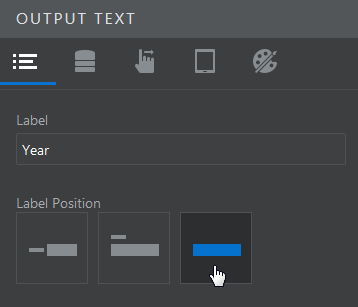
Description of this image Set the Region field and the Sales field to None in the same way. The fourth column is back on the first line now.
-
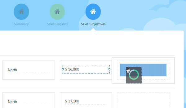
Drag a Circular Status Meter from the Gauge section of the Components palette to the fourth column of the Sales Objective list.
Description of this image -
In the pop-up box, select or enter the following details:
-
Business Object:
Summary(selected by default) -
Value:
Sales -
Minimum Value:
0 -
Maximum Value:
16000
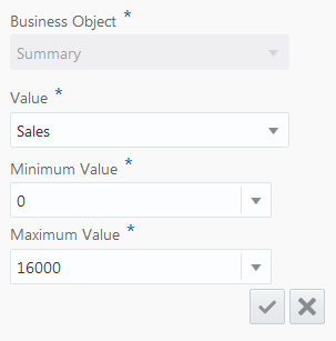
Description of this image Click the
 icon to create the field.
 -
-
In the Property Inspector, set the Label Position to None.
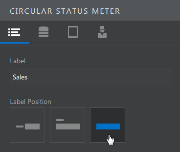
Description of this image -
Set the Value Label to %.

Description of this image - On the Data page, click
 to add a threshold. Thresholds are used to
control the color of a gauge. As long as the
value of the gauge's data is below a
threshold, it will display the color selected
for that threshold.
For Threshold 1, enter a value of
15000, and select Orange for the color.
Description of this image - In the same way, add two more thresholds.
Configure Threshold 2 with a
value of
16000and the color Green. Configure Threshold 3 with a value of50000and the color Blue. -
The gauges visually represent each region's sales for a given year. Gauges that are orange show sales that fall below 94% of target. Green gauges indicate sales that are above this threshold, or that have met the sales objective. Blue gauges show results that have exceeded the sales objective.
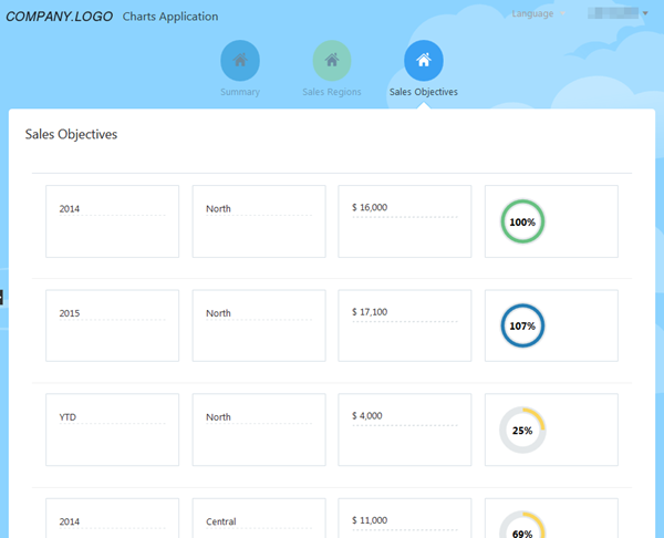
Description of this image
Want to Learn More?
-
Getting Started with Oracle Visual Builder Cloud Service OBE tutorial
-
Designing Pages in Oracle Visual Builder Cloud Service in Oracle Help Center
-
Working with Business Objects in Oracle Help Center
-
Managing Application Data in Oracle Help Center
-
Editing an Application in Oracle Visual Builder Cloud Service OBE tutorial
-
Staging and Publishing an Application in Oracle Visual Builder Cloud Service OBE tutorial