Creating Charts in SQL Developer 4.0
Overview
Purpose
This tutorial shows you how to create a user defined chart with Oracle SQL Developer 4.0.
Time to Complete
Approximately 25 minutes
Introduction
Oracle SQL Developer reports provide an integrated and efficient means of viewing information stored in Oracle databases. You can view the standard database reports that come with SQL Developer, and you can create your own user defined reports and charts.
In this tutorial you create a user defined chart report, selecting its features and properties, and you generate an HTML version of the report.
Prerequisites
Before starting this tutorial, you should have:
- Oracle SQL Developer 4.0 software, which is available on the Oracle Technology Network
- Oracle Database 12c software, which is available at Oracle Database Software Downloads
- Access to the HR sample schema
Setting up the Environment
In this section, you set up the users and connections for the tutorial.
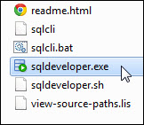
Double-click on sqldeveloper.exe to launch SQL Developer.
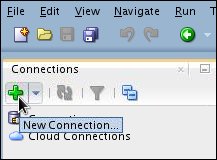
In the connections window, click New Connection.
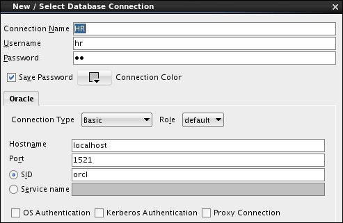
In the New / Select Database Connection dialog box, provide the following entries:
Name: HR
Username: hr
Password: Enter the password for your system.
Save Password: Select this check box
Connection Type: Basic
Role: default
Hostname: localhost
Port: 1521
SID or Service Name: Enter SID or
Service Name
Your screen should look similar to this:
Click Test then Connect to create the connection. The new connection will appear on the Connection Navigator.

Creating a User Defined Chart
Create your own report using the HR schema.
Click the Reports tab if it is visible. If it is not, select View > Reports.
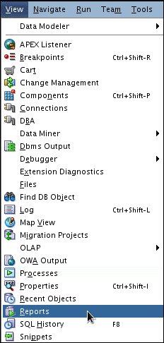
The Reports tab is displayed.
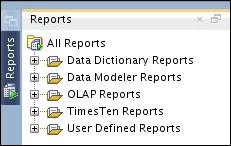
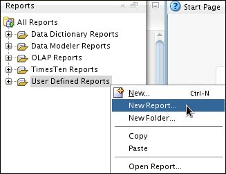
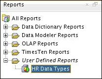
In the Reports tab, right-click User Defined Reports, and select New Report.
The Create Report dialog box displays Master Report properties.

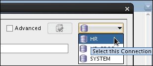
Connect to the HR schema.
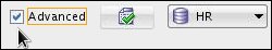
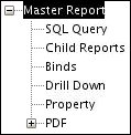
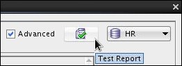
Select the Advanced check box.
The Master Report tree is displayed.
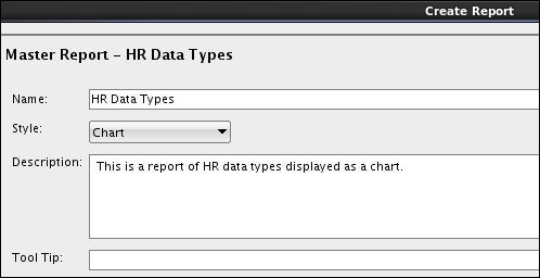
For the report name, enter HR Data Types.
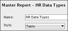
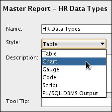
For the report style, select Chart.
Optional: Enter the following description: This
is a report of HR data types displayed as a chart.
Optional: Add a tool tip. (In the Reports tab, when users hover the cursor over the reports name, the tool tip is displayed.)
Absent the tool tip, your entries should look similar to this:
Selecting Chart Features and Properties
In this section, you select features and properties of the chart and provide the SQL query that pulls chart data from the database.
In Master Report, click SQL Query.
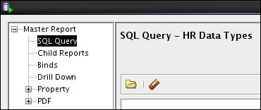
Enter the following SQL statements for generating the chart:
select table_name, data_type,
count(data_type)
from all_tab_columns
where owner = 'HR'
group by table_name, data_type;
Your query should look like this:


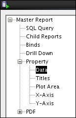
In the Master Report, expand Property, then select it.
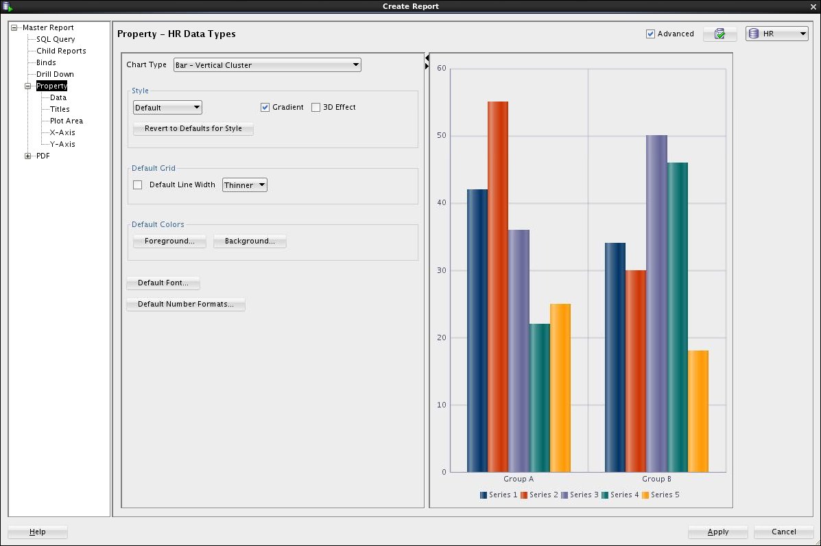
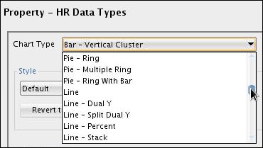
Select the Chart Type list.
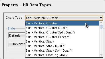
A few of the more than fifty SQL Developer built-in reports are displayed. To see more reports, use the scroll bar to browse the list.
For the chart type, select Bar - Horizontal Cluster.
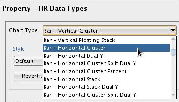
The chart type Bar - Horizontal Cluster is displayed.
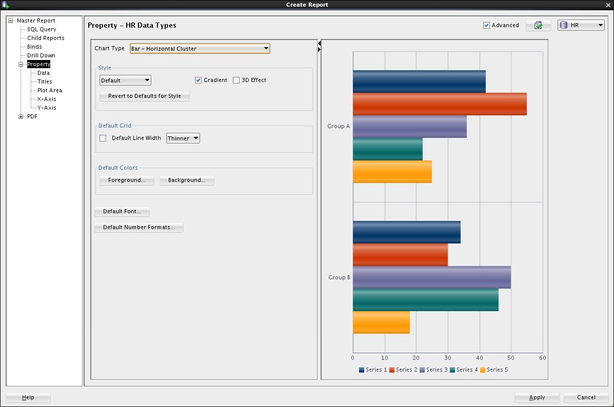
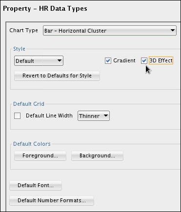
In the Style section, select the 3D Effect check box. (The selection is dynamically displayed in the Preview panel.)
Your selections should look like this:
Select the Data property.
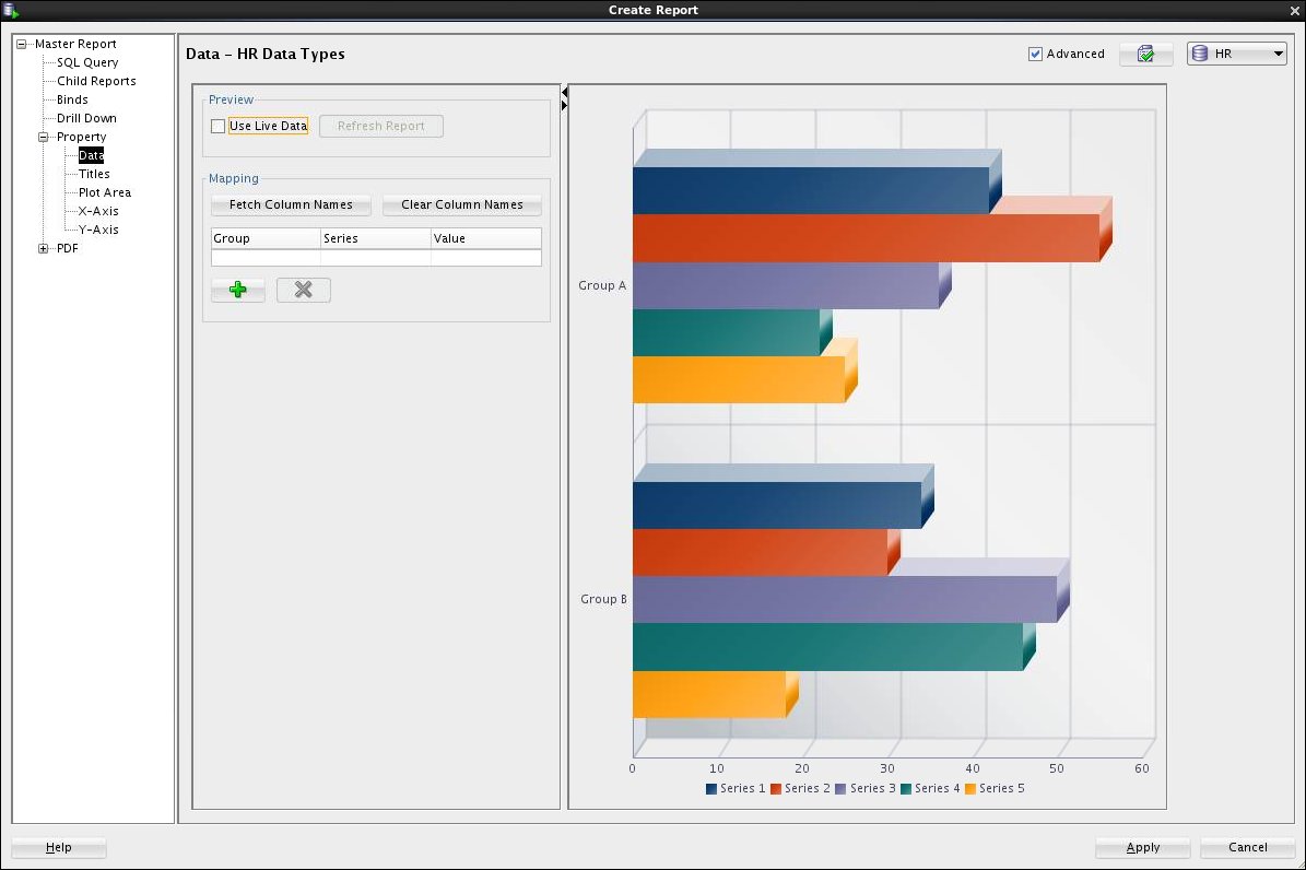
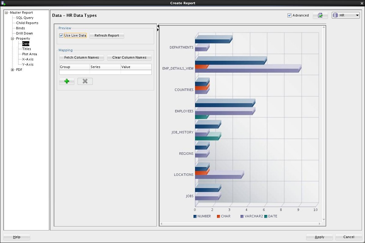
When a report is assigned a connection, in this case HR, you can preview the chart with live data. Select Use Live Data.
In the Reports navigator, select Titles.
The chart title properties are displayed.
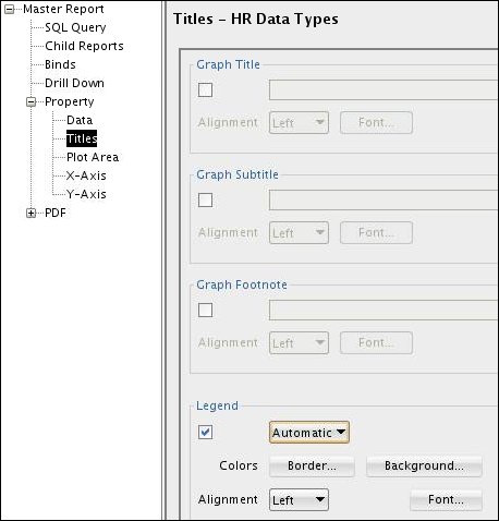
Select the Graph Title check box and enter the following
graph title: Data Types for Tables in HR Schema.
In the Graph Title Alignment list, select Center.
Select the Legend check box and, from the list, select Right.
Your chart titles properties and Preview panel should look like this:

In the Reports navigator, select Plot Area.
The chart plot area properties are displayed.
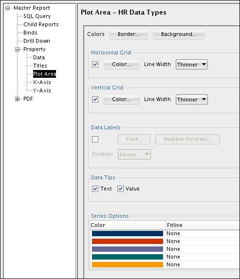
Select the following options:
Horizontal Grid (Color - Default, Line
Width - Thinnest)
Vertical Grid (Color - White, Line Width - Thinnest)
Series Options (Click Purple then Yellow, then
click OK.)
Data Tips (Select both Text and Value
check boxes)
Your screen should look similar to this:

In the Reports navigator, select X-Axis.
The X-Axis properties are displayed.
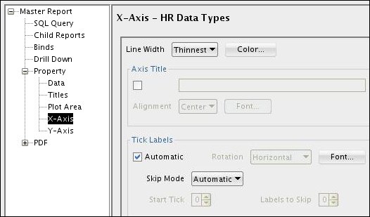
Select the Axis Title check box and, in the text box, enter
Table Name.

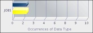
Your entry is reflected in the sample chart panel, along the vertical axis.
In the Reports navigator, select Y-Axis.
The Y-Axis properties are displayed.

Select the Axis Title check box and, in the text box, enter Occurrences
of Data Type.
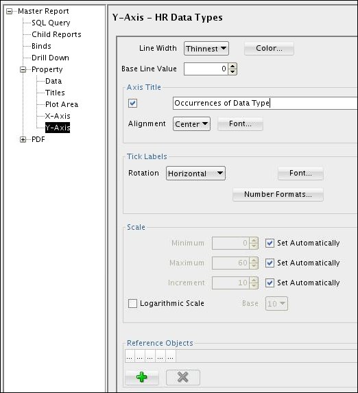
Your entry is reflected in Preview panel, along the horizontal axis.
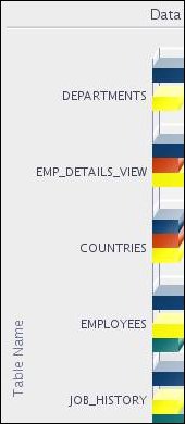
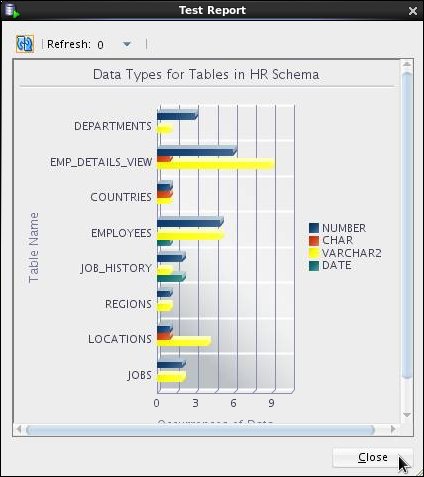
Click Test Report.
A preview of your final report is displayed. Review and then click Close.
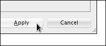
Click Apply to save the HR Data Types report.
The report is saved in the Reports tab.
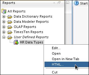
Generating an HTML Report
Any report can be generated into HTML.
In the Reports tab, right-click HR Data Types and select HTML.
In the Connection list, select HR.
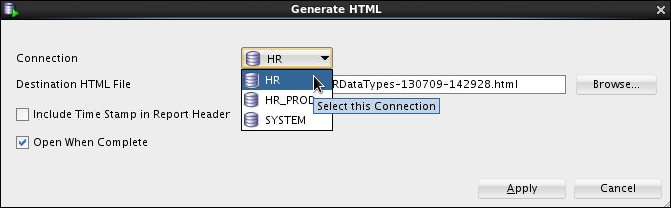
Click Apply.
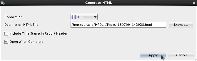
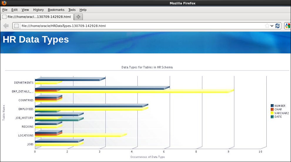
The HR Data Types report is displayed in HTML.
Congratulations! You have completed the tutorial.
Summary
- Create a user defined chart report
- Select chart features and properties
- Generate an HTML version of the report
- To learn more about Oracle database technologies, visit www.oracle.com.
- For more information about Oracle Database 12c concepts, visit Oracle® Database Concepts 12c Release 1 (12.1).
- To look for more OBEs related to Oracle Database 12c, visit the Oracle Learning Library.
- Lead Curriculum Developer: Pete DeHaan
- Other Contributors: Ashley Chen, Nancy Greenberg
This brief tutorial showed you how to create your own user defined chart report using SQL Developer 4.0.
You learned how to:
Resources
Additional information about Oracle and Oracle technologies is available at the following sites:
Credits
To navigate this Oracle by Example tutorial, note the following:
- Hide Header Buttons:
- Click the title to hide the buttons in the header. To show the buttons again, click the title again.
- Topic List:
- Click a topic to navigate to that section.
- Expand All Topics:
- Click the button to show or hide the details for the sections. By default, all topics are collapsed.
- Hide All Images:
- Click the button to show or hide the screenshots. By default, all images are displayed.
- Print:
- Click the button to print the content. The content that is currently displayed or hidden is printed.
To navigate to a particular section in this tutorial, select the topic from the list.