Creating Analyses and Building Dashboards
Purpose
In this tutorial, you will learn how to build, format, and customize Oracle Business Intelligence (BI) analyses and how to create and update dashboards by utilizing these analyses. This tutorial is based on Taleo Enterprise Edition 13B, OBI 11.1.1.7 release.
Time to Complete
Approximately 2 hours
Overview
Oracle BI is a comprehensive collection of enterprise business intelligence functionality that provides the full range of business intelligence capabilities, including dashboards, full ad hoc, proactive intelligence and alerts, and so on.
In this tutorial, you will learn how to create analyses, add graphs, work with pivot tables, format the analyses and graphs, create column and view selectors, work with views, create a dashboard, and add user interactivity and dynamic content to enhance the user experience. You create analyses and work with views including graphs, pivot tables, and narratives.
Requirements
Taleo Enterprise Edition 13B or later is required to complete this training.
- Oracle Buisness Intelligence Reporting must be enabled on your zone.
Prerequisites
Before starting this tutorial, you should have the proper user type permissions. The BI Author user type is recommended. Access to the Recruiting subject area is also required. Limited authors may be restricted in tasks they can complete.
Note From the Author
Throughout this tutorial Region - Name is used frequently. Region - Name corresponds to Requisition Primary Location Level 3, in this zone. Due to the dynamic nature of OLF, your company may not have a Region location. Please feel free to use any location in your location heirarchy except Primary Location Level 5, as it will interfere with your ability to drill in the exercises. If you need to use an alternate location, please use the same location consistently throught the exercses in place of Region - Name.
The field values available, and the rows returned will vary as you are reporting on the information from your zone.
Beginning the Analytic Process
In this topic, you will learn how to access Oracle Taleo BI to create an analysis.
Logging In
This topic will cover the general navigation to start with the analytic process.
To log into Oracle Taleo BI and begin creating an analysis, perform the following steps:
. |
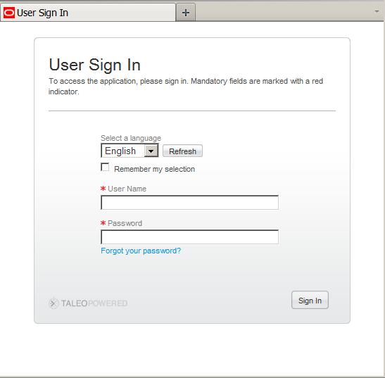
Navigate to the Oracle Business Intelligence Sign In page and sign in. Navigate to the Oracle Taleo Enterprise Edition Sign In page and sign in. The Oracle Taleo Enterprise Edition Sign In page is displayed. Enter your User ID and Password and click Sign In.
When you sign in, the Welcome Center is displayed. |
|---|---|
. |
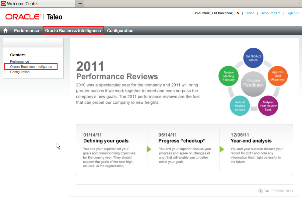
The Welcome Center is the landing page where you can choose which Oracle Taleo Enterprise Edition Cloud Service module you would like to access. You can access Oracle Business Intelligence by choosing the link in the top navigation, or through Centers in the left channel.
When you access Oracle Business Intelligence, the Home Page is displayed. |
. |
The Home page is a task-oriented, centralized workspace combined with a global header, allowing access to Oracle Taleo BI objects, their respective editors, help documentation, and so on. The Home page contains a global header, a Create New section, a Catalog Management section, a Get Started section with links to additional help and BI tools, a Recent section displaying the recently viewed or created analyses or dashboards, and a Most Popular section. You can always operate these features from the global header as well.
|

Favorites Menu
The favorites menu allows you to bookmark your favorite Catalog objects, such
as analyses, dashboards, and reports.
You can view your favorites list and open your favorite objects from
the global header's Favorites menu. This topic covers how to manage favorite objects.
. |
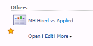
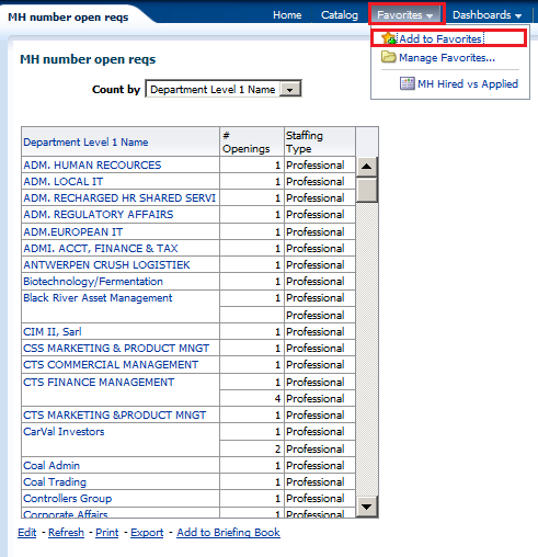
You can add catalog objects to favorites using the following steps: Select an object (analysis or the dashboard) from the catalog. In this example we selected the analysis MH Hired vs Applied. Click the More drop-down list and select the task Add to Favorites.
The selected analysis or object is displayed with a gold star symbol on the Home page.
|
|---|---|
. |
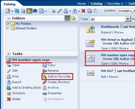
You can also add the catalog object to favorites by using the tasks pane as shown below. a. Select the object: a report, analysis, or a dashboard. b. Click the Add to Favorites task from the task pane.
The analysis is displayed as a favorite object on the Home page. |
. |
You can also add the object from the viewer window. Open the object (in this example it is an analysis). Click the Favorites menu, and then select Add to Favorites.
The analysis is displayed as a favorites on the Home page. Observe a star next to the newly added analysis. You can organize these favorites and also delete the objects from the favorites section based on your business requirements. |

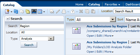
Searching the Catalog (Basic Search)
This topic covers the basic search of catalog objects from the global header. Depending upon how your system is configured,
you will use the basic search or the fully integrated full-text search to quickly find an object within the catalog.
The basic Catalog search, which is the standard search delivered with Oracle Taleo
BI, gives you the proper privilege
to search for objects from the global header and the Home or Catalog pages.On
the Catalog page, you can use the basic Catalog
search to locate an object by searching for its exact name, description, location, and type,
only.
You find only those objects for which you have the appropriate permissions. When the
desired object is located, you can select the
object to display it for viewing or editing, as your
permissions allow.
To conduct a basic search for the catalog objects, perform the following steps:
. |
a. In the global header's Search field, click the drop-down list, and select the object type for which you want to search.
b. Place your cursor in the field next to the Search field and enter part or all of the object's name or description. c. Click the arrow icon to begin the search. |
|---|---|
. |
The Catalog page is displayed with the results that match your search criteria.
|

Exporting and Printing Data
Various options are available for exporting the results of analyses, for example, exporting to Microsoft Excel or exporting to PowerPoint. These options are available on the Export link that is displayed with an analysis (in a dashboard, if the content designer includes the link there). Dashboards or dashboard pages can also be exported to excel.
Analyses and Dashboard pages can be printed in PDF and HTML formats.
This topic demonstrates how to export and print data from the BI system in various formats.
|
. |
The available data types when exporting analyses are:
|
||||||||||||||
|---|---|---|---|---|---|---|---|---|---|---|---|---|---|---|---|
. |
From an analysis, opened either directly from the catalog, or in a dashboard, click Export, and choose the format you want the analysis saved as. |
||||||||||||||
. |
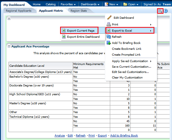
From the dashboard you can export a dashboard page or the entire dashboard to Excel. Click More Options > Export to Excel and export the current page or the whole dashboard.
|
||||||||||||||
. |
Individual dashboard pages and analyses can be saved as Printable HTML or Printable PDFs. After making a selection a print preview will open up that you can print or save in the specified format. To view a dashboard print preview, click More Options > Print and view a Printable PDF or Printable HTML. To view an analysis print preview, click Print and view a Printable PDF or Printable HTML.
|

Creating Analyses
Creating an Analysis and Using the Analysis Editor
This topic covers creating a new analysis by using the Analysis Editor.
To build an analysis, do the following:
. |
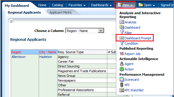
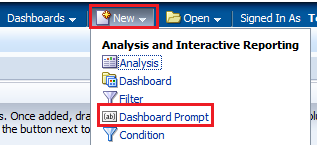
From the Home page, click New > Analysis.
|
||||||||||||||
|---|---|---|---|---|---|---|---|---|---|---|---|---|---|---|---|
. |
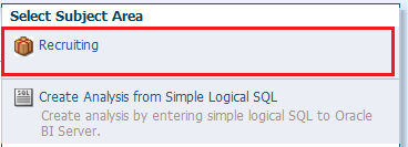
The Select Subject Area pop-up appears.
In the Select Subject Area pop-up, select Recruiting. The Analysis Editor is displayed. |
||||||||||||||
|
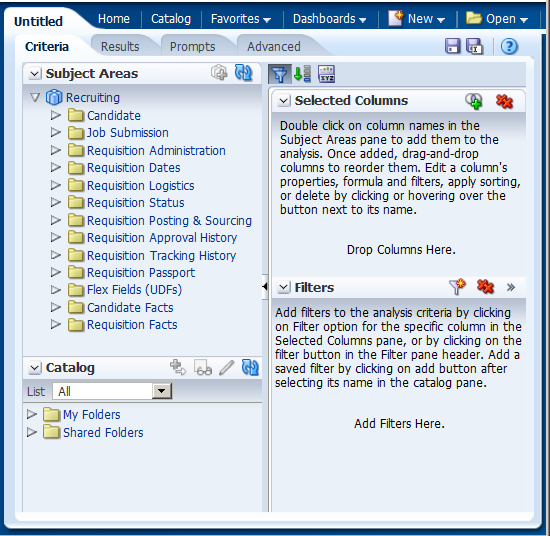
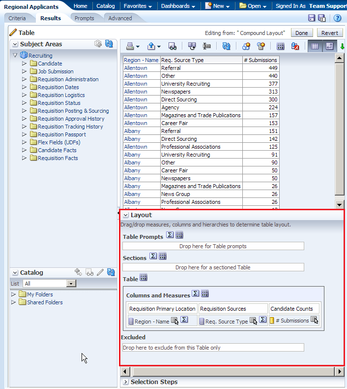
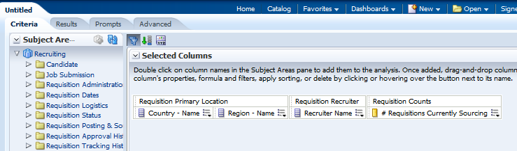
Observe the Analysis Editor, which is used to explore and interact with information by visually presenting data in tables, graphs, pivot tables, and so on.
The Analysis Editor is composed of tabs and panes, as shown in the screenshot, representing the subject area (columns), available catalog objects, selected columns for the analysis, and filters (which limit the selected data). A subject area contains folders, measure columns, attribute columns, hierarchical columns, and hierarchy levels that represent information about the areas of an organization's business or about groups of users with an organization. Subject areas usually have names that correspond to the types of information that they contain, such as Period, Regions, Products, Orders, and so on. In this example:
|
|||||||||||||||
|
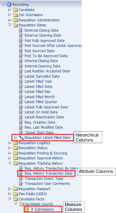
There are various column types in a subject area. They are:
The screenshot shows folders and columns in the Recruiting subject area.
|
||||||||||||||
. |
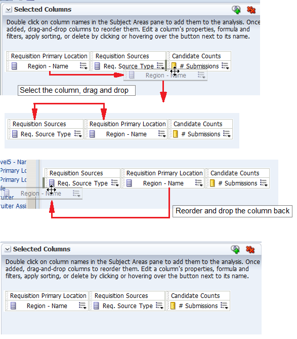
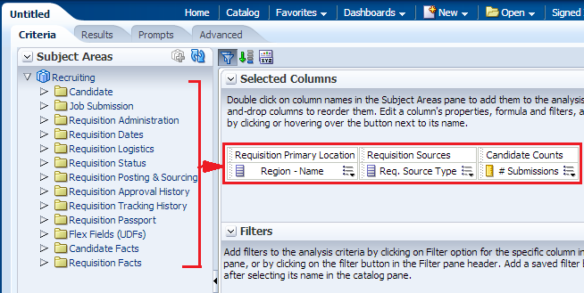
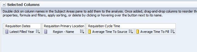
a. Select the following columns for your analysis.
b. While selecting the columns, click the collapsed arrow
c. The selected columns are displayed in the Selected Columns section. Your analysis criteria should look like this:
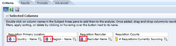
Note: In the Selected Columns section, you can reorder the columns in your analysis by clicking and dragging them. The image shows the step-by-step view of reordering the columns.
|
||||||||||||||
. |
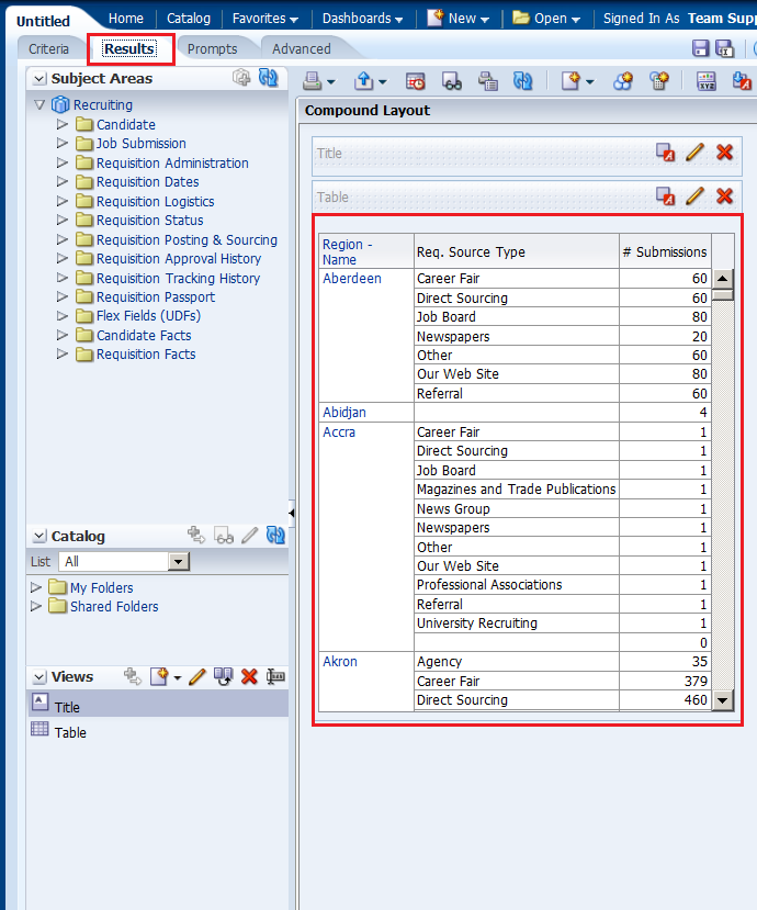
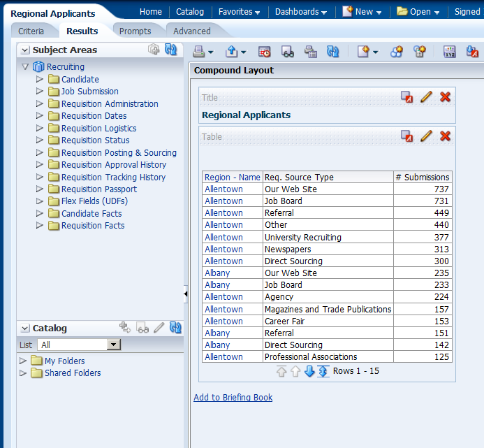
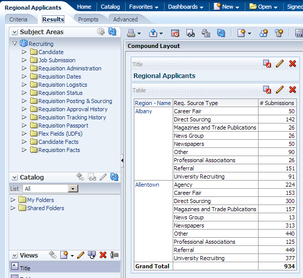
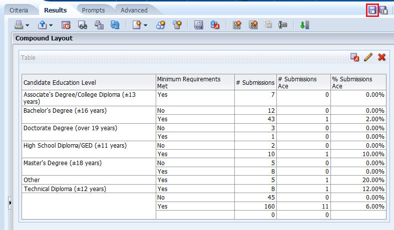
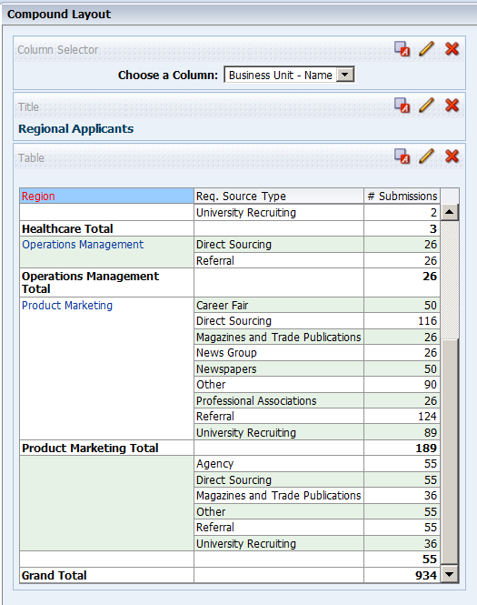
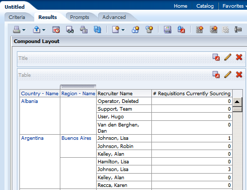
Click the Results tab. The default Compound Layout is displayed.
The Compound Layout is a composition of many views. By default, both a Title view and a Table view are defined for you when using attribute and measure columns. A Pivot Table view is automatically created when using hierarchical columns in your analysis. The Title view allows you to add a title (the default), a subtitle, a logo, a link to a custom online help page, and timestamps to the results. The Table view displays results in a standard table. You can navigate and drill down in the data. You can add totals, customize headings, and change the formula or aggregation rule for a column. You can also swap columns, control the appearance of a column and its contents, and specify formatting to apply only if the contents of the column meet certain conditions. Note: In the Compound Layout, you can create different views of the analysis results such as graphs, tickers, and pivot tables. These are covered in the upcoming topics. |

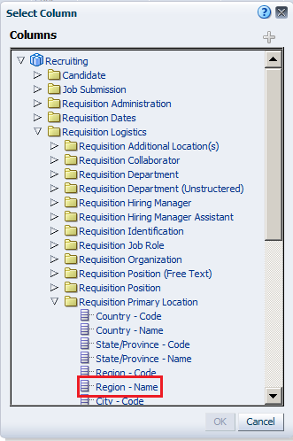
 to expand the folders and double-click the required column names to
get them in the Selected Columns section. In this example, expand
Requisition Logistics>Requisition Primary Location,
and then double-click Region - Name to get it in the Selected
Columns section.
to expand the folders and double-click the required column names to
get them in the Selected Columns section. In this example, expand
Requisition Logistics>Requisition Primary Location,
and then double-click Region - Name to get it in the Selected
Columns section. 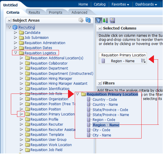
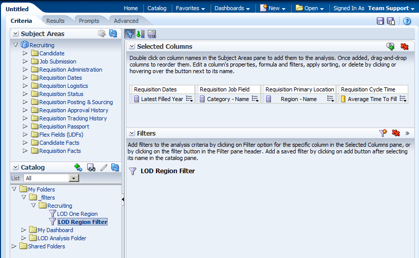
Filtering, Sorting, and Saving Your Analysis
This topic demonstrates how to filter, sort, and save the analysis you have created above.
You will add a filter to the analysis and then save the filter. Filters allow
you to limit the amount of data displayed in the analysis and are applied
before the analysis is aggregated. Filters affect the analysis and thus the
resulting values for measures. Filters can be applied directly to attribute
columns and measure columns.
A filter
created and stored at the analysis level is called an inline filter because the filter is embedded in the analysis and is not
stored as an object in the Presentation
Catalog (Catalog). Therefore, an inline filter cannot be reused by other analyses or dashboards.
If you save the filter however, it can be reused and is known as a named filter. (Named filters can also be created from the global header.)
Perform the following steps to filter, sort and save the previously created analysis.
|
. |
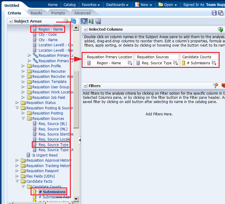
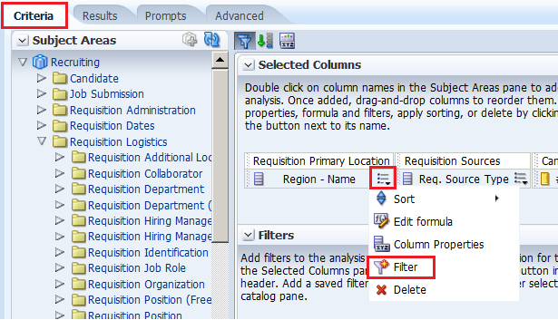
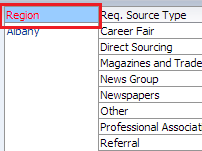
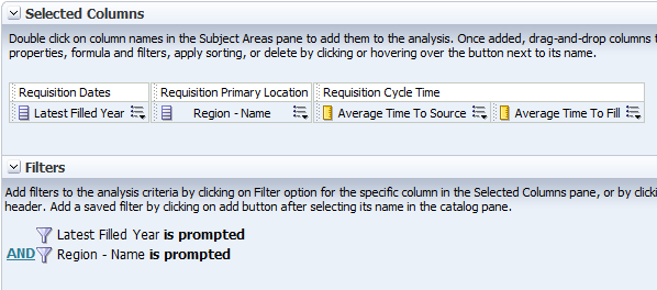
a. Click the Criteria tabbed page. Select the column Requisition Primary Location > Region - Name to create a filter. You can create a filter by hovering over the specific column's toolbar and selecting the More drop-down menu.
b. In the More drop-down menu, select Filter. |
|---|---|
|
. |
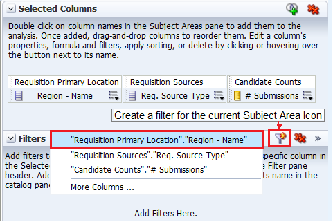
You can also create a filter by clicking the "Create a filter for the current Subject Area" icon in the Filters pane and then selecting the column from the drop-down list, as shown in the screenshot. The column selected for this example is Region - Name.
Since you have already selected a filter in the previous step you are not using this option. |
|
. |
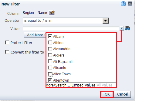
The New Filter dialog box is displayed. Accept the default value for the operator (is equal to / is in), and enter a column value (or a range of column values) for this condition. To do this, click the drop-down list for Value, and select the desired checkboxes. Values may vary due to configuration settings. Choose any values you wish. I am choosing Albany and Allentown.
Click OK. |
|
. |
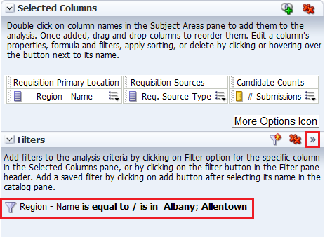
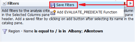
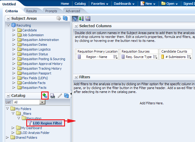
The Filters pane displays the newly created filter.
Save this filter. Click the More Options icon in the filters pane and select Save Filters from the drop-down list.
|
|
. |
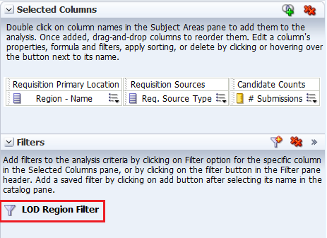
The Save As dialog box appears. A filter should be saved to a subject area folder so that it is available when you create an analysis using the same subject area. Navigate to the _Filters folder under the My Folders. Select the Recruiting Folder. Name the filter LOD Region Filter and accept the default location. If a Confirm Save Location dialog box appears, accept the default. Oracle Taleo BI allows you to save any type of business intelligence object to any location within the Catalog. However, for some object types such as filters, Oracle Taleo BI suggests the best Catalog location. The Save As dialog box should look like this:
Click OK. |
|
The Filters pane should look like this:
|
|
|
. |
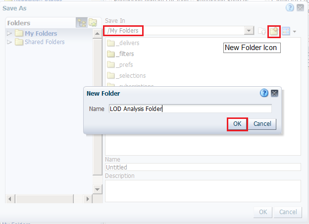
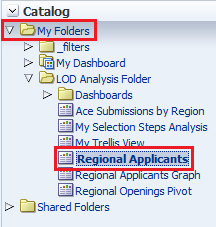
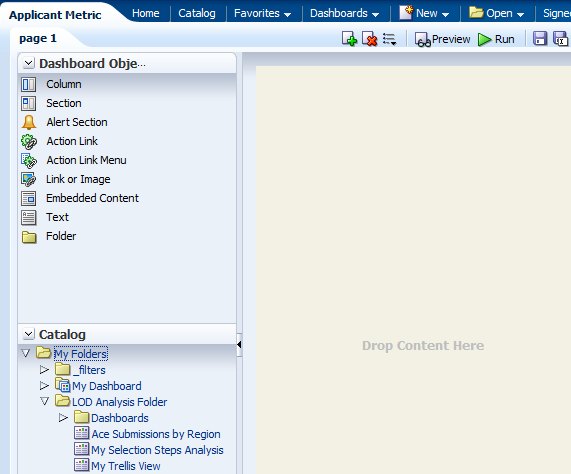
Next, you save the analysis so that you can verify the creation of your named filter within the Catalog. a. Click the Save icon to save your analysis. b. Navigate to My Folders and click the New Folder icon . The New Folder dialog box appears.
c. Name the folder LOD Analysis Folder and click OK. Save the analysis as Regional Applicants in the catalog folder LOD Analysis Folder. |
|
. |
Verify the named filter. Click the Catalog link on the global header and navigate to the folder where you saved your filter. The LOD Region Filter is displayed in the Catalog.
|
|
. |
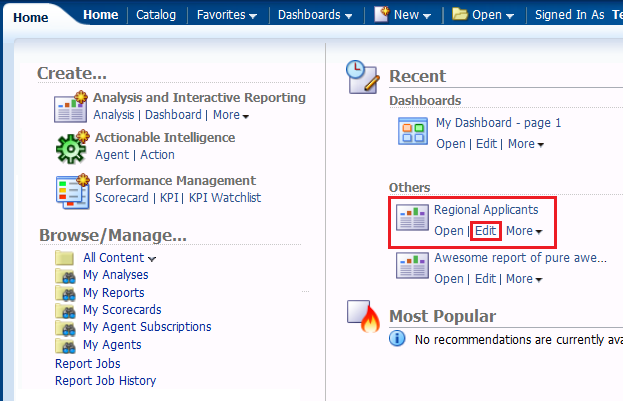
Go to Home page, and in the Recent area, click the Edit link for the Regional Applicants analysis.
|
|
. |
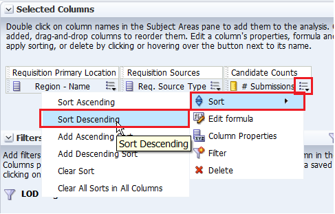
Now you will add a sort to this analysis. a. On the Criteria tabbed page, click the More Options icon for # Submissions. b. Select Sort > Sort Descending.
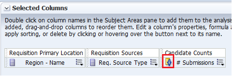
Observe that a sort icon is added to # Submissions. The order of the sort is indicated by an arrow; in this case, the arrows points down, indicating that it is descending. Additionally, if multiple sorts are added, a subscript number will also appear, indicating the sequence for the sort order.
c. Save your analysis again. |
|
. |
Click the Results tabbed page to verify the filter and sort are being applied to your analysis. The Compound Layout displays the filtered and sorted analysis.
This concludes the topic of saving an analysis and sorting it. |


Creating Selection Steps for Your Analysis
This topic covers how to add selection steps for the product in the analysis. Both filters and selection steps allow you to limit the data displayed in your analysis.
Unlike filters that are applied before the analysis is aggregated, selection steps are applied after the analysis is aggregated.
Selection steps only affect the members displayed, not the resulting aggregate values.
For example, the outline total for the top level of a hierarchy is not affected if some members of the hierarchy are excluded from the selection.
Selection steps are per column and cannot cross columns. While measure columns
appear in the Selection Steps pane, you cannot create selection steps for
them.
Note that however, the grand totals and column totals are affected by selections. You can create selection steps for both attribute columns and hierarchical columns.
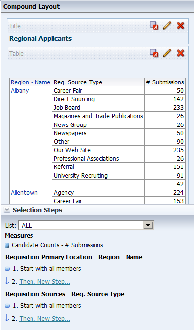
To add selection steps for Req. Source Type, do the following:
. |
Click the plus icon
The Selection Steps pane opens.
|
|---|---|
. |
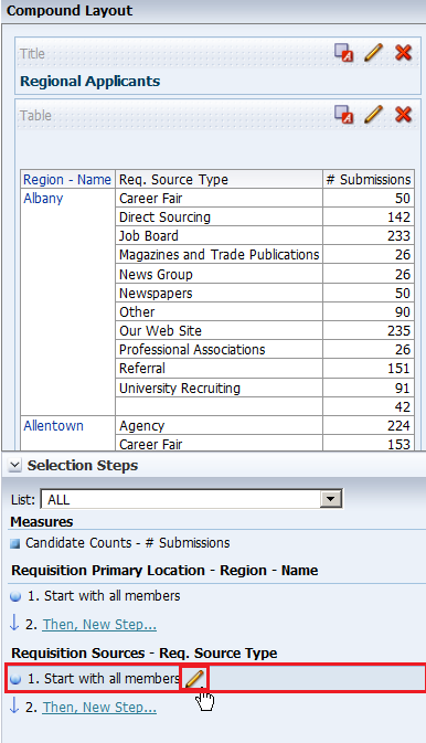
Under Requisition Sources - Req. Source Type, hover over 1. Start with all members, and click the pencil icon.
|
|
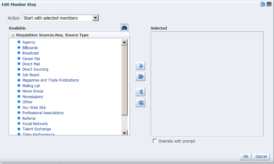
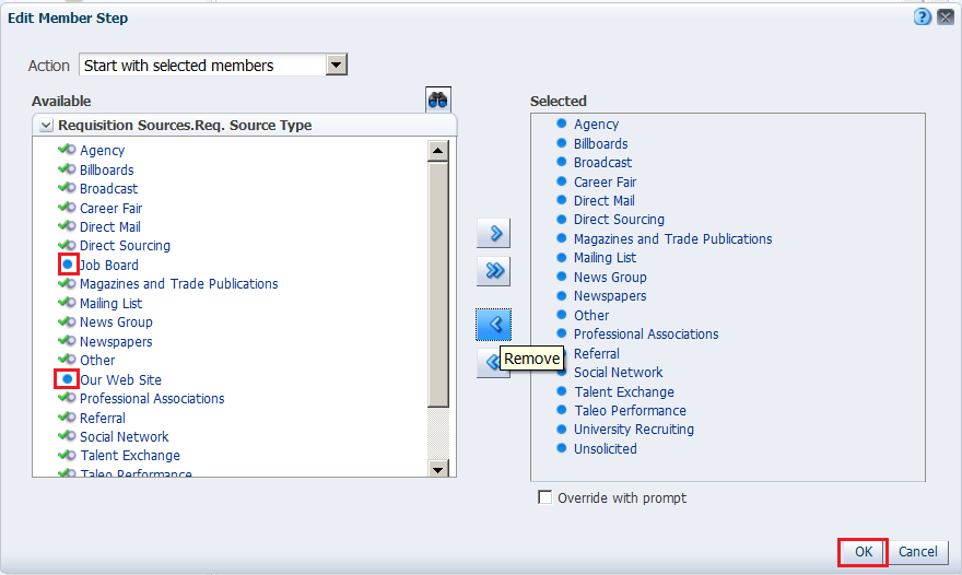
The Edit Member Step dialog box appears with the list of available products.
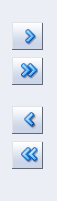
You will use the shuttle icons to move column members between the Available and Selected columns.
|
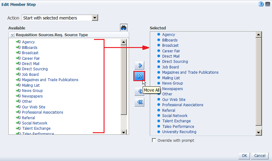
. |
Click the Move All shuttle icon to move all members from the Available pane to the Selected pane.
|
. |
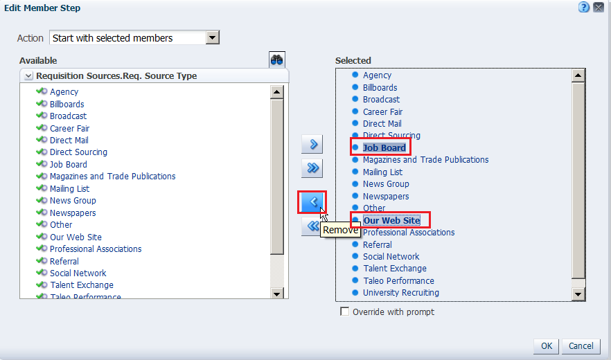
In the Selected column, select Job Board and Our Website and click the Remove icon to return these two members to the Available column. (If these options are not available, choose any selections you want.)
You can use Ctrl+C and click to select multiple members in the list. Click OK. Note that the two members that you removed(Install and Maintenance), are not selected anymore.
|
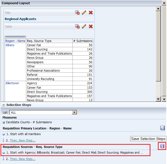
. |
a. The Selection Steps pane appears with the new values added. Observe that you can also save the Selection Steps as an object in the Catalog by clicking the Save icon.
b. Click the collapse arrow icon to minimize the Selection Steps pane . |
. |
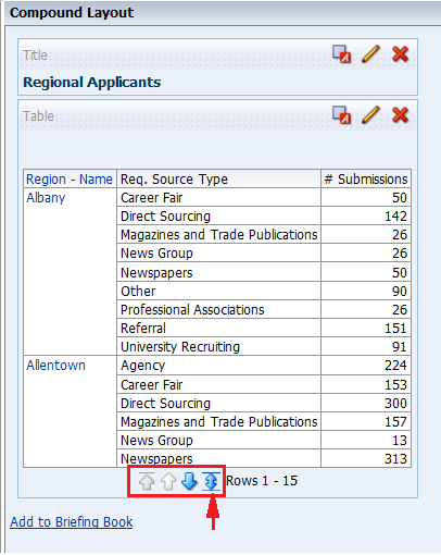
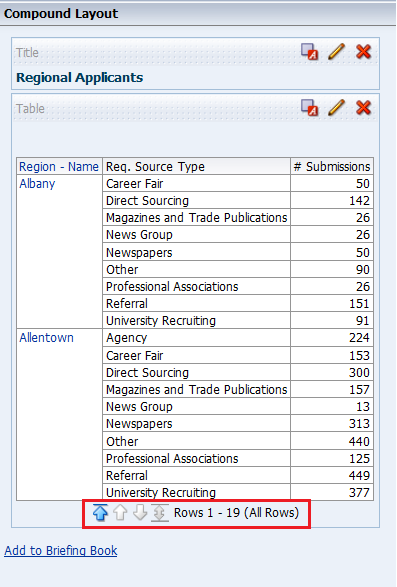
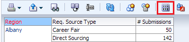
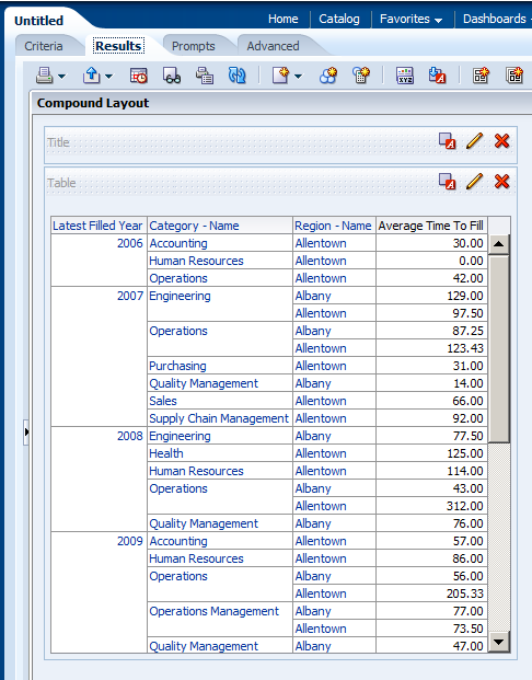
Verify your results by reviewing your analysis in the Table view of the Results tab. Due to configuration settings you may have a scroll bar instead of pagination.
If you have pagination, click the double-headed arrow icon within the Table view to display all rows of the analysis. The analysis appears with all 19 rows. The number of results you see may be different. . |
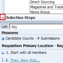
 to expand the Selection Steps pane of the Compound Layout.
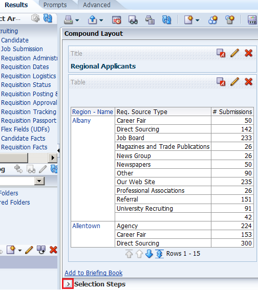
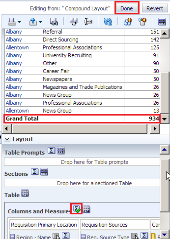
Formatting and Adding Totals to Your Analysis
To add formatting and totals to your analysis, do the following:
. |
To add totals to your analysis, click the Edit View icon in the Table view.
The Table Editor appears.
|
|---|---|
. |
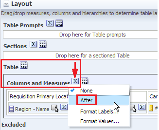
a. To add a grand total to the analysis, click the Totals icon to the right of Columns and Measures in the Layout pane of the Table editor.
b. Select After from the drop-down list. Review the results in the Preview pane, and note that the Totals icon now displays a green checkmark, indicating that a grand total has been added to the analysis.
c. Click Done. |
. |
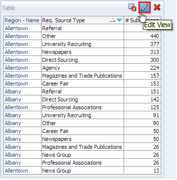
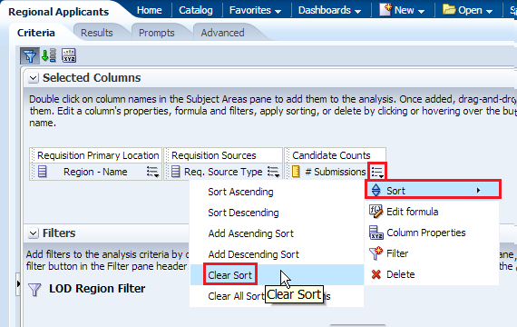
Before adding a total to the Region, remove the sort from # Submissions. a. Click the Criteria tabbed page. b. Click the More Options icon for # Submissions and select Sort > Clear Sort.
c. Click the Results tabbed page and review the Table view to confirm that the sort has been removed from the analysis.
|
. |
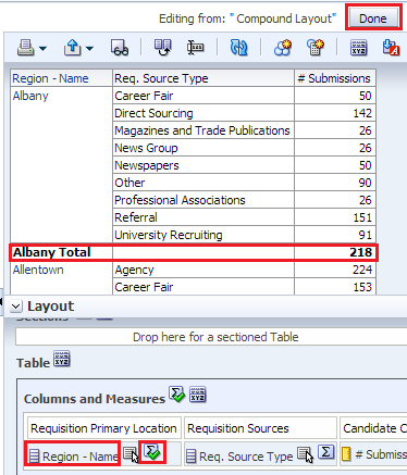
Now you will add a total by region to your analysis. a. Click the Edit View icon b. In the Layout pane, click the Totals icon for Region - Name.
c. Select After from the drop-down list. Review the results in the Preview pane, and note that the Totals icon now displays a green checkmark, indicating that a total has been added for that specific column/region.
|
. |
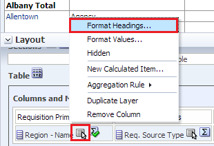
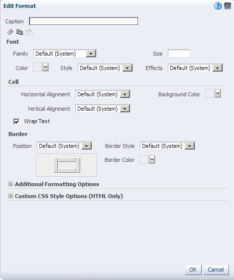
After you create and run an analysis, default formatting rules are applied to the analysis' results. Default formatting rules are based on cascading style sheets and XML message files. You can create additional formatting to apply to specific results. Additional formats help you to highlight blocks of related information and call attention to specific data elements. You can also use additional formatting to customize the general appearance of analyses and dashboards. Now you will apply formatting to the Region - Name column. You apply formatting to a heading. Click the More
options icon
The Edit Format dialog box appears.
|
. |
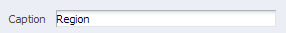
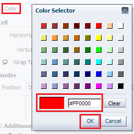
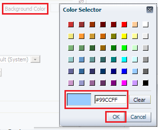
a. In the Caption text box, enter Region.
b. In the Font area, click the drop-down list for Color and select a red color from the Color Selector dialog box. Click OK.
c. In the Cell area, click the drop-down list for Background Color and select a light blue color from the Color Selector dialog box. Click OK.
d. Click OK in the Edit Format dialog box to see the results of your format changes for the Region - Name. The Preview pane should look like this:
|
. |
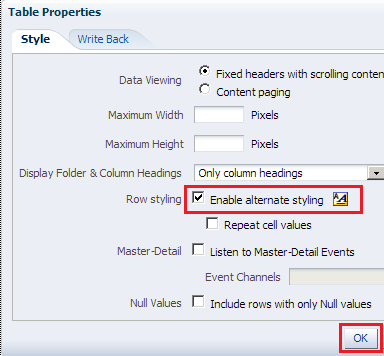
a. Click the Table View properties icon on the toolbar.
The Table Properties dialog box appears.
b. Select the Enable alternate styling check box, and click OK.
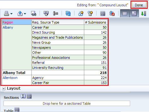
c. The Preview pane should look like this. Click Done and then save your analysis.
This concludes the topic of formatting and adding totals to your analysis. |
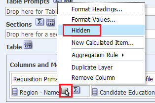
 for the Region - Name and select Format Headings.

Adding a Graph to an Analysis
In this topic, you learn how to add a graph to an analysis, and how to apply a saved filter and format the graph.
Enhancing an Analysis by Adding a Graph
In this subtopic, you begin by creating a new analysis to which you add a graph and apply a named filter created in the first topic. Perform the following steps:
. |
Create a new analysis by using the same columns that you used to create Regional Revenue. Select New > Analysis on the global header. Use Recruiting Subject Area.
|
|---|---|
. |
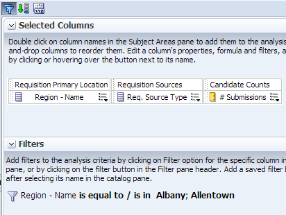
Add Region - Name from Requisition Logistics > Requisition Primary Location, Req. Source Type from Requisition Posting & Sourcing > Requisition Sources, and # Submissions from Candidate Facts > Candidate Counts to Selected Columns.
|
. |
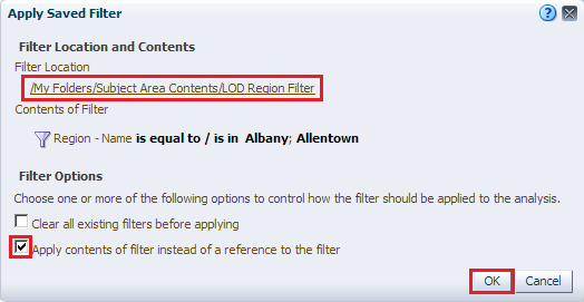
Next, you will add a named filter that you previously created to limit the analysis.. a. In the Catalog pane, navigate to locate your filter LOD Region Filter.
b. Select the filter and click the Add More Options icon. |
. |
a. In the Apply Saved Filter dialog box, select the Apply contents of filter instead of a reference to the filter check box. This option adds the filter as an inline filter, allowing you to make changes without changing the Catalog filter item. Note that if you do not select this check box, the filter is added as a named filter that you can view, but not edit.
b. Click OK. The filter is added to your analysis.
|
. |
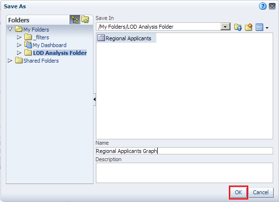
Save the analysis to your LOD Analysis Folder, entering Regional Applicants Graph as the analysis name.
|
. |
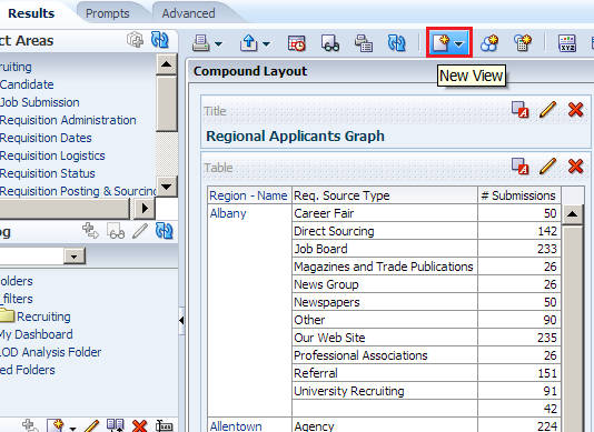
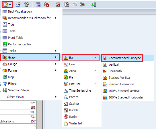
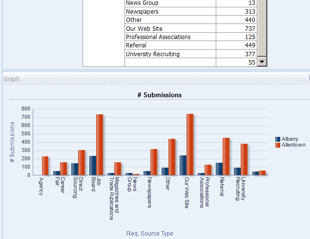
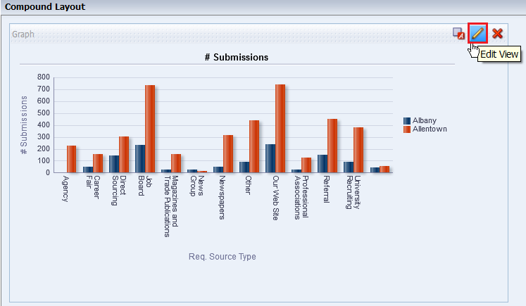
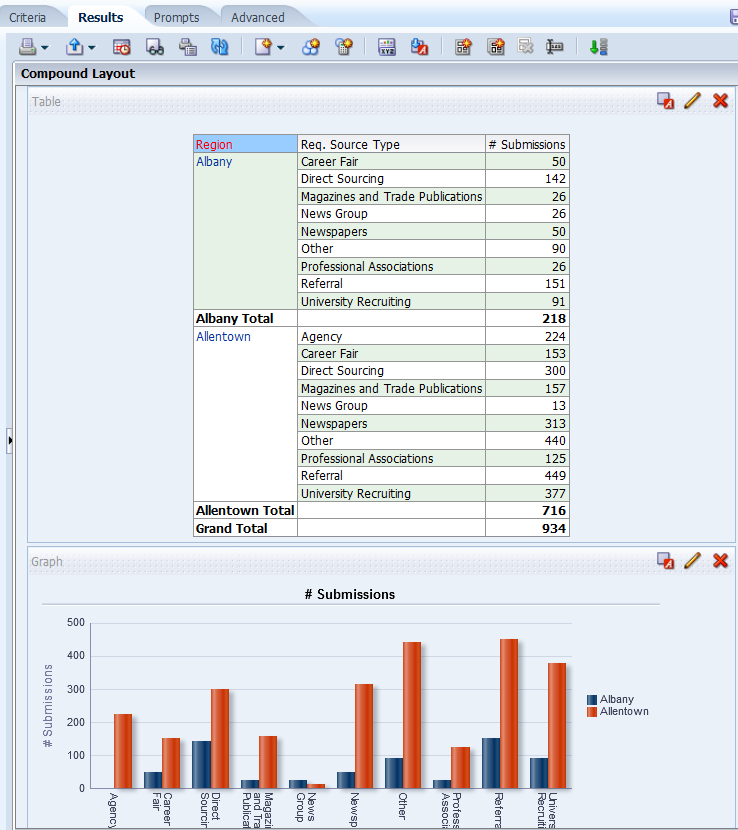
You will add a graph to this analysis. a. Click the Results tabbed page, and click the New View icon.
b. Select Graph > Bar > Recommended Subtype from the menus.
The Graph view appears below the Table view.
|
. |
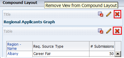
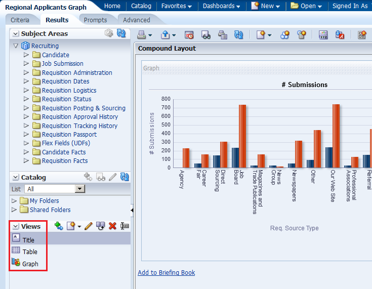
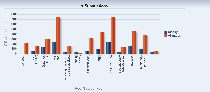
Click the Remove View from Compound Layout icon for both Title and Table views.
Both views are removed from the Compound Layout. Note however, that they are still available for use from the Views pane.
|
. |
Save the analysis. |
Formatting the Graph
To enhance the appearance of a graph, perform the following steps:
|
. |
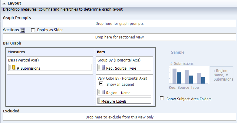
Click the Edit View icon to begin your formatting changes. The Graph editor appears.
|
||||||||
|---|---|---|---|---|---|---|---|---|---|
|
. |
The Graph, like other view editors, is composed of three sections:
|
||||||||
|
. |
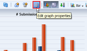
Click the Edit properties icon.
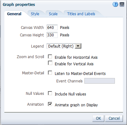
The Graph properties dialog box appears.
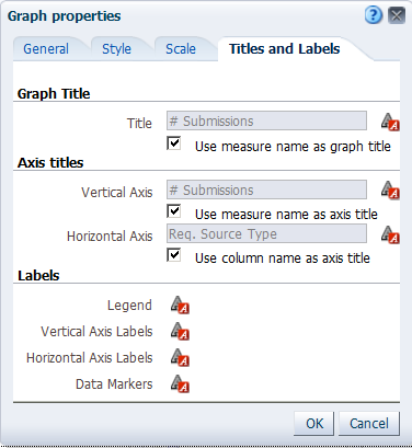
The Graph properties dialog box is composed of four tabbed pages: General, Style, Scale, and Titles and Labels. These tabbed pages allow you to do the following:
|
||||||||
|
. |
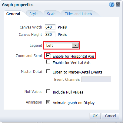
a. Select Enable for Horizontal Axis from the "Zoom and Scroll" check boxes. When zooming and scrolling is enabled for a graph, then the graph includes a Zoom icon. The Zoom icon allows you to zoom in and out of a graph's plot area via its axes. Once you zoom in on an axis, you can scroll the axis. When you zoom an axis, a zoom and scroll slider appears. b. Select left from the Legend location drop-down list. The dialog box should look like this:
Note: The "Animate graph on Display" checkbox specifies whether to show initial rendering effects and is selected by default. For example, the bars on a horizontal graph start at the x-axis and move up the scale on the x-axis to the current measurement level. "Listen to Master-Detail Events" allows you to specify this analysis as a detail view in a master-detail relationship. You will use this option in a subsequent step when working with pivot tables |
||||||||
|
. |
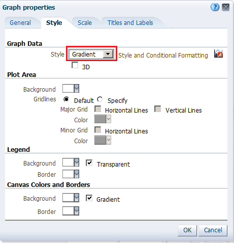
a. Click the Style tabbed page.
b. Click the Style drop-down list for Graph Data and select Gradient. The Graph Data area allows you to choose a style for specific types of graphs. For example, you might choose pattern fill for to highlight differences on a line-bar graph or gradient for a bar graph to make the data values standout. |
||||||||
|
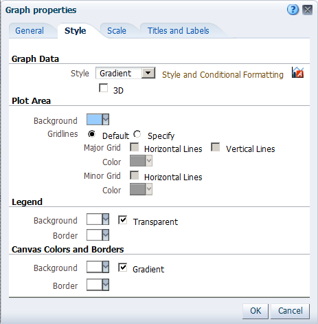
. |
Click the Background drop-down list in the Plot area, and select a light blue color from the Color Selector. Click OK.
The Graph properties dialog box should look like this:
|
||||||||
|
. |
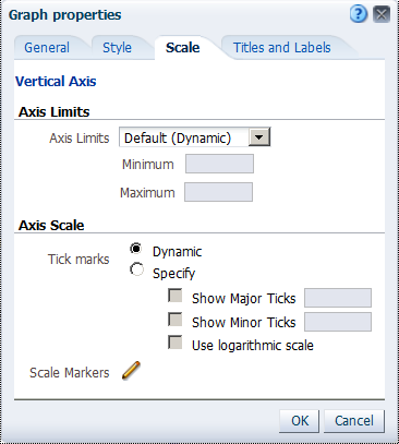
Click the Scale tabbed page. The Scale tabbed page appears.
Specifying setting for the axis limits and tick marks enables you to control what you see on your graph. If you override the system default for tick marks, the colors that you have selected for horizontal and vertical gridlines on the General properties tabbed page will be applied to both major and minor ticks. |
||||||||
|
. |
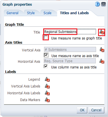
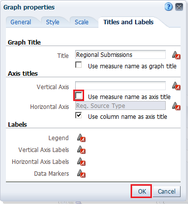
a. Click the Titles and Labels tabbed page.
b. Deselect the check box for Use measure name as graph title and enter Regional Submissions in the Title text box.
c. Click the Format
Title icon The "Font Format: Title" dialog box appears. You use this dialog box to specify how titles, legend labels, and so on are handled (such as truncated automatically) and to specify font properties. Click Cancel.
|
||||||||
|
. |
Deselect the check box for Vertical Axis Title and click OK to close the Graph Properties dialog box.
The preview pane refreshes and should look like this:
Examine the changes that you made to the graph. The formatting changes have been applied along with a new title and a horizontal zoom. |
||||||||
|
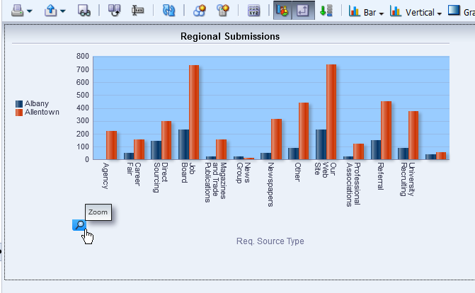
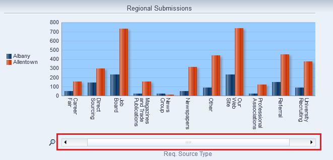
. |
Click the Zoom icon and select Zoom In.
Once you have zoomed in, a slider appears.
|
||||||||
|
. |
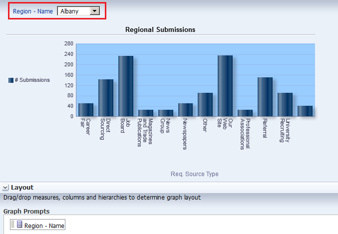
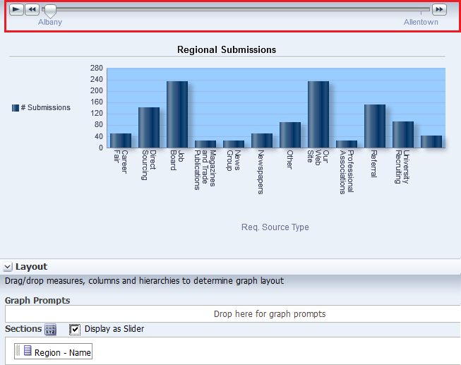
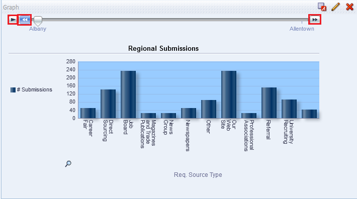
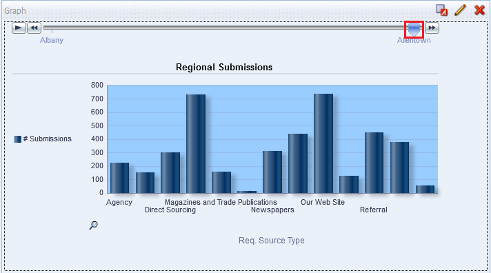
a. In the Layout pane, move Region - Name from the Group By drop target to the Graph Prompts drop target. The preview pane refreshes:
The prompt allows you to select each region individually, making the graph a bit easier to consume. b. Move Region - Name to the Sections area and select the Display as Slider check box. The Graph editor should look like this:
When you move along the slider for a particular region, the graph changes accordingly. c. Click Done and then save your analysis.
You can further experiment with the region slider using the play button, action arrows, or slider. The graph display changes accordingly.
|


 for Graph Title.
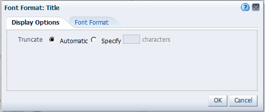

Working with Pivot Tables, and Master-Detail Linking
In this topic, you learn how to create an analysis with a Pivot Table view, format, add a calculated column to a pivot table, add a Gauze view, and create a master-detail linking. You also learn how to filter your results using Selection Steps in pivot tables.
Creating and Formatting a Pivot Table view and Adding Calculations
In this subtopic, you begin by creating a new analysis with a hierarchical
column and then applying a named filter. Also you format and add totals.
Pivot tables provide the ability to rotate rows, columns, and section headings to obtain different perspectives of the same data.
They are interactive in that they are drillable, expandable, and navigable.
To create an analysis with a pivot table, perform the following steps:
|
. |
Click New > Analysis on the global header.
Select Recruiting as the subject area. |
||||||||||
|---|---|---|---|---|---|---|---|---|---|---|---|
|
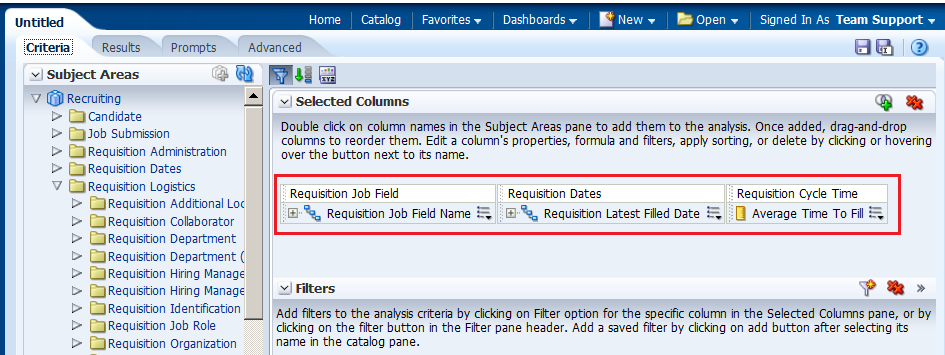
. |
In the Analysis Editor, add the following columns to the analysis criteria:
|
||||||||||
|
. |
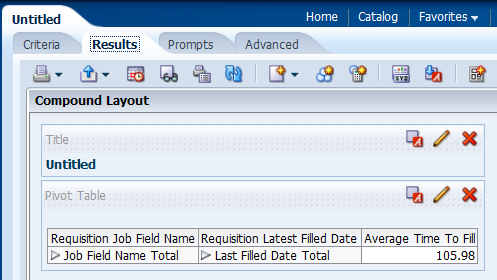
Click the Results tabbed page to view the analysis and inspect the pivot table. Observe that the Pivot Table view is included by default.
|
||||||||||
|
. |
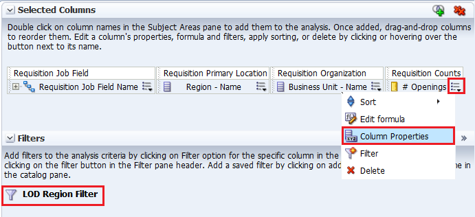
a. Return to the Criteria tabbed page. b. Apply the LOD Region Filter named filter as you did previously. c. Edit the column properties for # Openings. Click the More Options icon for # Openings and select Column Properties.
The Column Properties dialog box appears. |
||||||||||
|
. |
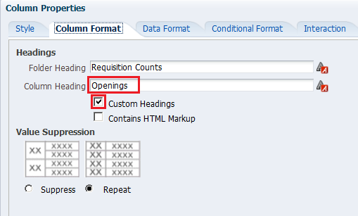
Select the Column Format tabbed page. Select the Custom Headings check box and enter Openings in the Column Heading text box.
|
||||||||||
|
. |
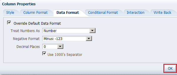
Select the Data Format tabbed page. Select the Override Default Data Format checkbox and select the values as indicated below in the image. Click OK.
|
||||||||||
|
. |
Click the Results tabbed page. Review the formatting changes that you made to the Opening column. (Note that you must have more than 1000 openings in a region to see the 1000's separator.)
|
||||||||||
|
. |
Delete the Title view and then click the Edit
View icon The Pivot Table editor appears.
|
||||||||||
|
. |
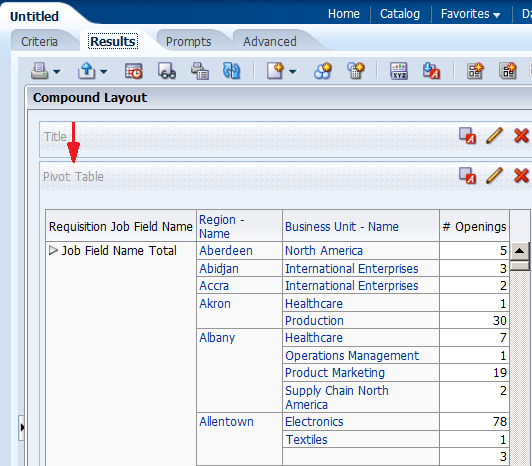
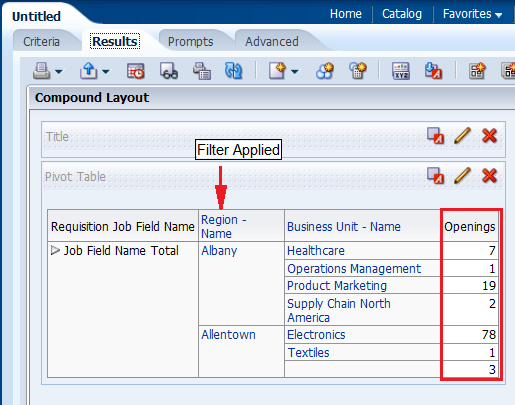
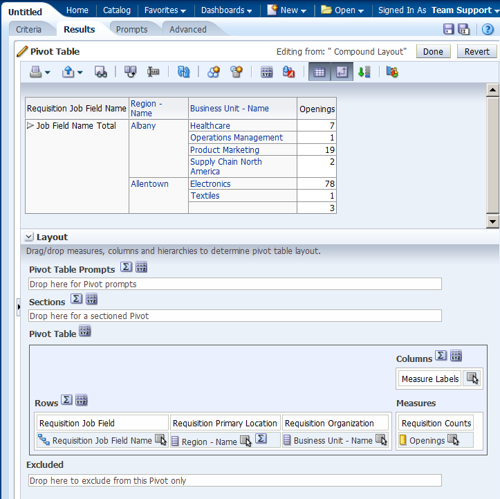
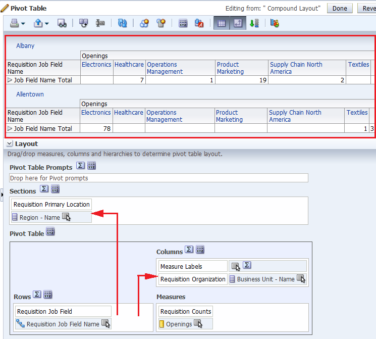
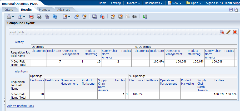
Format the pivot table as follows: a. Drag Business Unit - Name below Measure Labels. b. Drag Region - Name to the Sections area. The pivot table should look like this:
|
||||||||||
|
. |
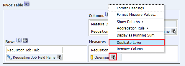
Add a calculation to the pivot table by duplicating the Openings
column. Click the More Options
icon
The duplicated Openings column appears.
|
||||||||||
|
. |
a. Select the More Options > Format Headings to edit the properties for the duplicate column.
b. In the Caption text entry box in the Edit Format dialog box, name the new column % Openings and click OK.
|
||||||||||
|
. |
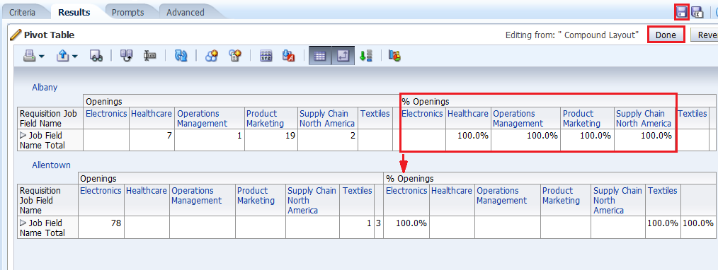
Change the calculation to reflect a percentage of the parent. Select the More Options > Show Data As > Percent of > Row Parent.
The Pivot Table editor looks like this:
Click Done and save the analysis as Regional Openings Pivot. The pivot table should look like this:
|
||||||||||
|
. |
a. Expand the Orders
Hierarchy by clicking the plus sign icon
Because hierarchical columns imply pivot tables, you can sort not only
on members and measures, but also on rows. Hierarchical members on the
row edge can include sort carat icons ( When you sort members in a hierarchical column, you always sort within the parent; that is, children are never sorted outside of their parent. The children appear below the parent in the proper sort order; the parent is not sorted within its children. b. The Job Field Name Total parent member represents an outline total for the orders. Row sort Job Field Name Totals, for your top section in Descending sequence and examine the results within the pivot table. (You can also access sort options by choosing Sort in your right click menu.) The product brands on the column edge are sorted, reflecting sorted Openings values in descending sequence for each Job Field Name Total.
|
||||||||||
|
. |
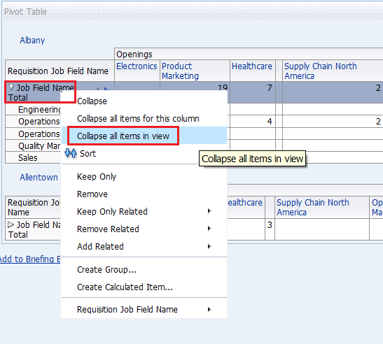
a. Place your cursor on top of the Requisition Job Field Name Hierarchy and right-click. Select Collapse all items in view from the menu. Notice that you can also sort, exclude columns, and move items around using this menu.
b. Place your cursor to the left of the Business Unit - Name column (Electronics in this example). A tab appears. When you hover over this tab, a swap icon appears. You use this swap icon to swap columns with rows or to reposition a column or row along a different axis.
c. Drag Business Unit - Name on top of Orders Hierarchy. The pivot table should look like this before you release the mouse button:
d. Release the mouse button and review the pivot table.
e. Save the analysis. |

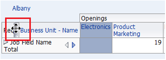
 for Job Field Name Total for Albany, or whatever your top section is.
The open and collapse arrows are used to expand and collapse the data for
analysis. Requisition Job Field Name contains Job Field Names
on the row edge and Job Field Name Total as the parent.
Openings is the measure.
for Job Field Name Total for Albany, or whatever your top section is.
The open and collapse arrows are used to expand and collapse the data for
analysis. Requisition Job Field Name contains Job Field Names
on the row edge and Job Field Name Total as the parent.
Openings is the measure.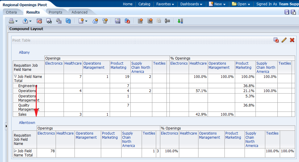


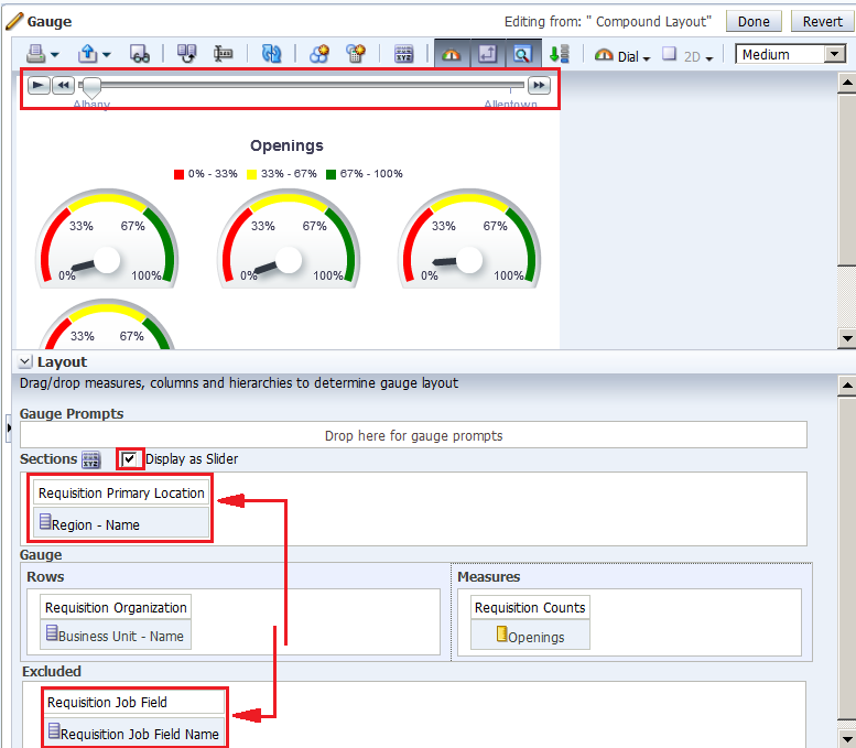
Adding a Gauge View
In this subtopic, you add a Gauge view to the Compound Layout.
To add a Gauge view, perform the following steps:
|
. |
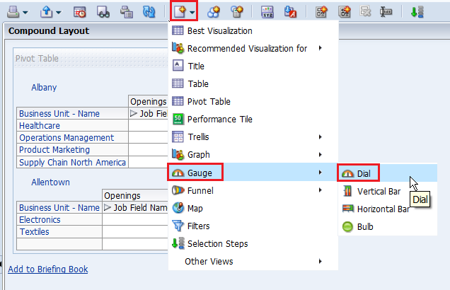
Click the New View icon and select Gauge > Dial.
|
|---|---|
|
. |
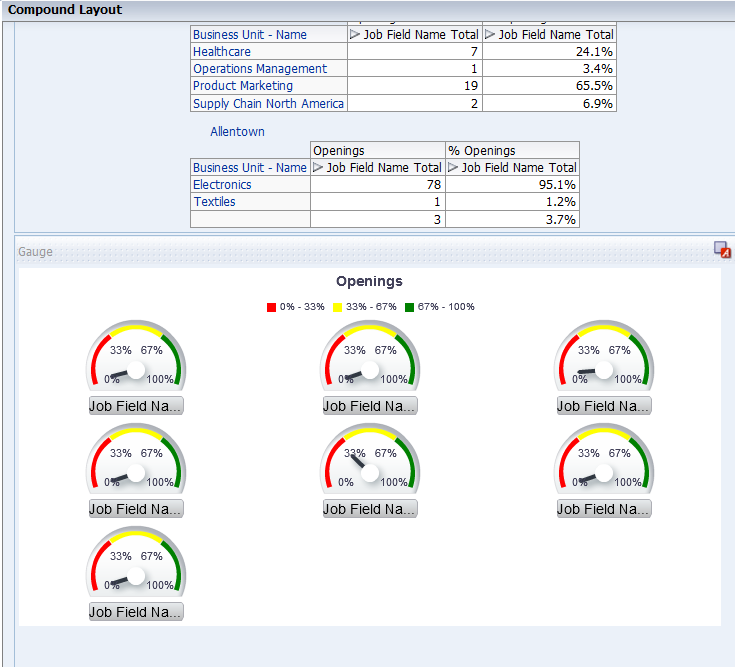
Scoll down and view the gauge.
|
|
. |
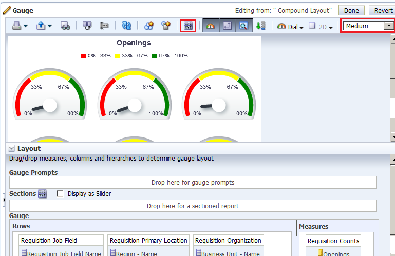
Use the pencil icon to access gauge editor. Change the display to medium size and edit the gauge properties, Titles and Labels tab, to remove the footers. The gauge view should look like this.
|
|
. |
Add a slider to the gauge (for Region - Name) and exclude the Requisition Job Field Name Hierarchy. In the Layout pane, drag Region - Name to the Sections drop target and select Display as Slider. Then, drag Requisition Job Field Name to the Excluded drop target.
Click Done and save the analysis. |
Adding Selection Steps and Selection Steps View
In this subtopic, you begin by creating a new analysis with hierarchical columns and apply selection steps.
To create an analysis with a pivot table, perform the following steps:
|
. |
Select the New > Analysis on the global header. Select A – Sample Sales as the subject area.
|
||||||||
|---|---|---|---|---|---|---|---|---|---|
|
. |
In the Analysis Editor, double-click the following columns:
|
||||||||
|
. |
Click the Results tab. Two views appear: Title and Pivot Table. Because you are using hierarchical columns, a Pivot Table view is generated automatically.
Expand Requisition Latest Filled Date Hierarchy.
|
||||||||
|
. |
a. Delete the Title view.
b. Scroll down to view the Selection Steps
pane. Expand it.
|
||||||||
|
. |
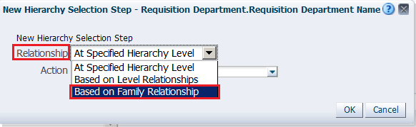
You will add members based on Hierarchy for Requisition Job Field Name Hierarchy. In the Requisition Job Field - Requisition Job Field Name Hierarchy section, click Step 2.Then, New Step. Select Select Members based on Hierarchy.
|
||||||||
|
. |
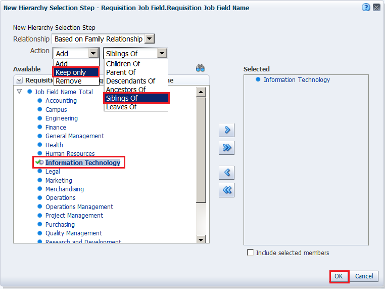
The New Hierarchy Selection step dialog box appears.
Select “Based on Family Relationship” from the Relationship drop-down list. |
||||||||
|
. |
The New Hierarchy Selection Step dialog box expands. Select “ Keep only”, “Siblings
Of” as the action, and then expand Job Field Name Total
and select a child. This example uses Information Technology, but you may choose a different job field that is available to you. Move the selection to the Selected
pane.
Click OK. |
||||||||
|
. |
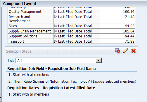
Save the analysis as My Selection Steps Analysis under the folder My Folders>LOD Analysis Folder. Observe that the analysis only shows the siblings of Information Technlology, or your selected job field.
|
||||||||
|
. |
Click the pencil icon |
||||||||
|
. |
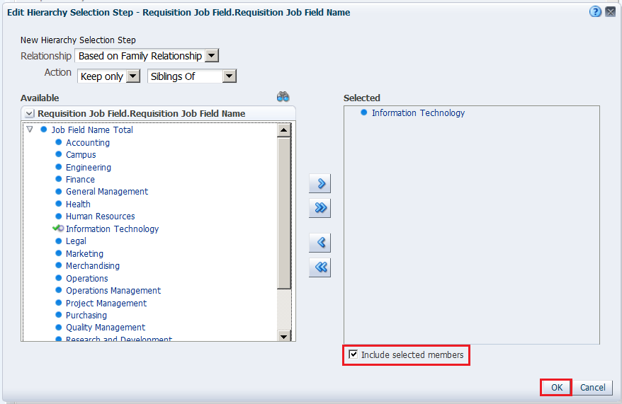
In the Edit Hierarchy Selection Step dialog box, select Include selected members. Click OK and save the analysis.
Observe that Information Technology, or your selected job field, is included this time.
|
||||||||
|
. |
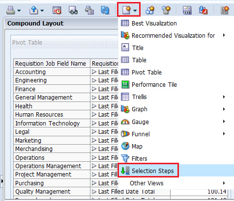
Selection Steps views are now available just as another view that can be included. From the New View drop-down list, select Selection Steps.
The Selection Steps view is displayed in the compound layout.
Save the analysis. |
||||||||
|
. |
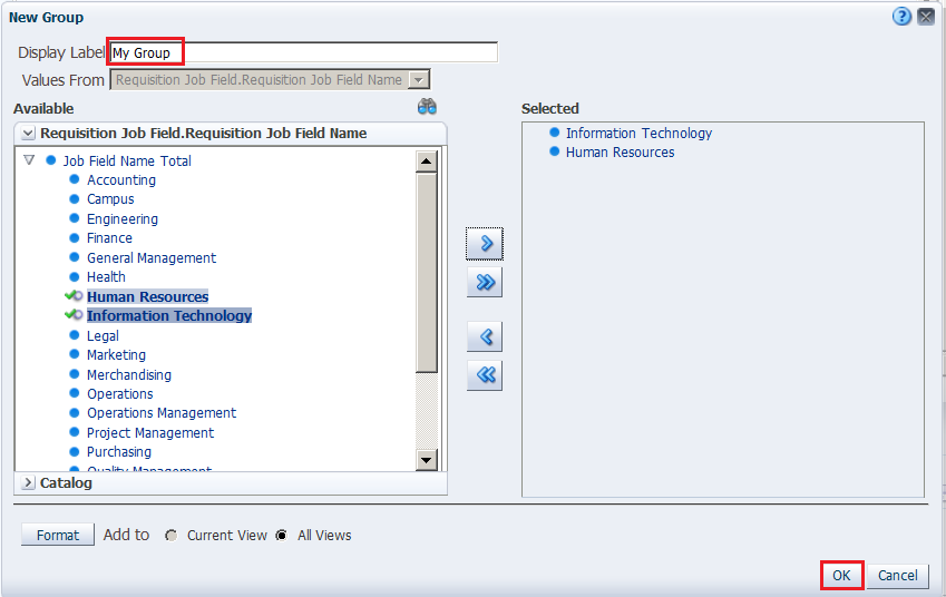
Now, you will add a Group for Requisition Job Field Name Hierarchy. In the Product – Product Hierarchy section, click “Then, New Step.”
Select Add Groups or Calculated Items > New Group. |
||||||||
|
. |
In the New Group dialog box, enter My Group in the
Display Label text box, expand Total Product, and then select
FunPod and HomeView. Move them to the Selected pane and click OK. This new group is added to the Compound Layout view.
|
||||||||
|
. |
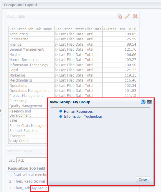
Click My Group in the Selection Steps View and you will be able to see the values in My Group.
You can also see the values if you expand My Group in the Pivot table. Save the analysis. This concludes the topic of creating a Pivot table and applying selection steps to the table. |


Creating a Master-Detail Linking
Master-detail linking of views allows you to establish a relationship between two or more views so that one view, called the master view, will drive data changes in one or more other views, called detail views. To create a Master-Detail linking, for the previously created Regional Revenue Pivot analysis perform the following steps:
. |
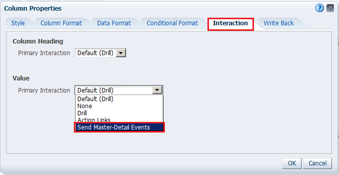
Set up the master view to which you link the detail view. a. Edit the Regional Openings Pivot analysis, and click the Criteria tabbed page. b. Click the More Options icon and select Column Properties for the Region - Name column.
|
|---|---|
. |
The Column Properties dialog box appears. Click the Interaction tabbed page.
In the Value area, click the Primary Interaction drop-down list, and select Send Master-Detail Events. |
. |
When "Send Master-Detail Events" is selected, a qualification text box, Specify channel, appears. You use this text box to enter a name for the channel to which the master view will send master-detail events. This is a case-sensitive text box.
a. Enter region in the "Specify channel" text box and click OK. b. Save the analysis. |
. |
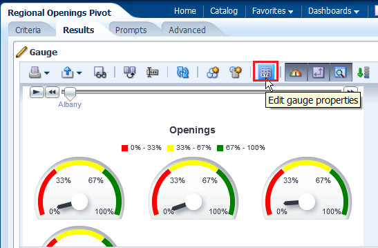
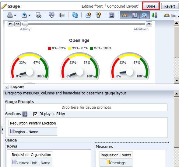
Define the detail view to which the master view should link. You can add any view that includes the same master column as the master view. a. Click the Results tabbed page to view the Compound Layout and click Edit View for the Gauge view.
b. The Gauge editor appears. Click Edit gauge properties on the toolbar.
|
. |
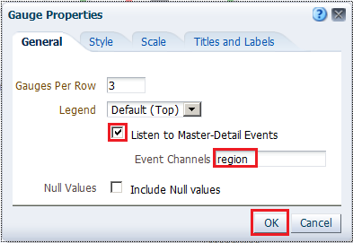
The Gauge Properties dialog box appears.
a. Select the Listen to Master-Detail Events check box. b. Enter region in the Event Channels text box. Remember that this must match precisely with the text entered for the master view. c. Click OK. |
. |
Click Done and then save your analysis.
|
. |
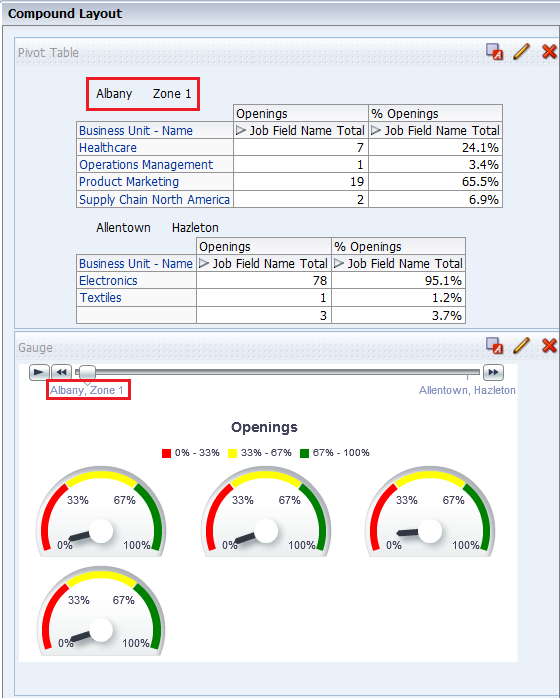
a. In the Pivot Table view (the master view), select Albany , or a region available to you, to drill down.
Both the Pivot Table view and the Gauge view (the detail view) update to reflect the drill.
b. Save your analysis. |


Working with Other View Types
You have learned about creating the following views:
- Titles
- Table
- Pivot Table
- Graph
In this topic, you create a Narrative view, a Column Selector view, and a View Selector view. You also create a Trellis chart.
Creating a Narrative View
You create a Narrative view to provide information such as context, explanatory text, or extended descriptions along with column values for an analysis. You can include values from attribute, hierarchical, and measure columns. If you want to include hierarchy levels in a Narrative view, use selection steps to display the levels. The Narrative view is a combination of text and query column values.
To add a Narrative view, perform the following steps:
. |
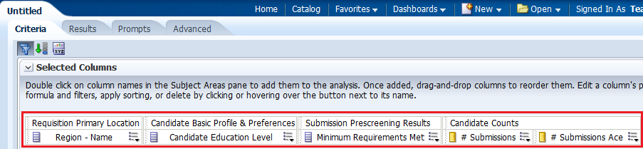
To create a meaningful Narrative view, begin by creating a new analysis that includes a calculated item. a. Create an analysis as you did above, including the following columns:
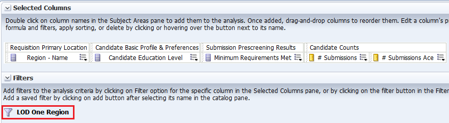
b. Add a filter to Region - Name and select only one region. For this example, I choose Albany region. Save the filter as LOD One Region.
|
||||||||||||
|---|---|---|---|---|---|---|---|---|---|---|---|---|---|
. |
a. Add # Submissions Ace to the Criteria tabbed page a second time. The Selected Columns within the Criteria tabbed page should look like this:
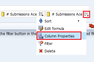
b. Edit the Column Properties for the duplicate # Submissions Ace column. Click More Options for this duplicate column and select Column Properties.
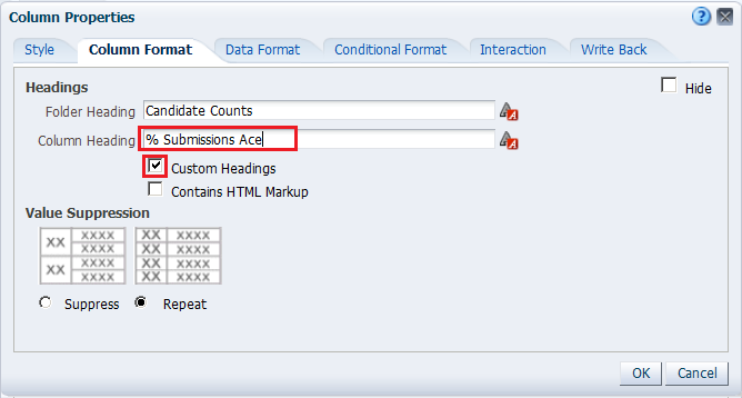
c. Select the Column Format tabbed page, and select the check box for Custom Headings. Enter % Submissions Ace in the Column Heading text box.
d. Using the Data Format tabbed page, format the data for this column as a percentage with two decimal places and then click OK.
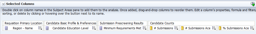
The Selected Columns should look like this:
|
||||||||||||
. |
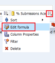
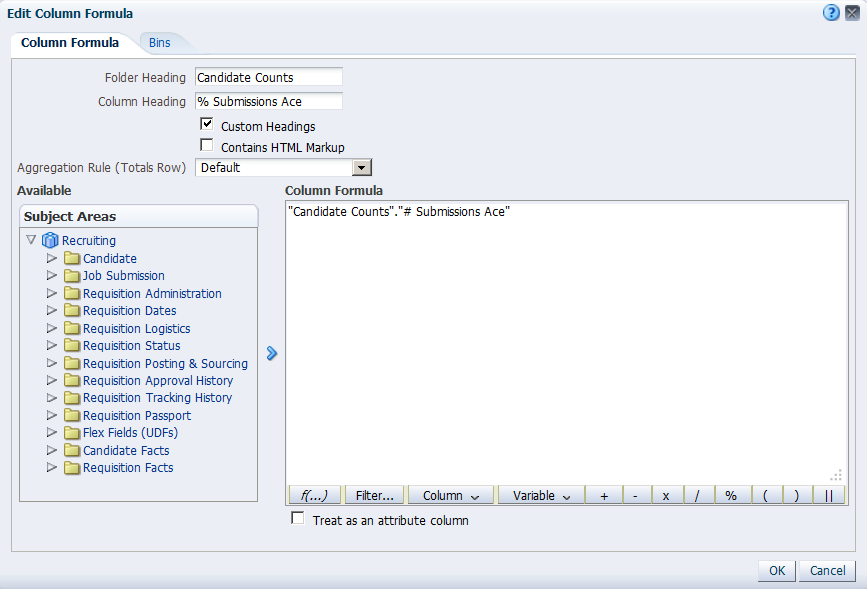
a. Click More Options for % Submissions Ace and select Edit Formula.
The Edit Column Formula dialog box appears:
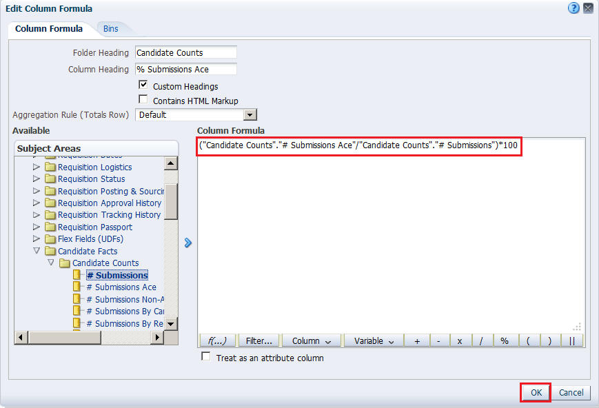
b. Enter the following formula in the Column Formula text box. ("Candidate Counts"."# Submissions Ace"/"Candidate Counts".# Submissions")*100 Hint: You can copy the line of code and paste it in the Column Formula text box. The Edit Column Formula dialog box should look like this:
c. Click OK. |
||||||||||||
. |
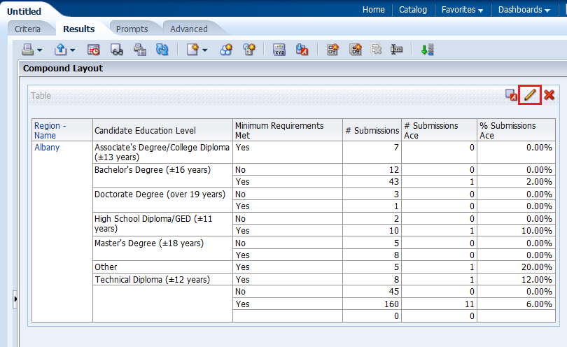
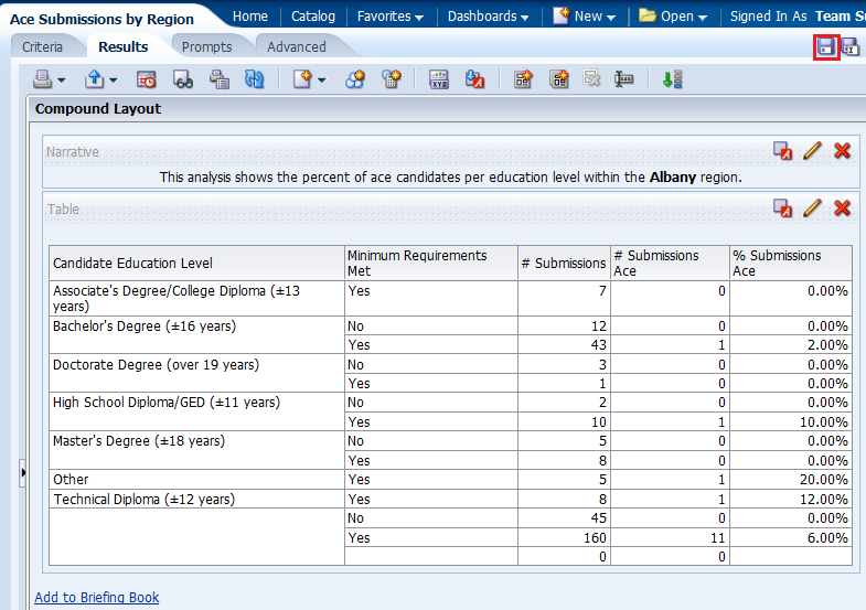
a. Select the Results tabbed page and remove the Title view from the Compound Layout. b. Click the Edit View icon to open the Table editor.
c. Click the More Options icon for Region - Name and select Hidden to hide the column.
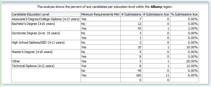
d. Click Done to review your results. The Table view should look like this:
e. Save the analysis as Ace Submissions by Region. |
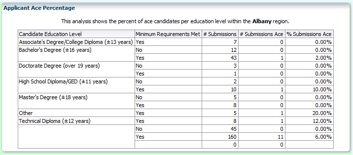
||||||||||||
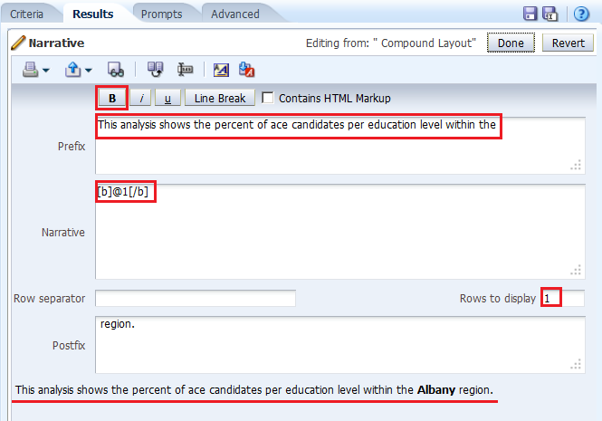
. |
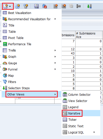
To add the Narrative view perform the following steps: a. Click the New View icon on the toolbar and select Other Views > Narrative.
b. Drag the Narrative view above the Table view.
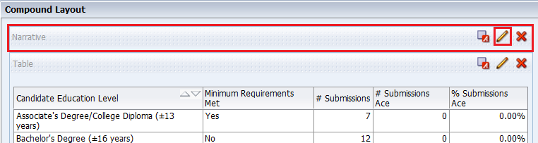
c. Click the Edit View icon for the Narrative view. |
||||||||||||
. |
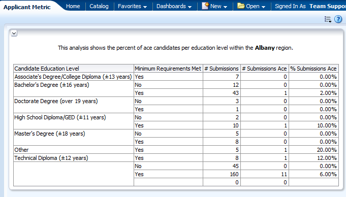
The Narrative editor appears.
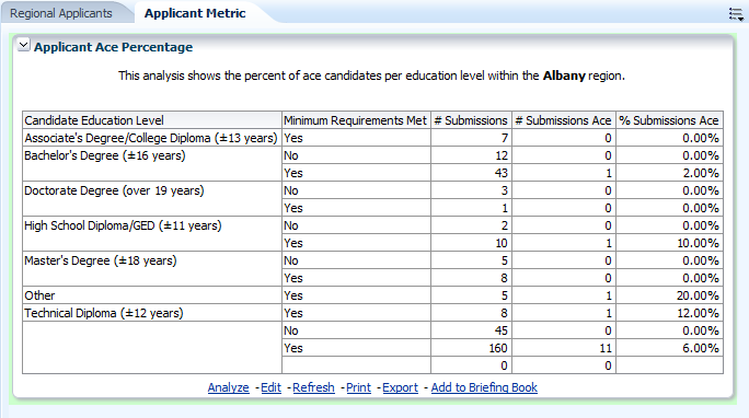
b. In the Prefix text box, enter This analysis shows the percent of ace candidates per educaiton level within the , ensuring that you leave a single space following the last word.
c. In the Narrative text box, enter @1, where the number "1" represents the first column in the analysis (Region - Name). Then, select the @1 that you entered and click the bold icon. d. In the Postfix text box, enter region., ensuring that you include a space before region and a period after region. e. Enter 1 in the "Rows to display" text box. Notice that a preview is provided at the bottom of the editor. |
||||||||||||
. |
Click Done and save your analysis. The Compound Layout should look like this:
This concludes the topic of creating a narrative view. |


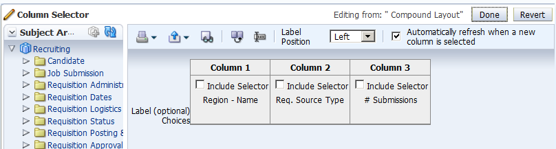
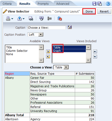
Creating Column Selector and View Selector Views
A Column Selector view adds a column selector to the results. A column selector is a drop-down list from which users can dynamically change the columns that display in results. This will allow you to analyze data along several dimensions. By changing the measure columns, you can dynamically alter the content of the analyses you have created.
To create a Column Selector and View Selector views, perform the following steps:
. |
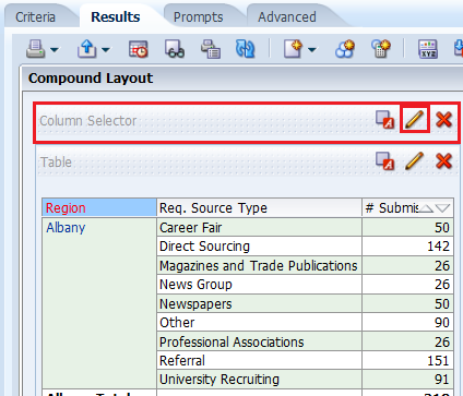
a. Open the Regional Applicants analysis in the Analysis Editor. The Results tabbed page appears.
b. Click the New View icon and select Other Views > Column Selector.
|
|---|---|
. |
The Column Selector view appears. Drag the Column Selector view above the Title view.
Click the Edit View icon for the Column Selector view. The Column Selector editor appears.
|
. |
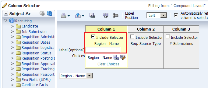
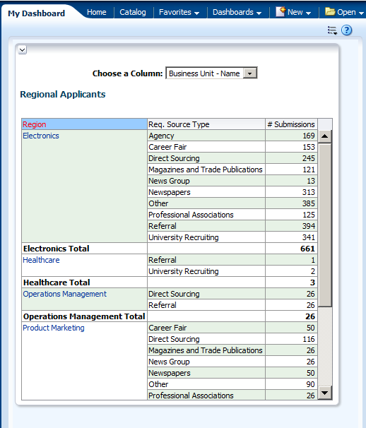
a. Select the Include Selector Region - Name check box.
b. In the Label (optional) Choices text box, enter Choose a column:. c. With Column still selected, double-click the following columns to add to the selector: Job Field Name, Business Unit - Name, and Job Role Name.
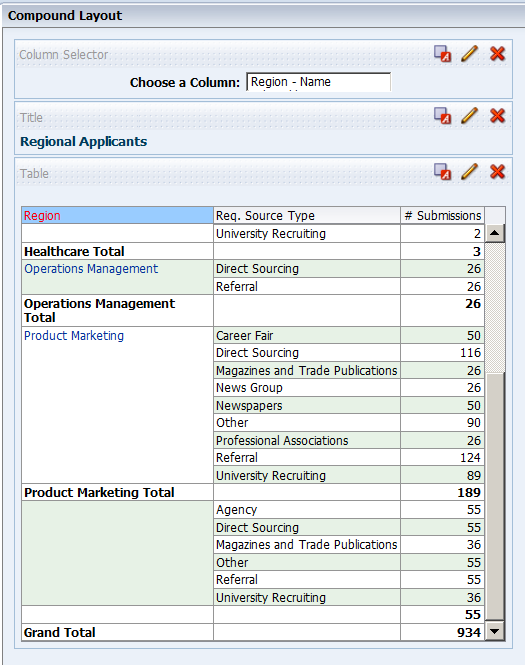
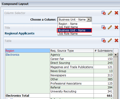
d. Click Done. The Compound Layout appears:
|
. |
a. Click the Column Selector drop-down list and select Business Unit - Name:
b. The values change appropriately. Note, however, that because you set a custom heading for the Region - Name column earlier, the custom heading is still displayed for the column.
c. Save the analysis. |
. |
Now you will add the View Selector view. A View Selector view provides a drop-down list from which users can select a specific view of analysis results from among saved views. A View Selector view is analogous to a storage container, because it holds other views that have been selected in the editor for display. a. Perform these steps before adding the View Selector view:
These changes will allow you to showcase the analytic data-driven views. Regional Applicants should look like this:
|
. |
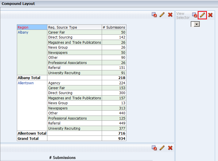
a. Click the New View icon on the toolbar and select Other Views > View Selector.
b. Drag the View Selector view to the right of the Table view.
c. Click the Edit View icon for the View Selector view. |
. |
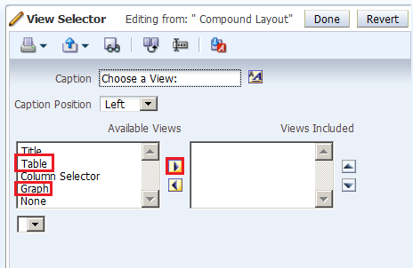
a. The View Selector editor appears.In the Caption text box, enter Choose a view:.
b. In the Available Views list, select the Table and Graph views and click the shuttle icon to move them to the Views Included list.
A preview appears at the bottom of the editor. Note that these views are data-driven views, unlike the Column Selector and Title views, which were deleted from the Compound Layout.
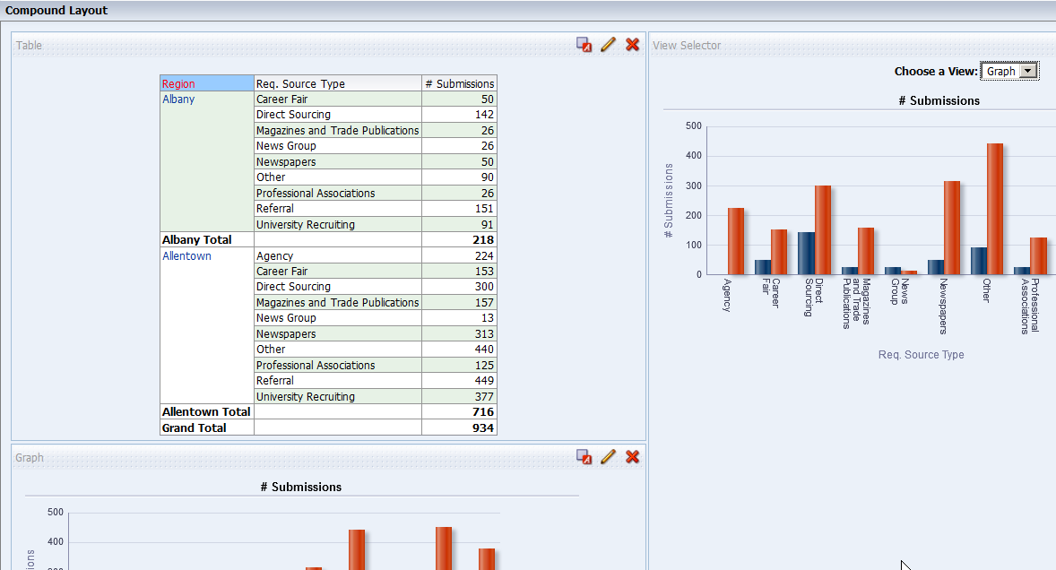
c. Click Done. |
. |
The Compound Layout should look like this when the Graph view is selected:
Do not save your changes to the analysis. |


Creating a Simple Trellis View
. |
Create a new analysis by selecting New>Analysis on the global header, and then selecting Recruiting as the subject area. |
||||||||||
|---|---|---|---|---|---|---|---|---|---|---|---|
. |
On the Criteria tab, select the following columns:
Insert the LOD Region Filter
|
||||||||||
. |
Click the Results tab. Two views Title and Table appear.
|
||||||||||
. |
Add the Trellis view. Select New View>Trellis>Simple.
Scroll down to view the Trellis view.
|
||||||||||
. |
Delete both the Title and Table views.
|
||||||||||
. |
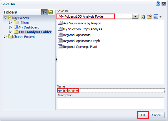
Save the analysis as My Trellis View, under the folder My Folders/LOD Analysis Folder
|
||||||||||
. |
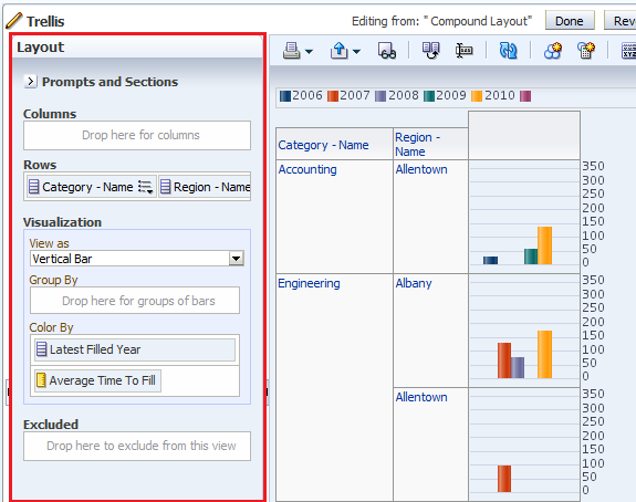
Click the Edit View pencil icon
|
||||||||||
. |
Arrange the dimensions and measure as shown below:
Click Done. |
||||||||||
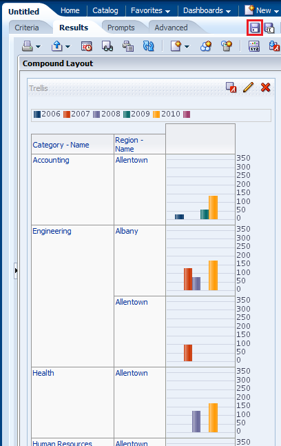
. |
The Trellis view appears. Save the analysis. Observe that the measure has the same scale for all the Categories.
This concludes the topic of creating a Simple Trellis view. |


Building Dashboards
In this topic, you learn about My Dashboard view and how to create and edit a shared dashboard, adding a saved analysis that you have created previously. Dashboards provide personalized views of corporate and external information. Based on your permissions, you can view preconfigured dashboards or create your own personalized views. Users with BI Author or Tenant Administrator permissions can create shared dashboards for groups of users with common responsibilities or job functions.
You can view your personalized views by selecting My Dashboard from the Dashboards drop-down list. You can also set My Dashboard as your default dashboard.
Exploring and Editing My Dashboard
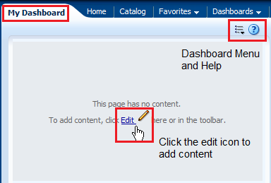
My Dashboard, a personalized view, is a dashboard page that you create and save as your default, personal starting page by using the Preferences tabbed page in My Account dialog box. To open My Dashboard, perform the following steps:|
. |
Click the Dashboards link on the global header and then click My Dashboard.
An empty My Dashboard page appears.
When you open a dashboard, including My Dashboard, the content appears on one or more dashboard tabbed pages. Pages contain the columns and sections that hold the content of a dashboard, and every dashboard has at least one page. Multiple pages are used to organize content. This example shows an empty My Dashboard page with no content. Hover over the Edit icon to edit the dashboard and add content. |
|---|---|
. |
Click the Edit icon ( The Dashboard Builder appears and automatically creates page 1 of your dashboard (the first tabbed page).
Using the Dashboard Builder, you can add pages and objects to a dashboard and control the page layout. The Dashboard Builder is composed of the following:
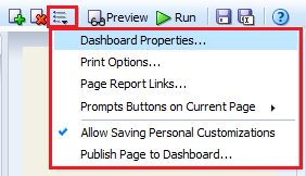
In the Dashboard Toolbar, the Tools toolbar button provides options to set dashboard properties, set page report links, and so on.
|
. |
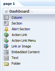
As mentioned above, the Dashboard Objects pane provides you with a list of objects to add as content to a dashboard page. You will have to drag the object to the Page Layout pane on the right.
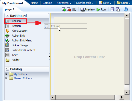
Drag the Column object onto the Page Layout pane.
The Column object appears on the Page Layout pane.
|
. |
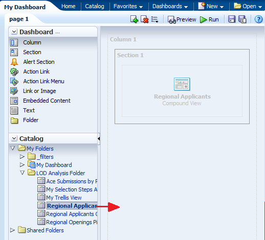
a. In the Catalog pane, navigate to the folder where you saved your analyses.
b. Drag the Regional Applicants analysis to Column 1.
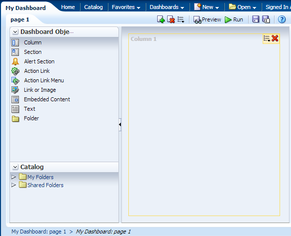
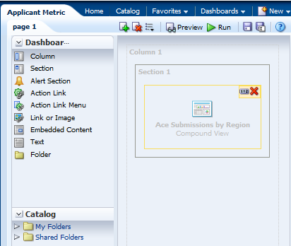
Regional Applicants appears in the column. Observe that a Section is automatically created for you. You can also drag an analysis directly onto an empty Layout Pane without first creating a column. The Dashboard Builder automatically creates the column for you. You can then add sections automatically to that column by dragging analyses below the existing sections.
c. Click the Save icon ( My Dashboard appears with the selected analysis Regional Applicants.
|


Creating a Dashboard
To create a new dashboard, perform the following steps:
. |
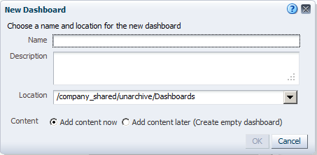
Select New > Dashboard in the global header.
The New Dashboard dialog box appears.
|
|---|---|
. |
a. Enter Applicant Metric in the name text box. Notice that you can also enter a description of your choice. b. Navigate to your LOD Analysis Folder and select it as the Location. If you receive a warning message, click OK to close it. c. Accept the default to Add content now. The New Dashboard dialog box should look like this:
Observe that a Dashboards subfolder was automatically created inside the LOD Analysis Folder. d. Click OK. The Dashboard Builder appears.
|
. |
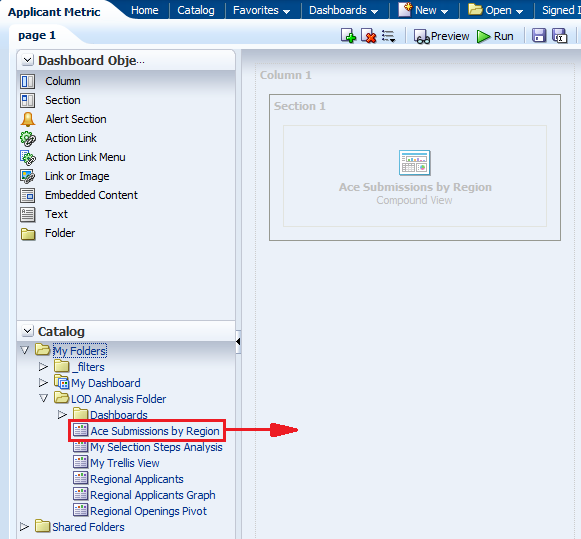
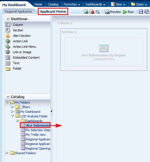
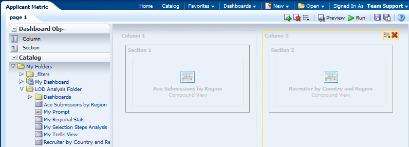
a. Navigate to the Ace Submissions by Region analysis and drag it from the Catalog to the Page Layout pane.
b. Save and run the dashboard. The Applicant Metric dashboard appears.
|


Editing a Dashboard
Dashboard editing, which is performed by using the Dashboard Builder (as explained above), is allowed for users with the appropriate privileges. In this subtopic, you enhance My Dashboard.
To begin enhancing My Dashboard, perform the following steps:
. |
a. Select Dashboards > My Dashboard. b. Click the Page Options icon (
|
||||||||||||
|---|---|---|---|---|---|---|---|---|---|---|---|---|---|
. |
Give the existing tabbed page a more meaningful name. Click the Tools button and select Dashboard Properties.
The Dashboard Properties dialog box appears.
From this dialog box, you can do the following:
|
||||||||||||
. |
Select page 1 in the Dashboard Pages section. The Dashboard Page Control toolbar is enabled. Using the toolbar, you can do the following:
|
||||||||||||
. |
a. Click Rename icon ( b. Enter Regional Applicants in the Name text box and click OK.
The Dashboard Properties dialog box reappears with the new dashboard page name.
|
||||||||||||
. |
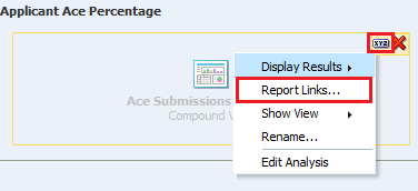
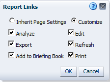
a. Click the Edit icon for Dashboard Report Links to set the report links at the dashboard level. Report links can be set at the dashboard, dashboard page (click Page Options> Page Report Links), or analysis level (click the properties icon for the specific analysis within the Dashboard Builder and then select Report Links).
b. Select the check boxes as indicated in the image below: c. Click OK and then click OK again to return to the Dashboard Builder.
The Dashboard Builder should look like this:
|
||||||||||||
. |
a. Click the Add Dashboard Page icon ( b. Name the dashboard page Applicant Metric and click OK.
|
||||||||||||
. |
In the Catalog pane, navigate to the Ace Submissions by Region analysis and drag it to the Page Layout pane on the right.
|
||||||||||||
. |
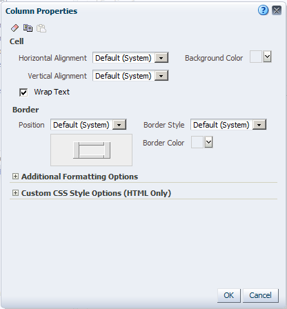
Edit the properties of the column. a. Click the Column Properties icon.
The Column Properties dialog box appears.
Using the Column Properties dialog box, you can change the appearance of the cells, border, width, height, and so on. You can also apply a custom style sheet. |
||||||||||||
|
. |
a. Select the drop-down list for Background Color within the Cell area and choose light green. Click OK, then click OK again to close the Column Properties dialog box.
b. Click Preview to preview the dashboard. After previewing close the Window.
|
||||||||||||
. |
Edit the properties of the section. You use the Section Properties drop-down list to do numerous tasks:
When you have more than one analysis within the section, you can also align the analyses by using the vertical and horizontal alignment icons.
a. Click the Properties drop-down list for the section and select Condition.
The Section Condition dialog box appears.
You use conditions to determine the following:
b. Set a condition that determines whether the analysis
appears on the dashboard.
|
||||||||||||
. |
Browse the Catalog and select the Ace Submissions by Region analysis.
|
||||||||||||
. |
a. In the "True If Row Count" drop-down list, select is greater than and enter 25 in the text box to the right.
b. Click Test. If previously your analysis returned less than 25 records this test should evaluate to False. Modify the condition, as necessary, to create a false evaluation.
c. Your results are verified. Click OK.
To further verify your results, then click OK
and click OK again to
return to the Dashboard Builder.
The dashboard page is empty. All that appears within the dashboard page is the column color. d. Close the Preview window. Click the Properties
drop-down list for the section and select Condition.
The Section Condition dialog box appears.
e. Click the OK. |
||||||||||||
|
. |
You will rename the section. a. Click Properties (within the section) > Rename. The Rename dialog box appears.
b. Enter Applicant Ace Percentage in the text box.
c. Click OK. |
||||||||||||
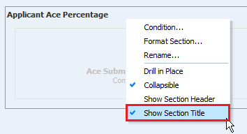
. |
a. Click Properties (within the section) > Show Section Title.
b. Preview the dashboard page once again to see your changes.
c. Save the dashboard. |
||||||||||||
. |
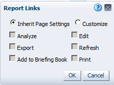
Override the default dashboard report links at the analysis level. a. Click the Properties icon for the Customer Discounts by Region analysis, and select Report Links.
b. The Report Links dialog box appears.
c. Select the Customize radio button and then select all check boxes.
d. Click OK. e. Save and run the dashboard page. You are now able to export and copy this analysis from the dashboard.
|
||||||||||||
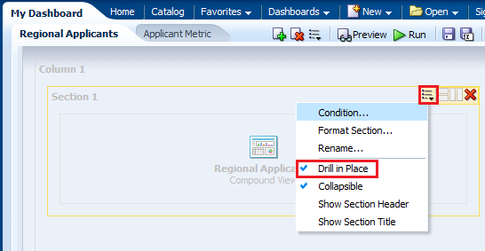
. |
a. Edit the dashboard in the Dashboard Builder again and edit the Regional Applicants tabbed page. b. Edit the section properties for the analysis and select Drill in Place. Drilling allows you to view additional levels of detail for the specific column. Drill in Place means that the current browser is refreshed with the new data. To return to the previous view, simply click the back button on your browser.
c. Save and run the dashboard page. |
||||||||||||
|
. |
Ensure the Region - Name column is selected in the column selector. Drill down on Region - Name, for this example the drill was performed on Allentown. Choose any value available to you. The Region's City - Name column appears.
|
 ) and select


 ). The Add Dashboard Page dialog box appears.
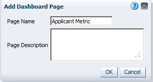


 ). The New Condition dialog box appears. Select Analysis,
to base the new condition, from the drop-down list.
). The New Condition dialog box appears. Select Analysis,
to base the new condition, from the drop-down list. 


Saving a Customized Dashboard
To save a customized dashboard and set preferences, perform the following steps:
|
. |
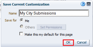
Create a personal, customized view of your dashboard page. Saved customizations allow you to save and view dashboard pages in their current state with your most frequently used or favorite choices for items such as filters, prompts, column sorts, drills in analyses, and section expansion and collapse. By saving customizations, you do not need to make these choices manually each time you access the dashboard page. a. Select Page Options > Save Current Customizations.
b. The Save Current Customization dialog box appears. Name your customization My City Submissions and click OK.
c. You can apply the saved customization to a dashboard page. Click Page Options > Apply Saved Customization > My City Submissions.
|
|---|


Prompting to Filter Analyses
A dashboard prompt is a special filter that filters analyses embedded in a dashboard. There are two various prompts and this topic discusses the Named and Inline Prompts. You will learn to create a Named Prompt in your dashboard.
The prompt created at the dashboard level is called a Named prompt, because, the prompt is created outside of a specific dashboard and stored in the catalog as a prompt object, which can then be applied to any dashboard or dashboard page that contains the columns, which are specified in the prompt. It can filter one or any number of analyses embedded on the same dashboard page. You can create and save these named prompts to a private folder or a shared folder.
- A named prompt is interactive and will always appear on the dashboard page so that the user can prompt for different values without having to rerun the dashboard.
- A named prompt can also interact with selection steps. You can specify a dashboard prompt to override a specific selection step.
The step will be processed against the dashboard column with the user-specified data values collected by the dashboard column prompt, whereas all other steps will be processed as originally specified.
Inline prompts, are embedded in an analysis and are not stored in the Catalog for reuse. An Inline prompt provides general filtering of a column within the analysis, and depending on how it is configured, can work independently from a dashboard filter, which determines values for all matching columns on the dashboard. An inline prompt is an initial prompt. When the user selects the prompt value, the prompt field disappears from the analysis. To select different prompt values, the user must rerun the analysis. The user's choices determine the content of the analyses embedded in the dashboard.
Creating a Named Dashboard Prompt
Named prompts in the Catalog can be applied to any dashboard or dashboard page that contains the columns specified in the prompt.
To create a named dashboard prompt, perform the following steps:
|
. |
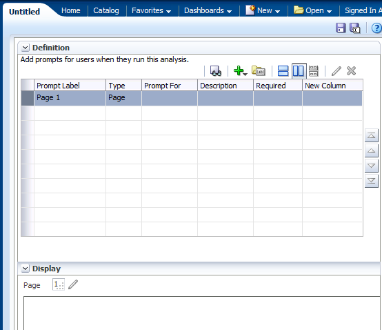
Create a named dashboard prompt for region. Click New > Dashboard Prompt on the global header and then select the Recruiting subject area.
The Definition pane appears. The Definition pane allows you to add, organize, and manage a named prompt's columns. The Display pane is a preview pane that allows you to view the prompt's layout and design.
|
|---|---|
|
. |
a. In the Definition pane, click the New prompt icon (
b. Select Region - Name as the column for the prompt, and click OK.
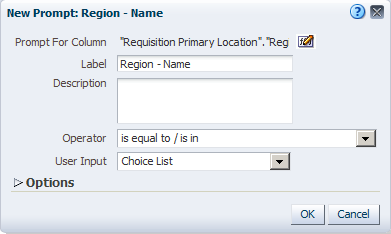
c. The New Prompt: Region - Name dialog box appears.
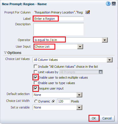
The Label text box allows you to enter a meaningful label that appears on the dashboard next to the prompt. Enter Select a Region: in the the Label text box (add a space following the colon). You can optionally enter a description. d. Select the operator. Accept the default, which is "is equal to / is in." This field is only for column prompts. e. The User Input field's drop-down list appears
for column and variable prompts and provides you with the option to
determine the User Input method for the user interface—in other
words, the user will see one of the following: check boxes, radio buttons,
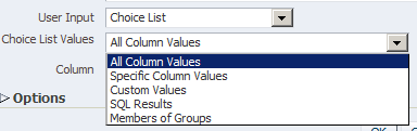
a choice list, or a list box. Accept the default, Choice List. f. The Options section provides you with the opportunity to constrain values available for selection. Accept the default, All Column Values. g. The series of check boxes allows you to restrict
the amount of data returned. The New Prompt dialog box should look like this:
h. Click OK. |
|
. |
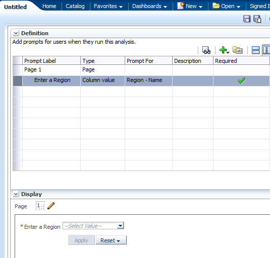
The prompt is added to the Definition pane.
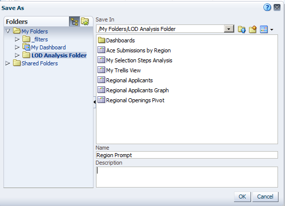
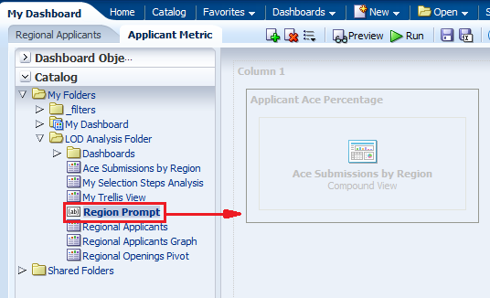
Save the prompt in the LOD Analysis Folder as Region prompt.
|
|
. |
Test the prompt. Navigate to My Dashboard - Applicant Metric and open
it in the Dashboard builder.
|
|
. |
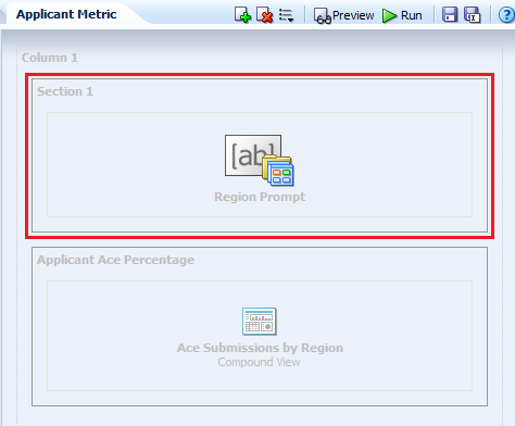
Drag Region Prompt to Column 1, above the "Customer Discounts by Region" analysis.
|
|
. |
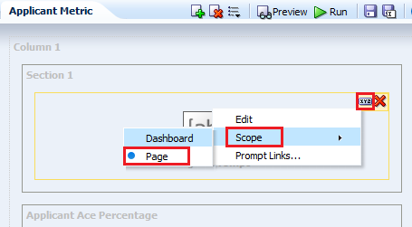
Click the Region Prompt properties icon and select Scope > Page. Scope determines whether the prompt applies to the entire dashboard or just this page.
|
|
. |
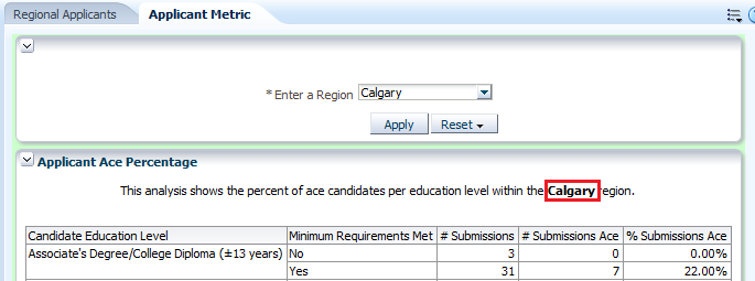
a. Save and run the dashboard. Initially, the filters for the analysis that you created earlier are assumed; that is, the analysis is filtered for Albany region, in this example.
b. Select a new region from your dashboard prompt. This example uses Calgary.
c. Click Apply. The region value changes for this page. d. Observe the change in the region in the dashboard display:
You can try selecting other values in the prompt. Then click Apply to rerun the dashboard prompt. |
 ), and select Column Prompt.
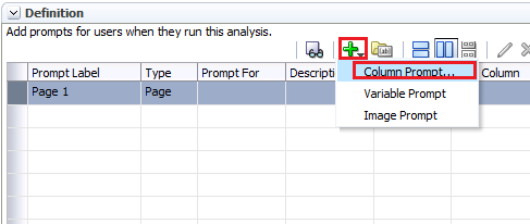


Managing Prompts
You can now manage prompts with different options.
- You can choose to show or hide a prompt's apply and reset buttons. If the designer chooses to hide the apply button, then the specified prompt value is immediately applied to the dashboard or analysis.
- The prompt Reset button now provides three reset options: Reset to last applied values, Reset to default values, and Clear All.
- The row-based layout prompt option is added to the prompt editor's "Definition pane". You can now display your prompts in a row or in a column.
|
. |
Create an analysis with filters. a. Create an anlysis with the following columns:
b. Create filter for Latest Filled Year and Region - Name. Click the More link for Latest Filled Year. In the New Filter dialog box, select is prompted as the operator. Click OK.
c. Similarly, create a filter for Region - Name. Your analysis should look like this:
d. Save the analysis as My Regional Stats. |
||||||||||
|---|---|---|---|---|---|---|---|---|---|---|---|
|
. |
Create a dashboard prompt for year and region. Click New > Dashboard Prompt on the global header and then select the Recruiting subject area.
|
||||||||||
|
. |
a. In the Definition pane, click the New
prompt icon (
b. Select Latest Year from the Requisition Datess folder, and click OK.
|
||||||||||
|
. |
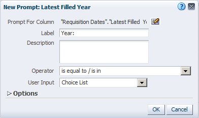
In the New Prompt dialog box, enter the label as "Year: ". Click OK.
|
||||||||||
|
. |
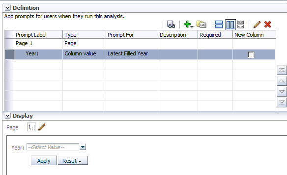
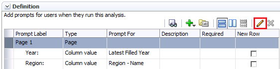
The prompt is added to the Definition table.
|
||||||||||
|
. |
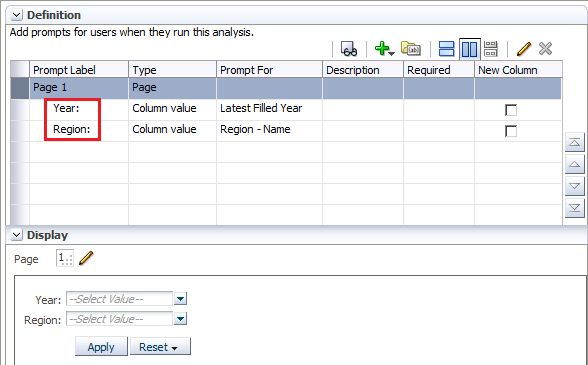
Similarly, add another prompt for Region - Name. In the New Filter dialog box, label the prompt as "Region: ". You should now have two prompts in the Definition table.
|
||||||||||
|
. |
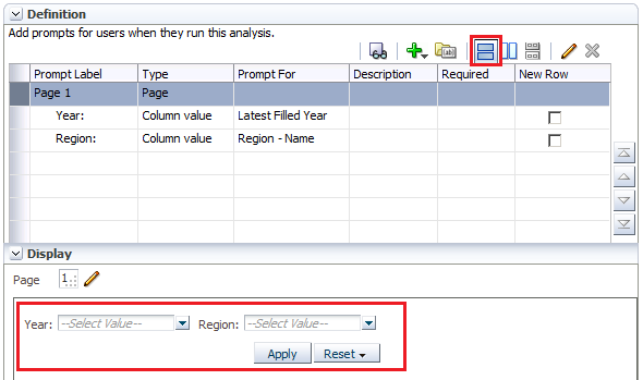
Click the row-based layout at the top and notice that the prompts are laid out horizontally in the Display section.
|
||||||||||
|
. |
Save the prompt in the LOD Analysis Folder as My Prompt. |
||||||||||
|
. |
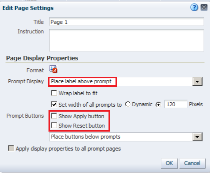
Select Page 1 row in the Definition table and click the pencil
|
||||||||||
|
. |
In the Edit Page Settings dialog box, change Prompt Display to Place label above prompt. Deselect the Show Apply button and Show Reset button check boxes. The Edit Page Settings dialog box should look like this:
Click OK. Observe that the buttons have been removed from the Display section. Save the prompt.
|
||||||||||
|
. |
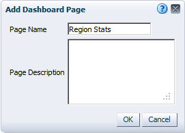
Open My Dashboard and add a new page. Use Page Options > Edit Dashboard to open the Dashboard builder. Click the Add Dashboard page icon.
|
||||||||||
|
. |
In the Add Dashboard Page dialog box, enter Region Stats as the page name and click OK.
|
||||||||||
|
. |
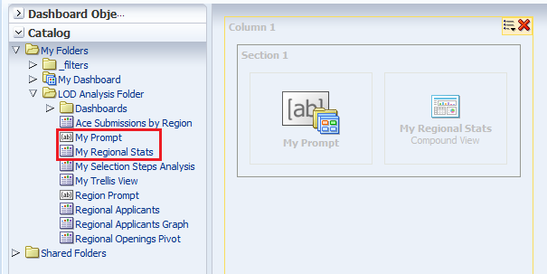
In the new page, drag My Prompt and My Region Stats from My Folders>LOD Analysis Folder, to the dasboard page.
|
||||||||||
|
. |
Save My Dashboard and click Run. The dashboard appears.
|
||||||||||
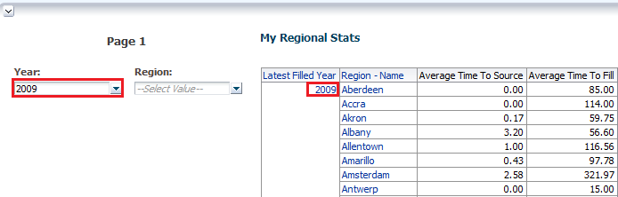
|
. |
Select 2009 as the year and click anywhere on the dashboard. The query runs immediately and returns with data for only 2009.
|
||||||||||
|
. |
Select a region and click any where on the dashboard. . This example uses Aberdeen as the Region. The dashboard refreshes with Year as 2009 and Region as Aberdeen.
|
||||||||||
|
. |
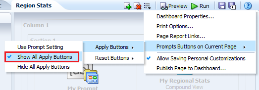
Select Page Options>Edit Dashboard. Click the Tools icon and select Prompts Buttons on Current Page>Apply Buttons>Show All Apply Buttons.
|
||||||||||
|
. |
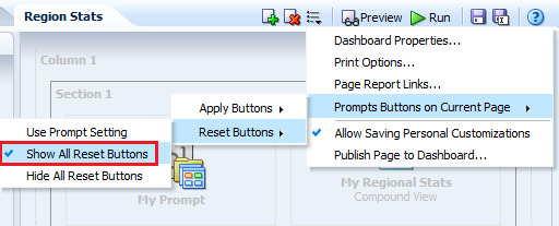
Click the Tools icon and select Prompts Buttons on Current Page>Reset Buttons>Show All Reset Buttons.
|
||||||||||
|
. |
Save the dashboard and run it again. This time both the Apply and Reset buttons are displayed.
|

 ),
and select Column Prompt.
),
and select Column Prompt.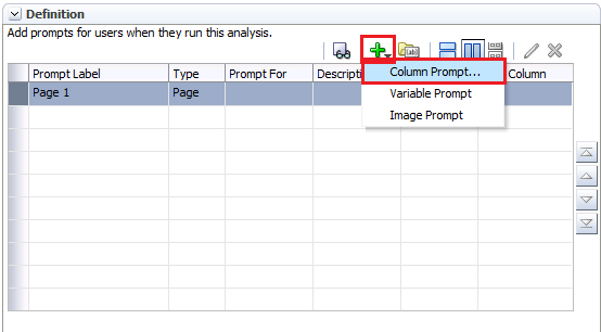


Using a Presentation Variable
A presentation variable can be created as part of the process for creating a column prompt or a variable prompt. When the presentation varaible is part of a column prompt, it is associated with a specific column and takes on that column's value. When it is part of a variable prompt, you define the values that the prompt can have as it is not associated with any specific column. The name and value of the presentation variable is determined by the user when it is initially declared or when it is referenced in the analysis, dashboard, or agent.
Note: You have already created and used a presentation variable when you added a Narrative view to your analysis.
To add a presentation variable using a variable prompt, perform the following steps:
|
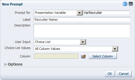
. |
Create a new variable dashboard prompt that creates a Recruiter presentation variable. a. Click New > Dashboard Prompt and select Recruiting as the subject area.
|
|---|---|
|
. |
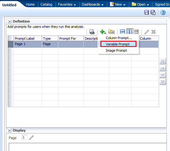
Click New > Variable Prompt.
The New Prompt dialog box appears.
|
|
. |
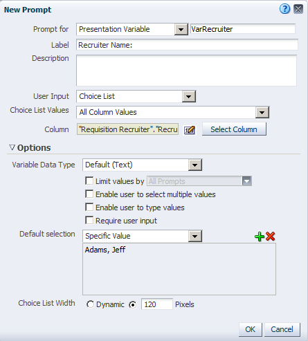
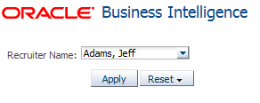
a. Accept Presentation Variable as the default prompt type. b. In the text box to the right of the drop-down list for the prompt type, enter VarRecruiter. c. Enter Recruiter Name: in the Label text box.
d. Select Choice List for User Input. e. Select All Column Values for Choice List Values.
The dialog box should look like this:
|
|
. |
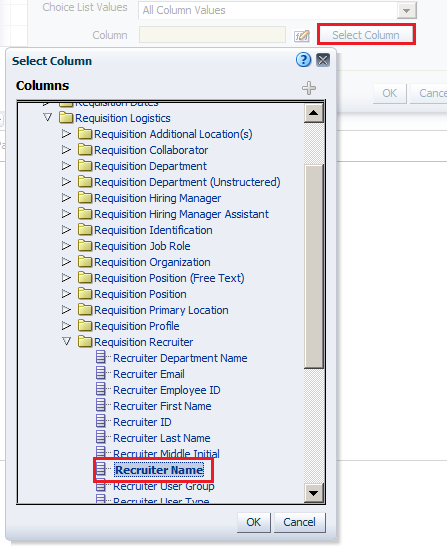
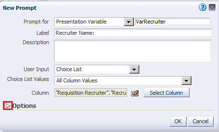
a. Click Select Column and, in the Select Column dialog box, select Requistion Logistics > Requisition Recruiter > Recruiter Name.
b. Click OK. The dialog box should look like this:
Expand the Options section. |
|
. |
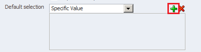
Select Specific Value from the "Default selection" drop-down list.
Click the Select Values icon.
|
|
. |
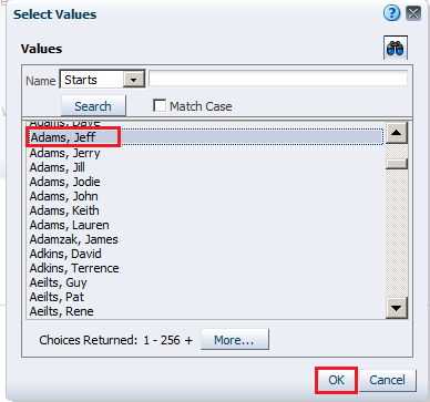
In the Select Values dialog box, select a recruiter and then, click OK. For this example we choose Jeff Adams.
|
|
. |
The New Prompt dialog box should look like this:
Click OK. The newly created variable prompt is displayed in the prompts definition list.
|
|
. |
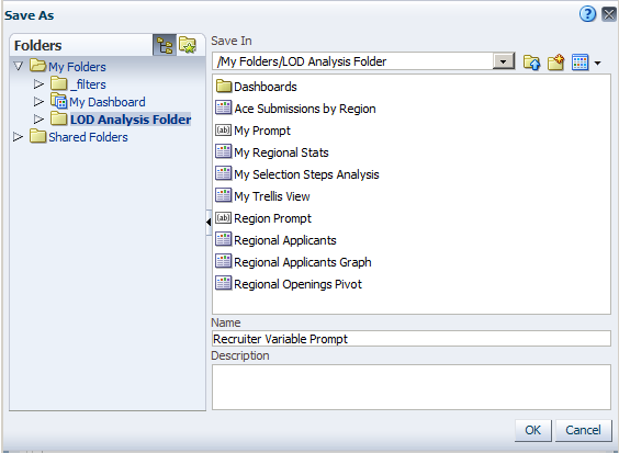
Save the prompt as Recruiter Variable Prompt Variable Prompt in your LOD Analysis Folder.
|
|
. |
Click the Preview icon (
Close the Preview window. |


Using a Presentation Variable in a Static Text View
Create an analysis that uses the VarRecruiter presentation variable
in a Static Text view and in a Filter.
A Static Text view adds static
text in the results.
|
. |
Create an analysis by selecting the following columns:
|
|---|---|
|
. |
Add ascending column sorts in this sequence: Country - Name, Region - Name, and Recruiter Nameas shown below:
The Criteria tabbed page should look like this after adding the sorts:
|
|
. |
Select the Results tabbed page.
|
|
. |
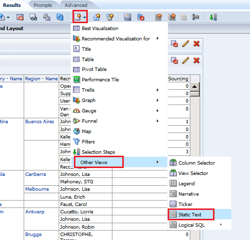
Select New View > Other Views > Static Text.
|
|
. |
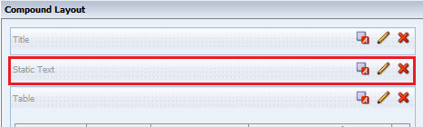
Move the Static Text view above the Table view.
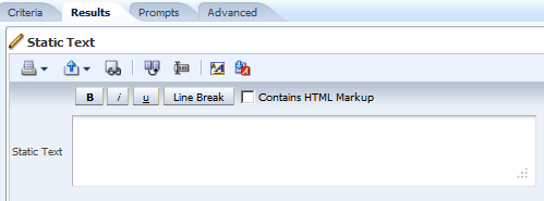
Click the Edit View icon on the Static Text view. The Static Text editor appears.
|
|
. |
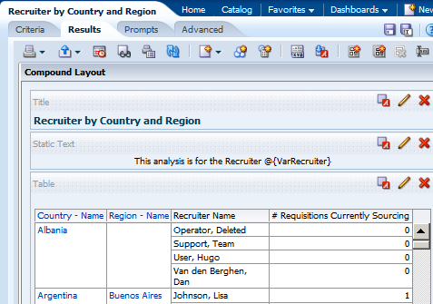
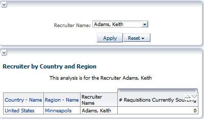
In the Static Text editor, reference the VarRecruiter variable. Enter the following syntax in the Static Text pane: This analysis is for the Recruiter @{VarRecruiter}. The syntax for referencing a Presentation variable is as follows: @{variables.variablename}[format]{defaultvalue} or @{scope.variables['variablename']}
Observe that your entry is previewed below the Static Text text box. Click Done. |
|
. |
Save your analysis as Recruiter by Country and Region.
Your analysis should look like this:
|
|
. |
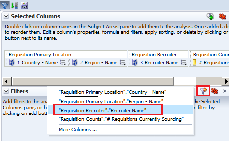
a. Select the Criteria tabbed page. b. In the Filters pane, click the Create a Filter icon and select "Requisition Recruiter"."Recruiter Name".
|
|
. |
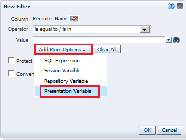
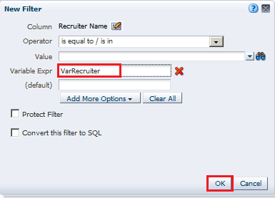
a. In the New Filter dialog box, click Add More Options and select Presentation Variable.
b. In the Variable Expr field, enter the variable name, VarRecruiter. Notice that you can also specify a default for the variable, but in this case the default is driven by the variable prompt, which is set to default to "Jeff Adams".
c. Click OK. The filter should look like this:
|
|
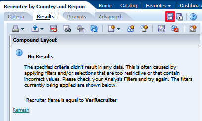
. |
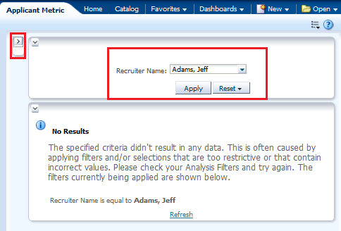
Select the Results tabbed page. Because the variable dashboard prompt has not been run, the VarRecruiter presentation variable has not been populated with a value. Because of this, no results from the analysis meet the filter requirement.
Save the analysis. |
|
. |
Add the analysis Recruiter by Country and Region and the newly created variable prompt to the Applicant Metric dashboard. |
|
. |
Open the dashboard Applicant Metric from the LOD Analysis Folder > Dashboards folder, then click Page Options > Edit Dashboard.
|
|
. |
Add a new column next to Column 1, and then navigate to the Sales Reps by Region and Country analysis and drag it to the new column.
|
|
. |
Navigate to Recruiter Variable Prompt in the catalog pane, and drag the prompt above the Recruiter by Country and Region analysis. Save the dashboard and run it. The Dashboard view looks like this:
|
|
. |
Click the Collapse icon for the first column to minimize it.
The dashboard runs and the variable dashboard prompt is preset to the default value, Adams, Jeff, which in turn appears in the Static Text view as expected and is used to filter the embedded analysis results. The value of a presentation variable is populated by the variable prompt. That is, each time you select a value in the variable prompt, the value of the presentation variable is set to that value. |
|
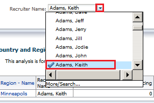
Click the drop-down list for the dashboard prompt, and select a different recruiter. For this example we chose Keith Adams.
Click Apply. The dashboard displays the presentation variable as Adams, Keith.
This concludes the topic of Presentation Variables and Filters. |


Working with Agents
Agents enable you to automate your business processes. You can use them to provide event-driven alerting, scheduled content publishing, and conditional event-driven action execution. Agents can dynamically detect information-based problems and opportunities, determine the appropriate individuals to notify, and deliver information to them through a wide range of devices (eMail, phone, and so on).
In the simplest format, an agent automatically performs a specified catalog analysis based on a defined schedule, and examines the results for a specific problem or opportunity. If the specific problem or opportunity is detected in the results, an alert is generated and delivered to specified recipients and to subscribers to the agent, using the delivery options that are specified for each person.
Creating a Condition-Based Agent/Alert
This topic covers how to create an alert/agent based on a condition and how to define the destination for both the dashboard and the eMail Client.
|
. |
You will have to set the Delivery Options for the Oracle BI Account settings as Email. It is recommended to do this for an authoring user without row level security restrictions, and a report viewer user with row level security set. For more information about row level security see the Oracle Taleo Reporting with Oracle Business Intelligence User Guide. If your company does not use row level security with reporting there will be no difference between running the report as the recipient or using the agent owner's credentials. A System Profile is created automatically with the user's SmartOrg email, but we are going to set up an additional delivery profile. In the Global Header, click the username, and then click My Account.
|
|---|---|
| . |
a. Click the Delivery Options tab and select Email from the Devices drop-down list.
b. Click the Add icon. |
| . |
In the Create Device window, add details as shown in the following screenshot and click OK.
The Email Device is listed. Set the Email device you created as Default.
|
| . |
a. Click the Add icon for Delivery Profiles.
b. Enter details for the Delivery Profile as shown in the following screenshot. Click OK.
c.Set the Email Delivery Profile as Default. Both the Email Device and Delivery Profile are listed on the Delivery Options tab. Click OK.
Repeat steps 1-4 for the other user you will test, you may use the same email for both users. Now create an agent to create and deliver the alert by using Oracle BI Delivers. |
| . |
Click New in the Global Header and select Agent to navigate to the Agent Editor.
|
|
. |
In the Agent Editor, start with the General tab to specify the priority of the agent and how to send the delivery content. Select the following options:
|
|
. |
Click the Schedule tab and verify that scheduling is enabled, Frequency is set to Once, and the Start date and time are set to the current date and time.
|
|
. |
On the Condition tab, select the Use a condition option and click Create. The Create Condition dialog box appears.
|
|
. |
a. In the Create Condition dialog box, select Analysis from the Create condition based on drop-down list and click Browse to select the analysis. In this example, you must choose the standard report Requisitions Filled Details.
b. Navigate to the Reports - Recruiting folder and select Requisitions Filled Details. Condition Data is displayed as the selected analysis. Now you also see the condition operator drop-down list.
c. Select is greater than from the True If Row Count operator drop-down list and enter 0 as the row count. If your environment has a lot of filled requisitions you may want to set a date range on the Latest Filled Date filter. This step is optional. d. Click Test to test the condition. The test result is displayed.
e. Click OK. If the result is false, you do not have enough data to return a result. You may alter the filter criteria, choose another analysis, or run the analysis knowing you will not get any results. |
|
. |
Click the Delivery Content tab to identify the content that will be delivered by the agent. Perform the steps given as follows:
|
|
. |
On the Recipients tab, select the default option to identify the recipients of the agent. By default, the agent creator is available. Remember that you have set the delivery options for "My Account" in the BI EE Home as Email.
|
|
. |
On the Recipients tab, add the report viewer as a recipient. a. Click the add recipient button (
b. Select Users as the list option c. Enter the viewer's name in the Name search box. d. Search for the user by clicking the search button. e. Select the user and move him into the Selected Members column by using the move carrot. f. click OK.
Now both the authoring user and the viewer user are listed as selected recipients. |
|
. |
On the Destinations tab, select the destination for the agent. For User Destinations, select the Devices > Specific Devices and Email check boxes.
|
|
. |
Click the Save button to save the agent. In the Save Agent dialog box, save the agent as Requisitions Filled Details in the LOD Analysis Folder.
|
|
. |
Click the Run Agent Now button. Verify that the agent is running in the Running Agent dialog box:
When the agent has run successfully, you should receive a confirmation: Click OK. 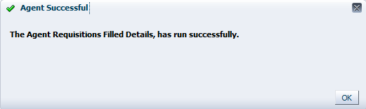 Verify that the agent ran successfully and generated and an email for the report author and the report viewer was received. |
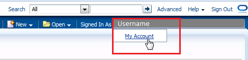
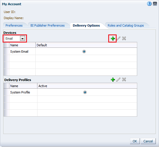
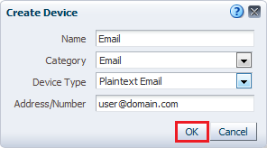
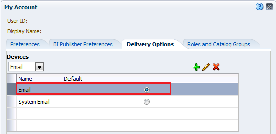
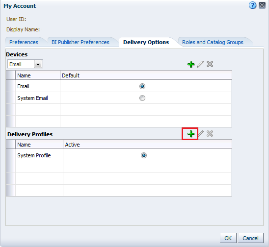
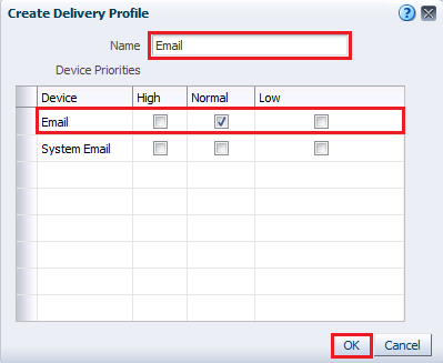
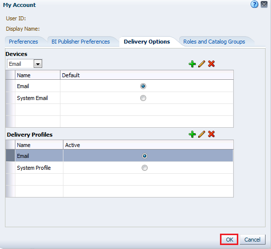
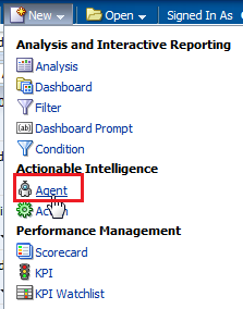
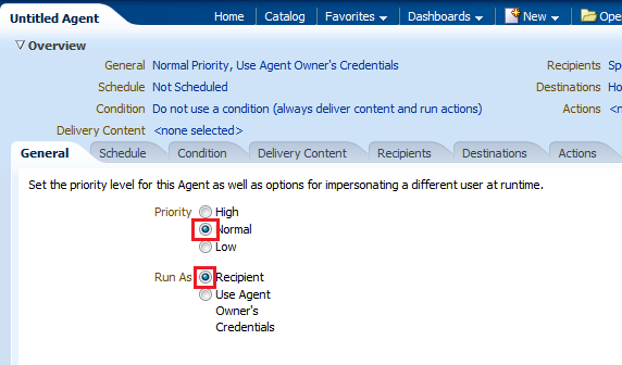
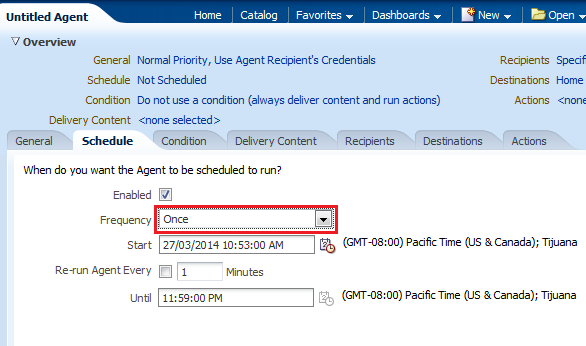
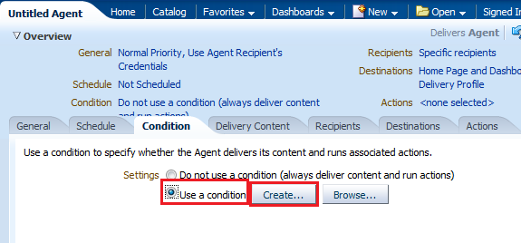
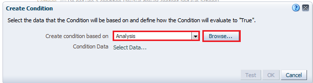

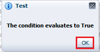
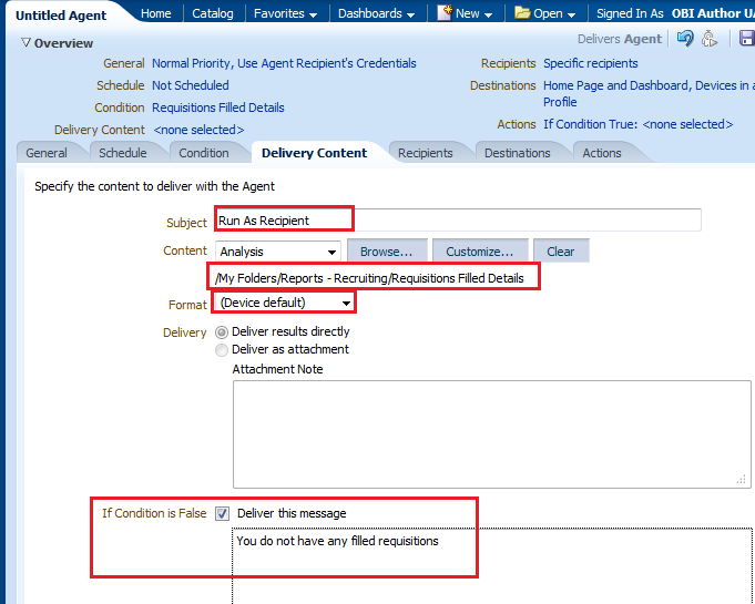
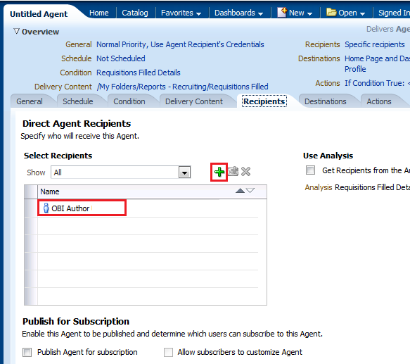
 ) to open the select user dialog.
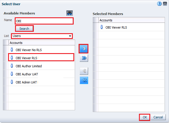
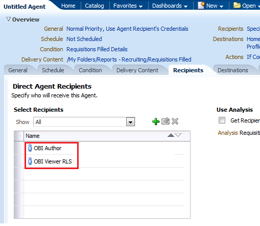
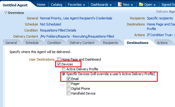
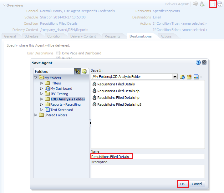
Creating an Agent/Alert to be Delivered to an Email List
This topic covers how to create an alert/agent that can be delivered to a list of emails that can belong to people who do not have access to Oracle Business Intelligence.
|
. |
We will be modifying the Requisitions Filled Details agent for this exercise. In the LOD Analysis Folder click edit under the Requisitions Filled Details agent.
|
|---|---|
| . |
Click the General tab and select Use Agent Owner's Credentials from the Run As selections.
Since the system will not be able to recognize an email as a recipient you must select this option for any agents that will be delivered to specified emails instead of, or in addition to, system users. |
| . |
Click the Delivery Content tab and in the Format dropdown, select CSV Format.
Deliver As Attachment is automatically selected for this format type. |
| . |
a. In the Recipients Tab clear all selected recipients and click the Add Email Recipents icon.
b. In the Enter Email Address dialog, enter email list including your email, and the email of colleagues who don't mind confirming receipt (separate multiple addresses with commas), as shown in the following screenshot. Click OK.
The recipients image should look like the following image, with your list of emails displayed.
|
| . |
Click Save As and save the agent as Requisitions Filled Details - run as user in the LOD Analysis Folder.
|
|
. |
Manually run the agent using the Run Agent Now icon.
|
|
. |
Verify the agent ran successfully by waiting for the Agent Successful message.
|
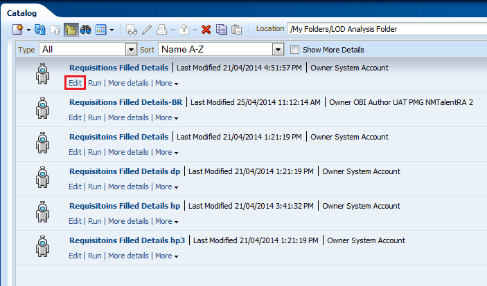
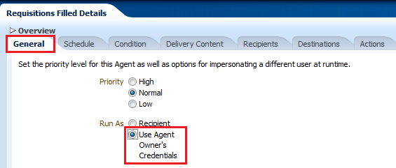
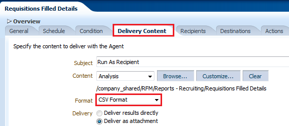
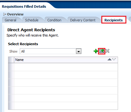
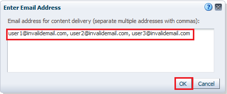
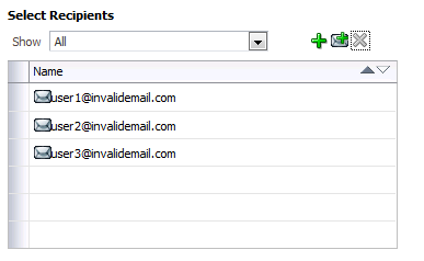
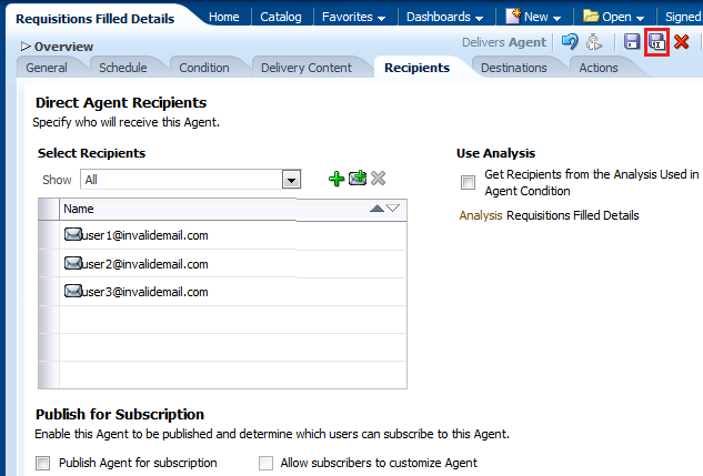
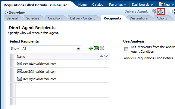
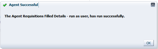
Summary
This tutorial has covered how to build, format, and customize Oracle Taleo Business Intelligence (BI) analyses and how to create and update dashboards by utilizing these analyses.
In this tutorial, you have learned how to:
- Create analyses, add graphs, and work with pivot tables
- Format analyses and graphs
- Create and work with several types of views
- Explore My Dashboard and add a new dashboard page
- Create a dashboard
- Create a dashboard prompt
- Create a variable prompt for a presentation variable
- Create an Agent
Resources
- Oracle by Example - Oracle Business Intelligence Enterprise Edition
- Oracle Learning Library - Home
- Oracle Business Intelligence Enterprise Edition Documentation
- Oracle Technical Network (OTN) - Oracle Business Intelligence Enterprise Edition Plus
- Oracle University
Credits:
- Lead Curriculum Developer: Sindhu Rao
- Other Contributors: Kasturi Shekhar, Nikki Sanger, Rashmi Raj,Dave Granholm
![]()
|
|
Copyright © 2013, Oracle and/or its affiliates. All rights reserved |