PivotTable Usage Guideline 

RCUX Document Version 5.0.1 for Oracle® Fusion Middleware 11g Release 1 Patch Set 1 (11.1.1.2.0)
Last updated 02-Dec-2010
A Pivot Table provides a summary view of data in cross-tab format and allows users to see different views of data by dragging and dropping rows and columns.
- General Principles
- Configurable Elements
- Header Regions
- Row and Column Headers
- Rows and Columns
- Cells
- Pivot Handles
- Context Menus
- Status Bar
- Pivot Filter Bar
- Common Actions
Related Guidelines
| Guideline | Section | For Information About |
|---|---|---|
| Table | All | Data display using tables |
| Common Table Actions | Export | Export feature |
Related ADF Elements
Refer to the ADF Faces Rich Client demos page to find demos and tag documentation for the ADF elements related to this component:
| ADF Element | Notes |
|---|---|
| dvt:pivotTable | Pivot Table component. |
| dvt:pivotFilterbar | Pivot Filter Bar component. |
General Principles

Purpose:
A Pivot Table enables users to view a large amount of data in a compact layout. Users can change the view of the data by repositioning rows and columns.
Description:
- Pivot Table structures data similarly to the Table component, with column groups, but the Pivot Table can display groups of both row and column headers.
- Unlike regular tables, each cell in a Pivot Table refers to a distinct row and column value. By organizing data in this way, a Pivot Table is more compact than a row-based table, and is ideal for displaying a large quantity of data.
- When pivoting is enabled, users can reposition the rows and columns to change the view of the data.
- The Pivot Table has a read-only mode and an edit mode. In read-only mode, users cannot modify cell values; in edit mode, users can modify cell values. See Edit below for details.
Example:
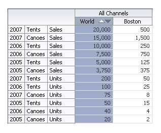
The following image illustrates the compact nature of a Pivot Table. The top image presents sales data in a table with duplicate entries, and the table below it shows the same information in a Pivot Table, whose grouped headers eliminate duplicate cell entries.
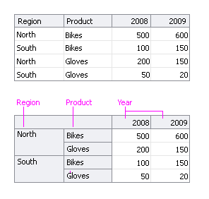
Data Presented in a Table and in a Pivot Table
The image below shows how the user can change the view of the data by pivoting Product headers from the row region to the column region.
Pivoting Product Headers From Row Region to Column Region
Usage:
- A Pivot Table can be used to accomplish any of the following:
- Enable users to reorganize multi-level tabular data.
- Display tabular data with more than one level of row headers, or more than two levels of column headers.
- Display shallow hierarchies without using a Tree Table.
- Display deep hierarchies using a combination of multi-level row and column headers and Tree Table-style expand/collapse to control the number of levels displayed.
- Pivot Table headers and cells may contain elements such as text, icons, or links. See Row and Column Headers, and Cells for details.
- Cells typically contain numeric data (such as currency, percentages, or counts), whereas row and column headers typically contain text values (such as item names, dates, or place names).
- By default, the Pivot Table is 300px wide x 300px high. Product teams may change this to a different fixed size, or may use auto-sizing to adjust the height and width of the Pivot Table based on its content. Usage recommendations are the same as for a Table—see Table Size in the Table Information Design guideline.
- Pivoting should be enabled in Pivot Tables except when the Pivot Table is used to provide a specific, fixed view of the data. In that case, a page or section title should describe that view, such as "2010 Sales by Region".
- Product teams may define custom header and cell formatting. See Custom Formatting for details.
Comparison with Table Component
The pivotTable component differs from the Table component in the following ways:
- Selection cannot be disabled.
- Row and column resize cannot be disabled.
- Row and column banding are not supported.
- Row and column gridlines may not be hidden.
- PivotTable does not support Active Data.
- PivotTable does not support QBE (Query by Example).
- Edit all mode is not supported.
- Custom status bar text is not supported.
In addition, pivotTable does not provide end-users with the following capabilities:
- Highlight on mouseover
- Select All
- Hide, show, add, remove, freeze, or re-order rows or columns
- Advanced sort
- Hide or show the status bar or pivot labels
- Wrap header or cell content
- Change the way sorting occurs
- Filter data
- Delete, copy, cut, or paste data
- Import data
Configurable Elements
The following image shows the principal elements of a Pivot Table.
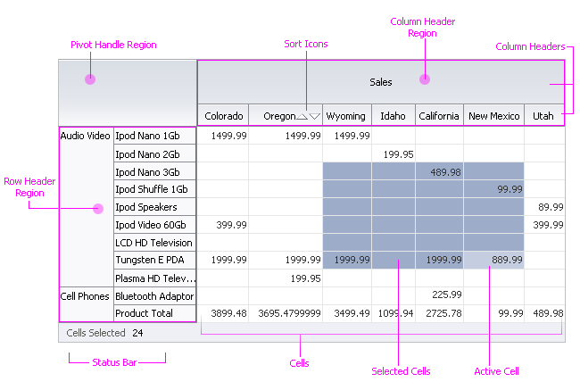
Pivot Table Elements
Header Regions
Purpose:
Header regions frame the Pivot Table and contain groups of row and column headers.
Description:
The row header region appears before the cells and the column header region appears above the cells.
Usage:
- Initially, row and column header groups should be positioned in header regions in a way that supports common data usage scenarios. For example, if users most often want to see individual product data by year, position the Year headers outside of the Product headers.
- Header regions may contain any number of row and column header groups, but it is recommended to display no more than six different row and column header groups in a Pivot Table. Among advanced users, displaying more than six header groups is acceptable.
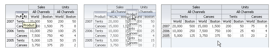
In the following example, the Year header group appears in the row header region in the first image, and appears in the column header region in the second image. It is more difficult to see the relationships between the cells and their column headers in the second image, because there are four column header groups.
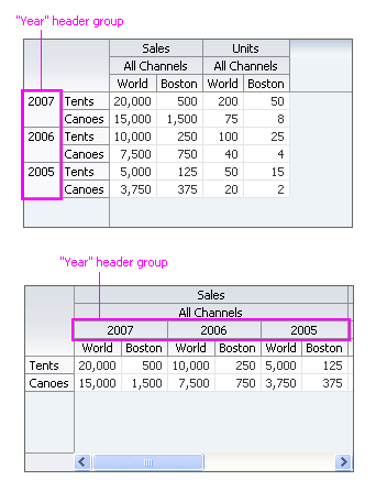
Displaying Many Header Groups in a Header Region
Row and Column Headers
Purpose:
Identifies the data in rows and columns and enables row and column selection and drilling.
Description:
Row and column headers are containers that appear at the start of a single row or column or a group of rows or columns.
- By default, a row or column header contains a label. If drilling is enabled, a disclosure icon is also included.
- A row or column header may contain one or more of the following optional read-only components:
- Text
- Sort Icons (column headers only, when sorting is enabled—see the Sort section for details.)
- Disclosure Icon (when drilling is enabled—see the Displaying Hierarchies section for details)
- Link
- Button
- Status Icon
- Functional Icon
- Users can adjust row and column header height and width.
- Adjusting the height of a row header also affects the height of its corresponding cells.
- Adjusting the width of a column header also affects the width of its corresponding cells.
- Users can select row and column headers. When a row or column header is selected, its corresponding cells are also selected.
Usage:
- Header labels should be short because header text does not wrap, and when header text truncates, its full text does not appear in a tooltip on mouseover.
- Keep the number of elements inside headers to a minimum to preserve screen real estate. The more elements, the larger the header, and the larger its corresponding cells.
- Custom header formatting can be used to distinguish particular headers. For example, users might want to show Country names in bold text. See Custom Formatting for details.
Rows and Columns
Purpose:
Rows arrange cells horizontally, whereas columns arrange cells vertically.
Description:
- The total number of rows or columns can change when the user reorganizes row and column headers. This is because the total number of rows or columns at any time is equal to the number of row or column headers directly adjacent to the cells.
- By default, up to 50 rows and 50 columns are loaded initially. Additional rows and columns are loaded as the user scrolls them into view. Product teams may change the default number depending on page layout constraints and expected usage of the data.
- Users can adjust row height and column width.
Usage:
Because Pivot Table is often used for complex analysis tasks, it is recommended to initially load as many rows and columns as the system can handle while maintaining acceptable performance.
Cells
Purpose:
Display numeric values, labels, or other components in a grid layout.
Description:
- A cell may be either read-only or editable.
- Both read-only and editable cells may include any of the following elements, in any combination:
- Text (in alphanumeric, numeric, date, time, or currency formats)
- Link
- Button
- Status Icon
- Functional Icon
- Input/Choose Date Selector
- Disclosure Icon
- Required Field Indicator
- Changed Field Indicator
- Graph
- Gauge
- In addition, editable cells may include the following input elements:
- Text Field
- Text Area
- Select Choice List (Select-one and Select-many)
- Spinbox
- Checkbox
- Select Radio
- Input/Choose Color Selector
- Input/Choose Date Selector
- LOV (Input/Output Text and Select Choice List)
- Users can select cells contiguously or non-contiguously. When users select cells, their corresponding row and column headers are not selected.
Usage:
- Numeric data and dates should appear start-aligned in a cell, whereas text should appear left-aligned. For more information see the Common Formats guideline.
- It is not recommended to place more than one component in a cell. However, when placing multiple items in a cell, it is recommended to position them on the same line. For example, a cell containing text and an icon should appear on the same line, rather than on separate lines.
- Custom cell formatting can be used to call users' attention to particular cells. For example, users might want to be able to quickly see values that are below a particular threshold. See Custom Formatting for details.
Pivot Handles
Purpose:
Reposition a group of row or column headers to provide a different view of the data.
Description:
A pivot handle is a graphic that appears when the user mouses over a row or column header. Optionally, the name of the group of row or column headers is also displayed.
- The pivot handle appears automatically when pivoting is enabled.
- The pivot handle appears at the start of a group of column headers and at the top of a group of row headers.
- The user pivots a row or column header group by dragging and dropping a pivot handle to a new location in either the row region or the column region.
- Pivot handles are displayed by default.
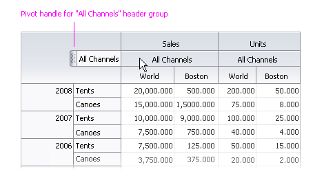
Pivot Handle
Usage:
- Product teams can disable pivoting. This is recommended only when the data need to remain in a fixed view—typically to provide a summary of data without a requirement for extensive data analysis. In this case, a page or section title describes the view, such as "2008 Sales by Region".
- It is recommended to always display the pivot handle label.
Context Menus
Purpose:
Provide commonly-used commands applicable to selected content.
Description:
- The following context menus and menu items are provided by default:
- On column headers that are directly adjacent to cells, when sorting is enabled: "Sort", with "Ascending" and "Descending" submenu items.
- On column and row headers: "Height..." and "Width...", for opening header resize dialogs.
- Product teams may add both custom context menus items to the default menus and custom context menus.
- For more information on context menus, see Context Menus in the Menus guideline.
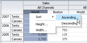
Default Context Menu
Usage:
- Context menus should be provided when users can perform actions on selected content. For example, if users can select cells then delete their values, a context menu item should be provided for that action.
- Context menu items should be divided into logical groups, according to function, with a menu item separator between groups.
- There is no limit to the number of context menu items allowed. However, it is recommended to list no more than four context menu groups, and no more than 10 to 12 context menu items, to avoid creating a long list where it is more difficult to scan and select items.
Status Bar
Purpose:
Displays selection status.
Description:
- The status bar is optional. By default, it does not appear.
- When the number of selected elements can be precisely determined, the status bar displays the element name and the number selected. Otherwise, the status bar displays the element name and the word "multiple". This can occur when elements are selected non-contiguously.
Usage:
It is recommended to display the status bar only when users need to know how many items are selected.
Pivot Filter Bar
Purpose:
Adds a region labeled "Filters" above the Pivot Table to allow users to filter on a specific group of headers, such as a year, region, product, etc.
Description:
- Allows users to scope data to specific header values in a Pivot Table by dragging headers into the Filter Bar.
- Users can drag multiple groups of headers to the Filter Bar in any order, and can drag them out of the filter region and back into the Pivot Table.
Usage:
- Use filters when you have a Pivot Table with more than five groups of headers.
- The label "Filters" is shown by default. Use the default label unless there is a need to more specifically describe the kinds of filters that are being applied.
- Product teams can turn off the label, but this is not recommended.
- Typically, individual filter labels should be hidden. Show them when there are multiple filters that contain the same or similar types of values (for example, different filters that contain months).
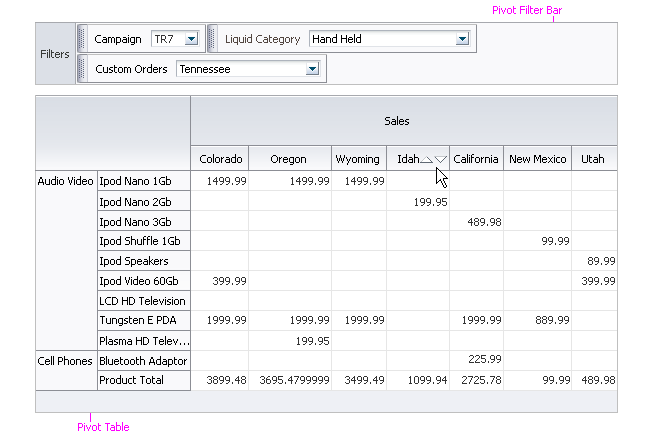
The Filter Bar Filters Data by Headers
Common Actions
Sort
Purpose:
Re-orders rows based on the values in a single column.
Description:
- Support for sorting is the same as described in the Sort section of the Table Display Manipulation guideline, except that the Pivot Table:
- Provides grouped and ungrouped sorting.
- Does not provide advanced sorting.
- Does not provide menu bar support for sorting.
- The results of a sort can appear either grouped or ungrouped. If grouped, only the innermost rows are sorted. If ungrouped, all rows are sorted, regardless of their position in the header region. The following images show examples of grouped and ungrouped sorting.
- Grouped sorting is enabled by default.
- Users cannot switch between grouped and ungrouped sorting.
- Sorting may be performed only from a column header directly adjacent to the cells.
- Only one column may be sorted at a time.
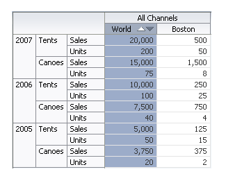
Grouped Sort - Only Sales and Units are Sorted
Ungrouped Sort - All Rows are Sorted
Usage:
Ungrouped sorting is recommended only when users need to compare values across many header groups at a time. Otherwise, grouped sorting is preferred.
Edit
Purpose:
An editable Pivot Table displays all of its cells in read-only mode on page load. When the user double-clicks a cell or selects a cell and presses F2, the cell switches to editable mode.
Description:
- Any number of cells may be editable, but only one cell may be edited at a time.
- When a cell becomes editable, the first component in the cell gets focus.
- All other cells remain in read-only mode, providing context for editing.
- The user exits edit mode by clicking outside of the cell, double-clicking a different cell, or pressing the Esc key.
- Data is validated and saved when the user exits the cell.
- Once a cell value is changed, the change cannot be undone.
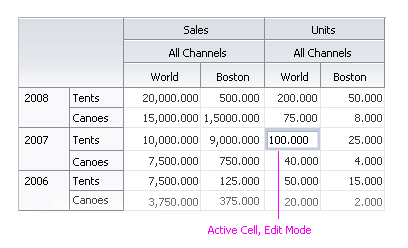
Cell in Edit Mode
Usage:
- Enable editing when users are expected to edit cell data. Enable editing only for those cells that users are permitted to modify.
Export to Excel
Purpose:
A Pivot Table features an optional Export function that enables users to load Pivot Table data into Microsoft® Excel®.
Description:
Export extracts data from the Pivot Table and puts it in a Microsoft Excel file on the user's desktop.
- Users may export either all or selected Pivot Table data to a Microsoft Excel file.
- Users cannot import data into a Pivot Table.
- The export file created uses the .XLS format.
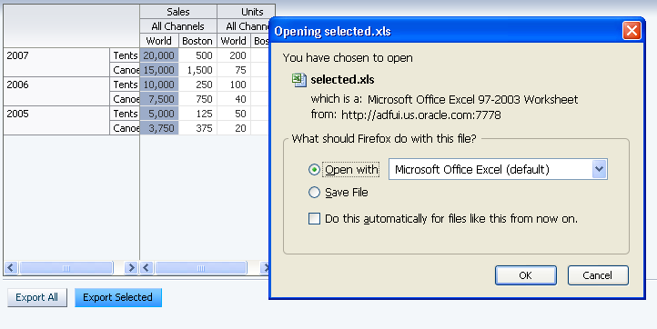
Clicking the "Export Selected" Button Exports Selected Data to a Microsoft Excel File
Usage:
- Enable export for advanced users who perform data analysis using Excel.
- The export function can be made available to users with section- or page-level action buttons, as well as through a context menu.
- Use the following labels for action buttons and context menu items:
- "Export All" for exporting all data
- "Export Selected" for exporting selected data.
Displaying Hierarchies
Purpose:
Displays headers organized in a hierarchy as a set of expandable and collapsible groups of headers.
Description:
- A header that has one or more subordinate (or "child") headers displays a disclosure icon next to its label. For example, in the image below, the "All Products" header has three child headers.
- Clicking the disclosure icon toggles the appearance of the next level of headers in the hierarchy.
- In the row region, the next level of headers in the hierarchy appears at the beginning of the header.
- In the column region, the next level of headers in the hierarchy appears below the header.
- Cell values reflect the lowest-level of headers that are displayed.
In the following example, the "All Products" header is collapsed in the first image. The cell value represents total Worldwide Sales for All Products. In the second image, "All Products" is expanded. Three new row headers are inserted, and the cells now represent Worldwide Sales for each of the three product Divisions.
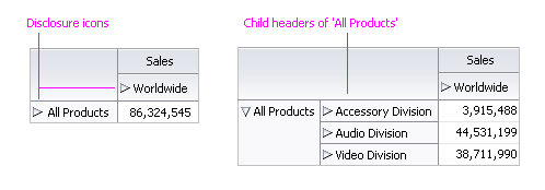
Drilling into the 'All Products' Hierarchy
Usage:
Headers organized in a hierarchy display disclosure icons automatically.
Displaying Calculations
Purpose:
Display calculations in cells.
Description:
- The following calculations are provided by default:
- Sum
- Average
- Count
- Minimum
- Maximum
- Standard Deviation
- Variance
- End-users cannot add, remove, or modify calculations.
- Product teams can display other calculations using custom code.
Usage:
Display calculations when cell data is numeric and users require row and/or column totals to be displayed.
Custom Formatting
Purpose:
Customize the appearance of headers and cells.
Description:
- Using custom code, product teams can format headers and cells with respect to background color, text color, and/or font style.
- End-users cannot apply, remove, or modify header or cell formatting.
In the following example, cells are colored according to their value.
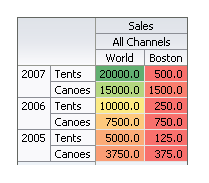
Custom Formatting Applied to Cells
Usage:
- Custom formatting is recommended when users need to be able to find certain headers and/or cells quickly. For example, cells might be colored based on their values, or to indicate that they represent calculations.
- When applying custom formatting using color, provide a legend so users can understand what each color means. The legend should also include any supplemental information necessary to assist those who cannot see color to discern the meaning of the formatting.
- Use custom formatting sparingly. Applying custom formatting to too many headers and cells diminishes their ability to stand out.