PanelAccordion Usage Guideline 

RCUI Document Version 5.0.0 for Oracle® Fusion Middleware 11g Release 1 Patch Set 1 (11.1.1.2.0)
Last Updated
16-Dec-2009
The panelAccordion component provides flexible access to multiple panels of content that could not otherwise be displayed on a single page.
Related Guidelines
| Guideline | Section | For Information About |
|---|---|---|
| Headers | Subheaders | Use for Accordion panel headers. |
| Page Layout | All | Placement of components in page layers and regions. |
| PanelSplitter | All | Use for Accordion panels. |
Related ADF Elements
Refer to the ADF Faces Rich Client demos page to find demos and tag documentation for the ADF elements related to this component:
| ADF Element | Notes |
|---|---|
| af:panelAccordion | Container element for accordion panel. |
| af:showDetailItem | Creates an accordion panel. |
| af:toolbar | Adds a toolbar into the pane. |
General Principles

Purpose:
The panelAccordion component provides access to multiple panels of content that could not otherwise be displayed within the same space.
Usage:
- The panelAccordion component consists of a collection of panels associated with a common outer container/pane. The Accordion pane is embedded in a page or dialog. Panels consist of a header and a content region.
- Accordion panels can be expanded or collapsed. The panelAccordion allows dynamic space allocation among panels, and placement of additional panels in overflow lists.
- The primary use of a panelAccordion is to present multiple sections of content on a single page without scrolling, where all of the sections are peers in the application or object hierarchy.
- An accordion may be placed in any of the layers or regions listed below. See the Page Layout guideline for details on layers and regions.
- Start or End Auxiliary Content Region in Global, Primary, or Secondary layer.
- Page Content Region in Secondary layer.
- More than one panel accordion may be placed on a page.
- To avoid confusing users, it is recommended to display no more than two accordions per page, and to only do so in power user applications.
- Layout changes such as expanding, collapsing, and resizing persist across sessions (as a user profile) until explicitly changed by the user.

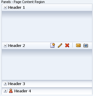
PanelAccordion Component: Showing Global/Primary/Secondary Layer, and Page Content Region
Configurable Elements

PanelAccordion Elements
Panel
Purpose: A panel contains and separates each section of content within a panelAccordion.
Usage:
- Each panel must contain a panel header and a panel content region.
- A panel accordion must contain at least one panel. There is no technical limit to the number of panels allowed within an accordion, but it is recommended to have no more than five to avoid screen clutter and maximize the available vertical space for each panel.
- Product teams can set panel width in pixel amounts or percentages. If set to 100%, the panel expands to the width of the parent content region.
- Product teams may configure accordion panel collapse/expand behavior to one of the following:
- Multiple panels may be expanded simultaneously; all panels may be collapsed simultaneously.
- Multiple panels may be expanded simultaneously; all panels may not be collapsed simultaneously—one panel must remain expanded at all times.
- Only one panel may be expanded at a time; all panels may be collapsed simultaneously.
- Only one panel may be expanded at a time; all panels may not be collapsed simultaneously—one panel must remain expanded at all times.
- Users should be allowed to turn panel expand/collapse animation on or off in their Preferences. Animation is on by default.
- Product teams can specify different default arrangements of panels:
- Display content of multiple panels at the same time, so users can compare panels.
- Display a single panel with all other panels collapsed, so users focus on the details of a single panel at a time.
- Multiple selection of panels is not supported.
- See Space Allocation Among Panels for more details.
- Product teams may allow users to rearrange panels in order to organize content:
- It is recommended to allow panel rearrangement only when the order of panels is relevant to the user.
- Users may customize panel accordion arrangement to suit their needs.
- Accordions containing panels that need to appear in a predetermined order should not allow panel rearrangement.
- See the PanelSplitter guideline for Pane details and associated actions; see the Page Layout guideline for Content Region details.
Panel Header
Purpose: Identifies a panel and provides controls to manipulate panel content.

Panel Header
Usage:
- Panel headers follow the same general guidelines as subheaders, except:
- Panel headers do not support Content Switchers.
- Panel headers do not support truncation.
- Product teams can turn off panel header backgrounds and borders.
- Teams may choose to do this if the page becomes too busy.
- It is not recommended to selectively turn off header borders.
- For more information on subheaders, see the Headers guideline.
- Panel headers may contain the following standard header elements: text, decorative header icons, disclosure icons, action buttons, and header overflow icon.
- When a panel moves into the panel accordion Overflow List, the following header elements are hidden:
- Disclosure icon
- Action buttons
- Header Overflow Icon
- Product teams can assign custom access keys to specific accordion panel headers or Disclosure icons.
Panel Content Region
Purpose: Displays one of a set of peer objects.
Usage:
The Panel Content Region may contain most type of components that can be used within a FusionFX page, including Menu, Toolbar, Tree, Input/Choose Color, and others.
- Product teams can apply settings to affect panel size. See the following subsection, Space Allocation Among Panels, for details.
- If the content within the panel content region exceeds the vertical and/or horizontal space available, a vertical and/or horizontal scroll bar appears on the end and/or bottom of the panel content region.
- It is strongly recommended to limit the content of each panel to avoid scrolling. Scroll bars take up space in what is already a relatively small container, and the resulting small box with scroll bars can be both annoying difficult to use. To avoid scrolling, it may be necessary to change the Minimum Height of an expanded panel.
Space Allocation Among Panels
Space allocation among panels is based on three factors:
- Flexible vs. inflexible panels
- Single vs. multiple expanded panels
- Minimum height of expanded panel
Flexible vs. Inflexible Panels
- Individual Panel Content Regions may be set to be flexible or inflexible where zero is inflexible, and integers greater than zero are flexible:
- Flexible: When multiple flexible panels are expanded, space is allocated among them based on the ratio formed by their integers. This setting is recommended for most cases.
- Inflexible: Space is allocated to the panel primarily based on the size of content within the panel. This setting is recommended only if it is necessary to see all of a panel's content at a glance, without scrolling.
- When some panels are flexible and others are inflexible, the inflexible panels consume only the vertical space required by their content. Flexible panels allocate extra vertical space among themselves according to their ratios.
- If all panels are inflexible, each expanded panel consumes only the vertical space required by its content, EXCEPT for the last panel in the accordion; this panel consumes the remaining vertical space even if the space is larger than its content requires.
Single vs. Multiple Expanded Panels
- When a single panel is expanded, it consumes all of the vertical space available regardless of whether it is a flexible or inflexible panel.
- When multiple flexible panels are expanded, space is allocated among them based on a ratio formed by their integers.
Minimum Height of Expanded Panel
The default minimum height of a panel content region is 30px; product teams may override this default and set the minimum height to any CSS value needed to display all panel content without scrolling.
Overflow List
Purpose: Provides access to panel headers that cannot be displayed within the accordion pane due to space constraints.

Panel Selection from Top Overflow List
Usage:
- Panel accordion overflow icons dynamically appear at the top, the bottom, or both top and bottom of an accordion pane when:
- One or more content panels cannot expand within the accordion to the minimum size set by teams.
- Even though all panels are collapsed, they still can't fit in the vertical space available.
- Overflow icons may appear and disappear based on changing screen resolution, resizing the browser window, and expanding/collapsing panels.
- The tooltip for the top overflow icon is "Show Previous Panels"; the tooltip for the bottom overflow icon is "Show Next Panels".
- When clicked, each accordion overflow icon displays its related Overflow list. Users can then click a header within the list to display it within the accordion pane, usually in place of the topmost or bottommost header.
- Setting panels to be flexible reduces the need for Overflow lists.
- In addition to Accordion Overflow icons, each panel may have a header Overflow icon if the accordion pane is not wide enough to display all header elements.