Breadcrumbs Usage Guideline 

RCUX Document Version 5.0.1 for Oracle® Fusion Middleware 11g Release 1 Patch Set 1 (11.1.1.2.0)
Last Updated
08-Feb-2011
Breadcrumbs are a series of links and text strings that show the user's location within the hierarchy of an application.
- General Principles
- Configurable Elements
- Determining the Breadcrumb Path
- Breadcrumb Syntax
Related Guidelines
| Guideline | Section | For Information About |
|---|---|---|
| Tab Bar | All | Application hierarchies |
Related ADF Elements
Refer to the ADF Faces Rich Client demos page to find demos and tag documentation for the ADF elements related to this component:
| ADF Element | Notes |
|---|---|
| af:breadcrumbs | Breadcrumbs component. |
| af:commandNavigationItem | Breadcrumb links. |
General Principles

Purpose:
The Breadcrumbs component is used to indicate page location within the application hierarchy and to navigate up through the hierarchy.
Breadcrumbs in Local Context Region
Usage:
- Breadcrumbs reflect location in the application hierarchy, regardless of the navigation path used to reach the current page.
- Breadcrumbs are recommended for all applications with a page hierarchy of more than two levels. For more information about application hierarchies, see Determining the Breadcrumb Path.
- Breadcrumbs may be placed within the Global Layer or within the Local Context Region. They should be placed consistently within similar application pages. See the Page Layout guideline for more information about page layers and regions.
- Breadcrumbs should always include the higher levels shown in the tabs/navigation, along with any hierarchical levels traversed to reach the current page.
- The root or first text string in the breadcrumb should be the top level of the hierarchy structure. If the page contains tabs, then the root of the breadcrumbs is the current top-level tab.
- As the user drills down to more content and functionality, the breadcrumbs extend to continue tracking the location of the current page.
- Breadcrumbs do not appear in dialogs, and do not include links to display dialogs.
- Pages that include a Train component should use a single, unchanging breadcrumb string for the entire Train process. The Current Page Text reflects the overall process name rather than individual pages within the process, and the breadcrumb links represent the path to launch the process.
- Breadcrumbs provide links to navigate up through the application hierarchy, but these links should not be designed as the primary navigation method.
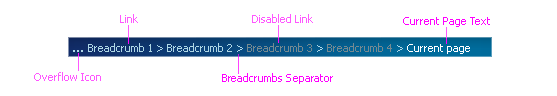
Breadcrumbs in Global Layer
Configurable Elements
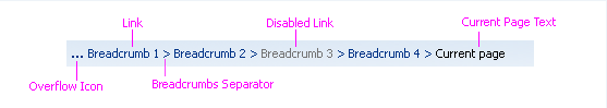
Breadcrumbs consist of the following elements: Links, Breadcrumb Separators, Current Page Text, and the Overflow Iconic Button (opens the Overflow Breadcrumb Selector).
Links
Purpose:
Identify and navigate to a higher level in the application hierarchy.
Description:
- Breadcrumb links are based on the Link component. See the Links guideline for details.
- Each link represents a unique page in the application hierarchy.
- If the number of links exceeds available horizontal space on page load, links at the start of the breadcrumbs move into the Overflow Breadcrumb Selector. Any links that have been shortened retain their shortened state within the Overflow Breadcrumb Selector.
- When the user resizes the browser window to be smaller, the links dynamically move into the Overflow Breadcrumb Selector.
Navigating Up with a Breadcrumb Link
Usage:
- The text of each link must match the title of the page that is being represented in the application hierarchy. Product teams may shorten long page titles.
- Breadcrumb text must clearly identify the pages in the hierarchy. For directions on shortening page title text, see Shortening Titles and Headers in the Language in UI guideline.
- The maximum number of links rendered on the page depends on the number of characters per link and the horizontal space available.
- Breadcrumb links may be disabled. Disabled links render as disabled text.
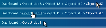
- If the user navigates to a page using a breadcrumb link, all breadcrumb links after the clicked link (including the level separator) should be removed once the new page loads, and the clicked link should become the Current Page Text.
Level Separators
Purpose:
Separate the links and text that represent different levels of pages in the application hierarchy.
Description:
- Breadcrumb level separators are "greater than" symbols (>) that are placed between each breadcrumb link. When the order of the trail is reversed for right-to-left languages, level separators are "less than" symbols (<) that separate each breadcrumb link.
- Level separators appear after all links; a breadcrumb separator does not appear after Current Page Text.
- Level separators appear within the Overflow Breadcrumb Selector.
Usage:
When page titles contain colon separators, the colons may also appear in individual Breadcrumb links and Current Page Text. Note that such use of colons in page titles has no effect on breadcrumb level separators.
Current Page Text
Purpose:
Identifies the current page in the breadcrumb sequence.
Description:
The Current Page Text string always appears at the end of the breadcrumb links.
Usage:
- Current page text should match the current page title.
- Current page text renders as read-only text.
- In sequential or non-sequential processes requiring a train, the current page text should match the overall process name rather than individual pages within the process.
- If the current page text is long, the application developer can shorten the text. For directions on shortening page title text, see Shortening Titles and Headers in the Language in UI guideline.
Overflow Breadcrumb Selector
Purpose:
Provides access to breadcrumb links that cannot fit into the space available for breadcrumbs.
Description:
- The Overflow Breadcrumb Selector is a type of inline selector. See the Secondary Windows guideline for details on inline selectors.
- The Overflow Breadcrumb Selector consists of an iconic button, a selection panel, and links.
- Breadcrumb links move into overflow when there is not enough space for the links. This may occur simply because the current page is nested deeply in the application hierarchy, or because the user has resized the application window so that it is too narrow to display the full set of breadcrumb links.
- Breadcrumb links move into overflow and are stacked starting with the first link in the sequence (representing the top of the application hierarchy), then the second, and so on.
- If the user increases the width of the window, breadcrumb links move out of overflow in the reverse order, starting with the last link.
- When all breadcrumb links are displayed, the overflow iconic button does not appear.
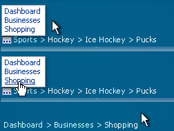
Navigating Up with an Overflow Breadcrumb Link
Overflow Iconic Button
Purpose:
Displays the Overflow Breadcrumb Panel.
Description:
- The overflow iconic button renders at the start of the breadcrumb link s.
- The overflow iconic button cannot be disabled.
- The tooltip for the overflow iconic button is 'Show More Links…'.
Overflow Panel
Purpose:
Displays higher-level links that do not fit in the Breadcrumbs area.
Description:
- The panel does not scroll horizontally or vertically; the height and width of the panel vary based on content.
- The panel floats on top of other page elements.
- The panel contains at least one link.
- By default, the panel appears above and start-aligned to the overflow iconic button. When there is not enough vertical space to display the entire panel in its default position, the panel appears below and start-aligned with the overflow iconic button.
Determining the Breadcrumb Path
The information architecture in most products consists of a top-down hierarchy, with a structure that could be displayed in an organization chart. Typically, each page has only one location within the application hierarchy, which is represented by the breadcrumbs, and each breadcrumb link consists of that page's title. There may be alternative methods to display that page, such as Search, but product teams should have no difficulty determining the breadcrumb path.
Path Through an Application Hierarchy
For detailed breadcrumb syntax for common page types, see Breadcrumb Syntax later in this guideline. The following subsections discuss cases where the path may not be so obvious.
Multiple Breadcrumb Paths
Some products may consist of an object structure that can be viewed in different ways. As a result, such products may provide multiple "correct" paths to navigate to a page from the top of the hierarchy. In these cases, breadcrumbs should be generated according to the following recommendations:
- If the user's navigation follows one of the "correct" paths, display the breadcrumbs for that path.
- If the user's navigation does not follow any of the correct paths, choose one path as the default, and display its breadcrumbs.
Example:
Based on the application's hierarchy, there are two correct paths to navigate to page F: A > B > D > F and A > C > E > F. If the user navigates from A to C to E to F (or even from just E to F), use the following breadcrumbs on page F: A > C > E > F. However, if the user navigates from page A to F, the product team must choose a default location which may be either A > B > D > F or A > C > E > F.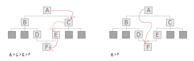
Two Paths Through an Application Hierarchy
Multiple Levels of Tabs
When an application has both level one and level two tabs, selection of a level one tab may also default to selection of the first level two tab. Consequently, on subordinate drill-down pages, breadcrumb links to both the parent tab and the level two tab would have the same target. To avoid this problem, combine the level one tab label with the level two label to form a single link in the breadcrumbs, using a colon (:) as a separator, such as "Projects: Overview". The colon should be appended directly to the level one tab label with one space before the level two label (no space in front of the colon and one space after it).
Breadcrumb Syntax
Breadcrumb text for each page should match the page header. To make breadcrumbs easier to read, syntax format is restricted to:
- Concatenated elements that are not delimited by angle brackets
- xxx = a page at another level (usually higher) within the hierarchy of the application
Object List Pages
| Application Contexts | Recommended Syntax | Examples |
|---|---|---|
| All | Breadcrumb may or may not be on object list page depending on location in application hierarchy.
If breadcrumb exists: xxx |
View and Edit Pages
| Application Contexts | Recommended Syntax | Examples |
|---|---|---|
| All | xxx > ObjectTypes |
xxx > Purchase Orders xxx > Employees xxx > Courses |
Drill Down from View and Edit Page
| Application Contexts | Recommended Syntax | Examples |
|---|---|---|
| When user drills down on a View and Edit Page to secondary/child object details like attachments or expense lines | xxx > ObjectTypes > PrimaryObjectBreadcrumb |
xxx > Expense Reports > Paris Trip xxx > Course Tests > Psych 101 |
Guided Processes
2-Step Process
| Application Contexts | Recommended Syntax | Examples |
|---|---|---|
| All | xxx > ObjectType Note: Same syntax as Multi-Page Non-Linear Process. |
xxx > Customers xxx > Contracts |
Drill Down from 2-Step Process
| Application Contexts | Recommended Syntax | Examples |
|---|---|---|
| If the two pages constitute a sequential process | Use the following syntax in most cases:
xxx > ObjectType > {Process Name:}{Step Name} Use the following shortened syntax when either the Process Name or Step Name becomes too lengthy: xxx > ObjectType > Process Name Note: See 3-Plus Step by Step Process (Wizard) for directions on assembling the Process Name. |
Full form:
xxx > Customers > Create Customer: Name Shortened Form: xxx > Customers > Create Customer |
| If the two pages represent an object with two parts | Use the following syntax in most cases:
xxx > ObjectType > {ObjectName:}{Step Name} Use the following syntax when either the ObjectName or Step Name becomes too lengthy: xxx > ObjectType v ObjectName |
Full form:
xxx > Contracts > Bob's Supplies: Renewals Shortened Form: xxx > Contracts > Bob's Supplies |
3-Plus Step Process (Wizard)
| Application Contexts | Recommended Syntax | Examples |
|---|---|---|
| All | No breadcrumbs with train. |
Drill Down from 3-Plus Step Process
| Application Contexts | Recommended Syntax | Examples |
|---|---|---|
| All | No breadcrumbs with train. |
Multi-Page Non-Linear Process
| Application Contexts | Recommended Syntax | Examples |
|---|---|---|
| All | xxx > ObjectType |
xxx > Customers xxx > Contracts |
Drill Down from Multi-Page Non-Linear Process
| Application Contexts | Recommended Syntax | Examples |
|---|---|---|
| When a process name exists | Use the following syntax in most contexts:
xxx > ObjectType > {Process Name:}{Step Name} Use the following syntax when either the Process Name or Step Name becomes too lengthy: xxx > ObjectType > Process Name |
Full Form:
xxx > Customers > Create Customer: Name Shortened Form: xxx > Customers > Create Customer |
| When a process name does not exist | Use the following syntax in most contexts:
xxx > ObjectType > {ObjectName:}{Step Name} Use the following when either the ObjectName or Step Name becomes too lengthy: xxx > ObjectType > ObjectName |
Full Form:
xxx > Contracts > Bob's Supplies: Renewals Shortened Form: xxx > Contracts > Bob's Supplies |
Master/Detail Pages
| Application Contexts | Recommended Syntax | Examples |
|---|---|---|
| All | Same as View and Edit Pages. |
Batch Detail and Processing
| Application Contexts | Recommended Syntax | Examples |
|---|---|---|
| All | See View and Edit Pages breadcrumbs.
Note: As the user cycles through the batch of detail objects, the last breadcrumb element changes from page to page, and does not append to the previous detail object breadcrumb. |
Browse Pages
| Application Contexts | Recommended Syntax | Examples |
|---|---|---|
| Root of Catalog | No breadcrumbs on primary page. | |
| Category Page | TabName | Clothes |
| Subcategory, sub-subcategory, and item names on Browse Pages | CatalogName > Category > SubCategory | Books > Art History > Modern Art |
Export and Import Options Pages
| Application Contexts | Recommended Syntax | Examples |
|---|---|---|
| If export or import options exist | See appropriate breadcrumb for drill-down page (depends on where the user drilled down from). |
Global Pages
| Application Contexts | Recommended Syntax | Examples |
|---|---|---|
| All | No breadcrumb on primary global page; follow breadcrumb standards for drill-down pages. |
Home Page
| Application Contexts | Recommended Syntax | Examples |
|---|---|---|
| All | No breadcrumb on home page.
Note: When drilling down from home page, breadcrumb is: "Home" |