Carousel Usage Guideline 

RCUX Document Version 5.0.0 for Oracle® Fusion Middleware 11g Release 1 Patch Set 1 (11.1.1.2.0)
Last Updated
02-Feb-2011
The Carousel is a browsing component which displays objects in a layout that mimics the carousel carnival ride, with objects rotating in a circular, simulated 3D space.
Related Guidelines
| Guideline | Section | For Information About |
|---|---|---|
| Search and Query | Quick Search | Details about Quick Search component |
| Slider | All | Details about Slider component |
| Breadcrumbs | All | Details about Breadcrumbs component |
Related ADF Elements
Refer to the ADF Faces Rich Client demos page to find demos and tag documentation for the ADF elements related to this component:
| ADF Element | Notes |
|---|---|
| af:carousel | Carousel component. |
| af:quickQuery | Enables a quick search. |
| af:inputNumberslider | Enables user to spin the carousel. |
| af:breadCrumbs | Indicates the path back to the root page in a hierarchy, with links. |
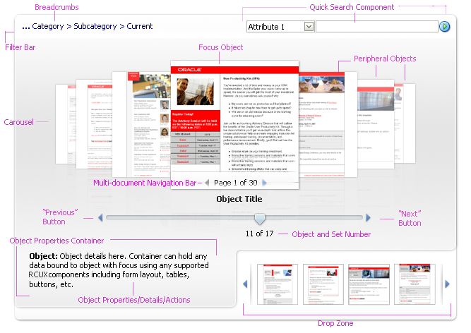
General Principles

Purpose:
The Carousel is a browsing component which displays objects in a layout that mimics the carousel carnival ride, with objects rotating in a circular, simulated 3D space.
Description:
- The Carousel component manages a group of objects that can be displayed horizontally or vertically.
- The carousel displays one Focus object and many peripheral objects. Clicking on any peripheral object will bring it to the center.
- Users can browse through carousel objects using either direct manipulation or the slider.
 |
 |
Two Views of Carousel Elements: Horizontal and Vertical Orientations
Usage:
- Carousel use cases include, but are not limited to: Browse Sales and Templates Collateral, Reference Rolodex, PIM Attachments, PIM Item Catalog, Reports Browsing, Portrait and Gallery View, and Shop for Products.
- The Carousel component may be used in both view-only and updatable pages.
- The Carousel component may be used as a stand-alone, browsing-driven component, or may be used in conjunction with other actionable components such as Breadcrumbs and Quick Search. In those cases, the accessory components may act as controllers of the carousel content. Accessory components allow users to navigate the hierarchy of carousel content and search for objects to be displayed within the Carousel component.
- Teams may add additional regions beneath the Carousel component, such as an Object Properties Container, Object Properties Details, or a Drop Zone.
- By default, the Carousel supports as many objects as available screen space will allow. However, teams can set the carousel to display a specific number of objects.
- It is recommended to include one carousel per page, and no more than two carousels per page. Including more than one carousel per page may be visually confusing for the user by making it unclear which slider controls a given carousel, or which drop zone belongs to a given carousel.
Configurable Elements
A Carousel component contains two configurable elements:
- Carousel
- Focus Object
Carousel
Purpose:
Allows users to browse objects in a circular, 3D simulated space.
Description:
- The carousel supports two orientations: horizontal and vertical.
- Object alignment: By default, the objects within the horizontal orientation of the carousel are vertically-aligned middle and the carousel itself is horizontally-aligned center within its container.
- Number of objects displayed within the carousel: By default, the carousel supports as many objects as available screen space will allow.
- Slider: By default, a slider accompanies the Carousel component. The slider assists users in browsing through objects within the carousel. Teams with limited space for the carousel component may opt to render the carousel without the slider.
- Carousel has the same performance constraints as the Table component that are associated with calculating the total number of objects in the carousel. When the total number of objects is too high to calculate, the thumb value on the slider will show only the current object number, rather than show the [current object number] of [the total object number]. An example might be a company's employee directory: by default the directory might show faces for every employee, but it may not know without an expensive database call that there are exactly 94,409 employees in the system that day. Another case would be where a total number of items would be too high to calculate after applying a filter on the data. For example, if the user executes a filter that causes the carousel to show only people working in a given VP's organization, the computation for that total number of employees might also be too expensive to compute.
- The Object Title label of a Carousel Object is configurable. See the Language in UI guideline.
Usage:
- Most use cases lend themselves to horizontal orientation. However, a reference rolodex is a good example of using a vertical orientation.
- Displaying objects: teams can set the carousel to display a specific number of objects, and may require more or fewer objects to be displayed simultaneously by the carousel, depending upon their use case.
- Teams can vertically-align the objects top or bottom, and horizontally-align the carousel left (start) or right (end).
- By default, the objects within the vertical orientation of the carousel are horizontally-aligned right (end) and the carousel itself is vertically aligned middle. However, teams can horizontally-align the objects center or left (start), and can vertically-align the carousel top or bottom.
- Carousel height and width: Generally the carousel should be placed in a parent component that stretches its children (such as a panelSplitter or panelStretchLayout). If not placed in such a parent component (generally a rare use case), the carousel must have some default dimensions or else nothing would appear; it is recommended that teams set the dimensions at 500px by 300px. If not being stretched by the parent component, teams can override these defaults.
- Object background color: Product teams may set the background color in each object container to complement their particular content.
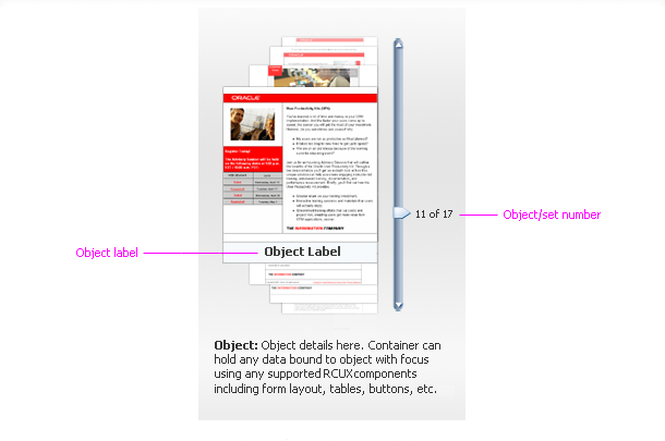
Focus Object
Purpose:
Shows users Details for one object within the carousel. Details allow users to make decisions and take actions.
Description:
- The Focus object consists of an image and an object title.
- The Focus object may be dragged out of the carousel and dropped into other acceptable drop targets such as a drop zone container, table, or a tree.
- Focus object tooltips are configurable. See Language in UI.
Usage:
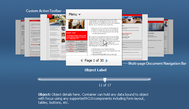
Focus Object Mouseover State
Teams can specify that focus objects show the following subcomponents on mouseover:
- Custom Action Toolbar - recommended if focus object supports custom actions.
- The custom action toolbar may contain a menu or toolbar component. It adheres to the same usage heuristics as the regular FusionFX toolbar. See Toolbars usage guideline.
- The custom action toolbar should be used when a use case requires that the user be able to perform actions directly on the focus object. Examples of custom actions include delete, add to favorites, and preview.
- Multi-page Document Navigation bar - recommended if focus object contains multiple pages.
- When supported, the multi-page document navigation bar appears on mouseover of the focus object. The multi-page document navigation bar should be used when objects within the carousel contain multiple pages. This allows users to navigate and preview the pages within the focus object, and to distinguish between objects.
- The multi-page document object has a "key" page. This page is a designated page within the document that acts as the document's cover page. By default, the "key" page is the first page; however teams can set any page of a multi-page document to be the "key" page.
Accessory Subcomponents
Filter Bar
Purpose:
The filter bar allows the user to filter objects within the carousel and take actions on the carousel. Teams may add the filter bar above the carousel.
Description:
- The filter bar may contain accessory components such as breadcrumbs, menu bar, toolbar, and quick search.

Filter Bar Featuring Accessory Components
Usage:
- Teams can configure the Filter Bar in various layouts, depending on their needs.
- The Filter Bar should be used in situations when users are allowed to filter objects displayed in the carousel, navigate an object hierarchy, search for objects, switch Object views (grid vs. carousel), or perform actions on all objects displayed within the carousel.
Object Properties Container
The Object Properties Container is a region that displays details about the focus object.
Purpose:
When added by teams, the Object Properties Container displays additional details about, or actions for, the focus object.
Description:
- Teams can place any type of data within this container, including actions or other components. The Object Properties Container updates when a peripheral object becomes the focus object. It does not update when the user rotates the carousel quickly.
Usage:
- Any users who need to see information in addition to the Object Title would benefit from the Object Properties Container.
Drop Zone
Purpose:
Teams may add a Drop Zone, which is a container in which users may place instances of carousel objects for some later operation, such as side-by-side comparison, collage, or group actions.
Description:
- The Drop Zone may be an empty container or a container with a toolbar and menu bar.
Usage:
- It is recommended to add the Drop Zone when users will benefit from object comparison, object grouping, or object collage in order for them to take actions on objects or make task related decisions.
Custom Actions
Purpose:
Allow the user to perform custom actions on the focus object.
Description:
- Custom actions are provided by product teams.
- Custom actions appear within the focus object custom action toolbar.
Usage:
- Custom actions should be used when a use case requires that the user be able to perform actions directly on the focus object.
- Examples of custom actions include: delete, add to favorites, and preview.