ContextInfo Usage Guideline 

RCUX Document Version 5.0.0 for Oracle® Fusion Middleware 11g Release 1 Patch Set 1 (11.1.1.2.0)
Last Updated
02-Feb-2011
The contextInfo component launches a pop-up dialog that provides additional contextual information or related actions for a specific item on a page.
Related Guidelines
| Guideline | Section | For Information About |
|---|---|---|
| Secondary Windows | Dialog Boxes | Details about dialog guidelines. |
Related ADF Elements
Refer to the ADF Faces Rich Client demos page to find demos and tag documentation for the ADF elements related to this component:
| ADF Element | Notes |
|---|---|
| af:contextInfo | Contextual Information component. |
| af:dialog | Dialog component for showing contextual information. |
| af:popup | Container for pop-up dialog. |
General Principles

Purpose:
The contextInfo component provides an affordance for showing a pop-up dialog that provides additional contextual information or related actions for a specific item on a page. Contextual Info conserves space by presenting a small, temporary box of related information over the existing page when invoked by the user.
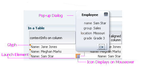
ContextInfo Elements: Default-State Glyph, Launch Element, Icon, and Pop-Up Dialog
Description:
- The contextInfo component displays a glyph in any field where contextual actions are enabled on that region.
- On mouseover, the glyph becomes an icon, which users click to open contextual information that usually appears in a dialog box. See Dialog Boxes in the Secondary Windows usage guideline.
- The contextInfo component is supported only on input/output text, table cells, drill-down links, Select Choice lists, and LOV choice lists.
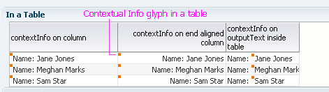
ContextInfo Glyph (Shown in a Table Cell)
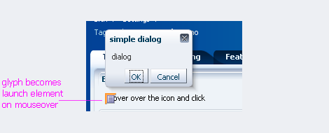
Clicking on Glyph Launches contextInfo Pop-Up Dialog
Usage:
- The contextInfo component is useful for presenting types of contextual information that can enable a user to quickly access data, other parts of the work area, or tools that support collaboration with others.
- Use Contextual Info when it is necessary to show additional contextual information for a specific item on a page, for example, to show a full contact card associated with an employee name.
- Use Contextual Info when users may benefit from having supplemental information or actions immediately available without leaving the current page, or when the information being presented is needed only temporarily.
- Contextual Info should not be used if the actions contained within it require the user to update or refresh the launching page, for example, if the pop-up dialog contains the same field as the launching page.
- When using input components, if a user enters invalid data, the icon should not display. If the user enters valid data but contextual information isn't available, clicking on the icon should display a message explaining why the information isn't available.
Pop-Up Dialog
Purpose:
Contains related information, images, titles, links, and icon buttons.
Usage:
- Actions and information in the contextInfo pop-up dialog should be grouped according to usage.
- A pop-up dialog should be as small as possible to avoid clutter; it should take up no more than one-quarter of a page.
- The pop-up dialog should not contain editable widgets, because there is no way to undo or explicitly commit changes.
- Actions in the pop-up dialog may:
- Take users to a different point in the current work area.
- Take users to a different work area.
- Open another pop-up.
- Open another browser window.
- Launching, navigating, nesting, and moving from the pop-up dialog should comply with existing dialog guidelines. See Secondary Windows guideline for more information.