Gantt Chart Usage Guideline 

RCUX Document Version 5.0.1 for Oracle® Fusion Middleware 11g Release 1 Patch Set 1 (11.1.1.2.0)
Last Updated
01-Oct-2010
A Gantt Chart is a common planning tool that graphically displays projects and resources on a timeline.
- General Principles
- Types of Gantt Charts
- Configurable Elements
- Menu
- Toolbar
- Task / Resource List
- Chart Region
- Information / Legend Panel
- Dialogs
- Common Actions
Related Guidelines
| Guideline | Section | For Information About |
|---|---|---|
| Menus | Component Menus | Using menus with components. |
| Toolbars | Component Toolbars | Using toolbars with components. |
| Tree | All | Tree actions and information display. |
Related ADF Elements
Refer to the ADF Faces Rich Client demos page to find demos and tag documentation for the ADF elements related to this component:
| ADF Element | Notes |
|---|---|
| dvt:projectGantt | Project Gantt Chart component. |
| dvt:schedulingGantt | Scheduling Gantt Chart component. |
| dvt:resourceUtilizationGantt | Resource Utilization Gantt Chart component. |
General Principles

Purpose:
A Gantt chart graphically displays projects or resources over time. A Gantt chart is a common tool for representing activities, schedules, and resource allocation.
Users can pan and zoom the Gantt chart, enabling them to examine projects through time and at multiple levels of detail.
- Three types of Gantt charts are provided:
- Project Gantt: Shows task progress over time. Several different types of tasks may be represented.
- Scheduling Gantt: Shows how resources are allocated to projects and tasks over time.
- Resource Utilization Gantt: Shows the extent to which resources are utilized over time.
Description:
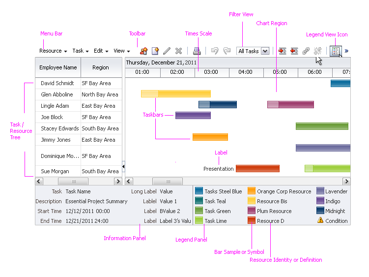
- A Gantt chart displays a tree or list of items on the left and a bar chart on the right, separated by a vertical splitter. In bi-directional layout, the tree appears on the right and the chart appears on the left.
- A menu bar and toolbar appear at the top and a collapsible information / legend panel appears at the bottom, displaying task or resource details and a key.
- Users can pan and zoom along the Time Scale to scan and view information over the long term, the short term, or somewhere in between. See Time Scale for details.
Scheduling Gantt Chart
Usage:
- When the user returns to the Gantt chart from a previous session, it is recommended to restore the Gantt chart to the state it had in the user's previous session. That is, the list should scroll to the previous location, tree nodes should appear expanded or collapsed according to the previous session, the time scale should be the same as previously, and the Chart Region should show the same time period as previously.
- It is recommended to show tasks and resources in a tree rather than in a list, so that users can control the number of rows shown by collapsing and expanding the tree as needed. For example, tasks can be combined into projects, whereas resources can be combined into groups. See the Tree guideline for more information.
- It is recommended that an application dedicate as much space as possible to the Gantt chart so that users can see the overall structure of the chart, particularly if there are more than about 20 tasks or resources.
- It is recommended to have the current date in view when the Gantt chart first appears on the page, so that users may easily orient themselves. If the current date is not available, show the most recent date or the nearest date instead.
Types of Gantt Charts
Project Gantt Chart
Purpose:
Shows project progress over time. Promotes active project management by showing where projects may be behind schedule or ahead of schedule.
Description:
- Each item in the list represents a task or project.
- Each item in the list may display only one taskbar in the chart region.
- Many standard types of taskbars are provided. See Project Gantt Chart Taskbars for details.
Usage:
Use the Project Gantt chart to show a task-centered view of a project, rather than a resource-centered view.
Project Gantt Chart
Scheduling Gantt Chart
Purpose:
Shows how resources are allocated to projects and tasks over time. Provides a resource-centered view of projects that enables comparisons among resources.
Description:
- Each item in the list represents a resource, such as a person or a machine.
- Each item in the list may display one or more taskbars in the chart region.
- Taskbars may show non-working time. See Taskbar With Non-Working Time for details.
Usage:
Use the Scheduling Gantt chart to show a resource-centered view of a project (rather than a task-centered view), or to show how each resource's time is occupied.
Scheduling Gantt Chart
Resource Utilization Gantt Chart
Purpose:
Shows how resource time is used during specific time periods. Promotes efficient resource management by showing when resources are over-utilized or under-utilized.
Description:
- Each item in the list represents a resource, such as a person or a machine.
- Each item in the list is associated with a series of Time Buckets in the chart region. See Time Buckets for details.
- Each Time Bucket in the chart region may contain one or more Metric Bars. See Metric Bars for details.
Usage:
Use the Resource Utilization Gantt chart to show how resource time is used during specific time periods.
Resource Utilization Gantt Chart
Configurable Elements
Menu
Purpose:
Provides access to common actions and commands. See the Menus guideline for more information.
Description:
- The menu is required and appears above the Gantt chart, next to the toolbar.
- Product teams may customize the menu region by by adding new menus and menu items.
- Custom menus appear after the default menus.
Usage:
Same as Component Menus in the Menu guideline.
Toolbar
Purpose:
Provides access to common actions and commands. See the Toolbars guideline for more information.
Description:
- The toolbar is required and appears above the Gantt chart, next to the menu region.
- Product teams may customize the toolbar by disabling default items or by adding new items.
- When an action or command that has a toolbar button is enabled, its toolbar button appears automatically. Conversely, when an action or command is not enabled, its toolbar button is hidden automatically.
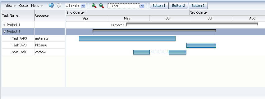
The following figure shows a typical toolbar for the Project Gantt chart.
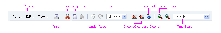
Project Gantt Toolbar
Usage:
- If an application requires custom toolbar actions, it is recommended to create an additional custom toolbar for those actions rather than add items to the default toolbar. Custom toolbars should appear below the default toolbar.
- The Zoom feature should be provided in cases when a user may need to alternate often between different time scale levels in a large Gantt chart. For instance, zooming enables the user to compare project durations at a high level, or view a specific project at a particular time interval.
- Zooming using the scroll wheel is a direct manipulation action; users can alternatively keyboard-navigate to the Zoom controls in the toolbar to perform the zoom action.
- The tooltip may be used to provide additional details about Zoom levels during scrolling. For instance, if a chart spans multiple years, the tooltip can indicate the time interval currently being viewed.
See Component Toolbars in the Toolbars guideline for more usage information.
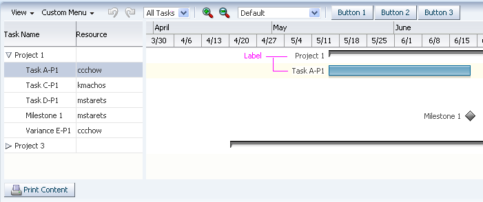
Task / Resource List
Purpose:
Shows a list of tasks or resources. The list may appear as either a flat list or as a collapsible tree.
Description:
- Each row in the list for a Project Gantt contains information about a project.
- Each row in the list for a Scheduling Gantt or Resource Utilization Gantt contains information about a resource.
- Each row in the list corresponds with a row in the chart region.
- Product teams can set the width of the task / resource list.
Usage:
- It is recommended to group individual tasks and resources and show them in a tree rather than in a list, especially when the number of tasks or resources causes the list to show a vertical scroll bar. For example, in the Project Gantt chart, individual tasks could be combined into projects, whereas, in the Scheduling and Resource Utilization Gantt chart, resources could be combined into departments or other groupings.
- Tasks in the list should include columns for task name, resource name, start date, and end date, at a minimum.
- Resources in the list should include a column for resource name at a minimum.
- The most important information should appear in the first column so users will see it first. In most cases, this will be the task or resource name.
- It is recommended to set the width of the task / resource list such that the user can see the most important columns of item information without scrolling or resizing. In most cases, one to three columns should be visible by default.
Chart Region
Purpose:
Shows the tasks or time buckets associated with items in the Task / Resource List.
Description:
The chart region is required and is the primary information display region of a Gantt chart.
The chart region may contain the following elements:
Time Scale
Purpose:
The time scale is a timeline along which taskbars and time buckets are plotted. Users can zoom the time scale in and out to see different levels of detail in the chart region.
Description:
- The time scale is required and appears horizontally across the top of the chart region, along its entire width.
- The time scale has a major axis, which shows larger units of time, above a minor axis, which shows smaller units of time. The major axis always shows larger units of time than the minor axis. For example, if the major axis shows Months, the minor axis could show Weeks or Days.
Usage:
- It is recommended to set the time scale such that the user can see the entire project when the Gantt chart first appears. For example, if a project will take four months, set the major axis to Half Years and the minor axis to Months.
- It is recommended to set the units of time for the major axis and minor axis to values that are close together. For example, if major axis time units are Years, minor axis time units should be Months or Quarters, rather than Weeks. Using very different units in the axes makes the Gantt chart difficult to read.
Taskbars
Purpose:
Taskbars represent tasks and appear in the chart region of the Project and Scheduling Gantt charts. Taskbars can be linked, resized, and moved.
Description:
- A taskbar is a horizontal bar whose length is proportional to the duration of the task it represents.
- There are several different types of taskbars. See Project Gantt Chart Taskbars and Taskbar With Non-Working Time for more information.
- A taskbar can stretch across several time periods, depending on its duration. On the other hand, metric bars occupy a single time period.
- Taskbars can include labels and icons. See Taskbar Labels and Taskbar Icons for more information.
Usage:
- In a Project Gantt chart, it is recommended to use the different types of taskbars provided to represent different types of tasks. See Project Gantt Chart Taskbars for details.
- In a Scheduling Gantt chart, it is recommended to use different taskbar colors to represent different types of tasks. For example, taskbars representing vacation time might use one color, while taskbars representing work time might use another color.
Project Gantt Chart Taskbars
Description:
The Project Gantt chart includes several conventional types of tasks used in project planning.
These taskbar types may not be used in the Scheduling or Resource Utilization Gantt chart.
| Task Type | Example | Description | Usage |
|---|---|---|---|
| Summary |  |
Represents the total duration and total progress of several sub-tasks. | Use to show progress for a project made up of several sub-tasks. |
| Milestone |  |
Marks a significant milestone during a project. | Use to highlight important project objectives. |
| Standard | 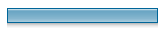 |
Represents a task using start and end time. | Use for shorter tasks or for tasks that do not require progress feedback. |
| Progress | 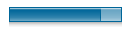 |
Represents a task using start time, end time, and a progress indicator. The dark fill indicates the extent of progress. |
Use for longer tasks or for tasks that require visible progress feedback. |
| Variance | 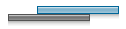 |
Represents a task using start time, end time, and a variance indicator. The bar on top represents actual start and end times, whereas the bar underneath represents the task's "baseline" — the original start and end times. |
Use when a task's start date is imprecise, or when task timing changes and the original timing needs to be recorded. |
| Progress Variance |  |
Combines the Progress and Variance task types. | Same as Variance task, plus the task also requires visible progress feedback. |
Note: Each of the taskbar types shown here also has a "Critical" style that appears in red. Use the Critical style sparingly— only for a project's most important tasks and milestones.
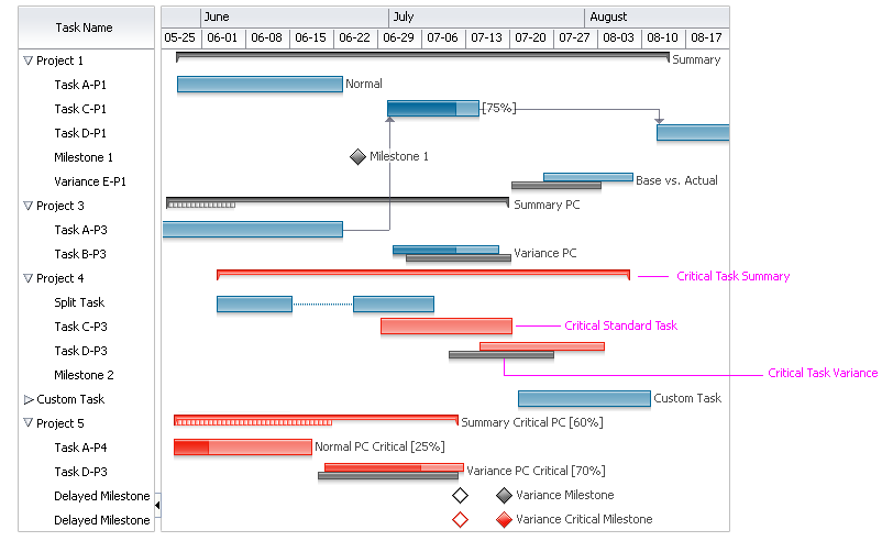
Project Gantt Chart with Critical Tasks
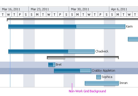
Taskbar With Non-Working Time
Purpose:
Shows a portion of a task as non-working time or downtime. Applies to the Scheduling Gantt chart only.
Description:
- Non-working time is optional and is shown using a lighter version of the taskbar color. The width of the lighter section is proportional to the duration of non-working time.
- Non-working time may appear only at the start of a taskbar, and only once per taskbar.
Usage:
Show non-working time in a taskbar when the task has a set start time but cannot begin until after a known period of downtime. For example, if a person is scheduled to start work on his report at 10:00, but he is traveling from 10:00 to 12:00, the two hours from 10:00 to 12:00 could be shown in the taskbar as non-working time.
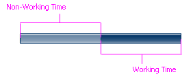
Taskbar With Non-Working Time
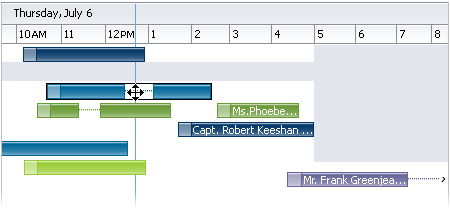
Taskbar Labels
Purpose:
Labels a taskbar. Applies to Project and Scheduling Gantt charts only.
Description:
A taskbar may have a single label, and it may appear before, inside, or after a taskbar.
Taskbar Labels: Project Gantt Chart
Taskbar Labels: Scheduling Gantt Chart
Usage:
- Generally speaking, it is recommended to hide taskbar labels by default, and to enable users to turn them on and off.
- In the Project Gantt chart, the label should show the name of the resource assigned to the task, so that users can see to whom tasks are assigned when the Task / Resource List pane is hidden.
- In the Scheduling Gantt chart, the label should show the name of the task, because each resource can have multiple tasks assigned, and labels help users tell the tasks apart.
- It is recommended to show a taskbar label after the taskbar to facilitate reading and to help users associate the label with the taskbar.
- Short labels can be placed inside long taskbars, and the text will be start-aligned, so that users do not need to scroll horizontally to the end of the taskbar to view them
- A label inside a taskbar may automatically truncate if the text string is longer than the taskbar, or when the user resizes the taskbar such that its width is less than that of the label. See Truncation in the Headers guideline for information.
- If labels that are placed on either side of a taskbar extend beyond available space in the chart, teams may wish to manually truncate the labels as necessary. See Manual Truncation in the Input/Output Text guideline for information.
Truncated Text String Inside Taskbar Labels
Taskbar Icons
Purpose:
Graphically shows status or other information associated with a taskbar. Applies to Project and Scheduling Gantt charts only.
Description:
- Each taskbar may include up to three icons, and they may appear before, inside, or after the taskbar.
- Product teams must provide their own icons.
Usage:
- Adding icons to taskbars can clutter the display, so use them sparingly.
- Use icons to call the user's attention to one or a few taskbars that are exceptional in some way. For example, a warning icon might be used to show that a certain task is behind schedule.
- It is not recommended to show more than one icon in a taskbar at a time.
- Each type of icon should appear in the legend with a label explaining what it represents.
- Icons should be 12px by 12px so they appear flush with taskbars.
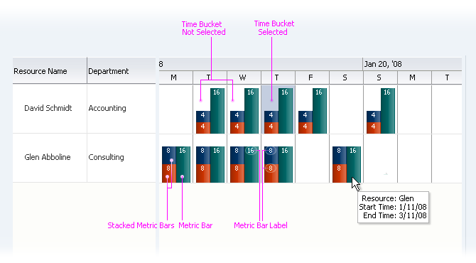
Time Buckets
Purpose:
Time Buckets represent distinct periods of time in the chart region of a Resource Utilization Gantt chart. A Time Bucket can contain metric bars.
Description:
- Time buckets are required and are cells formed in the chart region by the intersection of resources in the Task / Resource List and the time scale.
- Time Buckets represent discrete periods of time along the time scale. Each time bucket for a particular time scale is the same size.
- Whereas a Taskbar may occupy multiple time periods, each Time Bucket occupies a single time period.
- A time bucket may contain zero or more metric bars.
- A Time Bucket may show a single tooltip on mouseover. Product teams decide what appears in the tooltip.
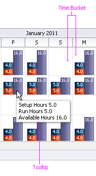
Time Bucket Tooltip
Usage:
It is recommended to always show a tooltip on a Time Bucket when it contains metric bars. The tooltip should show the labels, values, and units for each metric bar in the Time Bucket.
Metric Bars
Purpose:
Metric Bars graphically show how the time represented by a Time Bucket is accounted for. Applies to Resource Utilization Gantt chart only.
Description:
- A metric bar is an optional vertical bar whose height represents an amount of time.
- Each metric bar in a Time Bucket represents a portion of the total amount of time in a Time Bucket. The height of each bar is proportional to the amount of time the bar represents.
- Product teams decide what metric bars represent and how many stacks to show.
- Each metric bar may have a label.
- More than one metric bar may appear in the same Time Bucket. Bars may stack and more than one stack may appear in a Time Bucket.
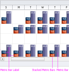
Metric Bars
Usage:
- It is recommended to show a label on each metric bar indicating the amount of time it represents.
- It is recommended to stack metric bars when they represent associated data. For example, in the figure above, the bars in the stack might represent a person's time at work, whereas the single tall bar might represent a person's time away from work.
- To ensure readability, it is not recommended to stack more than a few bars or to show more than a few individual stacks or bars.
Gridlines
Purpose:
Gridlines delineate Gantt chart rows. Applies to Project and Scheduling Gantt charts only.
Description:
Gridlines are optional lines that appear between rows in the Gantt chart. By default, gridlines do not appear.
Usage:
- Generally speaking, gridlines are not recommended, because they add visual clutter that makes the chart harder to read. However, gridlines may be helpful when there are very few tasks in the Gantt chart, or when the Gantt chart is very wide, making it difficult to visually associate an item in the Task / Resource List with its taskbar.
Current Time Indicator
Purpose:
Indicates the current time in the chart region. Applies to Project and Scheduling Gantt charts only.
Description:
- The current time indicator is an optional vertical line that extends from the current date of the time scale across the entire height of the chart region.
- The current time indicator overlays all other items in the chart region.
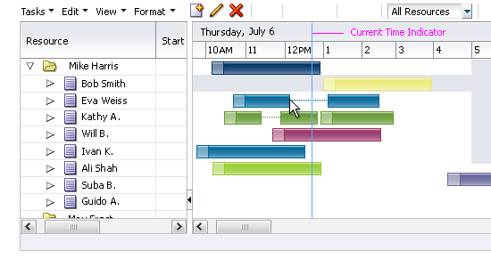
Current Time Indicator
Usage:
- It is recommended to always show the current time indicator.
- Product teams may customize the indicator color. It is recommended to use a color that contrasts well with the taskbars.
Non-Working Days
Purpose:
Highlights particular days of the week that are considered non-working days, such as Saturday and Sunday. Applies to Project and Scheduling Gantt charts only.
Description:
- The non-working day color is an optional background color that is applied to the days of the week that teams define as non-working days. The color is applied across the entire height of the chart region.
- The non-working days color appears underlies all other items in the chart region.
Non-Working Days
Usage:
- The non-working day color is recommended when the same non-working days (such as Saturday and Sunday) recur over a project's life span.
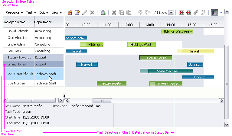
Information / Legend Panel
Purpose:
Shows information about the selected Task or Time Bucket in the first half, and a legend in the second half.
Description:
- The information / legend panel is optional. Users may hide and show it by using the View menu or a toolbar button.
- The height of the panel is fixed and may not be changed.
- The first 50% of the panel is dedicated to the information region, and the second 50% is dedicated to the legend region. These sizes may not be changed.
- Users may not edit items in the panel.
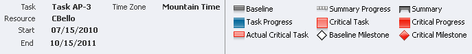
Information / Legend Panel for a Project Gantt Chart
Usage:
- Product teams may customize the content appearing in each region, and may show a single region instead of two. If a single region is shown, it occupies the entire width of the panel.
- It is recommended to show only the most important information in the information region. Showing too many items will cause horizontal scroll bars to appear, reducing readability.
- If only the information region is shown, more items may be shown without causing horizontal scrolling.
- It is recommended to always include the legend region unless there is only one kind of graphic or one bar color shown in the Gantt chart.
Dialogs
The Gantt chart includes the following dialogs:
Properties Dialog
Purpose:
Enables the user to view and update many properties for a particular Task or Time Bucket, and to perform several actions for a particular Task. There is no properties dialog for Resources.
Description:
- By default, the Task Properties dialog includes the General, Predecessors, Splits, and Attributes tabs. Users open the dialog from either the Task menu or the Taskbar context menu.
- By default, the Time Bucket Properties dialog includes only the General tab. Users open the dialog from either the Time Bucket menu or the Time Bucket context menu.
- Properties dialog tabs:
- General: Shows key information for the selected task or time bucket. Enables users to update some information.
- Predecessors: Shows a table of dependencies with other tasks. Enables the user to change dependencies. See Add Predecessor Dialog for more information.
- Splits (Project Gantt only): If the task is split, shows a table of its split sections in date order. Enables the user to further split a task and to merge existing splits.
- Attributes: Shows a read-only table of text-based information that teams define.
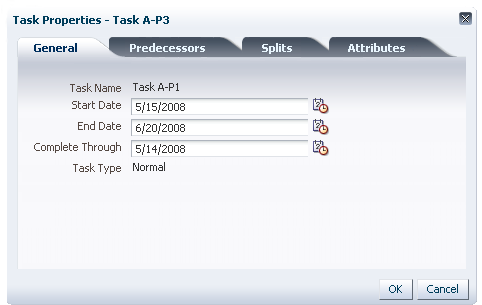
Properties Dialog for a Task, General Tab
Usage:
- Product teams decide what information to show in the table on the Attributes tab.
- It is recommended to show additional task information on the attributes tab, so users can refer to it if needed.
- Showing more than eight pieces of information in the Attributes tab is not recommended, as this will cause the content area to scroll.
- Other default tabs are not customizable.
- Product teams may add one additional tab to the dialog and may customize its contents. If a tab is added, it will appear as the last tab.
Add Predecessor Dialog
Purpose:
Enables users to create a dependency between two tasks. Only the Project Gantt and Scheduling Gantt include this dialog, since it refers to tasks.
Description:
- The Add Predecessor dialog is a modal dialog that contains a list of tasks and a list of dependency types. See the Secondary Windows guideline for more information.
- Users open the dialog from the Predecessors tab in the Properties dialog.
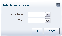
Add Predecessor Dialog
Usage:
Projects in the list should appear in the same order as they appear in the Task / Resource List.
Go To Date Dialog
Purpose:
Pans the View to a particular date.
Description:
- The Go to Date dialog is a modal dialog that pans the View left or right such that the selected date appears first, but does not change the time scale zoom level.
- Users open the dialog from the View menu.
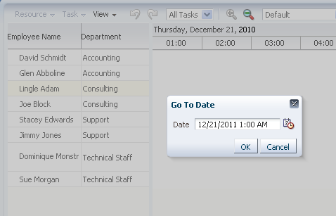
Go To Date Dialog
Usage:
Product teams should restrict the range of valid dates and times to be within the first and last dates in the Gantt chart, inclusive. For example, if the Gantt chart is configured to show information between 01-Feb-2010 and 30-Jun-2011, then dates outside this range should be invalid.
Time Scale Dialog
Purpose:
Enables users to change time scale axes. See Time Scale for more information.
Description:
- The Time Scale dialog is a modal dialog that shows the values of the major and minor time axes and a sample of the time scale that changes based on the axis settings.
- The major axis time period must always be larger than the minor axis time period.
- Users open the dialog from either the View menu or the Time Scale context menu.
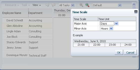
Time Scale Dialog
Usage:
- The built-in major and minor axis time periods are defined so that invalid combinations are not allowed. For example, choosing a major axis value of Weeks and a minor axis value of Months is not allowed. However, if teams add custom time periods, they must ensure that invalid combinations are disallowed.
Common Actions
Print
Product teams can build a custom Print function for the Gantt chart.
If Print is enabled, it appears automatically in the toolbar and/or menu.
Create
Applies only to Tasks and Resources. Same as Create in the Tree guideline.
If Create is enabled, it appears automatically in the toolbar and/or menu.
Note: The Scheduling Gantt chart can have both a Create Task action and a Create Resource action.
Update
Applies only to Tasks and Resources. Same as Edit in the Tree guideline, except that Update may also be accessed using the Taskbar context menu.
If Update is enabled, it appears automatically in the toolbar and/or menu.
Delete
Applies only to Tasks and Resources. Same as Delete in the Tree guideline, except that Delete may also be accessed using the Taskbar context menu.
If Delete is enabled, it appears automatically in the toolbar and/or menu.
Note: Delete removes an item from both the Gantt Chart and from the database.
Cut, Copy, Paste
Product teams can build custom Cut, Copy, and Paste functions for tasks or resources.
If Cut, Copy, and Paste are enabled, they appear automatically in the toolbar and/or menu.