Input/Choose Date Usage Guideline 

RCUX Document Version 5.0.1 for Oracle® Fusion Middleware 11g Release 1 Patch Set 1 (11.1.1.2.0)
Last Updated
10-Aug-2010
The Input/Choose Date component allows a user to pick a date and time to populate a field.
Related Guidelines
| Guideline | Section | For Information About |
|---|---|---|
| Common Formats | Dates and Time Formats | General information and internationalization issues for date and time fields. |
| Secondary Windows | Inline Selectors and Modal Dialogs | Used with Inline Date Selector and Select Date and Time Dialog. |
Related ADF Elements
Refer to the ADF Faces Rich Client demos page to find demos and tag documentation for the ADF elements related to this component:
| ADF Element | Notes |
|---|---|
| af:chooseDate | Allow users to select date values without navigating to a secondary window. |
| af:inputDate | Creates text field for entering dates or a glyph to open a pop-up for picking dates. |
General Principles

Purpose:
The Input/Choose Date component is a graphical method to populate a text field with a date, with a time, or with both date and time.
Description:
- Users can select a date or time from the calendar or manually enter the date or time in the associated text field.
- Development teams can restrict the range of valid dates and times for a date field. These restrictions are shown graphically in the Input/Choose Date component. See Calendar for details.
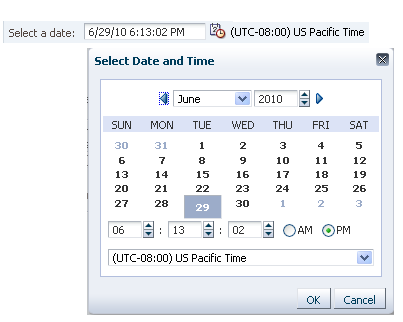
Select Date and Time Dialog Box
Usage:
- Input/Choose Date is recommended whenever users need to enter dates and times, because it allows users to see dates within the context of a calendar, and helps users enter dates and times in the proper format. At the same time, the Input/Choose Date component occupies little space, and users who are familiar with the date format also have the option to enter dates and times manually.
- The Input/Choose Date component can be used in a form layout, or in a table cell.
- The recommended default width for the text field is 30 characters (EMs) or 170 pixels when displaying both date and time, and 20 characters (EMs) or 120 pixels when displaying date only.
- If a date-time field is a required field, and the user leaves it blank, then an error message should be displayed when the user attempts to apply changes to the page, just as with any other required field. Required fields should follow the same validation rules as optional fields. See Manual Entry of Date and Time for details on validation.
Input/Choose Date Types
The Input/Choose Date component may be configured as:
- An inline selector with a calendar, but without time fields.
- A dialog box with both a calendar and time fields.
See the Secondary Windows guideline for details about inline selectors and dialog boxes.
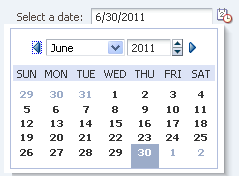
Inline Date Selector
Usage:
- The Input/Choose Date component supports selecting dates only in the inline selector, and selecting both date and time in the dialog box.
- When a specific time is not required, it is recommended to use the Inline Date Selector because it allows users to select dates without the extra clicks needed to launch and close a dialog box.
- Time fields require little space, and can be placed directly on the page if there is a need for time information without dates. If the time data is infrequently updated, consider using the Select Date and Time dialog box, or combining the time fields with other less used options in a separate dialog box or drill-down page. For details on implementing time fields, see the Common Formats guideline.
- The Inline Date Selector is best used for dates that are within three months of the current date, whereas the Select Date and Time dialog box is a better choice when dates are are likely to be further in the future or past.
Examples:
- The Inline Date Selector may be used:
- By a travel administrator to book a hotel room for a certain number of days.
- By a Human Resources specialist to set the start and end dates for a contractor.
- The Select Date and Time dialog box may be used:
- By a travel agent to book a flight at a certain date and time.
- By a system administrator to set the operation time of a database in a different time zone location.
Input/Choose Date Elements
The following image shows the principal Input/Choose Date elements:
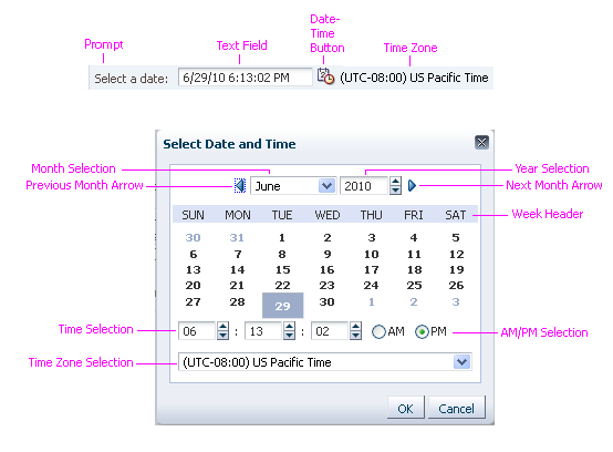
Input/Choose Date Elements in Dialog Box and Using Manual Entry of Date and Time
Date-Time Button
Purpose:
Launches the Input/Choose Date component.
Description:
- The same Date-Time button is used to launch all variations of the Input/Choose Date component.
- The Date-Time button is an iconic button. A tooltip on the button describes its function: either "Select Date" or "Select Date and Time."
- Users can manually enter data in the date-time field instead of clicking the Date-Time button. See Manual Entry of Date and Time for details.
Usage:
Only one Date-Time button can be associated with a single field. If multiple fields need date-time selection, each field has its own Date-Time button.
Calendar
Purpose:
Allows the user to select a date.
Description:
- By default, the calendar consists of a Month choice list, a Year spin box, Previous and Next Month arrow buttons, a week header, and days of the month.
- If the target field contains a date, this date is reflected in the calendar (month, year, active date); if the target field is empty, the current date is reflected in the calendar.
Usage:
- Development teams can show certain days in the calendar as disabled by setting a date range minimum and maximum, or by adding a validator.
- Certain dates or date ranges may not be available or valid for the task, such as public holidays, or dates when a resource is already booked.
- Certain days of the week may not be valid for the task, such as weekends.
- If minimum and/or maximum values are set, help text should be shown for the date field indicating the restriction, such as:
- Choose a date between 15-Mar-2010 and 15-Mar-2011.
- Choose a date within one of the following ranges:
- 15-Mar-2011 - 29-Mar-2011
- 12-Apr-2011 - 26-Apr-2011
- 10-Mar-2011 - 24-May-2011
- If a month is selected in which there are no valid dates, then all the dates in the month should be disabled.
- The user should be able to navigate to a year even if the all the dates in the year are invalid. All the dates in the year should be shown as disabled.
- Validation should not immediately occur when the user clicks the Next and Previous Month arrow buttons, or makes selections in the Month choice list, Year spin box, or time fields. The date and time should not be validated until selections are complete.
Time Fields
Purpose:
Select a time in hours and minutes, and optionally in seconds.
Description:
- Time fields consist of a set of spin boxes for hours, minutes, and seconds. See the Spinbox guideline for details.
- Time fields are only provided in the Select Date and Time dialog box (not in the Inline Date Selector).
- Time information is always appended after the date information in the target text field, separated by a single character space.
Usage:
- If time information is not required, the Inline Date Selector is preferred over the Select Date and Time dialog box.
- Validation should not immediately occur when the user makes selections in the hours, minutes, and seconds spin boxes. The time should not be validated until selections are complete.
Time Zone Field
Purpose:
Allows the user to select a different time zone.
Description:
- The Time Zone field is a choice list containing a list of time zones, sorted by UTC offset (Coordinated Universal Time), as shown in the image below.
- The Time Zone field shows the default time zone of the target field. If the target field is blank, then it defaults to the time zone of the user's locale.
- If users are allowed to change the time zone of a field, then the Time Zone field is presented as a choice list. If users are not allowed to change the time zone of a field, the time zone is displayed as read only.
- The time zone information always appends after the time information, either separated by a single character space, or appended as read-only text to the date-time field.
- The time zone display format is not configurable.
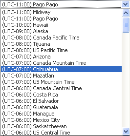
Time Zone Choice List
Usage:
- Time zone selection should be enabled when the task requires the user to specify a time zone that is different from the user's locale. For example, a call center support rep located in the Eastern Time zone may need to schedule a maintenance visit for a customer located in the Pacific Time zone.
Manual Entry of Date and Time
The date-time text field allows users either to enter a date and time manually or select them using the Input/Choose Date component. As such, its behavior is similar to an LOV field, where users can enter data manually or select data from a list of values. However, manual entries in the date-time field must also meet the following requirements:
- A date-time field should be a single text field, without separate fields for date and time. This allows for translation into multiple date formats.
- Date and time formats vary from one locale to another, so format hints must be localizable.
- Validation on the date and time should not occur until the user types an entry AND attempts to exit the field by tabbing out, by clicking the Date-Time button, or clicking anywhere outside of the date-time field.
- The user should always have access to the Date-Time button, even if certain fields in the page are in an invalid state. Changing a date-time field should not force other fields on the page to be validated.
A format hint appears automatically when the date-time field has focus. This hint helps the user enter the date and time in the correct format. When the user types an invalid entry into the text field, the field becomes highlighted. See the Input/Output Text guideline for details.