Keyboard Framework Usage Guideline 

RCUI Document Version 5.0.0 for Oracle® Fusion Middleware 11g Release 1 Patch Set 1 (11.1.1.2.0)
Last Updated 10-June-2010
The Keyboard Framework provides an alternative to pointing devices for navigating the page. Five types of keyboard shortcuts can be provided in FusionFX applications: Tab Traversal, Accelerator Keys, Access Keys, Default Cursor/Focus Placement, and use of the Enter key in certain contexts.
- General Principles
- Tab Traversal
- Accelerators (Hot Keys)
- Access Keys
- Default Cursor/Focus Placement
- Use of Enter Key
Related Guidelines
| Guideline | Section | For Information About |
|---|---|---|
| Form Layout | All | Layout that affects Tab traversal. |
| Browser and System Requirements | All | Supported browsers: Affects accelerator and access keys. |
| Menus | Menu Names | Using access keys for menu names. |
| Menus | Menu Items | Using access keys and accelerators for menu items. |
| Buttons | Button Text | Using access keys for button labels. |
Related ADF Elements
Refer to the ADF Faces Rich Client demos page to find demos and tag documentation for the ADF elements related to this component:
| ADF Element | Notes |
|---|---|
| Keyboard Framework | Most ADF elements support access keys through their "accessKey" and "textAndAccessKey" properties. |
| af:commandMenuItem | Menu item supporting accelerators through "accelerator" property. |
| af:skipLinkTarget | Links to first content-related component on a page. |
General Principles 
Purpose:
Keyboard shortcuts provide an alternative to pointing devices for navigating the page.
Description:
Five types of keyboard shortcuts can be provided in FusionFX applications:
- Tab Traversal, using Tab and Shift+Tab keys, moves focus through UI elements on a screen. Required for accessibility.
- Accelerators (hot keys) bypass menu and page navigation, and perform an action directly. Examples: Ctrl+C for Copy.
- Access Keys move the focus to a specific UI element. Example: Alt+F (in Windows®) for the File menu.
- Default Cursor/Focus Placement puts initial focus on a component so heavy keyboard users can start interacting with the page without additional navigation.
- Enter Key triggers an action when the cursor is in certain fields or when focus is on a link or button.
Usage:
Except for Tab traversal, keyboard shortcuts are not required for accessibility. Users should be able to use Tab traversal to navigate to all parts and functions of the application using the keyboard, without requiring keyboard shortcuts such as accelerators and access keys. Keyboard shortcuts provide an additional way to access a function quickly, and improve task efficiency for heavy keyboard users.
Tab Traversal
Purpose:
Moves focus through UI elements on a screen.
Description:
- All active elements of the page must be accessible by Tab traversal; that is, by using the Tab key to move to the next control and Shift+Tab to move to the previous control. In most cases, when a control has focus, the action can be initiated by pressing Enter.
- Some complex components use arrow keys or other keys to navigate within them, once the component receives focus using the Tab key. See individual component UI Specifications for details on using arrow keys.
- Default Tab traversal order for a page is from start to end and from top to bottom. Tab traversal in a form layout is from top to bottom within a column, and start to end within a field group. On reaching the bottom, the sequence repeats again from the top of the first column. See Tabbing Through Form Layout Fields in the Form Layout guideline for further details.
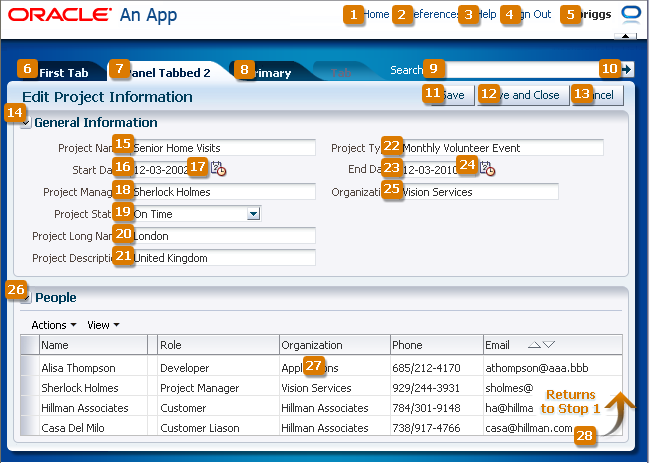
General Tab Traversal Sequence
Usage:
- Developers should avoid using custom code to control the Tab traversal sequence within a page, as resulting pages could become too difficult to manage and would create an inconsistent user experience across pages in an application and across applications.
- To improve keyboard navigation efficiency for heavy keyboard users (particularly screen reader users), it is strongly recommended to include a "skip navigation" link at the top of the page, which will navigate users directly to the first content-related tab stop.
Accelerators
Purpose:
Bypass menu and page navigation, and perform an action directly.
Description:
- Accelerators are single key presses (for example, Enter and Esc) or key combinations (for example, Ctrl+A) that initiate actions immediately when activated. A key combination consists of a meta key—which includes Ctrl ("Command" on a Macintosh keyboard), Alt ("Option" on a Macintosh keyboard), and/or Shift—and an execution key, which is the key that is pressed in conjunction with the meta key.
- Accelerators are sometimes called "hot keys". Common accelerators in a Windows application, such as Internet Explorer, are Ctrl+O for "Open" and Ctrl+P for "Print".
- FusionFX components have some built-in accelerators. Custom accelerators are supported only in menus (see the Menus guideline).
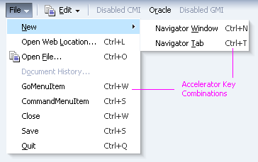
Accelerators in Menu
Usage:
- Accelerators must always have alternative interactions, such as direct manipulation with the mouse (for example, clicking a button, or drag and drop).
- Because accelerator keys perform actions directly, if a user presses an accelerator key unintentionally, data may be lost or incorrect data may be entered. To reduce the likelihood of user error, accelerators should be used sparingly, and only for frequently- and repetitively-used functions across applications. As a general rule, fewer than 25% of available functions should have accelerators.
- Custom accelerators must not override accelerators that are used in the menus of FusionFX-supported browsers (see Browser and System Requirements for supported operating systems and browsers in FusionFX), and must not override accelerators that are used in assistive technologies such as screen readers.
- Custom menu accelerators are always key combinations. The meta key may be Ctrl, Ctrl+Shift, or Ctrl+Alt. Ctrl+Alt is the recommended meta key because Ctrl and Ctrl+Shift are commonly used by browsers. The execution key must be a printable character (ASCII code range 33-126).
- Custom menu accelerators are global to the entire page. If a page has different menus that use the same accelerator, browser behavior will make it difficult to predict which action will be executed by the accelerator. For this reason, menu accelerators must be unique across an entire page.
- Certain accelerators are already assigned to FusionFX components. Some of these are reserved for page-level components, but others may be assigned to menus when the component is not used on a page. The following sections list these accelerators and components.
Accelerators Reserved for Page-Level Components
Product teams must not use the following accelerators that are already built into page-level FusionFX components:
| Accelerator | Used In | Function |
|---|---|---|
| Ctrl+Alt+R | Active Data | Check for updated data |
| Ctrl+Alt+W | Menu Messaging Secondary Windows |
Toggle focus between popup and primary window |
| Ctrl+Alt+P | Splitter | Give focus to splitter bar |
Accelerators Assigned to Optional Components
Certain FusionFX components have built-in accelerators that apply when the component has focus. However, if menu commands on the same page have the same accelerators, the menu commands will take precedence, and the component-level accelerators will not work. Thus, avoid the following accelerators in menus when the related component also appears on the same page.
| Accelerator | Used In | Function |
|---|---|---|
| Ctrl+Alt++ | RichTextEditor | Superscript |
| Ctrl+Alt+- | RichTextEditor | Subscript |
| Ctrl+/ | Hierarchy Viewer | Switch content panel |
| Ctrl+Alt+0. . . Ctrl+Alt+5 |
Hierarchy Viewer | Switch diagram layout |
| Ctrl+5 | RichTextEditor | Strikethrough |
| Ctrl+A | Input File Select-Many Choice List Select-Many List Box RichTextEditor Spinbox Input/Output Text Table |
Select all |
| Ctrl+B | RichTextEditor | Boldface |
| Ctrl+E | RichTextEditor | Center alignment |
| Ctrl+H | RichTextEditor | Create hyperlink |
| Ctrl+Shift+H | RichTextEditor | Remove hyperlink |
| Ctrl+I | Rich Text Editor | Italics |
| Ctrl+J | Rich Text Editor | Full justified alignment |
| Ctrl+L | Rich Text Editor | Left alignment |
| Ctrl+M | Rich Text Editor | Increase indentation |
| Ctrl+Shift+M | Rich Text Editor | Decrease indentation |
| Ctrl+Alt+M | Calendar Gantt PivotTable Table Tree TreeTable |
Launch context menu |
| Ctrl+R | RichTextEditor | Right alignment |
| Ctrl+Shift+S | RichTextEditor | Clear text styles |
| Ctrl+U | RichTextEditor | Underline |
| Ctrl+Y | RichTextEditor | Redo |
| Ctrl+Z | RichTex Editor | Undo |
| Ctrl+Shift+^ | Hierarchy Viewer Tree TreeTable |
Go up one level |
Access Keys
Purpose:
Move the focus to a specific UI element.
Description:
- Access keys relocate cursor or selection focus to specific interface components. Every component on the page with definable focus is accessible by tab traversal (by using Tab and Shift+Tab); however, access keys provide quick focus to frequently used components. Access keys must be unique within a page.
- The result of pressing access keys depends on the associated element and the browser:
- Buttons: In both Firefox and Internet Explorer, access keys give focus to the component and directly execute the action.
- Links: In Firefox, access keys give focus to the component and directly navigate the link; in Internet Explorer, access keys only give focus to the link.
- Other Elements: In both browsers, access keys only give focus to the element.
- Access keys are triggered with Shift+Alt+mnemonic in Firefox and Alt+mnemonic in Internet Explorer.
- If the mnemonic is present in the text of the component label or prompt (for example, a menu name, button label, or text box prompt), it is visible in the interface as an underlined character. If the character is not part of the text of the label or prompt, it is not displayed in the interface.
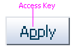
Access Key on a Button (mnemonic="p")
Usage:
- Access keys may be provided for buttons and other components with a high frequency of use. Product teams may provide standard cross-application key assignments for common actions by assigning a standard mnemonic letter in each language, such as such as "S" for "Save" or "C" for "Cancel".
- A single mnemonic or symbol can be assigned only to a single instance of an action on a page. If a page has more than one instance of a button with the same mnemonic, it may not be clear which button the access key will invoke.
- Focus change initiated through access keys must have alternative interactions, such as direct manipulation with the mouse (for example, clicking a button).
- The mnemonic should be an alphanumeric character—not a punctuation mark or symbol—and it is always case-insensitive. Letters are preferred over numbers for mnemonics.
- In Internet Explorer, application access keys override any browser-specific menu access keys (such as Alt+F for the File menu), and this can be a usability issue for users who habitually use browser access keys. Thus, teams should avoid using access keys that conflict with the top-level menu access keys in FusionFX-supported browsers (for example, Alt+F, E, V, A, T, H, M, J, R, P, or O in the English version of Internet Explorer 7 for Windows XP). See the Browser and System Requirements guideline for a list of supported browsers and operating systems.
- Product teams are responsible for assigning access keys to specific components. When choosing a letter for the access key, there are a few important considerations:
- Ease of Learning: Although the underlined letter in the label clearly indicates to the user which letter is the access key, it is still recommended to pick a letter that is easy for users to remember even without scanning the label. That is often the first letter of the label, like "Y" in "Yes", or a letter that has a strong sound when the label is read aloud, such as "x" in "Next".
- Consistency: It is good practice to use the same access key for the same command on multiple pages. However, this may not always be possible if the same command label appears multiple times on a page, or if another, more frequently-used command on the page uses the same access key.
- Translation: When a label is translated, the same letter that is used for the access key in English may not be present in the translation. Product teams should work with their localization department to ensure that alternative access keys are present in component labels after translation. For example, in English, the button "Next" may be assigned the mnemonic letter "x", but that letter doesn't appear when the label is translated to "Suivantes" in French. Depending on the pool of available letters, an alternative letter, such as "S" or "v" (or any other unassigned letter in the term "Suivantes"), should be assigned to the translated term, provided it doesn't conflict with the browser access keys for that language.
Default Cursor/Focus Placement
Purpose:
Puts initial focus on a component so heavy keyboard users can start interacting with the page without additional navigation.
Description:
- Focus refers to a type of selection outline that moves through the page when users press Tab keys or access keys. When the focus moves to a field where data can be entered, a cursor appears in the field. If the field already contains data, the data is highlighted. In addition, after using certain controls (such as an LOV or Input/Choose Date), cursor/focus placement moves to specific locations predefined by the component.
- When loading a standard FusionFX page, focus appears on the first focusable component on the page—either an editable widget or a navigation component. If there is no focusable element on the page, focus appears on the browser address field.
Usage:
- FusionFX applications should provide default cursor/focus placement on most pages so heavy keyboard users have direct access to content areas, rather than having to tab through UI elements at the top of the page.
- Teams may set focus on a different component than the default when the page is loaded. This may be helpful when there is a common starting point for data entry on the page so that users can start entering data without additional keyboard or mouse navigation. Otherwise, teams should not do this because it makes it more difficult for heavy keyboard users (particularly screen reader users) to orient themselves on page load.
Enter Key
Purpose:
Triggers an action when the cursor is in certain fields or when focus is on a link or button.
Description:
Many components have built-in actions for the Enter key. Some examples include:
- When focus is on a link or button, the Enter key navigates the link or triggers the action.
- When the cursor is in a Search Region, Quick Search, or QBE field, the Enter key triggers the search.
Usage:
It is recommended to also use the Enter key to activate a common commit button, such as in a Sign In form or in a dialog.