PanelDashboard Usage Guideline


RCUX Document Version 5.2.0 for Oracle® Fusion Middleware 11g Release 1 Patch Set 1 (11.1.1.2.0)
Last Updated 02-Mar-2011
The panelDashboard is a layout component which arranges panel boxes (content containers) within a grid comprised of rows and columns.
Related Guidelines
| Guideline | Section | For Information About |
|---|---|---|
| PanelBox | All | Details about panel boxes |
Related ADF Elements
Refer to the ADF Faces Rich Client demos page to find demos and tag documentation for the ADF elements related to this component:
| ADF Element | Notes |
|---|---|
| af:panelBox | PanelBox component. |
| af:panelSplitter | Divides a region into two parts with repositionable border |
| af:panelDashboard | PanelDashboard component. |
| af:panelGroupLayout | Layout component. |
| af:panelDashboardBehavior | PanelDashboard component. |
| af:navigationPane | Create series of navigation items in a particular level of navigation hierarchy. |
| af:commandImageLink | Create a link with icon support. |
| af:switcher | Dynamically decides which facet component to render. |
General Principles

Purpose:
The panelDashboard component provides an interactive environment in which users determine the order, positioning, and types of information they wish to see.
Description:
- A Panel Dashboard consists of a series of panel boxes in a grid. Each panel box may contain data presented in different formats, such as graphs, lists, tables, read-only data, or actionable fields.
- Panel boxes cannot be selected, but they can be rearranged using drag and drop. See the Common Actions section for details.
- Individual containers may be rearranged, created/added, minimized to the dock, undocked to the grid, maximized on the grid, and restored to regular size on the grid.
- The Panel Dashboard allows users to display any number of panel boxes at a time.

Panel Dashboard Elements
Usage:
- The Panel Dashboard may be used in both view-only and updatable pages.
- The Panel Dashboard may be used as a standalone, layout-driven component or may be used in conjunction with other actionable components such as Buttons, Menus, Trees, or Tables.
- The contents of panel boxes are configurable (see the panelBox Guideline), but this doesn't affect how the Panel Dashboard works.

Panel Dashboard Controlled by a Panel Dock
Configurable Elements
A Panel Dashboard contains three configurable elements:
- Grid
- Panel Boxes
- Panel Dock
Grid
Purpose:
Defines the number of rows and columns, the Panel Dashboard width, and height and row height.
Description:
- By default, the number of columns within the grid is three. This number determines the number of panel boxes which appear in the first row of the grid. For example, if there are nine panel boxes and three columns, there will be three rows.
- The dashboard region will scroll vertically and/or horizontally if the number of panel boxes exceeds the viewable region.
- Partial rows are not allowed, except when the number of panel boxes is not equally divisible by the number of columns; then the remaining panel boxes appear in the last row. For example, if a dashboard has 11 panel boxes and three columns, the first three rows will contain three panel boxes each, while the last row will contain two panel boxes.
- The panel dashboard inherits its height and width from its parent component. If necessary, teams can specify width and height of the dashboard region to achieve desired layout.
- The default row height for all rows in the dashboard region is 175 pixels Teams can specify the row height to achieve desired layout. Specified row height will apply to all rows.
Usage:
- The recommended number of columns within a Panel Dashboard is three. There is no maximum number of columns or rows.
- Product teams can set the number of columns to any number, based on the number of panel boxes they wish to see in each row. For example, with three columns they will see three panel boxes in the first row; five columns will show five panel boxes in the first row.
Panel Boxes
Purpose:
- Panel boxes contain data in various formats and for various uses. Panel boxes can:
- Present a summary, as presented by a graph
- Be detailed, as presented by a table
- Be used to proved a quick overview of data
- Be used in a transactional manner.
- Panel boxes support actions such as rearrange, dock, undock, add or create, maximize, and restore. See the Common Actions section for details.
- Panel boxes' content may be editable or read-only. See the PanelBox guideline for additional details.
Note: ADF does not provide out-of-the-box support for any panel box action except rearrange. However, some APIs will allow developers to tell the dashboard to perform an optimized rendering, so that the entire dashboard won't have to be redrawn when users want to toggle the rendered flag of a child. Developers get animations that go along with the "insert/restore" and "delete/minimize" actions resulting from these API calls for free.
Description:
- Panel boxes within the Panel Dashboard are derived from af:panelBox. Users define how many panel boxes appear within the dashboard at any given time. See the PanelBox usage guideline for details.
Usage:
- The contents of each panel box within the dashboard may be view-only or updatable.
- By default, each panel box has no toolbar buttons. Teams may add toolbar buttons and may add actions such as Maximize, Dock, Undock, Restore, Add or Create, and other content-specific actions.
- The recommended title bar button order from start to end is:
- Create (or Add)
- Content-specific actions
- Maximize/Restore (toggle button)
- Dock or Undock.

Panel Box Toolbar Iconic Buttons
Panel Dock
Purpose:
Holds all docked and undocked panels that exist within the Panel Dashboard.
- Panels in the dock support actions such as undock, dock, and maximize. See the Common Actions section for details.
Description:
- The panel dock is a panel box controller that allows users to dock, undock and maximize panels.
- Clicking on a panel in the dock toggles it between its docked state and its undocked state (in view in the dashboard). See Common Actions for details.
- The panel dock supports two orientations: horizontal and vertical. In the horizontal orientation, the dock appears above the grid. In the vertical orientation, the dock appears to the left of the grid.
- When the dock is vertical, a scroll bar appears if there are more panels than vertical space permits. When the dock is horizontal, an overflow icon will appear if there are more panels than horizontal space permits.

Panel Dock in Horizontal Layout with Overflow Icon
Usage:
- Panel dock is recommended when there are more panel boxes than can be displayed in the grid at one time. Depending on layout, teams may choose to use a panel dock when the number of panel boxes exceeds four or six.
- Panel dock is recommended when users could benefit from seeing snippets of information about panels that are not displayed in the grid. When panels are docked, teams can show small amounts of information in the docked panels.
Common Actions
The following common Panel Dashboard actions can be implemented by product teams.
Other actionable components—such as Buttons, Menus, Trees, or Tables—may act as controllers of the panel boxes within the Panel Dashboard. Panel controllers allow users to create additional panel boxes, add selected panel boxes to the dashboard grid (undock), minimize them to the panel dock (docking), or maximize/restore specific panel boxes to toggle panel box size in the dashboard grid.
Rearrange
Purpose:
Allow the user to rearrange the panel boxes within the grid.

Rearrange Panel Box
Description:
- The rearrange action is implemented by direction manipulation—by dragging and dropping a panel box to another position in the grid.
- When the user drags a panel box to a new position, destination feedback appears within grid. Panel boxes within the grid shift to make space for a dragged panel box.
Usage:
- Users will have different preferences for content layout. For example, the way panel boxes are arranged in a layout may emphasize patterns or information.
- The ability to rearrange panel boxes within the Panel Dashboard gives users the freedom to lay out the content in a way which fits their personal needs or working habits. For example, one user may prefer the most frequently-used content to appear on the far right of the screen; whereas, another user may prefer the most frequently-used content to appear on the far left of the screen.
- The drag and drop input method for the Panel Dashboard is not keyboard accessible. If the page allows for saving the ordering of panel items, teams must also design an alternative solution for moving the panel items (for example, using a shuttle) as part of their page design.
- Rearranging panel boxes in an instance of a Panel Dashboard should persist across sessions (as for a user profile), until explicitly changed by the user. No explicit "Save" action should be required.
Maximize / Restore
Purpose:
Toggle a specific panel box to fill the entire screen in the dashboard grid and restore it to its regular size in the grid.

Maximize Panel Box
Description:
- The Maximize/Restore actions should be available as a button within the Panel Box header.
- The Maximize/Restore button is a toggle button. Once the user maximizes a panel box, the Restore button can be used to return the panel box to its original size.
- Teams determine whether the maximize action makes content bigger (as it does in the case of a graph) or displays more content (as in the case of a table).
Usage:
- Maximizing a specific panel box within the Panel Dashboard makes it easier for users to interact directly with the content.
- Consider using Maximize/Restore for panel boxes with the following characteristics:
- Content which causes scrolling.
- Complex content presented in forms such as tables, tree tables, or graphs that is easier to comprehend when it appears larger on the screen.
- Editable content
- Content which needs to be projected
- Being able to maximize panel boxes can improve the speed and ease in which users complete tasks associated with the content.
- Teams needing more real estate in the maximized View can opt to close the panel dock region using the panel splitter when the user clicks the Maximize button. One caveat of this interaction would be that the user will not have access to any of the content or actions within the panel dock until the maximized panel box is restored.
Add or Create
Purpose:
Add a panel box to the Panel Dashboard grid or create a new one.
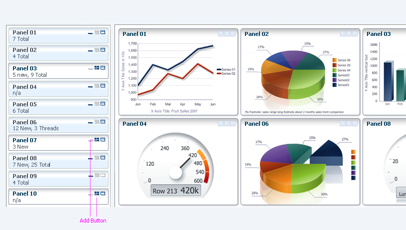
Add Panel Box
Description:
- The Add action should be available as a button within the Panel Dock Item header.
Usage:
- Adding a panel box gives the user the ability to add content, lay out content in a way that best fits their personal needs or working habits, and further customize the Panel Dashboard. Recently-added panel boxes should appear as the last panel boxes in the grid.
- The Add action is recommended only when the Dock action is also available
- The Add action is recommended only when a Panel Dashboard is used in conjunction with a panel dock.
- Consider Add for dashboards featuring dynamic content in which some content may be relevant to the user in one session, while other content may be relevant to the user in another session.
Dock
Purpose:
Remove a specific panel box from view in the panel dashboard grid.
Description:
- The Dock action should be available as an iconic button within the Panel Box Header.
- Docking a panel removes a panel box from view in the dashboard grid. Adjacent panel boxes in the grid may slide over to take the space vacated by the newly docked panel.
- When a panel dock is present, users click on the panels in the dock to toggle between a docked and an undocked state.
- Clicking a panel in its maximized state within the dashboard grid docks it. Clicking the same panel again in the dock restores it to regular size in the grid. The maximized state is not remembered.
- Docked panels appear as items in the panel dock.
Usage:
Docking panels is a way for users to minimize panel boxes whose data they don't need to see at a given time.
Undock
Purpose:
Enlarge a docked panel selected from the panel dock and display it in detail within the Panel Dashboard grid.

Undock Panel Box Button
Description:
- The Undock action should be available as an icon within panels in the panel dock.
- Undocked panels appear in the dashboard grid. Existing panel boxes may slide over to make space for the newly undocked panel in a grid.
- Undocked panel boxes should appear as items within the panel dock.
Usage:
- The Undock action is recommended only when a panel dashboard is used in conjunction with a panel dock.
- Undocking panel boxes is another way users can customize the content displayed within the Panel Dashboard grid, by laying out the content in a way that best suits their working habits.
- Consider Undock for dashboards that have dynamic content, in which some content may be relevant to the user in one session while other content may be relevant to the user in another session.