Form
amx:panelFormLayout
A Form component is a layout component that positions components so that their labels and fields align horizontally. In general, the main content of the Form consists of input components (such as Textbox) and selection components (such as Choice). If a child component with a label attribute defined is placed inside the Form, the child component's label and field are aligned and sized based on the Form definitions. Within the Form, the label area can either be displayed on the start side of the field area or on a separate line above the field area.
This component consists of the following basic elements:
- Container: The general container that holds items in the Form.
- Row: A row can be separated by divider lines for components in the Form.
- Label: The field label for each component.
- Field: The component or value that correlates to a give label.
This component is commonly used on tablets and phones.
Appearance
Appearance characteristics for this component.
- Form Background: The component default background color is white.
- Width: The Form spans the width of a page or panel.
- Height: The Form is dependent on the content placed within it.
- Corners: Depending on the theme, the Form may have squared corners (Alta theme}) or rounded corners (FusionFX theme).
- Divider: Rows may be separated by thin divider lines.
- Label Alignment: Labels may be positioned above the field or in-line with the field. Labels may be aligned at the start, center or end of a Form row.
- Field Alignment: Fields may be aligned at the start, center, or end of a Form row.
- Descendants: A descendant component of a Form will inherit the style of that component (i.e. links will be blue).
Behavior
Common behaviors for this component.
- Editable: Maybe either read-only or editable.
- Linkable: Rows are not tappable by default, but can be made tappable by defining a Command Link.
- Wrapping: Rows with labels or Text may either wrap or truncate without an automatic ellipses.
- Alignment: By default, labels are aligned at the start.
- Selection: Value components such as Textbox or Switches may be displayed within a Form and may be edited or manipulated by the user.
Usage
Usage guidelines for this component.
- More than one Form can be displayed on a page.
- Minimize the amount of input required when designing the form, because data entry is difficult in mobile applications.
- Minimize the amount of text entry required by using alternative input methods such as location awareness, voice input, photos, and smart defaults.
- Group related fields into panel forms to make pages easier to read.
- Label alignment should be placed consistently though the application.
Sample
AMX sample code for this component.
 <amx:outputText value="Sub-Section Title" styleClass="amx-text-sectiontitle"/>

    <amx:panelFormLayout labelAlignment="start">

    <amx:panelLabelAndMessage label="Name">

    <amx:commandLink text="Jim Berney" action="editname"/>

    </amx:panelLabelAndMessage>

    <amx:panelLabelAndMessage label="Street Address">

    <amx:commandLink text="123 Main Street" action="editaddr"/>

    </amx:panelLabelAndMessage>

    <amx:panelLabelAndMessage label="Phone">

    <amx:outputText value="888-555-1212"/>

    </amx:panelLabelAndMessage>

    </amx:panelFormLayout>

    <amx:outputText value="Sub-Section Title" styleClass="amx-text-sectiontitle"/>

    <amx:panelFormLayout labelAlignment="start">

    <amx:panelLabelAndMessage label="Type">

    <amx:commandLink text="Personal" action="edittype"/>

    </amx:panelLabelAndMessage>

    <amx:panelLabelAndMessage label="Anniversary">

    <amx:outputText value="November 22, 2005"/>

    </amx:panelLabelAndMessage>

    </amx:panelFormLayout>

    <amx:panelFormLayout labelAlignment="start">

    <amx:panelLabelAndMessage label="Date Created">

    <amx:outputText value="June 20, 2011"/>

    </amx:panelLabelAndMessage>

    </amx:panelFormLayout>
Related

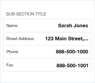
Fig 1. iOS Form - Labels Start Aligned

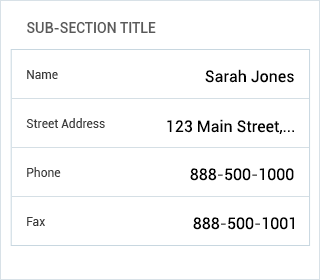
Fig 2. Android Form - Labels Start Aligned