Image
amx:image
The Image component displays different sizes of images and/or icons. This component supports the following formats:
- Android: BMP, GIF, JPEG, PNG, and SVG.
- iOS: PNG and SVG.
This component is commonly used on tablets and phones.
Appearance
Appearance characteristics for this component.
- Placement: It can be displayed on top of various other components or the page background.
- Shape: It is usually shaped in a square or rectangle, unless css is applied for other shapes (e.g. rounded images used for photos of people).
- Size: Images should be sized appropriately for the display.
- FusionFX Guide: For creating FusionFX mobile icons, please refer to the FusionFX Mobile Icon Design Guide.
- Alta Guide: For creating Alta mobile icons, please refer to the Alta Mobile Icon Design Guide.
Behavior
Common behaviors for this component.
- Animated: Images may animate.
- Static: Images maybe static.
- Actionable: Images maybe tappable (e.g. when placed inside a Link component).
Usage
Usage guidelines for this component.
- Use icons from the same theme.
- Provide images and icons in various sizes in order to support devices with different DPIs.
Sample
AMX sample code for this component.
 <amx:image id="i1"
    source="images/sample.png"
    shortDesc="Sample image example"/>
Related
- Used On: Phone, Tablet
- Also Called: Graphic
- Related Components: Indicator
- Resources: None
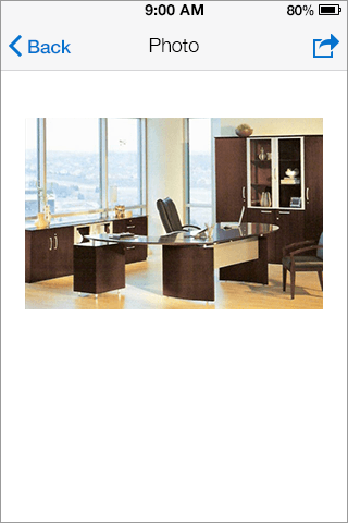
Fig 1. iOS Image
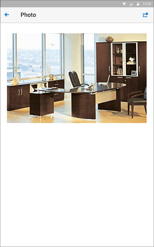
Fig 2. Android Image