Popup
amx:popup
The Popup component is a container whose content is used in popup windows, such as modal views, popup menus, alerts, and banners. It can contain various components similar to a Panel Page.
A popup component consists of the following attributes:
- Align: Specifies where the popup will appear.
- Animation: Specifies how the popup will appear.
- AutoDismiss: If set to ON, the popup can be closed by tapping outside of it. If OFF, the popup closes only if a button or feature inside the popup is tapped.
- Decoration: Specifies if anchor should be visible or not.
- Rendered: Specifies whether the popup should be visible or not.
Popups are commonly used on tablets. On phones, content of the popups is displayed on a new page.
Appearance
Appearance characteristics for this component.
- Dimming: When a popup appears, the application page can be set to dim.
- Animation: A popup may appear with an animation.
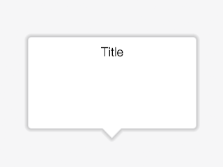
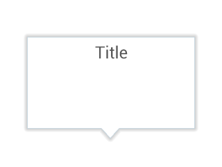
- Anchor: A popup may be rendered with an anchor that points to the associated property on the application page.
- Popup Title: When displaying title bar in a popup, the title should clearly communicate from which property or button the popup was invoked.
- Scroll Bar: When content exceeds sizes of the popup, a vertical scroll bar may display.
- Style: Style of popups can be customized.
Behavior
Common behaviors for this component.
- Position: A popup should be aligned relative to a component. This can be set by the align property. The default is after.
- Closing: A popup can be closed by tapping a button inside the popup or auto dismissed by tapping outside the popup. This can be set by the autoDismiss property. The default is false.
- Scrolling: If content exceeds sizes of the popup, a vertical scroll bar may appear. Users can scroll the content vertically by using the swipe, flick, or drag gesture.
- amx:showPopupBehavior: This tag is a declarative way to show a popup. When the showPopupBehavior tag is associated with a component, the popup specified will automatically be shown when the action event is activated. This tag contains Align attribute that indicates how the popup should be aligned relative to a component and Type attribute that defines when the popup will occur.
- amx:closePopupBehavior: This tag is a declarative way to hide a popup. When the closePopupBehavior tag is associated with a component, it can hide the popup on some user action.
Usage
Usage guidelines for this component.
General
- Anchor a popup to the control the user used to launch the popup.
- Do not crowd a popup with too much information.
- Try to size the popup appropriately for the information that is shown (i.e. less content, size the popup to that content).
- When leaving a popup, the users work should be saved if there was no Button to perform the action.
- Use popups to display a set of navigational items in a list view. There are two common variations: 1. Page Menu, which displays the menu on a home page of phone apps, and 2. Popup Menu, which shows the menu in a popup that is triggered by a button or icon in a header or footer.
- To help users maintain context, avoid using more than three levels of popups.
- Dim the background of the application page to let users focus on content of popups.
- Popups are commonly used on tablets.
Modal Views
- The user must explicitly close the popup by using a button or tapping outside the popup.
- Modal Views with editable content should have a minimum of two action buttons: an acceptance button, frequently labeled "OK" or "Done" to accept changes made in the Popup and close it, and a rejection button, frequently labeled "Cancel", to discard changes and close the Popup. If additional buttons are needed, place them between the acceptance and rejection buttons.
- Modal Views with read only information should have a single action button, frequently labeled "OK" or "Close", that closes it.
- Modal Views are also used for messages that require a response from the user:
- When users must choose whether to proceed with an action, the popup should contain Yes and No buttons.
- When users must choose between a positive action, a negative action, or no action, the popup should contain Yes, No, and Cancel buttons, or buttons with descriptive labels that perform equivalent functions.
Messages/Alerts
- Popup messages are displayed in situations where the application must capture the user's attention is some way.
- These require the user to "Close" the message.
- These messages should never be used to display validation errors or to display messages that contain content that require the page "below" the message to process.
- Once the user has closed the message, the content is gone.
Sample
AMX sample code for this component.
Here is a trigger for a popup:
 <amx:commandButton id="commandButton2" text="Launch Menu">

    <amx:showPopupBehavior popupId="popup1" type="action" align="overlapBottom" alignId="pp1"/>

    </amx:commandButton>
And here is the popup:
 <amx:popup id="popup1" animation="slideUp">

    <amx:panelGroupLayout id="panelGroupLayout1" halign="center">

    <amx:commandButton id="commandButton3" text="Reply" inlineStyle="width:275px"
    styleClass="adfmf-commandButton-rounded adfmf-commandButton-highlight">

    <amx:closePopupBehavior popupId="popup1" type="action"/>

    </amx:commandButton>

    <amx:commandButton id="commandButton4" text="Reply-All" inlineStyle="width:275px"
    styleClass="adfmf-commandButton-rounded adfmf-commandButton-highlight">

    <amx:closePopupBehavior popupId="popup1" type="action"/>

    </amx:commandButton>

    <amx:commandButton id="commandButton5" text="Forward" inlineStyle="width:275px"
    styleClass="adfmf-commandButton-rounded adfmf-commandButton-highlight">

    <amx:closePopupBehavior popupId="popup1" type="action"/>

    </amx:commandButton>

    <amx:commandButton id="commandButton6" text="Cancel" inlineStyle="width:275px"
    styleClass="adfmf-commandButton-rounded ">

    <amx:closePopupBehavior popupId="popup1" type="action"/>

    </amx:commandButton>

    </amx:panelGroupLayout>

    </amx:popup>
Related
- Used On: Phone, Tablet
- Also Called: Popover
- Related Components: Page
- Resources: None

Fig 1. iOS Popup

Fig 2. Android Popup