Radio Set
amx:selectOneCheckbox
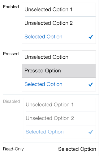
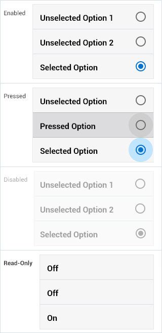
The Radio Set component is similar to Checkbox Set, but allows the user to select a single item from a list. The component has the following elements:
- Label: An optional label for the component.
- Container: The container is a type of a List.
- Item: The row is a type of list item.
- Text: Text that describe the item.
- Circle: Android displays a circle to the right of each item for selection. iOS does not display this circle.
- Checkmark: iOS displays a checkmark when selected.
- Filled Circle: Android displays a filled circle when selected.
Appearance
Appearance characteristics for this component.
- Label: An optional label may be displayed.
- State: Supports enabled, pressed, disabled and read-only.
- Selection: Supports selected and unselected rows.
- Background: Supports white or light gray colors.
- Read-Only: The selected item is bold text.
- Rendered: This component can be shown or hidden.
Behavior
Common behaviors for this component.
- Selection: Supports single selection or no selection. No selection is the default.
- Tap: When user taps a row, the row is selected. Tapping the row again will de-selects it.
- Scrolling: The rows in this component scroll vertically.
- Required: Can be set as a required field, resulting in an error if the user submits the page without selecting a value.
- Nesting: Does not support nested fields beneath an option.
Usage
Usage guidelines for this component.
- There should be at least two rows in this component.
- This component should be used when there are mutually exclusive choices.
- This component should be displayed as disabled when the choice is not available to the user, but is necessary to display the choice because it may become available in different contexts.
- On a tablet this component may not display well if it span the whole landscape orientation.
- On a phone this component may need to display on a new page, due to length of the list.
- Use Switch or Checkbox when presenting simple Yes or No choices.
- If you need to reset, provide an option to return to the unselected view or an additional 'None' option.
- The component should be shown as read-only when data is displayed in a read-only page, such as a printable page, and a value has been selected.
- Read-only data may also be displayed when the user has permission to view the selected value, but not edit it. When the component is read-only, the button does not display and the selected value is displayed as bold text.
Sample
AMX sample code for this component.
 <amx:selectOneRadio label="Enabled" id="sor1">

    <amx:selectItem value="true" label="One"/>

    <amx:selectItem label="Two"/>

    <amx:selectItem label="Three"/>

    </amx:selectOneRadio>


    <amx:selectOneRadio label="Disabled" id="sor2" disabled="true">

    <amx:selectItem value="true" label="One"/>

    <amx:selectItem label="Two"/>

    <amx:selectItem label="Three"/>

    </amx:selectOneRadio/>


    <amx:selectOneRadio label="Read-Only" id="sor3" readOnly="true">

    <amx:selectItem value="true" label="One"/>

    <amx:selectItem label="Two"/>

    <amx:selectItem label="Three"/>

    </amx:selectOneRadio>
Related
- Used On: Phone, Tablet
- Also Called: Radio List
- Related Components: Checkbox List
- Resources: None

Fig 1. iOS Radio Set

Fig 2. Android Radio Set