Swipe to Reveal
amx:accesoryLayout
The Swipe to Reveal component allows a user to drag on the left or right side of a List Item to reveal an area with additional content or actions. This is typically used with a List View, but could be used with other components.
This component is commonly used on tablets and phones. For examples of transitions, see Animated Transitions doc.
Appearance
Appearance characteristics for this component.
- Facet: The facet can appear from either left or right of the area.
- Color: By default red, orange, gray and blue backgrounds are used on the facets.
- Elements: Text, Icons, Button, Links, etc… can be displayed in the facets.
Behavior
Common behaviors for this component.
- Drag: Dragging from the left or right will reveal a background container and display content.
- Full Drag: Dragging across the List Item will reveal and then close a background container and content.
- Push: The content of the list item will push the primary content area (i.e. list item).
Usage
Usage guidelines for this component.
- Add animated transitions cautiously and use them consistently throughout your app.
- Transitions should start immediately on the action that triggers them.
- Consider the cultures that you are designing for if sliding left or right has other meanings.
Sample
AMX sample code for this component.
<amx:accessoryLayout id="alSimple" rendered="#{pageFlowScope.componentProperties.rendered}"

      inlineStyle="#{pageFlowScope.componentProperties.inlineStyle}" styleClass="#{pageFlowScope.componentProperties.styleClass}"

      contentStyle="#{pageFlowScope.componentProperties.contentStyle}" contentClass="#{pageFlowScope.componentProperties.contentClass}"

      startDesc="#{pageFlowScope.componentProperties.startDesc}" startWidth="#{pageFlowScope.componentProperties.startWidth}"

      startStyle="#{pageFlowScope.componentProperties.startStyle}" startClass="#{pageFlowScope.componentProperties.startClass}"

      startFullTriggerSelector="#{pageFlowScope.componentProperties.startFullTriggerSelector}"

      endDesc="#{pageFlowScope.componentProperties.endDesc}" endWidth="#{pageFlowScope.componentProperties.endWidth}"

      endStyle="#{pageFlowScope.componentProperties.endStyle}" endClass="#{pageFlowScope.componentProperties.endClass}"

      endFullTriggerSelector="#{pageFlowScope.componentProperties.endFullTriggerSelector}">
<amx:facet name="start">

      <amx:commandLink id="clStartSimple" text="Start" styleClass="full-trigger">

      <amx:showPopupBehavior popupId="startPopup" type="action"

      alignId="pp1" align="overlapMiddleCenter"/>

      </amx:commandLink>

      </amx:facet>
<amx:facet name="end">

      <amx:commandLink id="clEndSimple" text="End" styleClass="full-trigger">

      <amx:showPopupBehavior popupId="endPopup" type="action"

      alignId="pp1" align="overlapMiddleCenter"/>

      </amx:commandLink>

      </amx:facet>
<amx:outputText id="otContentSimple" value="Simple example"/>
</amx:accessoryLayout>
Related
- Used On: Phone, Tablet
- Also Called: Drag to Reveal
- Related Components: List View, Pull to Refresh
- Resources: None
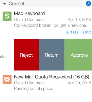
Fig 1. iOS Swipe to Reveal
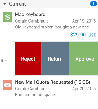
Fig 2. Android Swipe to Reveal