Springboard List Style
- Style: Mono Color Restricted or Full Palette. All icons in the same Springboard should be the same style.
- Color: With Mono Color the color is restricted to White.
- Container: Containers around the icon are optional.
- Position: Place icons at the start of label.
- Selection: Multiple icon selections do not need to be provided.
- State: Multiple icon states do not need to be provided.
- Stroke: No Stroke is applied.
Icon Size
Please check Icon Sizes section on Design Parameters.
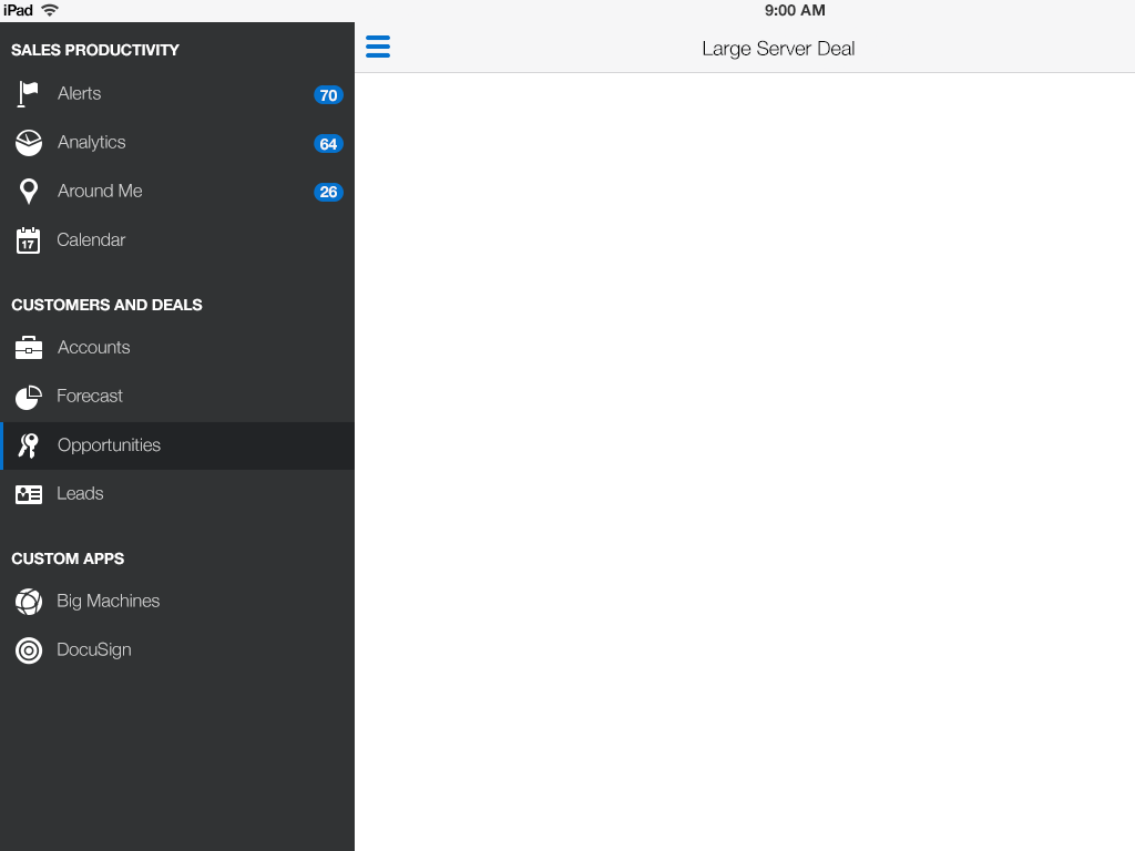
iOS 8 List View Springboard
For more information about list view springboard icon placement and padding please go here:
http://aseng-wiki.us.oracle.com/asengwiki/display/ASUsability/List+View+-+iOS+8.x
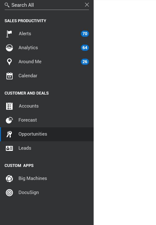
Android 5x List View Springboard
For more information about Android 5 list view springboard icon placement and padding please go here:
http://aseng-wiki.us.oracle.com/asengwiki/display/ASUsability/List+View+-+Android+5.x
Windows 10x List View Springboard
For more information about Windows 10 list view springboard icon placement and padding please go here:
http://aseng-wiki.us.oracle.com/asengwiki/display/ASUsability/List+View+-+Windows+10.x
Icon Sample
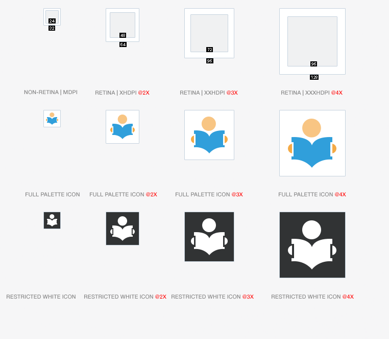