Gauge Usage Guideline

RCUX Document Version 5.0.0 for Oracle® Fusion Middleware 11g Release 1 Patch Set 1 (11.1.1.2.0)
Last Updated 02-July-2010
A Gauge graphically displays a single quantity. Often, distinct states (such as high, medium, and low) are defined to provide additional context.
- General Principles
- Accessibility
- Types of Gauges
- Gauge Heuristics
- Configurable Elements
- Common Actions
Related Guidelines
| Guideline | Section | For Information About |
|---|---|---|
| Graph | All | Displaying data using Graphs. |
| Table Elements | Valid Cell Content | Displaying Gauges in Table Cells. |
| Language in UI | Capitalization | Title and Label capitalization. |
Related ADF Elements
Refer to the ADF Faces Rich Client demos page to find demos and tag documentation for the ADF elements related to this component:
| ADF Element | Notes |
|---|---|
| dvt:gauge | Gauge Component |
General Principles

A Gauge shows a single data value. Due to its compact size, a Gauge is often more effective than a graph for displaying a single data value.
Gauges can show state information using color. For example, a gauge axis might show ranges colored red, yellow, and green to represent low, medium, and high states. See States and Thresholds for more information.
When users need to compare many data values at a glance, multiple gauges can be shown inside table cells, or in a vertical, horizontal, or grid layout. See Common Actions for more information.
When precise data values matter, a list or a Table is a better choice than a Gauge.
Accessibility
By default, Gauges are not accessible in Screen Reader Mode.
To make Gauges accessible in Screen Reader Mode, Teams must either:
- Provide a tabular display that shows Gauge labels and values as text, or
- Configure the Gauge to display in .PNG format and write custom code to configure the Gauge's ALT and SHORTDESC attributes to show the Gauge title, value, and state.
Colorblind Users
By default, Gauge states are not accessible for users who are colorblind. See States and Thresholds for more information.
To accommodate users who are colorblind, teams can define an accessible color palette for Gauge states. By default, states are colored red, yellow, and green.
Types of Gauges
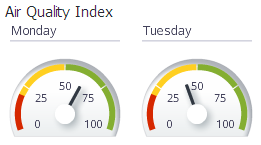
Dial Gauges
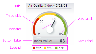
Description:
- A Dial Gauge looks like a speedometer. Its axis is curved along its outer edge, and its indicator (the needle inside) points to its value.
- If states are defined, state color may be applied the indicator and/or the data ranges corresponding to states may appear as colored regions along the axis. See States and Thresholds for more information.
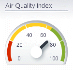
Dial Gauge
Usage:
- Consider a Dial Gauge when displaying an important data value, such as a key performance indicator (KPI).
- It is not recommended to display more than a few Dial gauges on a single page. Dial gauges are large relative to the amount of information they convey.
- If there are more than a few important data values to display on a page, consider using a Graph or a group of Status Meter or LED gauges instead.
- A Dial gauge should have a fixed size. See Gauge Size for more information.
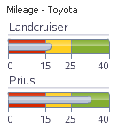
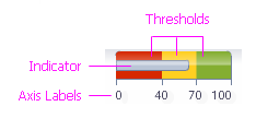
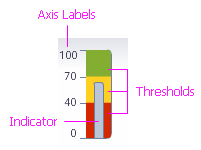
Status Meter Gauges
Description:
- A Status Meter gauge looks like a thermometer. The outer rectangle forms its axis, and the length of the indicator (the bar inside) is proportional to its value.
- If states are defined, state color may be applied to the indicator and/or the data ranges corresponding to states may appear as colored regions along the axis. See States and Thresholds for more information.
- A Status Meter may be either horizontal or vertical.
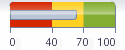
Horizontal Status Meter Gauge
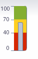
Vertical Status Meter Gauge
Usage:
- Status meter gauges work best in groups. Displaying a Status Meter gauge by itself is not an effective use of space.
- It is recommended to use the same axis for all Status Meter gauges displayed in a group.
- Consider a Status Meter gauge when space is limited and there are many related data values to show. For example, a set of Status Meter gauges could show how close each salesperson is to a sales target, showing a separate gauge for each salesperson.
- Vertical orientation is recommended when showing multiple Status Meter gauges in a table row or in a horizontal layout. See Common Actions for more information.
- Horizontal orientation is recommended when showing multiple Status Meter gauges in a table column or in a vertical layout. See Common Actions for more information.
LED Gauges
Description:
- An LED (light emitting diode) gauge shows state information using a colored shape.
- An LED gauge may use one of the following shapes: Circle (default), Rectangle, Triangle, Arrow, or Custom (an image file that teams specify).
Group of LED Gauges
Usage:
- It is highly recommended to define states for LED gauges. If states are not defined, the gauge will be difficult to interpret and will appear gray no matter what its value is. See States and Thresholds for more information.
- Consider an LED gauge when it is sufficient to show users only the current state, rather than a precise value or the set of possible states.
- LED gauges are legible even when very small, so consider them when space is limited, such as in table cells. See Gauge Size for more information.
- When three states are defined, the triangle and arrow gauge shapes change their orientation based on the state. Therefore, it is recommended to use one of these shapes so that colorblind users can correctly interpret the state of the gauge.
Gauge Heuristics
Gauge Size
Description:
- Generally speaking, because a gauge shows a single data value, it should be just large enough to display its value and any additional elements clearly. If a gauge is too large, space is not used effectively, whereas, if it is too small, users will not be able to see it clearly.
- Because a gauge's title, bottom label, legend, and axis labels are progressively and automatically hidden as a gauge gets smaller, teams should experiment with different sizes to determine what works best in a particular situation.
Usage:
Note: Configure the gauge to use .PNG format instead of Flash format when the width or height of a gauge is less than 100 pixels. Data Tip content can be clipped in small gauges that use Flash format. See Data Tips for more information.
- When gauges are displayed in Table cells, it is recommended to minimize gauge height so Table rows are minimally affected. See Displaying Gauges in Tables for more information.
- Gauges are best displayed in fixed, predictable sizes; therefore, a gauge should not be set to automatically fill its containing element.
- Dial and LED gauges are best displayed using equal height and width (a square shape), whereas Status Meter gauges should use a height and width that form a rectangular shape.
- Showing optional gauge elements such as a title, legend, and bottom label will require extra space; therefore, make certain that a gauge displaying any of these elements is large enough so that all its elements are legible.
Dial Gauge Size
Dial gauges are designed be visually prominent, so they are often larger than other types. The height and width of a Dial gauge should be roughly equal.
| Dial Gauge Display Sizes | In a Table Cell | With Title | With Title and Bottom Label |
|---|---|---|---|
| Gauge Width x Height (pixels) | 40 x 30 | 120 x 100 | 160 x 160 |
| Example | 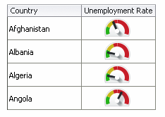 |
 |
 |
Dial Gauge in Different Sizes and Configurations
Horizontal Status Meter Gauge Size
Because Horizontal Status Meter gauges are oriented horizontally, they should be wider than they are tall.
| Horizontal Status Meter Display Sizes | In a Table Cell | With Title and Axis Labels |
|---|---|---|
| Gauge Width x Height (pixels) | 120 x 15 | 120 x 60 |
| Example | 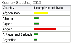 |
 |
Horizontal Status Meter Gauge in Different Sizes and Configurations
Vertical Status Meter Gauge Size
Because Vertical Status Meter gauges are oriented vertically, they should be taller than they are wide.
| Vertical Status Meter Display Sizes | With Short Title | With Longer Title | With Title and Axis Labels |
|---|---|---|---|
| Gauge Width x Height (pixels) | 20 x 120 | 40 x 120 | 80 x 120 |
| Example | 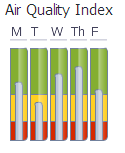 |
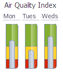 |
 |
Vertical Status Meter Gauge in Different Sizes and Configurations
LED Gauge Size
LED gauges are well-suited for display in small spaces, such as Table cells. The height and width of an LED gauge should be equal.
| LED Gauge Display Sizes | In a Table Cell | With Data Label |
|---|---|---|
| Gauge Width x Height (pixels) | 15 x 15 | 30 x 30 |
| Example | 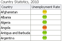 |
 |
LED Gauge in Different Sizes and Configurations
Active Data
Purpose:
Refers to data provided through the Active Data Service (ADS), which can be refreshed without user action.
Description:
Data updates caused by Active Data may be indicated on a gauge using Animation.
Usage:
Active Data is often used when displaying information that is subject to change in real-time, such as stock prices and account balances.
Animation
Purpose:
Gauge animation is optional and may be applied to give visual feedback about how gauge data are updating in real-time, and/or to give a gauge a dynamic effect when it first appears.
Description:
There are two types of gauge animation: Data Update Animation and Initial Display Animation.
- Animation applies only to Dial and Status Meter gauges.
- Both types of animation may be applied to the same gauge.
Data Update Animation
Purpose:
Data Update Animation provides real-time visual feedback when a Dial or Status Meter gauge's value changes.
Description:
Data Update Animation occurs when gauge data values are updated in real-time as a result of Active Data updates or by updates generated by the application.
Usage:
- Consider Data Update Animation when users are tasked with monitoring real-time data updates. Data Update Animation provides visual feedback about how gauge data are changing.
- It is recommended to provide a Toggle Button to enable users to turn Data Update Animation on and off. See the Buttons guideline for details.
- Use Data Update Animation sparingly on pages with multiple gauges. There is no limit to the number of gauges on a page that can use Data Update Animation, but users can become confused or frustrated when several gauges update at the same time. Consequently:
- it is recommended to limit Data Update Animation to three or fewer components per page, including other components on the page (such as Graphs) that are updating in real-time.
- It is recommended to set the duration of the Data Update Animation to between 1000 and 1500 milliseconds. This range has been shown to be both effective and pleasing for users.
Initial Display Animation
Purpose:
Initial Display Animation is purely decorative and gives a Dial or Status Meter gauge a dynamic effect when the gauge first appears on a page.
Description:
Initial Display Animation is different for Dial and Status Meter gauges. It gives users something pleasing to look at while a page loads.
Usage:
- Initial Display Animation is purely decorative. Consider using Initial Display Animation when demonstrating an application in a sales or marketing situation, in cases where gauges are used infrequently, or in applications for non-technical users. Initial Display Animation is not recommended for use in high-throughput, production environments because it can adversely affect application performance.
- If multiple gauges appear in a single page, Initial Display Animation should be enabled either for all of the gauges or for none of the gauges. Users may become confused if some gauges animate while others do not.
Configurable Elements
The following table shows the gauge elements of different Gauge types.
| Dial Gauge | Horizontal Status Meter Gauge | Vertical Status Meter Gauge | LED Gauge |
|---|---|---|---|
 |
 |
 |
 |
Note: The title, bottom label, data label, and legend elements may appear on all gauge types.
Axis
Purpose:
The axis provides a reference for displaying gauge data.
Description:
- The axis is required for Dial and Status Meter gauges. The LED gauge has no axis.
- The Dial gauge axis is curved and forms the outer edge of the gauge.
- The Horizontal and Vertical Status Meter gauge axes form the rectangular shape of the gauge itself.
Usage:
- The axis should always include a zero value.
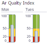
Axis Labels
Purpose:
Axis labels show incremental axis values on the gauge axis.
Description:
- Axis labels are optional.
- Dial gauge axis labels appear inside the frame of the dial.
- Horizontal Status Meter gauge axis labels appear along the bottom edge of the gauge.
- Vertical Status Meter gauge axis labels appear along the left edge of the gauge.
- The LED gauge has no axis labels.
Usage:
- It is recommended to display axis labels on a Dial gauge.
- Displaying axis labels for Status Meter gauges increases the size of the gauge significantly (see Gauge Size for more information). Therefore:
- When a group of Status Meter gauges each has the same axis values, consider displaying axis values using an external label.
- When a group of Status Meter gauges have different axis values, display axis labels for each gauge.
States and Thresholds
Purpose:
The state of a gauge is shown using color. Teams assign meaningful labels to states, and define states using thresholds. For example, a page might show some gauges that are red and some that are green, which could indicate "bad" and "good" states to the user.
Description:
- States and Thresholds are optional.
- Thresholds are limits on ranges of values that teams specify to define states. The Dial gauge shows it state colors inside its axis, whereas in LED and Status Meter gauges, state colors fill the gauge itself.
- The name of the state corresponding to the gauge value appears in the Data Tip.
- The ranges of values created by thresholds are mutually exclusive — they may not overlap.
Usage:
- States give a gauge context, and are highly recommended. States are especially recommended for LED gauges, because the color of an LED gauge indicates its state.
- Limit the number of states to five or fewer. The more ranges there are, the more difficulty users will have telling them apart, and the more space the Legend (if present) will occupy.
- On Dial and Status Meter gauges, the range of values corresponding to each state should be wide enough so it can be seen clearly in the gauge axis. If a range of values is too narrow to be seen clearly, use fewer ranges or adjust the range values.
Indicator
Purpose:
The indicator is a graphic indicating the precise gauge value.
Description:
- The indicator is required for Dial and Status Meter gauges. The LED gauge has no indicator.
- The Dial gauge indicator is a needle pointing to the gauge value on the axis.
- The Status Meter gauge indicator is a bar inside the gauge whose length indicates the gauge value.
Usage:
When showing all of the possible gauge states is not important, it is recommended to apply a gauge's state color to its indicator, rather to show all possible gauge states in the gauge axis.
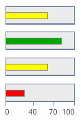
Status Meter Gauges with State Color Applied to Indicators
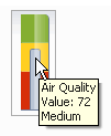
Data Tip
Purpose:
Data Tips are tooltips that show a gauge's title, value, and state.
Description:
- Data Tips are optional. They are enabled by default.
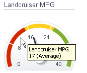
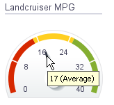
- A different Data Tip appears when the user mouses over the gauge background, its Indicator, or a Threshold:
- The background Data Tip shows the gauge title, value, and state.
- The Indicator Data Tip shows the gauge value.
- The Threshold Data Tip shows the threshold name and range.
| Background Data Tip Example | Indicator Data Tip Example |
Threshold Data Tip Example |
|---|---|---|
 |
 |
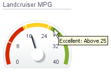 |
Data Tip Examples
Usage:
it is recommended to enable data tips for all gauge types.
Note: Data Tip content can be clipped in small gauges using Flash format, so configure the gauge to use .PNG format instead when the width or height of a gauge is less than 100 pixels. See Gauge Size for more information.
| Data Tip Content is Not Clipped in .PNG Format |
Data Tip Content May Be Clipped In Flash Format |
|---|---|
 |
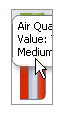 |
Example of Data Tip Content Clipping
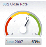
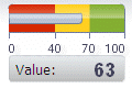
Data Label
Purpose:
The data label shows the precise gauge value.
Description:
The data label is optional and may appear on top of the gauge or inside the bottom label.
Usage:
Generally speaking, it is not recommended to show gauge data labels. However, they are beneficial for colorblind users and are useful when users need to quickly compare values among multiple gauges.
For an LED gauge, it is recommended to show the data label on top of the gauge, rather than in the bottom label, which requires more space.
LED Gauges: Data Labels On Top
For Dial and Status Meter gauges, it is recommended to show the data label inside the bottom label. Showing the data label on top of the gauge can obscure the gauge indicator.
| Recommended: Data Label Inside Bottom Label |
Not Recommended: Data Label On Top of Gauge |
|---|---|
 |
 |
Data Labels With Status Meter Gauges
Title
Purpose:
The gauge Title describes the data the gauge shows.
Description:
The Title is optional and appears above the gauge graphic.
Usage:
- Consider showing a Title when space is available and when the gauge is not described elsewhere, such as in an external label.
- It is not recommended to show a Title on a Vertical Status Meter or LED gauge.
- When displaying gauges in a table, use the row and column headers, rather than titles, to describe gauges.
- When displaying multiple gauges in a grid or a single gauge in isolation, product developers can manually provide a smaller external label above the gauge(s) rather than using Titles to describe them, as titles may take up space that is needed to show the gauge component.
- It is recommended to use headline capitalization for Titles. See Capitalization in the Language in UI guideline for details.
Legend
Purpose:
The legend is a key that identifies gauge states.
Description:
The legend is optional and may appear below, to the left, or to the right of the gauge.
Usage:
- The legend is not necessary when a gauge has no states defined.
- Showing the legend takes up space inside a gauge, so it is not recommended unless sufficient space is available on the page.
- Consider providing a custom, external legend when displaying multiple gauges that share the same axis and the same states.
- It is recommended to use headline capitalization for the Legend title and sentence capitalization for Legend labels. See Capitalization in the Language in UI guideline for details.
Bottom Label
Purpose:
The Bottom Label shows the name of the database row from which a gauge's value is derived. It can also show the Data Label.
Description:
The Bottom Label is an optional rectangular region that appears below the gauge graphic. The name of the database row appears on the left, and the Data Label (if present) appears on the right.
Usage:
- Consider showing the Bottom Label when using sets of multiple Dial or Horizontal Status Meter gauges to display data from different database rows. See Gauge Sets for more information.
- It is not recommended to show the Bottom Label with a Vertical Status Meter or LED gauge because doing so will cause the gauge to be much larger.
- It is recommended to use headline capitalization for the Bottom Label. See Capitalization in the Language in UI guideline for details.
Common Actions
Displaying Gauges in Table Cells
Description:
Dial, Horizontal Status Meter, and LED gauges are well-suited to display in table cells. Because of their vertical orientation, Vertical Status Meter gauges are not well-suited to display in table cells.
When gauges are displayed in a table, users can compare them and see them alongside related information such as links, labels, and icons.
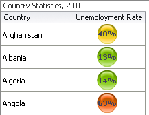
LED Gauges in Table Cells
Usage:
- It is not recommended to display Vertical Status Meter gauges in table cells. In order for the gauge to be legible, Table rows will have to be very tall.
- When displaying gauges in a Table, make gauges as small as possible while maintaining legibility. See Gauge Size for details.
- To maximize use of space, try to use the column and row headers to describe gauges, rather than using gauge Titles or Bottom Labels.
- Use the following techniques to enable users to rapidly scan and compare multiple gauges in a Table:
- Use only one type of gauge per column or row.
- Use the same axis values and thresholds for every gauge in a column or row.
- Display Horizontal Status Meters in columns.
- Display Dial or LED gauges in either rows or columns.
- Avoid displaying so many gauges that users must scroll to see them all.
Gauge Sets
Description:
A Gauge Set is a grid layout that is built into the gauge component. Using a Gauge Set does not require additional layout components such as a Table.
LED Gauges in a Gauge Set
Usage:
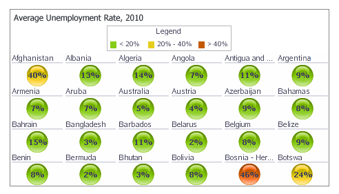
- Consider a Gauge Set instead of a Table when showing individual values for a group of related items, and related information is not required. For example, a Gauge Set could be used to show percentage price increases for a set of individual stocks.
- When the individual gauges in a Gauge Set do not have titles or axes, provide a label above the Gauge Set that shows the name of the data set and its units of measure. When displaying both the data set name and units of measure, units of measure should be displayed in parentheses. For example: "2010 Population (Millions)".
- It is recommended to use headline capitalization for Titles. See Capitalization in the Language in UI guideline for details.
- Include a Legend when Thresholds are defined.
- Avoid displaying so many gauges that users must scroll to see them all.