Media Player Usage Guideline 

RCUX Document Version 5.0.0 for Oracle® Fusion Middleware 11g Release 1 Patch Set 1 (11.1.1.2.0)
Last Updated 06-May-2010
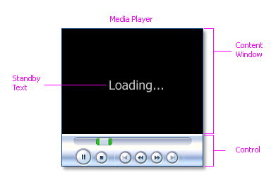
The Media Player renders a media player within a designated area for playing multimedia files.
Note: Images in this guideline are provided as a general reference, and may not be exact representations of FusionFX pages.
Related Guidelines
| Guideline | Section | For Information About |
|---|---|---|
| PanelBox | All | Optional container for Media Player. |
| PanelAccordion | All | Optional container for Media Player. |
| Secondary Windows | Modeless Dialogs | Optional container for Media Player. |
Related ADF Elements
Refer to the ADF Faces Rich Client demos page to find demos and tag documentation for the ADF elements related to this component:
| ADF Element | Notes |
|---|---|
| af:media |
General Principles

Purpose:
Play multimedia files using a standard media player.
Description:
The following types of media players are supported by the Media player (links point to external web sites):
Media Player Elements
Usage:
- Only one media player should be used per page because it is not useful to display two videos simultaneously.
- The media player may be displayed standalone on the page or in a container, such as an Panel Accordion, Panel Box, or Modeless Dialog Window.
- The size of the media player should not exceed the default browser size of 1024 x 768 pixels, and should be significantly smaller when the media player is placed in a container.
- Media players are set to load and play clips automatically, without user initiation. Product teams may override this behavior if it is desired for users to click the Play button in the media player's controls to start playing the media.
- By default, the media player should play content one time. Product teams may set the media player to loop any number of times or loop indefinitely until the user stops the player. This is recommended for short video clips (less than ten seconds) which play automatically on page load.
- Common uses for the media component include audio-visual advertisements or directions to help complete a task, such as the solution for a service request.
Note: Media player controls can vary from media player to media player, so it is recommended that product teams set the Inner Width and Inner Height of the media component instead of the Width and Height. Inner Width and Inner Height control the dimensions of the media content only, whereas, Width and Height control the dimensions of both the player and the content area.
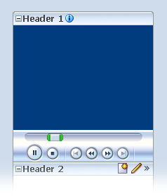
Media Player in an Accordion Pane
Note: Media content must be accessible, including an auditory description, synchronized captions, and an accessible text transcript.
Configurable Elements
Standby Text
Purpose:
Notifies users that media is being loaded.
Usage:
- Standby text is optional, and not displayed by default.
- Standby text is recommended for larger media files, so users realize that the file is being loaded.
- Unless other phrasing is more useful for a specific application, the recommended Standby text is: "Loading..."
Controls
Purpose:
Provide users with the means to control media playback.
Usage:
- Controls vary from one media player to another, but typically include Play, Stop, Previous, Rewind, Fast Forward, Next, Mute, and Volume.
- Likewise, the amount of space occupied by the controls will differ from media player to media player.
- Controls can occupy a significant amount of screen space. Development teams can block or provide different levels of access to controls, by choosing one of the control settings shown in the following table.
| Setting | Description | Recommended Use |
|---|---|---|
| None | No controls for the media player appear, and access to controls through alternative means, such as context menus, is not available. | Only for playback of short clips on page load or on clicking a link, where user control is not needed. |
| None Visible | No controls for the media player appear but access to controls through alternative means, such as context menus, is available. | For playback of short clips on page load or on clicking a link, where some users may want to control the playback, but space is at a premium. |
| Minimal | A minimal set of controls for playing media on the media player is available. These controls give the user control over the most important media playing controls, while occupying the least amount of additional space. | For playback of relatively short clips when space is limited. |
| Typical | A typical set of controls for playing media on the media player is available. Typical is the default value which gives users control over the most common media playing controls, but occupies extra space. | For playback of clips of any length when there is adequate space for controls. Not recommended when displaying the media component in a container. |
| All | All controls which exist for playing media on the media player are available. | For playback of clips of any length when the Media Player is the primary page element. |