Search and Query Usage Guideline 

RCUX Document Version 5.2.0 for Oracle® Fusion Middleware 11g Release 1 Patch Set 1 (11.1.1.2.0)
Last Updated
27-Jun-2011
FusionFX offers a range of search options and layouts to help users locate objects within a specific part of an application or across a broader range of data sources.
- General Principles
- General Search Interaction
- Filtering
- Case Sensitivity
- Wildcards
- Multiple Strings in Search Field
- Boolean Operators
- Symbols
- Spelling
- Synonyms
- Indexed Fields
- Length of Search Time
- Query Components
- Common Search and Results Patterns
- Search Results Display Methods
Related RCUX Guidelines
| Guideline | Section | For Information About |
|---|---|---|
| Page Layout | All | Description of page regions, page layout options, and context regions (for global context regions) |
| PanelAccordion | All | Alternative location for search. |
| Form Layout | All | Layout of search criteria fields. |
| Headers | Header Syntax | Syntax of Search and Results section headings. |
| Secondary Windows | Dialogs | Dialog usage information: Applicable when displaying results in a dialog. |
| Tabs | All | Tab usage information: Applicable when displaying results in a separate tab. |
| Table Information Design | Displaying an Empty Table | Display of results table without data. |
| Table Elements | QBE (Query By Example) Bar | Option for searching within a table. |
| Common Table Actions | Select and Add | Custom form of LOV dialog used for limited search with tables. |
| LOV | Search and Select Dialog | Method for searching within a limited range of objects. |
Related ADF Elements
Refer to the ADF Faces Rich Client demos page to find demos and tag documentation for the ADF elements related to this component:
| ADF Element | Notes |
|---|---|
| af:panelHeader | Header for search criteria and results. |
| af:query | Search with multiple criteria. |
| af:quickQuery | Quick search. |
| af:dialog | Dialog box. |
| af:menu | Menus. |
| af:noteWindow | Note window. |
General Principles

Purpose:
Search is used to locate objects within a specific part of an application or across a broader range of data sources. Some types of searches serve a unique purpose, such as searching across tabs and objects in an application or application suite. Others may serve the common purpose of searching for specific objects, but offer a varied layout choice, such as search within a section of the page and search in an accordion pane.
Overview:
FusionFX applications feature many different types of search, each type with several options depending on the required functionality and user needs. The FusionFX query components help the user define the query that is sent to the database to produce a set of search results. Product teams then determine which component (table, tree table, etc.) is best suited to display the results.
The FusionFX query component is "model-driven," meaning that most of the UI is set up in the data model. Consequently, product teams can control the look in the data model, which makes UI fixes minimal to automatic if the model changes (for example, a search column is dropped or an attribute changes data type from text to number).
Types of Search
There are two primary types of search in FusionFX applications. The key difference is the scope of the search:
- Global Search
- Focused Search
Global Search searches across multiple data sources and business objects in an entire application or application suite. It often searches a crawled index, like common Web search engines, rather than running a real-time search of transactional tables. Global search indexes are refreshed periodically, so search results may not be fully up to date. When provided in an application, global search always appears in the global layer at the top of the page (see the Page Layout guideline).
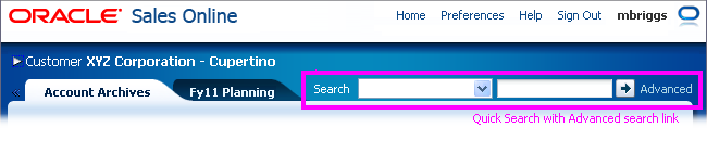
Global Search
Focused Search searches a specific object type or group of related data sources, such as the user's expense reports or contacts. Focused search typically uses transactional search facilities that provide real-time search of the transactional tables. Unlike global search, which is always present in the global layer, focused search appears in a page content region only when it is applicable to a specific task.
Focused Search in Main Content Region
Global search and focused search are implemented differently in application UI:
- Global Search: Always implemented with a Quick Search component (af:quickQuery) in the global layer at the top of the page.
- Focused Search: Focused Search May be implemented with either a Quick Search or Search with Multiple Criteria component (af:query) in either the main content region or in an accordion pane.
General Search Interaction
Search capabilities will vary depending on the type of search technology used, but here are some considerations for search interaction:
Filtering
Use of a filter is not the same as running a query. The key difference is that filtering searches within a set of already-retrieved results, whereas a query searches for a new set of results. The only filtering supported by ADF is provided through QBE (see QBE (Query By Example) Bar in the Table Elements guideline), but product teams may build their own filtering tools, such as providing select choice lists with pre-defined filters.
Case Sensitivity
Search criteria text fields should NOT be case sensitive. They should retrieve the same results for upper or lower case letters. For example, "KMart" "Kmart," "kMaRt" or "kmart" should all be treated the same way, and should return any value with "Kmart" regardless of capitalization.
Wildcards
Some search technologies allow "wildcard" characters like the underscore (_), question mark (?), percent sign (%), or asterisk(*) to be used to search for one of more characters. Wildcard characters may slow down search performance and should be provided only for advanced users.
Multiple Strings in Search Field
Different search technologies exhibit slightly different behaviors when a user enters multiple strings into a search field. Some treat the contents of the field as a single entity or single string while others search by an implicit "or", and do relevance ranking using "and". In the latter case, product teams can use "progressive relaxation" to control relevance based on occurrence and proximity of search terms. Quotation marks are often used to explicitly indicate that multiple strings should be treated as a single entity.
Boolean Operators (AND/OR)
In general, forming complex query statements with many levels of "and" and "or" statements is too difficult for most users. Nevertheless, an expert user who is familiar with Boolean searches may need to be able to form more complex queries. This is useful when users want to retrieve a very limited set of results.
Symbols
Symbols other than wildcards should be ignored in the search. Common types of ignored symbols include: currency symbols (such as dollar, yen, and euro symbols) and sentence punctuation (such as commas, periods, and hyphens).
Spelling
Dictionary matches allow matches between words with similar spellings, including misspellings, such as "expense" and "expence." Word stem matches allow word stems, such as "run", to match other parts of speech, such as "ran" and "running." Enabling dictionary and word stem matches is strongly recommended, as it is expected by users.
Synonyms
Synonym matches allow matches between words with similar meanings, such as "Bob" and "Robert." Development teams should provide the following types of synonyms for the entities they own:
- Object type synonyms (such as "Service Request" and "Trouble Ticket")
- Object type abbreviations (such as "PO" for "Purchase Order")
- Attribute name synonyms (such as "Code" and "ID")
- Page text synonyms, including synonyms for terms that appear in field labels, menu items, and page and section titles.
Indexed Fields
In general, it is preferable to allow users to choose which search fields to fill in before running a search, rather than requiring them to provide values for specific fields. Nevertheless, in order to improve performance, it may be necessary to optimize the database view object for search by marking specific columns as "indexed." These indexed columns may be surfaced in the UI in two ways:
- In required fields: If the user must provide a value for the indexed field before searching, or there is only one indexed field.
- In selectively required fields: If the user must provide a value for at least one of the indexed fields before searching.
Columns should be marked as indexed based on the likelihood of users searching on them—rather than on technical grounds, such as number of values, data type, and status as a unique key. If a field is required, users should be expected to be familiar with its values, and it must also be a field users prefer to search on. See Status Indicator below for more details on how indexed fields are displayed in the UI.
Required and indexed field validation should occur only when the user clicks the Search button, not when the field loses focus, as the user should have the freedom to fill out the fields in any order before executing the search.
If the user fails to fill out one of the indexed fields and attempts to execute the search, show an error message with the following text: "You must fill out one of the following fields before starting your search: {FieldNameX}[, FieldNameY][, FieldNameZ]." Note that the error message should be a global page message, not a component level message (see the Message Framework guideline); error messages at the component level would indicate that all fields must be filled out, which is neither correct, nor practical in certain search contexts.
Length of Search Time
Search should be optimized so that the user does not have to wait a long time for results to be retrieved. Depending on the size of the data set being searched, and the complexity of the search, the search time may vary. Users should be informed of delays both prior to conducting a search and during a search so that they know what to expect.
- Use a processing indicator when the search is expected to take more than five seconds to return results. See the Progress/Status Indicator usage guideline.
- Use a select choice list to restrict the search to specific object types or attributes. See the Attribute List section below.
- Primary search attributes should be indexed where needed to improve search performance. See Indexed Fields above.
Query Components
FusionFX applications may use two different query components: Quick Search and Search with Multiple Criteria.
Quick Search
Purpose:
Quick Search provides a simple, single-field search mechanism for global or focused search.
Description:
Quick Search is intended to search a specific key attribute of an object type, such as an object name. For instance, an object list page titled "Purchase Orders" may contain a Quick Search field labeled "Search" in the criteria section. The user types the purchase order name (or partial string) and then clicks the iconic Search button to query the results.
The Quick Search component can be displayed in horizontal and vertical layouts.
Quick Search Elements - Horizontal Layout
Usage:
When used for global search, Quick Search is always placed in the global layer. When used for focused search, Quick Search may be placed in an accordion pane or in the main content region. See Types of Search above for an explanation of global and focused search; see Common Search and Results Patterns below for more layout information.
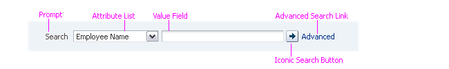
Prompt
Purpose:
Identifies the field as a search component, or indicates what is being searched for.
Description:
- The prompt is a text string that appears either before or above the Quick Search fields. By default, it appears before.
- The default text of the Quick Search prompt is "Search".
Usage:
- Product teams may replace the default prompt with a more specific term if appropriate:
- If the search is restricted to a specific object type, such as "Asset Number" or "Customer", use that term as the prompt for most cases.
- If the search is applicable to multiple object types, either with or without an Attribute List before the search field, use the default prompt.
- When Quick Search is displayed in a content region below a header, and the header describes the search, the prompt may be hidden. See the Headers guideline for details.
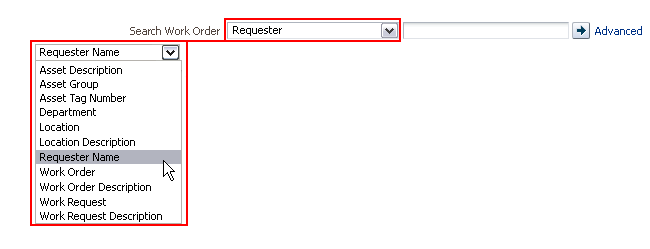
Attribute List
Purpose:
Helps the user refine a search to a specific object type or attribute.
Description:
- The attribute choice list contains a small list of common attributes (such as Employee ID, Last Name, etc.) for the object being searched.
- By default, the list contains the entire set of searchable attributes defined in the data model. Product teams may configure the model to show only a subset of the attributes.
Quick Search with Attribute List
Usage:
- It is recommended to sort the list of attributes alphabetically or in some other logical order.
- The list should be defaulted to a specific, commonly searched attribute. For instance, if searching for an order, the attributes in the choice list may be Order Date, Order Name, Order Number, and so on, but the list may be defaulted to the commonly searched attribute Order Number.
- The choice list may contain an "All" value, although searching across all attributes may take an excessive amount of time.
- It is recommended that the items within the attribute list be indexed to improve search performance. See Indexed Fields above.
- If the user typically needs to search on more than one attribute to retrieve a more specific set of results, use Search with Multiple Criteria instead to display the 3-5 most common attributes.
Value
Purpose:
Displays the Quick Search criteria string.
Usage:
- The value field is a text box by default; however, product teams can configure the data model to use a different control than a text box for the value, depending on the data type of the attribute selected in the attribute list.
- It is recommended to use a control that closely reflects the data type, for instance, an Input/Choose Date component for dates or a spin box for numbers.
- Do not use an LOV for the value field in the Quick Search component.
- The condition used in the Quick Search is defined in the data model and cannot be changed by the end user. Recommended conditions are as follows:
- Text data type - Starts with
- Number data type - Equals
- Date data type - Equals
Search Button
Purpose:
Submits the query string to the database.
Usage:
- The default tooltip of the search button matches the prompt. If the prompt does not adequately describe the function of the button, the product team may provide a more descriptive tooltip in place of the default (for example, "Search: Asset Number").
- Product teams should not use the button label "Find" in place of "Search".
Advanced Search Link
Purpose:
Displays Search with Multiple Criteria in Advanced mode.
Usage:
- When the application allows users to navigate from the Quick Search to Advanced Search, product teams should add an Advanced Search link as follows:
- After the Search button, when the Quick Search component uses a horizontal layout, or
- Below the Value field and Search button when the Quick Search component uses a vertical layout.
- See Search with Multiple Criteria for details on Advanced Search.
- The text of the Advanced Search link should be "Advanced".
- When the user clicks the Advanced Search link, product teams may either replace Quick Search with Search with Multiple Criteria, or display Search with Multiple Criteria on a separate tab while Quick Search remains in view. See Common Search and Results Patterns for details.
- Product teams may hide the Advanced Search link if access to additional search criteria is not needed.
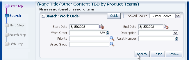
Search with Multiple Criteria
Purpose:
Search with Multiple Criteria may be used when users need to search for objects with many associated attributes. Users may not have found the objects using Quick Search, and want more criteria to refine the search.
For instance, the user may be searching for all projects that were started by a certain date, with a certain status, that are managed by a certain person, and that fall under a specific organization. Search with Multiple Criteria allows the user to fill out these specific criteria or object attributes to retrieve this type of query.
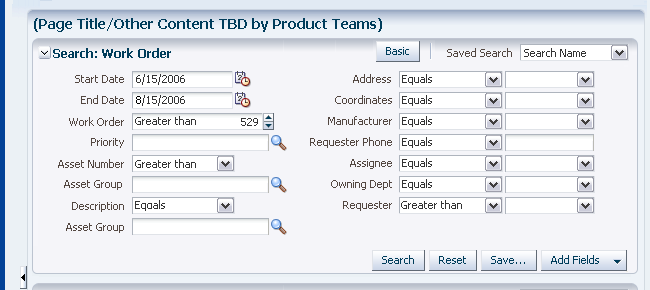
Search with Multiple Criteria - Basic Mode
Search with Multiple Criteria - Advanced Mode
Usage:
- Search with Multiple Criteria has two modes: Basic Search and Advanced Search. Product teams can configure Search with Multiple Criteria to show search fields in Basic mode, Advanced mode, or both.
- It is common to hide Match Type and conditions in Basic Mode.
- Product teams should use one of the following approaches to organize fields:
- Organize fields so that 80% of users can use Basic mode, another 18% can use Advanced mode, and the last 2% can use the Add Fields button. See Action Buttons below for details on adding fields. OR
- Provide a maximum of five attributes for the Basic mode and a maximum of ten attributes for the Advanced mode. For more than ten attributes, use the Add Fields button.
- The user may fill out some or all of the attributes within the criteria section. If a user leaves one of the attributes blank, the attribute is not included in the search.
- Search with Multiple Criteria supports three layout types: default, simple, and compact.
- The default layout type should be used for most cases.
- In the simple layout, the header and action buttons are hidden. This layout is best used when Search with Multiple Criteria is used in a dialog.
- In the compact layout, the header text is hidden, the Saved Searches list is start-aligned, and the Search mode button appears in the footer. This layout type is best used when search with multiple Criteria is used in a narrow area like an accordion pane.
- Search fields may be laid out in one or multiple columns. See Columns in the Form Layout guideline for recommendations on structuring the fields in columns.
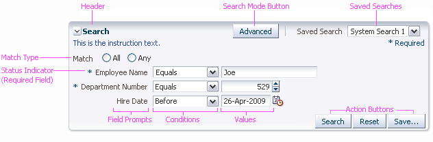
Header
Purpose:
Identifies the region containing Search with Multiple Criteria.
Description:
- The search header has a Disclosure icon.
- The search header displays two controls by default: a Search Mode button and Saved Searches list. See the related sections below for more details on these controls.
- Product teams may add custom controls to the header. Custom controls appear between the Search Mode button and Saved Searches list. A separator appears before and after the custom controls.
- The search header displays in both Basic and Advanced modes. It is hidden when using a simple layout.
- In a compact layout, the header text and container are hidden, but the disclosure icon and Saved Searches list remain visible.
- See the Headers guideline for more information on headers.
Usage:
- The default label of the search header is "Search". Product teams may change the default text to make it more specific, with the syntax "Search: [ObjectType]". See Header Syntax in the Headers guideline for details.
- Search with Multiple Criteria is expanded by default. Teams may show it collapsed by default when searching is not the primary task on a page.
Search Mode Button
Purpose:
Toggles between the Basic and Advanced modes of Search with Multiple Criteria or between the Advanced mode of Search with Multiple Criteria and a Quick Search component.
Description:
- When there is a one-to-one correspondence between a search field in Basic mode and Advanced mode, the existing value in the search field persists when switching from Basic to Advanced, and vice-versa.
- The Search Mode button displays in both Basic and Advanced modes.
Toggle from Basic to Advanced Search
Usage:
- The Search Mode button can appear either before the Saved Searches list in the header or before the Search button in the footer. The default placement is in the header.
- Showing the Search Mode button in the header is recommended when Search with Multiple Criteria is shown in a wide area like the main content region since it is easier for users to find the button when it is near the top.
- Showing the Search Mode button in the footer is recommended when Search with Multiple Criteria is shown in a narrow area like an accordion pane since more header space is needed for the header text and saved searches list.
- In a compact layout, the Search Mode button always appears in the footer.
- The Search Mode button should be hidden if there is only a single presentation for Search with Multiple Criteria (that is, no Basic and Advanced modes), or if the Basic mode of the panel still persists after the Advanced mode is revealed.
Saved Searches
Purpose:
Show application-seeded and user-defined search criteria.
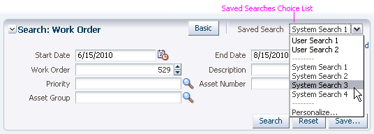
Saved Searches Choice List
Description:
- A saved search includes:
- The visible search fields
- The selected conditions
- The criteria values
- The search mode
- Selecting an option from the Saved Searches list updates the criteria to match that of the saved search. The action may also execute the search depending on how the user defines the search in the Personalize Saved Searches dialog.
- The Saved Searches list appears in both Basic and Advanced modes whenever the Save… button appears. However, it is not mandatory for the Save… button to appear when the Saved Searches choice list appears—an application may provide pre-seeded saved searches, but not permit users to save their own searches.
- A "Personalize…" option appears as the last option in the choice list when users are allowed to save and edit their own searches. Selecting Personalize… launches the Personalize Saved Searches dialog, where users can delete a saved search or modify the attributes of existing saved searches.
- In a compact layout, the Saved Searches list appears next to the Disclosure icon in the header.
- Clicking the Save… button launches the Create Saved Search dialog, where users can specify attributes for the new saved search.
- Users cannot create or rename a saved search with the same name as an existing search.
Usage:
- Save functionality is useful when there are a wide variety of fields that cater to different user needs, or when users are expected to run the same query frequently.
- Seeded searches should be provided in conjunction with Save functionality, so users have a starting point. When the Saved Searches list is turned on:
- To begin, the list must always contain at least one seeded search that is defined as the default, which will be displayed in the list.
- Product teams must define a seeded search as the default, and users may then set a different search (either seeded or saved search) as the new default search.
- The names of seeded searches should describe the search criteria concisely. Where possible, saved search names should include the values of key search fields, such as My Service Requests, New Service Requests, and Open Service Requests. The recommended name for the initial default seeded search is "<Application Default>", if no other useful name can be found.
- Search fields are populated with the default saved search criteria on page load.
- Where possible, the query based on the default saved search and all seeded searches should be executed automatically.
- Users cannot modify seeded searches.
- Consider providing seeded searches without a Save… button when you don't want to allow end users to create their own saved searches. This may either be because of an administrator policy (for example, to prevent people from building performance-risky queries), or because you want to simplify the UI by giving some common queries (such as different price ranges) without providing unnecessary customization.
Instruction Text
Purpose:
Provides users with additional information about the search task.
Usage:
- Omit instruction text for simple and straightforward search tasks. Search is a common interaction in Web applications; in most cases, users know what to do simply by seeing a header or button labeled "Search".
- Instruction text should inform the user about possible search restrictions (such as case sensitivity) or tips for advanced searching, such as Booleans and wildcards.
- If used at all, instruction text should be shown in both Basic and Advanced modes; however, different text may be used in each mode to call attention to differing search behaviors or expectations.
Status Indicator
Purpose:
Denotes when a search field is required or selectively required.
Description:
- A required field is denoted by a blue asterisk. When a search field is marked as required, the text "* Required" appears in the key notation area of the search region.
- A selectively required (indexed) field is denoted by two green asterisks. When a search field is marked as selectively required, the text "**At least one is required " appears in the key notation area of the search region.
Usage:
- It is recommended to allow users to choose which search fields to fill in before running a search, rather than requiring them to provide values for specific fields. Nevertheless, in order to improve search performance, it may be necessary to indicate that certain fields must have values before the user runs a search.
- If the user must provide a value for a specific search field, mark the field as required. If the user must provide a value for any one of several search fields, mark those fields as selectively required (indexed). This must be configured in the data model.
- For an overview of indexing, see Indexed Fields above.
Match Type
Purpose:
Defines whether the search criteria should be treated as an AND search or an OR search.
Description:
Match Type is a radio button group that appears below the instruction text.
- The first option is labeled "All". Selecting this option treats the search as an AND search.
- The second option is labeled "Any". Selecting this option treats the search as an OR search.
Usage:
- Although teams may show Match Type in both Basic and Advanced search modes, it is recommended to show Match Type only in Advanced mode. In Basic mode, the AND condition ("All" option) should be assumed.
- Product teams may hide Match Type in both Basic and Advanced search modes for performance reasons.
- Product teams define the default condition for Match Type in the data model, and when Match Type is hidden, the default selection is used:
- If an AND condition is defined between all criteria, the "All" Match Type option is selected. "All" is also the default selection when there is no AND nor OR condition specified.
- If an OR condition is defined between all criteria, the "Any" Match Type option is selected.
- If the default query contains a mix of AND and OR conditions, neither Match Type option is selected. A mix of AND and OR conditions is strongly discouraged because it gives users no visibility into the conditions, and they may not be able to understand how the default search results were obtained.
- If the user selects a different Match Type option, the selection overrides the default condition. The user may press the Reset button to restore the default state of the search.
Field Prompt
Purpose:
Identifies the type of criterion in the search field.
Usage:
- Use of prompts is required.
- There is no limit to the number of characters allowed in the prompt, but product teams must make sure that the layout allows for prompts to become up to 100 percent longer in translation.
- Prompts may be placed before or above the search fields. Place the prompts before the fields in most cases. If horizontal space is an issue, such as inside an accordion pane, place the prompts above the fields.
- Prompts should use headline capitalization. See Capitalization in the Language in UI guideline for details.
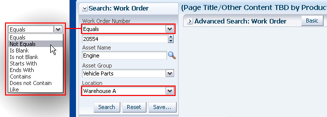
Conditions
Purpose:
Provide more complex querying capabilities by allowing the user to limit results based on pre-defined query conditions.
Conditions Choice List: Data Type - Text;
Description:
- The condition choice list contains a list of pre-defined options according to the data type of the search field.
- The list of conditions varies based on the data model and the search technology. The following tables show examples of conditions in ADFm (ADF model) for SQL-based searches. Other model implementations and other search technologies may have different conditions.
Conditions for Data Type - Text:
| Condition | Search String | Matches | Does Not Match | Notes |
|---|---|---|---|---|
| Starts with | Acme Corp | Acme Corporation Acme Corps of Marines |
Macme Corp Acme Tools Corp |
Recommended default condition. |
| Ends with | Acme Corp | Smith & Acme Corp Macme Corp |
Smith & Acme Corporation Acme Tools Corp |
|
| Equals | Acme Corp | Acme Corp | Acme Corporation Smith & Acme Corp Macme Corp |
|
| Does not equal | Acme Corp | Acme Corporation Smith & Acme Corp Macme Corp |
Acme Corp | |
| Contains | Acme Corp | Acme Corp Acme Corporation Smith & Acme Corp Macme Corporation |
Oracle Corporation AcmePlus Corp Acme Tools Corp |
Uses the LIKE operator in SQL. |
| Does not contain | Acme Corp | Oracle Corporation AcmePlus Corp Acme Tools Corp |
Acme Corp Acme Corporation Smith & Acme Corp Macme Corporation |
Uses the NOT LIKE operator in SQL. |
| Is blank | Value field is hidden | All records that have empty (null) values | Records with values | Uses the NOT EXISTS operator in SQL. |
| Is not blank | Value field is hidden | All records that have values | Records that have empty (null) values | Uses the EXISTS operator in SQL. |
Conditions for Data Type - Number:
| Condition | Search String | Matches | Does Not Match | Notes |
|---|---|---|---|---|
| Equals | 100 | 100 100.00 0100 |
10 101 0.100 |
Recommended default condition. |
| Does not equal | 100 | 10 101 0.100 |
100 100.00 0100 |
|
| Less than | 100 | 10 0.100 |
100 101 1000 |
|
| Less than or equal to | 100 | 100 10 0.100 |
101 1000 |
|
| Greater than | 100 | 101 1000 |
100 10 0.100 |
|
| Greater than or equal to | 100 | 100 101 1000 |
10 0.100 |
|
| Between | 0.5 - 100 | 0.5 0.50 0 5 10 100 100.00 |
0.005 0.05 101 1000 |
Searches for records that are greater than or equal to the first number, and less than or equal to the second number. Leaving the first value blank returns all records that are less than or equal to the second number; leaving the second value blank returns all records that are greater than or equal to the first number. |
| Not between | 0.5 - 100 | 0.005 0.05 101 1000 |
0.5 0.50 0 5 10 100 100.00 |
Searches for records that are less than the first number, and greater than the second number. Leaving the first value blank returns all records that are greater than the second number; leaving the second value blank returns all records that are less than the first number. |
| Is blank | Value field is hidden | All records that have empty (null) values | Records with values | Uses the NOT EXISTS operator in SQL. |
| Is not blank | Value field is hidden | All records that have values | Records that have empty (null) values | Uses the EXISTS operator in SQL. |
Conditions for Data Type - Date:
| Condition | Search String | Matches | Does Not Match | Notes |
|---|---|---|---|---|
| Equals | 25-JUN-2008 | 25-JUN-2008 | 25-JUN-2007 24-JUN-2008 |
Recommended default condition. |
| Does not equal | 25-JUN-2008 | 25-JUN-2007 24-JUN-2008 |
25-JUN-2008 | |
| Before | 25-JUN-2008 | 25-JUN-2007 24-JUN-2008 |
25-JUN-2008 17-MAR-2009 |
|
| After | 25-JUN-2008 | 25-JUL-2008 24-JUN-2009 |
25-JUN-2008 24-JUN-2008 |
|
| On or before | 25-JUN-2008 | 25-JUN-2007 25-JUN-2008 |
26-JUN-2008 24-JUN-2009 |
|
| On or after | 25-JUN-2008 | 25-JUN-2008 24-JUN-2009 |
25-JUN-2007 24-JUN-2008 |
|
| Between | 01-JUN-2007 - 25-JUN-2008 | 01-JUN-2007 02-JUN-2007 01-JAN-2008 25-JUN-2008 |
31-MAY-2007 26-JUN-2008 01-JUL-2008 |
Searches for records that are after or equal to the first date, and before or equal to the second date. Leaving the first value blank returns all records that are before or equal to the second date; leaving the second value blank returns all records that are after or equal to the first date. |
| Not between | 01-JUN-2007 - 25-JUN-2008 | 31-MAY-2007 26-JUN-2008 01-JUL-2008 |
01-JUN-2007 02-JUN-2007 01-JAN-2008 25-JUN-2008 |
Searches for records that are that are before the first date, and after the second date. Leaving the first value blank returns all records that are after the second date; leaving the second value blank returns all records that are before the first date. |
| Is blank | Value field is hidden | All records that have empty (null) values | Records with values | Uses the NOT EXISTS operator in SQL. |
| Is not blank | Value field is hidden | All records that have values | Records that have empty (null) values | Uses the EXISTS operator in SQL. |
Usage:
Although teams may show the condition list in both Basic and Advanced search modes, it is recommended to show the list only in Advanced mode. When the condition list is hidden in Basic mode, it is recommended to define the following default conditions in the data model:
- For Text: Starts with
- For Number: Equals
- For Date: Equals
Value
Purpose:
Displays the data for the criterion used in the query.
Description:
- The default control used for the value depends on the data type for the search field:
- For Text: Input/Output Text
- For Number: Spinbox
- For Date: Input/Choose Date
- When the condition is changed to "Between" or "Not between", two copies of the control are shown for the value, and any existing entry is moved to the first copy of the control. When the condition is changed from "Between" or "Not between" to something else, only the entry in the first copy of the control is retained.
- Product teams may configure the value to support selection from a list:
- The list control may be one of the following: LOV text field, LOV choice list, true/false checkbox, select choice.
- When a select-many choice list is used for the list control, the user can search for multiple values for a single criterion, similar to the IN operator in SQL.
- The list control appears only when the condition is "Equals" or "Does not equal". The default control appears for all other conditions.
- The value appears in both Basic and Advanced modes.
Usage:
- Product teams may pre-populate a search field with a default value, but it should be a value that is likely to produce results since users expect defaults to be valid.
- If the default control does not match the potential data for the field, teams can define a different control in the data model. For example, for a list of specific text values, a team may want to use a select choice list instead of input/output text.
- Do not use an LOV for a value field serving as a unique identifier (such as an ID) that returns only one result regardless of any other search criteria, and limit use of LOV's elsewhere in Search. A LOV forces a user to pick a specific value: this defeats the purpose of the object list where a user may want to search for multiple values containing a similar string, and requires the user to have to search twice—first in the LOV, and then when the Search button is pressed.
- The size of each field is set in the data model, and product teams should size fields to fit the data the user is likely to enter. This provides a visual cue for the amount of input expected, and makes it easier to review the data in the field.
Action Buttons
Purpose:
Perform query component actions.
Description:
- Search with Multiple Criteria includes the following action buttons:
- Search: Submits the query to the database.
- Reset: Sets the fields and values back to their original state in the currently selected saved search. If there is no selected saved search, the fields and values are set back to their original state in the default search.
- Save…: Launches the Save Search dialog which enables users to save a search with the currently defined criteria. When the Save… button is shown, the Saved Searches list is also shown. See Saved Searches above for details.
- Add Fields: Inline selector button that lets users add additional criteria fields. A Remove Fields iconic button is appended to each additional criteria field, allowing users to remove the fields they added.
- Search, Reset, and Save… appear in both Basic and Advanced modes. Add Fields and Remove Fields appear only in Advanced mode.
- Action buttons are hidden in the simple layout.
Add Fields Selection Panel
Usage:
- The Save… button is shown by default; however, product teams may hide it if users are not allowed to save their own searches.
- By default, the Add Fields list contains the entire set of searchable attributes defined in the data model. Product teams should customize this list to show just those fields which end users are likely to search on—a long list of fields can appear daunting to most users.
- The Add Fields list may show fields that are already displayed. Adding a field that is already displayed creates two instances of the field (for example, two "Employee Name" fields). The duplicate field should be shown directly below the original.
- The attributes in the Add Fields list appear in the order defined by the data model. The list should be sorted alphabetically, numerically, or by some other logical order (such as a sorted list of account codes).
- In the data model, product teams define the locations for the added fields to appear. Added fields should be placed in an order that is logical to the user.
- When a simple layout is being used (for instance, in a dialog), teams must add their own search action buttons into the footer.
Common Search and Results Patterns
Global Search
Purpose:
Allows a user to search across multiple objects in an application.
Description:
- Global search is implemented with a Quick Search component in the Global Context Region (in the Page Layout guideline).
- Global search shows results similar to those from a Web search engine. Results are displayed in a dialog or separate tab in the main content region. See Search Results Display Methods for details.
- The Quick Search component contains a select choice list of object attributes, allowing the user to quickly search for a specific order number, a specific customer ID, a specific product type, and so forth from any page.
- The Quick Search component may include an Advanced Search Link so users can specify more criteria. In this case, the Advanced mode of Search with Multiple Criteria is displayed on a separate tab or in a dialog, while Quick Search remains in place.
Global Search
Usage:
- The Quick Search component should not be pre-populated with default values, because the range of commonly-entered queries in global search is too great to predict.
- The Advanced mode of Search with Multiple Criteria should not include a button to toggle back to Basic Search because the Quick Search component remains on the page.
Search in Accordion Pane
Purpose:
Allows a user to perform a simple search within an accordion pane. It is used for focused search.
Description:
This pattern can be provided using either a Quick Search component or Search with Multiple Criteria. Results should appear either in a dialog or a separate tab.
Search in an Accordion Pane
Usage:
- A compact layout is suitable when Search with Multiple Criteria is used in a narrow area such as the Accordion Pane.
- In addition to the accordion panel header, search fields may have a header and one or more prompts, depending on the type of search component and other content in the accordion pane:
- Quick Search: A prompt is recommended except when the pane has no other content and the accordion pane header describes the purpose of the Quick Search. Quick Search is not associated directly with a header. See Quick Search above for details.
- Search with Multiple Criteria: A section header is recommended when the accordion pane has other content, but should be omitted when the pane is used solely for search and the accordion pane header describes the purpose of the search. Each search field should have a field prompt. See Search with Multiple Criteria above for details.
- The recommended number of search fields depends on the type of search component:
- Quick Search: May include a single attribute field in addition to the value field. See Attribute List above for usage recommendations.
- Search with Multiple Criteria: Provide no more than four search fields in the pane. The fields displayed should be those used by 80% of all users.
- When using a Quick Search, the attribute choice list should use key attributes to search by, such as Customer Name and Order Number.
- This pattern should be used only when searching is not the primary task. It should not be combined with search within the main content region, except where Advanced Search is displayed in that region.
- Search in an accordion pane may include a link or button to go to Advanced Search. The Advanced mode of Search with Multiple Criteria is usually displayed in a separate tab in the main content region. As a result, it is recommended to place the accordion in a split pane so users can resize or collapse the accordion to increase space for Advanced Search. See the PanelSplitter guideline for details.
- In some cases, an accordion pane may include both search fields and a results table.
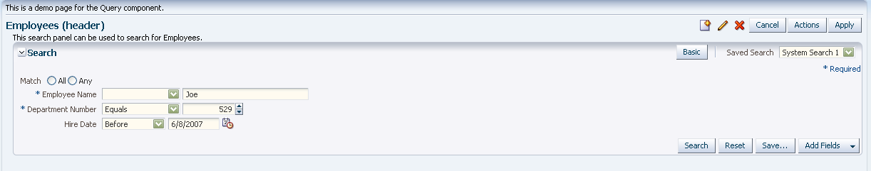
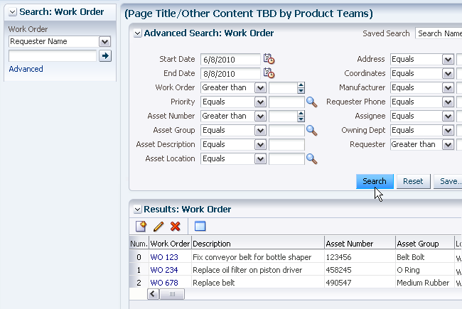
Search in Main Content Region
Purpose:
Provides both search and results within the same region.
Description:
This pattern can use either a Quick Search component or Search with Multiple Criteria. In both cases, a result table is displayed below the search fields.
Search with Multiple Criteria in Main Content Region
Usage:
- This pattern should be used when searching is a key task on the page. It is particularly useful when a specific object type may have hundreds to thousands of records, and it is necessary to narrow down the list to a manageable size using a range of criteria fields.
- In this pattern, it is recommended to provide an Advanced Search option, either as a link or button depending on the choice of component (Quick Search or Search with Multiple Criteria). The component is then replaced with the Advanced mode of Search with Multiple Criteria which contains a Basic button to toggle back to the previous search component.
Search Results Display Methods
Search results can be displayed in four different ways:
- On the same page
- In a new tab
- In a dialog
- With a shortcut directly to the single matching object.
Results on the Same Page
Showing the results on the same page is best for search in the main content region, or any time when tabs are not used in the application. The results are shown below the query component. A results header is optional, and it may also include a Disclosure icon. When a header is provided, the suggested header syntax is: "Results[: {ObjectType}]".
If the search region takes up more than half the screen, product teams should auto-collapse the search region when the results are shown.
This pattern can also be used for search in an accordion pane, where the results appear below the query component in the same accordion pane.
Search and Results on Same Page
Results in a New Tab
Showing results in a new tab lets users compare the result set with the objects they are currently working within the main content region. This display method is usually the best option for search in an accordion pane to make sure the user doesn't lose context when performing a search. Accordions are typically used for content that is within the current context, so placing the results in a new tab saves the users' previous context, and effectively adds the new search results to the context. The suggested tab name is "Results[: {ObjectType}]".
Unless it is necessary to compare multiple sets of search results, the results from iterative searches should appear in the same tab rather than on separate tabs. This pattern can also be used for global search.
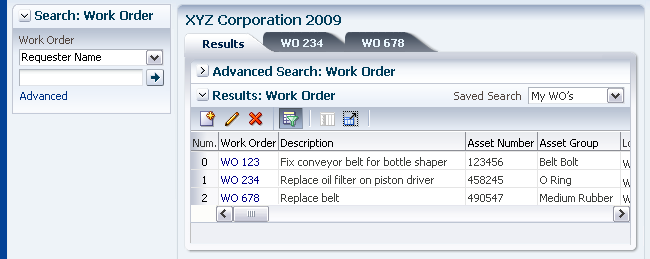
Search with Results on Different Tab
Results in a Dialog
Showing results in a dialog allows the user to find a record while retaining context with the current page. This method is best used as an intermediate step to locate a single object and then display it in the main content area. It is primarily intended for global search, but can also be used for the other search types when the task is to locate and work with a single object rather than to locate and perform actions on multiple objects. The suggested title for the dialog is "Results[: {ObjectType}]"
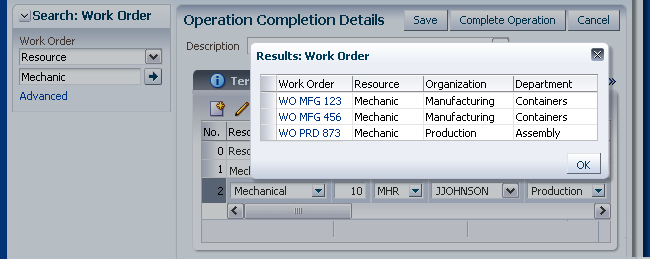
Search with Results in Dialog
Shortcut to Object
When there is a single result, product teams may display the result directly without first displaying it in a list. The drawback to this method, however, is that users cannot perform table actions on the result, so it should be used only when the purpose of the search task is to find records for viewing or direct editing.
Persistence of Results
After users run a search and view the results, they may perform actions on certain records that have been returned. In this case, the application should retain and redisplay the results set when the user returns to that results table.
For instance, the user may search for a specific employee named "Wendy". The results may return with many "Wendy"s and the user then decides to create a new one. The user selects the "Create" button, completes the flow, and returns to the Object List of Employees. The results from the last search ("Wendy") should be persistent. The new item may not be in view (since the table was not re-queried), thus a confirmation dialog should appear at the top of the page confirming that the new employee was created.
Consequently, when users edit a record, the change is reflected in the search results only after they save the changes and run the query again. If the user attempts to run another search before saving the change, a warning message should be displayed.
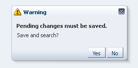
Pending Changes Warning Message