TreeTable Usage Guideline 

RCUX Document Version 5.3.0 for Oracle® Fusion Middleware 11g Release 1 Patch Set 1 (11.1.1.2.0)
Last Updated 08-Dec-2010
The treeTable component displays a tree hierarchy within a tabular layout, allowing concurrent display of multiple objects and associated details.
Related Guidelines
| Guideline | Section | For Information About |
|---|---|---|
| Table Overview | All | Primary method for displaying lists of objects together with their details. |
| Tree | All | Alternate method of displaying hierarchical data. |
| Search and Query | All | Search implementation with hierarchies, and optional sectional grouping of search or view mechanism. |
Related ADF Elements
Refer to the ADF Faces Rich Client demos page to find demos and tag documentation for ADF elements related to this component.
| ADF Element | Notes |
|---|---|
| af:panelCollection | |
| af:treeTable |
General Principles

Purpose: The treeTable (Hierarchy Grid) component is primarily used to display hierarchies of homogeneous objects in a tree, together with columns of object attributes in tabular format.
Description:
The Tree Table is based on the table component, but displays a list of object names within a Tree, rather than as a flat list.
Usage:
- TreeTable components use a specific set of terms to define hierarchical relationships, such as parent/child/sibling and root/branch/leaf. For definitions of these and related hierarchical terms see the Tree guideline.
- Tree Tables display both a hierarchy of objects together with a limited set of details, allowing users to see details for different objects in the hierarchy at the same time.
- Tree Tables are recommended for hierarchies with three or more levels. Shallower lists can be displayed in tables.
- A heterogeneous hierarchy may be displayed in a Tree Table only if attribute columns show attributes that are common to most of the hierarchy's objects.
Tree Table Elements
The treeTable component features elements in common with tables and with Tree components. The following sections provide links to specific sections of the Table and Tree guidelines, and details for elements with distinctive behaviors.
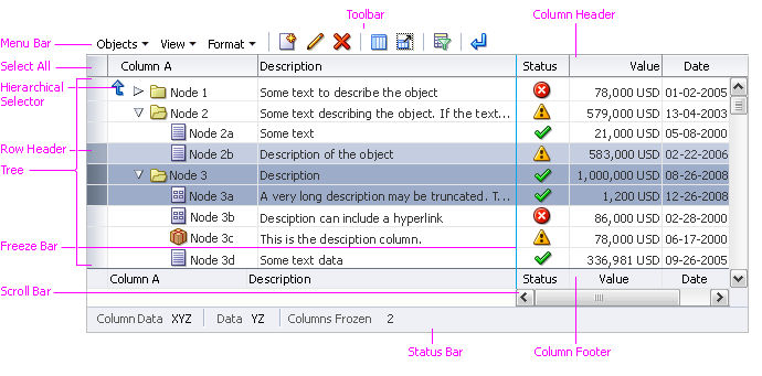
Tree Table Elements
Truncation: The following sub-components of the treeTable component support automatic Resize truncation when text extends beyond the container, or when a user resizes the column or row so that its width is less than that of the text string: tree columns, row and column headers, and tree text. See the Truncation section of the Headers guideline for details.
Note that when a tree is set into a treeTable component it will truncate automatically, but the tree component itself doesn't support truncation.
Tree Column
The Tree column displays a hierarchy in a tree layout, just as a regular Tree component. The tree interaction is identical to that of a Tree component (See the Tree guideline). The column interaction is the same as a table's object column (see Table Elements guideline), except that:
- The Tree column cannot be grouped, unfrozen, totaled, or hidden.
- In most cases, product teams should disable column reordering for the entire Tree Table, so users do not move the Tree column.
Note that the Tree column can be wrapped, resized, reordered, sorted, banded, and bordered, just as other columns.
Tree Tables share the following elements that are used in Trees but not in tables . All links in the following list point to the Tree guideline:
Title Area
Same as Title Area in the Table Elements guideline.
Cells
Same as Cells in the Table Elements guideline.
Attribute Columns
Same as Columns in the Table Elements guideline.
Rows
Same as Rows in the Table Elements guideline except that Tree Table rows do not support sequential numbering of row headers.
Node Icons
Same as Node Icons in the Tree guideline.
Status Icons
Tree Tables can contain multiple columns of status icons, and a single status icon next to each node in the tree.
Help Text
Same as Help Text in the Table Elements guideline.
Active Data
Same as Active Data in the Table Elements guideline.
Menu Bar
Tree Tables may include a menu bar with commands for performing actions on both tables and trees. The rules for enabling each command are identical to those for the Table and Tree components (see the Table Elements and Tree guidelines). Common items in each Tree Table menu are listed in the following subsections, along with the related component.
Object-Specific Actions Menu
The object-specific actions Menu may include a mix of Tree and table commands:
- Add - from Tree component
- Create - from Tree component
- Edit - from Tree component; Click-to-Edit - from Table component
- Duplicate - from Tree component
- Delete - from Tree component
- Remove - from Tree component
- Clear Contents - from Table component
- Increase Indent - from Tree component
- Decrease Indent - from Tree component
For details on Tree commands, see Common Tree Actions and Menus and Toolbars in the Tree guideline. For details on table commands, see the related section of the Common Table Actions guideline.
View Menu
The View Menu includes a mix of Tree and Table commands:
- Columns submenu - from Table component
- Freeze - from Table component
- Detach - from Table component
- Expand - from Tree component
- Expand All Below - from Tree component
- Collapse All Below - from Tree component
- Expand All - from Tree component
- Collapse All - from Tree component
- Show as Top - from Tree component
- Go Up - from Tree component
- Go to Top - from Tree component
- Scroll to First - from Tree component
- Scroll to Last - from Tree component
- Sort - from Table component (see Tree Table Sorting Restrictions below for details)
- Reorder Columns - from Table component
All View menu items listed above are implemented by default. Product teams may disable any of these commands along with any associated direct manipulation actions, if it is necessary to restrict users from modifying the view of the Tree Table.
For details on Tree commands, see Menu Bar and Toolbars in the Tree guideline. For details on table commands, see the Table Display Manipulation guideline.
Format Menu
The Tree Table Format menu is functionally the same as the table Format menu. Typical menu items include:
- Resize Columns
- Wrap
The menu items listed above are implemented by default. Product teams may disable any of these commands along with any associated direct manipulation actions, if it is necessary to restrict users from modifying the format of the Tree Table.
For further details see Format Menu in the Table Elements guideline, and the Table Display Manipulation guideline.
Tree Table Sorting Restrictions
Tree Tables support sorting as in tables, but with the following restrictions:
- Advanced sort is not supported.
- Sorting changes the order in which sibling nodes are listed, and never alters the structure of the hierarchy.
- The Sort action affects all nodes in the the hierarchy. However, the Sort action is performed using lazy evaluation, so sort criteria are only applied to a node once it is expanded.
- The Sort action can be provided in a Tree Table in up to three ways:
- Sort Icon in Tree Column Header: Rearranges all nodes based on the sort criteria associated with the Tree Column.
- Sort Menu Command and Context Menu Item: Rearranges all nodes based on the selection in the Sort submenu: Ascending or Descending.
- Sort Icon in Attribute Column Header: Rearranges all nodes based on the sort criteria associated with the attribute column. Depending on the sort criteria, the sort may be alphabetical, numeric, or date-based.
- For information on sort order, see Sort in the Table Display Manipulation guideline.
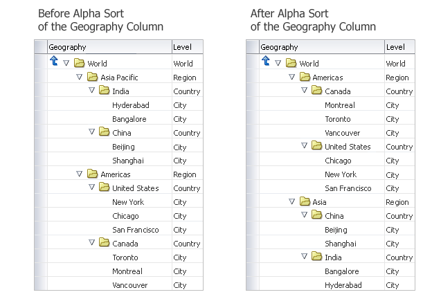
Sorting a Tree Table
Context Menus
As in tables, context menus display all commands available for a row or column. The key difference in a Tree Table is that row context menus may include Object and View menu commands to manipulate the tree, such as Expand and Expand All Below, and Increase Indent/Decrease Indent. See the related component for rules on enabling each menu item.
Toolbars
Tree Table toolbars may also include a combination of commands from table and tree components.
- The default Tree Table toolbar commands are derived from the View and Format menus:
- Freeze
- Detach
- Go Up
- Go to Top
- Show as Top
- Increase Indent
- Decrease Indent
- Wrap
- When the default buttons (provided by ADF) are used in a toolbar, they always appear after any custom buttons added by product teams.
- If it is necessary to restrict users from modifying the layout of the Tree Table, product teams may turn off any of these commands. If so, they must also turn off equivalent menu items and disable equivalent direct manipulation actions.
- When product teams provide a toolbar, and also provide support for object-specific actions, they should include toolbar buttons for the most common of those actions, such as:
- Create or Add
- Delete or Remove
- Edit
- Buttons for common, object-specific actions, such as Create, Edit and Delete, should appear on a toolbar before View Actions, such as Go Up and Go to Top. See the Toolbars guideline for more information.
Actions Column
Same as Actions Column in the Table Elements guideline.
Status Bar
Same as Status Bar in the Table Elements guideline, except: it is not recommended to use the "Rows Selected" status when the Tree Table contains heterogeneous objects or when only the root nodes or only the child nodes may be acted upon. Rendering the "Rows Selected" status in those cases may be confusing to users because the number of rows selected may not be the number of rows that will be acted upon.
Scroll Bars
Same as Scroll Bars in the Table Elements guideline.