Checkbox
amx:selectBooleanCheckbox
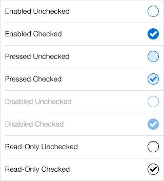
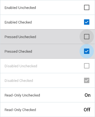
The Checkbox component supports 'checking' or 'un-checking' a box or container. It can be used in Settings or Properties pages on a form. This component has the following elements:
- Label: An optional label for the component.
- Box: This is a circle on iOS and a box on Android.
- Check: This is an element that is checkmark to indicate selection.
Appearance
Appearance characteristics for this component.
- Label: An optional label may be displayed.
- State: Supports enabled, pressed, disabled and read-only.
- Selection: Supports selected and unselected.
- Background: Supports being displayed on a form, page, panel, popup, etc...
- Read-Only: The selected item is black and white.
- Rendered: This component can be shown or hidden.
Behavior
Common behaviors for this component.
- Multiple Selection: Checkboxes allow the user to select multiple options from a set.
- On/Off: The presence of a checkmark in a box indicates that its value is turned on; the absence of a checkmark indicates that the value is turned off.
- Checkbox Groups: When multiple checkboxes are presented as a group, users can select none, one, or more than one at the same time. It might be better to use the Checkbox List component.
- Required: Component can be set to be required to complete.
Usage
Usage guidelines for this component.
- Consider the use of a Switch instead of a Checkbox for obvious on/off selections (i.e. properties page).
- If this component has dependent fields, they should be enabled or disabled rather than hidden or shown.
- If the checkbox is used to drive dependent fields, then update the data as soon as the user taps the checkbox.
- Place the dependent fields immediately after the checkbox or below it to indicate that those fields are dependent on the checkbox.
- Label the checkbox to clearly indicate the meaning of a checked or unchecked state. Checked and unchecked states must be antonyms by definition.
Sample
AMX sample code for this component.
 <amx:selectBooleanCheckbox label="Enabled" id="sbc1"/>

    <amx:selectBooleanCheckbox label="Disabled" id="sbc2" disabled="true"/>

    <amx:selectBooleanCheckbox label="Read-Only" id="sbc3" readOnly="true"/>
Related
- Used On: Phone, Tablet
- Also Called: Check, True/False
- Related Components: Switch
- Resources: None

Fig 1. iOS Checkbox

Fig 2. Android Checkbox