Switch
amx:selectBooleanSwitch
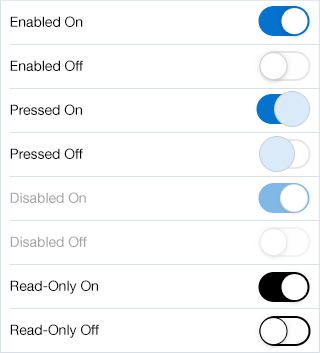
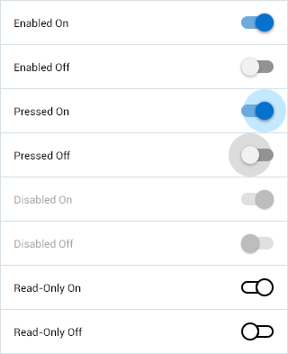
The Switch component displays two mutually exclusive choices. Typically ON and OFF. The switch is frequently used on Settings pages to turn on/off an attribute value. The component has the following elements:
- Label: An optional label for the component.
- Container: The container is pill shaped on iOS, while it is rectangular on Android.
- Segments: There are 2 segments: Selected and Unselected.
- Text: No text is displayed on iOS, while an ON or OFF label is displayed on Android.
Appearance
Appearance characteristics for this component.
- Label: An optional label may be displayed.
- State: Supports enabled, pressed, disabled and read-only.
- Selection: Supports selected and unselected.
- Background: Supports being displayed on a form, page, panel, popup, etc...
- Shape: It is shaped in a form of a pill or rectangle.
- Read-Only: The switch is black and white.
- Rendered: This component can be shown or hidden.
Behavior
Common behaviors for this component.
- Press: On iOS, the circle segment grows and highlights on press. On Android, the rectangle segment just highlights on press.
- Select: To toggle the selection, press and release the switch once.
Usage
Usage guidelines for this component.
- Switches are often grouped in a Form or Settings types of pages.
- Switches only have two mutually exclusive options.
- Switches should be shown as disabled when the choice is not available to the user, but is necessary to display the choice because it may become available in different contexts.
- Switches should be shown as read-only when data is displayed in a read-only page, such as a printable page, and a value has been selected.
Sample
AMX sample code for this component.
 <amx:selectBooleanSwitch label="Enabled" id="sbs1" value="true"/>

    <amx:selectBooleanSwitch label="Enabled" id="sbs1"/>

    <amx:selectBooleanSwitch label="Disabled" id="sbs2" disabled="true"/>

    <amx:selectBooleanSwitch label="Read-Only" id="sbs3" readOnly="true"/>
Related
- Used On: Phone, Tablet
- Also Called: On/Off, Toggle
- Related Components: Checkbox
- Resources: None

Fig 1. iOS Switch

Fig 2. Android Switch