Slider
amx:inputNumberSlider
The Slider component is used to make adjustments throughout a range of allowed values. The thumb of the slider can be dragged with a finger to adjust the value. The filled portion of the bar or track of the slider visually represents the current value. The minimum value is to the left, the maximum value is to the right for LTR languages. The component has the following elements:
- Label: An optional label for the component.
- Bar or Track: Location where thumb control slides left and right inside.
- Thumb: A control that slides left and right in the track.
- Icons: Icons may be placed on the start and end of track to indicate small and large values.
Appearance
Appearance characteristics for this component.
- Label: An optional label may be displayed.
- Orientation: Supports horizontal orientation only.
- State: Supports enabled, pressed, disabled and read-only.
- Selection: Supports selected and unselected.
- Thumb: Its position represents a single value.
- Read-Only: The switch is black and white.
- Rendered: This component can be shown or hidden.
- Icons: An image may be placed at the start and end of slider to reinforce the low/high values or to replace numeric values.
- Required: The show required indicator maybe displayed before the label if it is a required field. The indicator does not appear if a Slider is disabled or read-only.
Behavior
Common behaviors for this component.
- Press: When the user presses the slider, the thumb appears in a pressed state.
- Drag: When the user presses the slider, then drags the thumb left/right or drags his/her finger away, the slider remains selected until the user lifts his/her finger from the device.
- Release: When the user lifts his/her finger, a value represented by position of the thumb is committed.
- Setting: Users can drag the thumb or tap the bar to set the value for the slider.
- Labels: A thumb value label indicates the value associated with the current thumb position. The value displayed depends on the slider's minimum increment setting.
- Textbox: A textbox control allows the user to directly enter a slider value.
Usage
Usage guidelines for this component.
- There should always be a minimum and maximum value within the defined range of the slider component.
- Numbers on a slider may be of any increment.
- Sliders should be avoided where precise numeric entry is required or where there is a wide range of values (e.g., 0 - 1000).
- If the numeric values are meaningful only in terms of being lesser and greater, and the range of values is small, consider using another selection-oriented component such as radio group or choice list, with descriptive labels instead of numbers. For example, instead of rating a product or service from 1 to 5, consider rating it from Poor to Excellent, or Very Dissatisfied to Very Satisfied.
- Representative images should be use to show the low and high value of the slider component.
- Although the slider supports a required field indicator, teams should never set a slider as a required field because it is impossible to have a null value on a slider.
- By default, a single slider thumb is positioned at the start of the the bar. Product teams may change the default position to meet the needs of the slider scale.
Sample
AMX sample code for this component.
 <amx:inputNumberSlider label="Normal" id="ins1" minimum="1" maximum="100" stepSize="1" value="55" imageRight="images/largeVol.png" imageLeft="images/smallVol.png"/>

    <amx:inputNumberSlider label="Disabled" id="ins2" minimum="1" maximum="100" stepSize="1" value="55" disabled="true" imageRight="images/largeVol.png" imageLeft="images/smallVol.png"/>

    <amx:inputNumberSlider label="Read-Only" id="ins3" minimum="1" maximum="100" stepSize="1" value="55" disabled="true" imageRight="images/largeVol.png" imageLeft="images/smallVol.png"/>
Related
- Used On: Phone, Tablet
- Also Called: Seek Bar
- Related Components: Textbox
- Resources: None
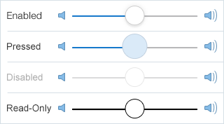
Fig 1. iOS Slider
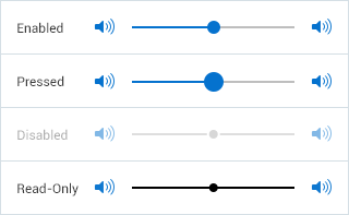
Fig 2. Android Slider