Textbox
amx:inputText
The Textbox component is a text input field that accepts either a single line or multiple lines of input. This component has the following elements:
- Label: An optional label for the component.
- Container: A long container including input text, hint text and other elements.
- Cursor: Device platform provides a blinking cursor.
- Hint Text: Placeholder text is optional element for the container.
- Input Text: The text that the user enters.
- Mask: The masked bullets are used on secret input type.
- Search: The search icon is used on the search input type.
- Clear: The clear icon is an optional element that can be coded by the application developer.
Appearance
Appearance characteristics for this component.
- Label: An optional label may be displayed.
- State: Supports enabled, pressed, disabled and read-only.
- Style: Text fields display differently on the iOS and Android platforms.
- Type: Supports Normal, Multi Line, Secret, Email, Number, Phone, and URL.
- Hint Text: Placeholder text can be displayed by default.
- Icons: Search, clear and other icons can be placed into the field with custom CSS.
- Read-Only: The selected item is black and white.
- Rendered: This component can be shown or hidden.
Behavior
Common behaviors for this component.
- Keyboard: When a user taps into Textbox, the keyboard slides up.
- Cursor: When a user taps into the textbox a blinking cursor displays. This cursor indicates where adding or editing text can occur.
- Hint Text: The placeholder text will disappear when the user begins to type.
- Scrolling: Rows of text in the Multiple line text box will scroll up as more text is entered.
- Width: If the width of the Textbox is shorter than the length of the value
- Single Line: The value is not shown.
- Text Area: Text wraps to the next line or horizontally scrolls. If a text area is not large enough to display all of its contents, a vertical scroll bar appears.
Usage
Usage guidelines for this component.
- There is no recommended width for Textbox, but it should fit within the application page or area.
- If text cannot fit in a text field, ellipses should appear.
- In pages where a text field or text area is the only component on the page, the input focus should be given to the field/area and the keyboard should be displayed by default when the page loads. The user should not be required to tap first to enter/edit text.
- A recommended height for a text area is 3 or 4 lines, but product teams can increase or decrease the size of a text box according to expected content.
- The Textbox should be disabled when users are not able to enter data, but it is still necessary to display the box because it may be enabled in different contexts.
- The Textbox should be shown as read-only when data is displayed in a read-only page, such as a printable page. Read-only data may also be displayed when the user has permission to view the text, but not to edit it.
- Caution should be used when attempting to embed a Text Area in a typical Form because it may make the Form too long. Sometimes on the phone it is displayed on another page.
- When using a multiple line Textbox to display read-only content with hard line breaks, such as a contract, set the box width to avoid additional line breaks that make the content harder to scan. When the box is read only, the box does not render; only the value within the box renders as plain text.
Sample
AMX sample code for this component.
 <amx:inputText label="Normal" id="it1" hintText="Hint text"/>

    <amx:inputText label="Disabled" id="it2" disabled="true" value="Text here"/>

    <amx:inputText label="Read-Only" id="it3" readOnly="true" value="Text here"/>

    <amx:inputText label="Secret" id="it4" value="Text here" secret="true"/>

    <amx:inputText label="Email" id="it11" inputType="email" value="adf@oracle.com"/>

    <amx:inputText label="Number" id="it12" inputType="number" value="500"/>

    <amx:inputText label="Phone" id="it13" inputType="tel" value="303-555-1212"/>

    <amx:inputText label="URL" id="it14" inputType="url" value="www.oracle.com"/>

    <amx:inputText label="Multiple Line" id="it5" rows="4"/>
Related
- Used On: Phone, Tablet
- Also Called: Check, True/False
- Related Components: Text
- Resources: None
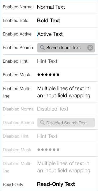
Fig 1. iOS Textbox
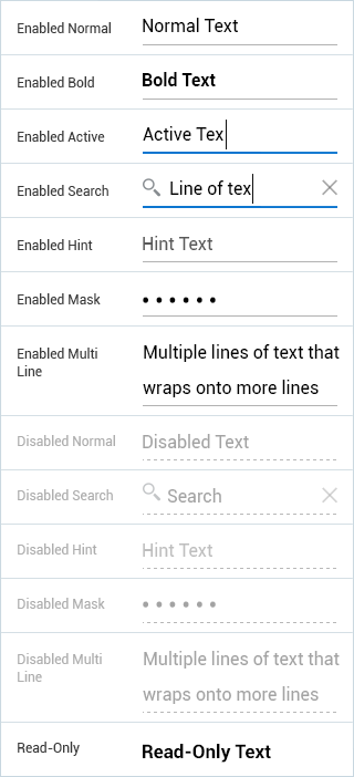
Fig 2. Android Textbox