Text
amx:outputText
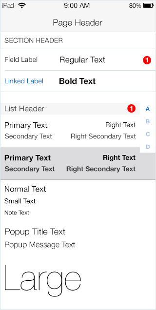
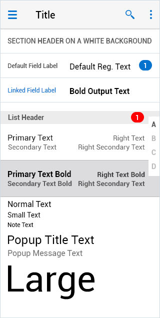
The Text component displays a string of static text. It can be used in different areas of an application, which makes it a very common component. Users read the text and may copy the text from a Page. The Text component consists of a few variations.
- Header: This is the page title in the header of the page. On iOS it usually centered, while on Android it usually left aligned.
- Section Header: Usually a sub header above a Form or List. Usually all the letter are capitalized.
- List Header: A header that segments list items.
- Label: Often this is text label for item in a Form.
- Read-Only Text: This is text on various locations on the page.
Appearance
Appearance characteristics for this component.
- Section Header: The Section Header will usually display against the background of the page and above a Form or List.
- List Header: The List Header will display as a header segments list items.
- Label: A label can display inside a Form or on a Page background, but is associated with another component.
- Read-Only Text: Read only text can display inside a Form or on a Page background.
Behavior
Common behaviors for this component.
- Copy & Paste: Output Text can be copied from the page and pasted in other components.
Usage
Usage guidelines for this component.
- Keep text labels clear and concise on forms.
- Use short but meaningful messages in your application.
Sample
AMX sample code for this component.
 <amx:outputText value="Sub-Section Title" styleClass="amx-inputText-sectiontitle"/>

    <amx:panelFormLayout labelAlignment="top">

    <amx:panelLabelAndMessage id="plam1" label="Name">

    <amx:commandLink id="cl1" text="Jim Berney" action="editname"/>

    </amx:panelLabelAndMessage>

    </amx:panelFormLayout>


    <amx:outputText value="Within a PFL" styleClass="amx-inputText-sectiontitle"/>

    <amx:panelFormLayout>

    <amx:panelLabelAndMessage id="plam1" label="Label">

    <amx:outputText id="ot1" value="outputText"/>

    </amx:panelLabelAndMessage>

    </amx:panelFormLayout>

    <amx:outputText value="Outside a PFL" styleClass="amx-inputText-sectiontitle"/>

    <amx:outputText id="ot1" value="outputText"/>
Related
- Used On: Phone, Tablet
- Also Called: Check, True/False
- Related Components: Textbox
- Resources: None

Fig 1. iOS Text

Fig 2. Android Text