Spacer
amx:spacer
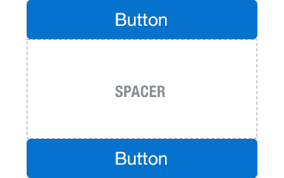
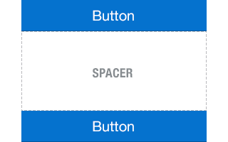
The Spacer component is a layout component that creates an area of blank space on a page. The spacer helps to space out the components on the page, so the page appears less cluttered than it would if all the components were presented immediately next to each other, or immediately below each other. You can include either or both vertical and horizontal space in a page using the height and width attributes.
- Height: Defines the amount of vertical space.
- Width: Defines the amount of horizontal space.
This component is commonly used on tablets and phones.
Appearance
Appearance characteristics for this component.
Using the height and width attributes of the spacer, you can create an area of blank space that forms:
- Line Either vertical or horizontal in orientation.
- Square
- Rectangle
Behavior
Common behaviors for this component.
- Scroll Bar: If the spacer exceeds the size of the container it is in, there might be no scroll bars shown.
- For example, if the spacer is used in a header or footer and its size exceeds the size of the header or footer, there will be no scroll bars shown. On the other hand, if the spacer is used in e.g. Panel Group Layout (PGL) and its size exceeds the size of the PGL, scroll bars will show.
Usage
Usage guidelines for this component.
- Use it on a page to space out the components, so the page appears less cluttered.
- Use it on a bottom of page to create extra white space when scrolling to the bottom of the page.
Sample
AMX sample code for this component.
<amx:spacer id="s1" height="48" width="48"/>
Related
Fig 1. iOS Spacer
Fig 2. Android Spacer