Table
amx:tableLayout
A Table component is a HTML table that provides basic layout support on a page. This component consists of 3 AMX components that work together to provide formatting.
- Table: A tableLayout is a thin wrapper around the HTML table element. It contains a series of rowLayout components which in turn contain a series of cellFormat components.
- Row Layout: A rowLayout component is used to define a row of a tableLayout. It contains a series of cellFormat components. Similar to <TR> in HTML5.
- Cell Format: A cellFormat component is used to define a cell in a rowLayout of a tableLayout. Similar to <TD> in HTML5.
This component is commonly used on tablets and phones.
Appearance
Appearance characteristics for this component.
- Transparency: The table is transparent by default.
- Attributes: The border width, cell padding and cell spacing will determine how the border of the table will display.
- Height: There is no height support for rowLayout.
Behavior
Common behaviors for this component.
- Scroll Bars: If the tableLayout exceeds the size of the container it is in, there will be no scroll bars shown.
- Layouts: There are fixed (default) and weight layout options.
- In fixed layout you care more for the specified cellFormat widths than content sizes (particularly if your cellFormat widths are percentage-based and your cells have contents that are programmatically-resizable based on the cell width), then a cell width will be given priority.
- In weighted layout tables can treat cell widths more like suggestions rather than requirements; cell content sizes contribute more in determining the size of each column.
Usage
Usage guidelines for this component.
- Tables be used for both simple and complex layouts.
- Table are popular for position of List Items in a List View.
- Panels do not work well with percentage layout.
Sample
AMX sample code for this component.
 <amx:tableLayout id="tl1" width="100%" summary="This is summary of the table" borderWidth="1"
    cellPadding="2" cellSpacing="2">

    <amx:rowLayout id="rl1">

    <amx:cellFormat id="cf1" halign="center">

    <amx:outputText value="1" id="ot4"/>

    </amx:cellFormat>

    <amx:cellFormat id="cf2" halign="center">

    <amx:outputText value="2" id="ot5"/>

    </amx:cellFormat>

    <amx:cellFormat id="cf3" halign="center">

    <amx:outputText value="3" id="ot6"/>

    </amx:cellFormat>

    </amx:rowLayout>

    </amx:tableLayout>
Related
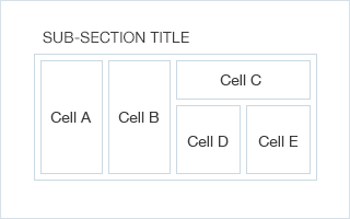
Fig 1. iOS Table
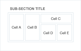
Fig 2. Android Table