Card
The Card pattern is a small container for displaying information. Cards display summary information about an object and may display different components inside them. Cards maybe displayed inside Carousels, Lists, Panel Splitters, Popups, Tables, etc... Cards are common for use on both phones and tablets. There maybe different types of cards, here are a few examples:
- Action Card: A card allowing the user to perform an action or set of actions on the particular card or object. For example buttons for Approve or Reject.
- Infolet Card: Analytic summary of a larger data set. The infolet's purpose is to highlight the most relevant data for the user and provide a method to explore more data.
- Item Card: A card displaying information about a particular item or object. This is the most generic type.
- Person Card: Similar to a vCard (virtual business card) displaying a photo and information about the person.
Appearance
Appearance characteristics for this component.
- Border: Each card should have a border and may optionally have a drop shadow.
- Background: Each card can have a background color or be transparent.
- Container: The card is either a rectangle or square.
- Size: The height and width of a card can be variable. Cards within a collection should be the same size. Cards are usually wider, than tall. =
- Title: An optional title area with title may be displayed. On the right side of a title area, icons maybe displayed to close the card or perform other actions.
- Content: Cards may contain any type of content (e.g., graphic, chart, infographic, form, table, text, links, etc...).
- Outside Container: Cards may be displayed on a Page, Panel Splitter, Popup, Carousel Item, List Item, etc...
- Person Card: These can include Photos, Name, Job Title, Organization, Phone Numbers, Emails, Location, Social Networks, etc...
- Within List: On phone usually 1 card is display per list item, while on tablet 2 to 4 cards might be displayed per list item.
- Within Carousel: A card is a carousel item, within a carousel component.
Behavior
Common behaviors for this component.
- Summary: A card is a summary view. Tapping the card will drill-down to a details view. This drill-down can be performed on the whole card or an element of the card.
- Closing: Cards maybe optionally be closed or dismissed via tapping a button, icon or link. Some cards maybe dismissed via swipe gesture.
- Selection: Users can select one or more cards within a collection for performing some tasks. This is not common.
- Animation: Tapping a card may flip it, to display content on the 'back' of it. When closing a card, it may slide or perform some other animation to disappear.
- Flip: Flip the card to view data on the back of the container.
- Expand: The card to see more details within the container.
- Tap: Drill-down to a separate view outside of the card container.
- Drag and Drop: Users may drag-and-drop a card to different positions within a grid.
Usage
Usage guidelines for this component.
- Cards may need to be sized to displayed within a container.
- Limit the amount of information displayed in a card, so that the card does not appear cluttered. Make use of white space.
- Structured data often displays better within a card, compared to unstructured data that may have variable lengths and sizes.
- Multiple actions can be performed on a card. Limiting the actions to primary actions (i.e. Approve and Reject) is a good practice. If additional actions are needed, display a few of those actions in a popup.
- Action Cards may not be the best choice for careful decisions or additional information. These types of actions may easily lead to the wrong decisions. Use these carefully.
- Default infolet view should be targeted and the infolet designer must decide what level of detail to expose for the summary. For instance, a user may be only interested in a single category of notifications, such as approvals, and only wants to see those summarized within the default view.
- Infolets are frequently used for watchlists and business intelligence (BI) reports. A watchlist infolet summarizes the top items of interest to a user, such as top sales deals or most relevant job openings, so they can be easily accessed. A BI report infolet usually displays a simplified graphic that links to a detailed report.
- Don't put transactional elements such as button or form fields directly into the default infolet view.
- Do not use scroll bars for small sized infolets.
Related
- Used On: Phone, Tablet
- Also Called: Infolet, Portlet, Tile, vCard
- Related Components: Image, Panel, Text
- Related Patterns: Master Detail
- Resources: JET FixItFast Demo
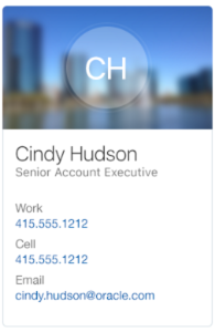
Fig 1. People Card
Fig 2. Avatar Card

Fig 3. Item Card
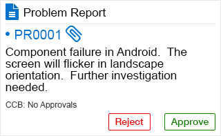
Fig 4. Action Card
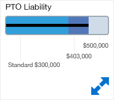
Fig 5. Expanding Card
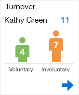
Fig 6. Flip Card
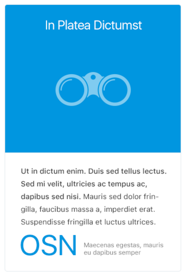
Fig 7. Info Card