Master Detail
The Master Detail pattern provides a method of displaying additional detail about a selected item. There are several approaches to displaying additional detail, including: popups, master-detail layouts, new windows and show/hide content. There are six common pattern variations for displaying details on demand:
- A New Page is displayed by using a drill-down method. This is common on a phone, due limited screen sizes.
- A Popup window floats on top of application page with details of the selected item. This is common on a tablet.
- Split View: A single item is selected from the master panel and the details are shown in a details panel for the selected item. This is common on a tablet.
- Expand/Collapse: Details can either be shown or hidden on part of the application screen (i.e. similar to collapsible/expandable section). Expanding a list item works well on a phone or tablet, expanding a card works best on a tablet.
- Semantic Zoom: User can bring up additional information by zooming into a map or diagram. This is common on a tablet.
- Flip: Using animation, an area on the screen can appear to "flip over" to reveal details on the "back". Can work on both phones and tablets.
Appearance
Appearance characteristics for this pattern.
New Page
- Phone: The new page (or drill-down) is the primary method to view details of an object on a phone.
- Details: The details about the selected object are displayed in the new page in either read-only or editable mode.
- Drill Down Icon: A simple caret icon indicates that the user can drill down to another page for details about the selected object.
- Back Navigation: “Back" navigation that returns to the list of objects is presented on the left side of the header.
- Edit Button: If the object details are read-only, an "Edit" option can be presented on the right side of the header.
Popup
- Object Details: Similar to a new page the details of the object are displayed in a popup for the selected object.
- Height and Width: Popups can be sized to display the details of the object.
- Background: The underlying application can be dimmed when the popup is displayed.
- Button Location: Popups do not have headers, so buttons are placed below the details, at the bottom of the popup.
- Icons/Labels: Buttons may have short labels, icons or a combination of both.
Split View
- Components: A Panel Splitter is used for Master-Detail.
- Master Pane: The left pane where the master set of objects is displaying. One item is selected that displays details in the right pane.
- Details Pane: This where item details, subordinate lists or both can be displayed based on the item selected in the left panel.
- Selected Item: When displaying a list, the list item is selected.
- Drill-Down Icon: A carat is an optional element in the list item, if list is being displayed.
- Button Location: On the phone the "Cancel" button is on the left side of the header. On tablet this a good location, but there maybe other good locations to place this button. On the phone the "Done" or "Save" button is often on the right side of the header. On tablet this a good location, but there maybe other good locations to place this button.Done Button: The "Done" button is usually place on the right side of the header for the right pane.
- Cancel Button: The "Cancel" button is usually place on the left side of the header for the right pane.
Flip
- Flip to Back: Icons, Labels, Buttons, or Links maybe used to show details about a selected object on the back side of a panel or card.
- Flip to Front: The same method used to flip a card to the back should also used to restore it to show the front side.
Expand/Collapse
- Expanded Details: Icons, Labels, Buttons, or Links may be used to show details about a selected object.
- Collapsed Details: Icons, Labels, Buttons, or Links may be used to hide details about a selected object
Semantic Zoom
- Zoom Level: More details about an object are displayed, the deeper the user is zoomed in on the master diagram.
- Details: Editable details are displayed inside the object, in a popup associated with the object or just outside the associated object.
Behavior
Common behaviors for this pattern.
New Page
- Drill-Down: On the phone the new page is the primary method to display details of the selected object.
- Animated Transition: The list of objects can slide in from the left, while the object details can slide in from the right. Other transitions might be acceptable on tablet.
- Navigation: The user may need to navigate back to the page were objects are selected. Also "Previous" and "Next" buttons may help navigate between objects on the details page.
- Split-List Item: When displaying a detailed disclosure icon in list item, tapping the icon itself will perform the action, but tapping elsewhere in the list item will not.
Popup
- Open Popup: Based on a selected object the details about the object will appear in a popup in either read-only or editable mode.
- Position: A popup will cover a portion of the main application page.
- Close Popup: The popup can have buttons to close it and save or disregard changes.
- Auto Dismiss: If auto dismiss is set, the user can tap outside the popup to close it.
- Animated Transition: Multiple transitions are available, but popups commonly slide up as they open, and slide down as they close.
- Selected Item: Selecting another item will usually change the details in the selected popup.
Split View
- Selected List Item: Based on the selected list item in the left pane, the details will be read-only or editable in the right pane.
- Animated Transition: Detail panes can slide in from the right.
- Confirmation Message: A confirmation message can be displayed at the top of the right pane indicating that the details of the selected object have been updated.
Flip
- Selecting Component: Tapping a component triggers an animation that appears to flip it over to reveal details on the "back". This may change the state of the component for example the direction an arrow points, the label of a link, etc...).
- Returning to Default Display: Tapping the component a second time triggers an animation that appears to reverse the process, flipping the card or panel back to its default state.
Expand/Collapse
- Selecting Component: Tapping a component expands or collapses the details area. This will change the state of the component for example the direction an arrow points, the label of a link, etc...).
- Orientation Change: In landscape orientation details about a selected object can be displayed, in portrait orientation details about a selected object can be hidden. This is more common on tablet.
Semantic Zoom
- Zoom Levels: When zooming in on a feature, that feature can be a larger view of the object. The view of the feature can change, to represent details of that object at that zoom level.
- Zoom In: Zooming in on a feature can be done by touching the feature and spreading fingers apart or double tapping with one finger.
- Zoom Out: Zooming out on a feature can be done by touching the feature and pinching fingers to together or double tapping with two fingers.
- Pan: Panning on a feature can be done when dragging one finger on a feature. Also one finger swipe can pan the feature.
- Moving Object: Moving an object from one place in the overall view, can possibly change the relationships with other objects.
Usage
Usage guidelines for this pattern.
- Master Detail can be a good pattern for selecting an object and showing details about that object.
- A master list of objects provides an easy way to order items: alphabetical, category, priority, etc...
- Advantages of new pages for view object details can provide a full screen for lots of object details.
- Disadvantages of new pages is the user has to navigate back and forth to change details on multiple objects.
- An advantage of popups is that it doesn't always obscure underlying information, especially on tablet.
- The details in the popup can provide context to the selected item if the selected object is not covered by the popup.
- It is not a good practice to show multiple popups. If comparison is important use multiple views in a popup or other method.
- Allows the details to be shown or hidden in context to the selected item.
- Semantic zoom requires at least two zoom levels to be available.
Related
- Used On: Phone, Tablet
- Also Called: Details on Demand
- Related Components: List View, Popup, Text, Textbox
- Related Patterns: Card, Create Object, Drawer, Manage Object
- Resources: None
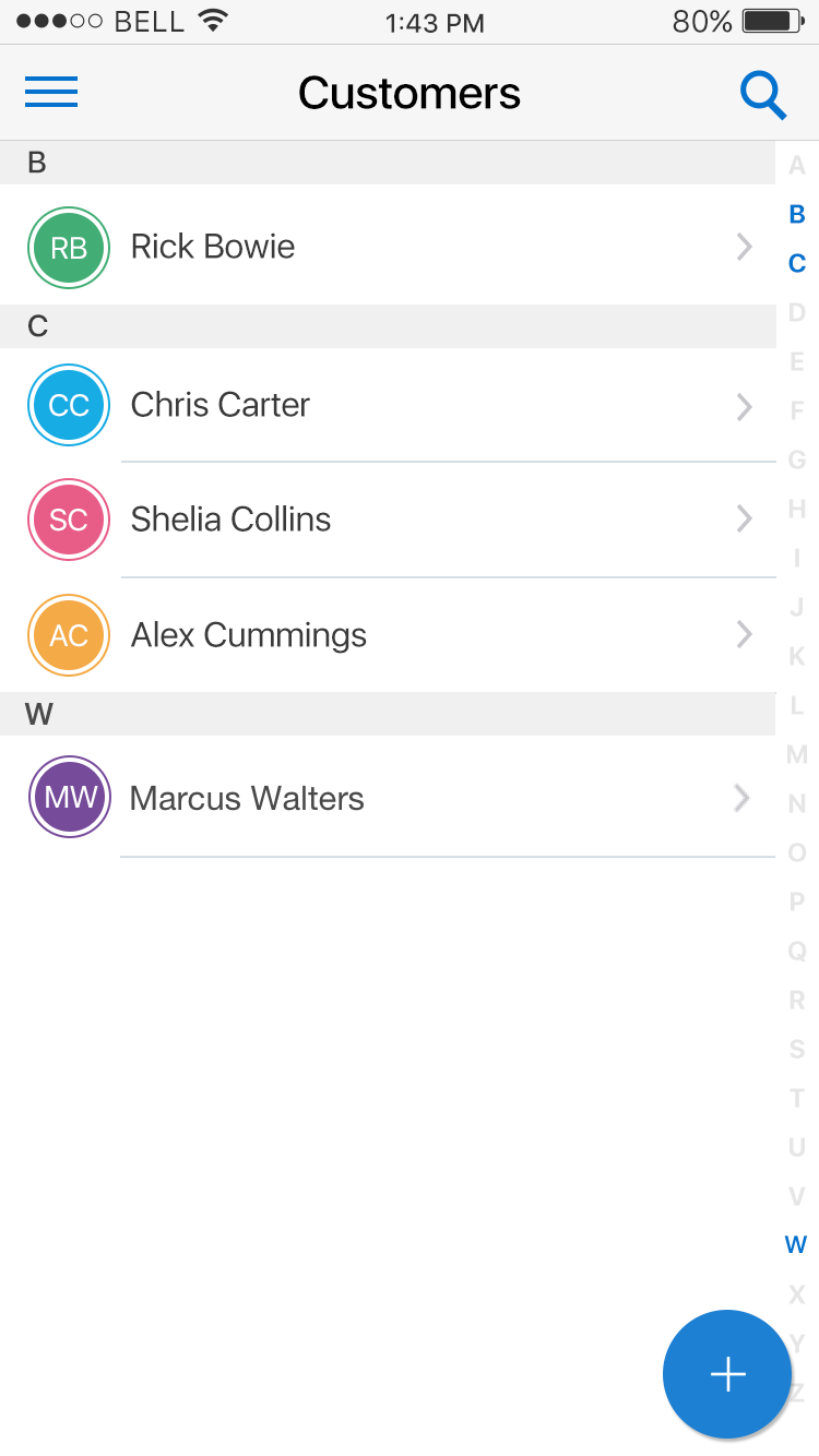
Fig 1. New Page List
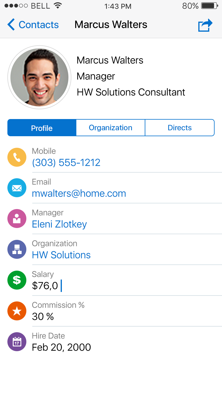
Fig 2. Detail View
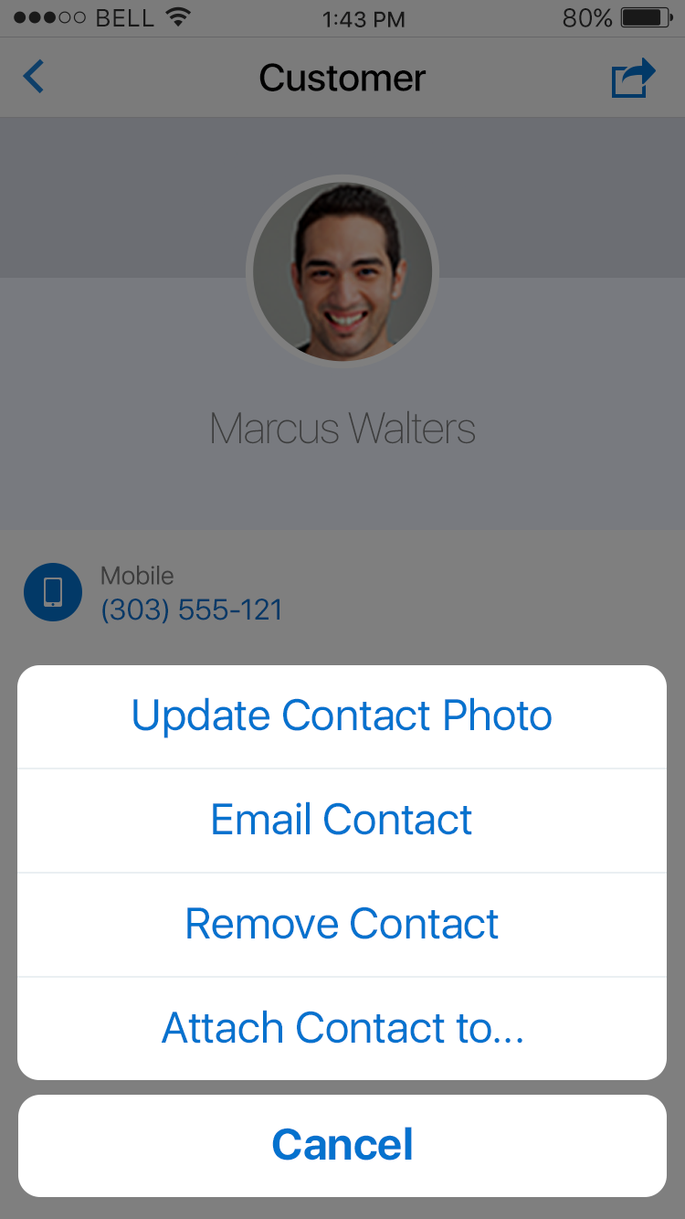
Fig 3. Popup Sheet
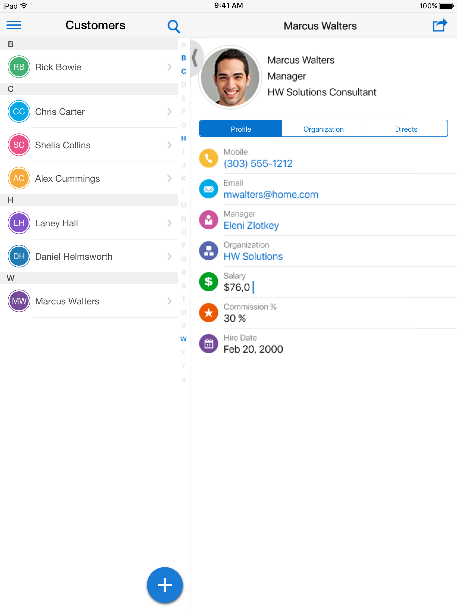
Fig 4. Split View
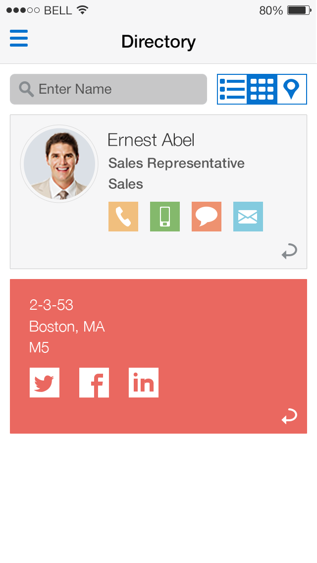
Fig 5. Flip Card