Expand & Collapse
The Expand and Collapse pattern shows and hides content on demand. This pattern can be used when screen real estate is really important. There are a few common methods for how this is done.
- Accordion: These usually involve a List View. Headers or sections might show or hide.
- Menu: These usually are associated with components such as: menu, select, select many and date/time.
- Reveal: These usually consist of areas of the page that show or hide. These include:
- Card/Tile flip, reveal or expand
- List item reveal or expand
- Area expand
In addition there are panels that show or hide, but usually described in other patterns or components (i.e. drawers, split views, keyboards, full dialogs, etc...).
Appearance
Appearance characteristics for this pattern.
Accordion
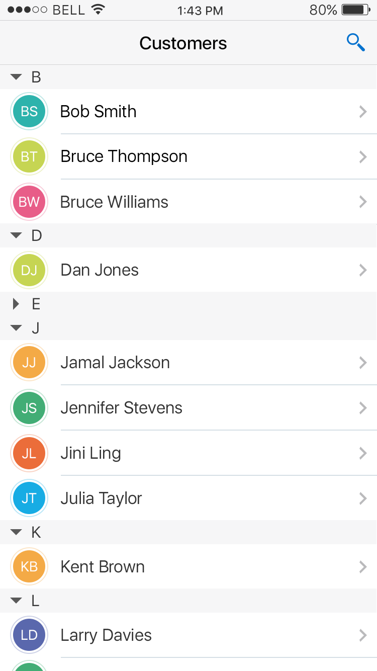
- Section Headers: On a List View these show or hide content below the section header.
- Icons: Various icons can be used to indicate the ability to expand or collapse (i.e. triangle, plus/minus, etc...).
Menu
- Menu: Usually displays a set of options in a small popup.
- Icons: Icons can be associated with different menu items.
Reveal
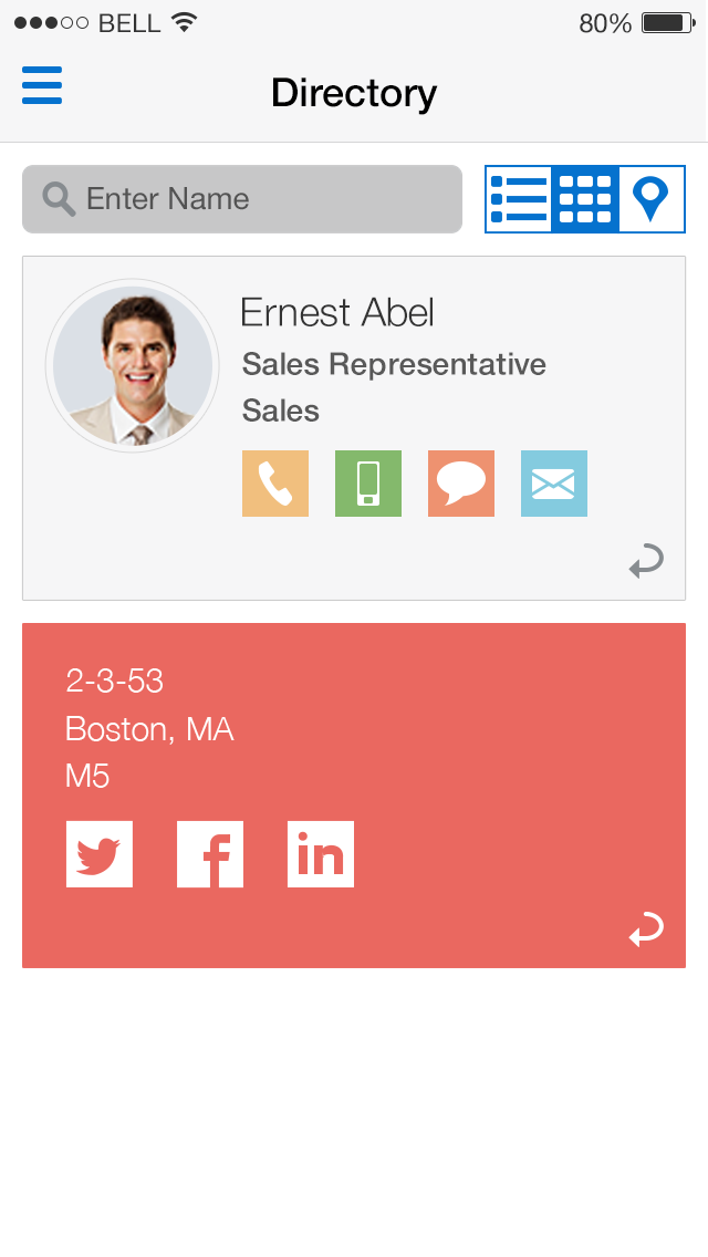
- Cards: These can either flip or expanded to reveal content..
- List Items: These can either swipe to show contextual information or expand to show additional information below.
- Sections: These are just areas on a page or popup that can expand or collapse.
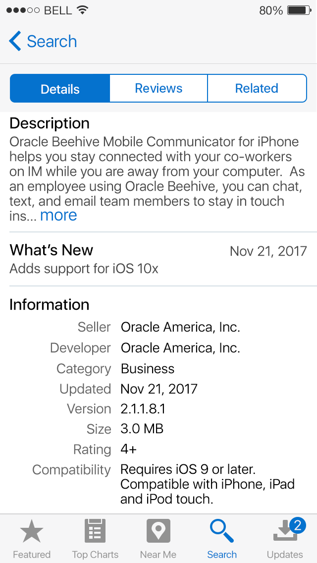
- More Link: A summary of content maybe display, with a More link that reveals more.
Behavior
Common behaviors for this pattern.
- Accordion: These expand or collapse a single section at a time or handle multiple sections at one time.
- Animation: Various animations can be used to show and hide content. Cover and reveal is common.
- Tap: This can trigger the ability to show or hide content.
- Rotate: These involve flip a card to reveal content or actions on the back.
- Swipe: This can trigger the ability to reveal content or hide it. This can be a cover/revel or sometimes a push.
Usage
Usage guidelines for this pattern.
- Make sure that icons that are displayed in headers or sections correspond with their states.
- Make sure that states of buttons indicate what action will be triggered (e.g. the UP icon in the Navigation Bar indicates that the bar will show while the DOWN arrow indicates that the bar will hide).
- If you use swipe to show and hide a block of content, apply this interaction consistently throughout the application so that users know what to expect.
- Use it in long menus or content for easier scanning.
- Each accordion must have 2 or more sections of content.
- Each accordion section should have a title.
- Sections may contain nested sections, although this is not recommended for phones and tablets since menus might be hard to scan.
- Multiple sections may be open at any one time. Note that this behavior is not recommended when sections have a large number of child items.
- User test the Accordion to determine the optimal number of items that may be grouped within a single container and whether multiple sections should be open at any one time.
Related
- Used On: Phone, Tablet
- Also Called: Accordion, Show/Hide, Reveal
- Related Components: Accordion, Collapsible, List View, Split View
- Related Patterns: Card, Contextual Actions, Drawer, Navigation Bar
- Resources: None

Fig 1. More Link

Fig 2. Card Flip

Fig 3. Swipe to Reveal

Fig 4. Accordion