How do I generate graphs in Oracle Reports Developer?
Reports Builder, a component of Oracle Reports Developer, has a Graph Wizard using which you can define a graph in the paper layout as well as in the web layout.
By using this wizard you can choose the data to be displayed, graph title, axis titles, legend, color information, etc. After designing the graph,
you can re-enter the Wizard to customize it.How do I customize the Graph that I generated using the Graph Wizard? Is the Graph Wizard the only way to change the properties?
No. If you want to customize or fine-tune your graph beyond the
attributes exposed by the Graph Wizard, you can do so by editing the Graph.xml file.What is Graph.xml? How do I access it?
When you use the Graph Wizard to create a graph in the report layout, internally it generates an XML file to store the attributes for that graph. This XML file is called Graph.xml. If you want to define some graph attributes beyond the ones exposed by the Graph Wizard, you can edit this file manually, and Oracle Reports will use this edited Graph.xml to generate the graphs in the output.
To access Graph.xml in paper reports:
Go the paper layout
Double click the graph object to open the Property Inspector.
Click the Graph Settings to see and edit the Graph.xml file.

For web reports, Graph.xml is available directly in the web source of the JSP.
What does the Graph.xml look like?
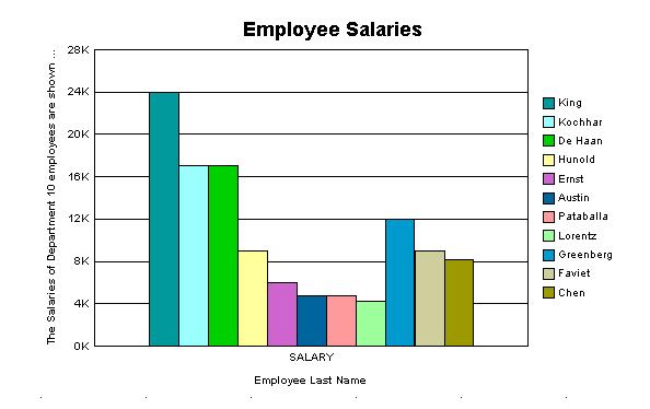
If you use the Graph Wizard to define a simple Bar Graph for Exmployee Salaries, the Graph.xml will look like this:
<rw:graph id="CT_1" src="G_EMPLOYEE_ID" series="LAST_NAME" dataValues="SALARY">
 <!--
 <?xml version="1.0" ?>
 <Graph version="2.6.0.23" seriesObjectCount="30">
 <O1Title visible="true" text="Employee Last Name"/>
 <Title visible="true" text="Employee Salaries"/>
 <Y1Title visible="true" text="Salary"/>
 </Graph>
-->

 </rw:graph>
And the graph in the report output will be:

How do I find the Graph.xml version I am using? Which version has been used in this FAQ?
Different versions of Graph.xml have been used in different releases of Oracle Reports (starting with Oracle9i Reports). Graph.xml was not used in any of the pre-9i releases.To find the version that you are using:
Open the file bigraphbean.jar. It is located in
\jlib View the version number in version.txt. For all examples in this FAQ, Oracle Reports 10g (9.0.4), and thus Graph.xml version 2.7.5 have been used. How many Graph types and sub-types does the Graph Wizard support?
Using the Graph Wizard, you can choose from the following 11 Graph types and their sub-types:
Bar
- Bar
- Dual-Y Bar
- Split Dual-Y Bar
- Percent
- Stacked Bar
- Dual-Y Stacked Bar
- Split Dual-Y Stacked Bar
Horizontal Bar
- Same sub-types as in Bar Graph
Pie
- Pie
- Multiple Pie
- Pie-Bar
- Ring
- Multiple Ring
- Ring-Bar
Line
- Line
- Dual-Y Line
- Percent
- Stacked Line
- Dual-Y Stacked Line
- Split Dual-Y Stacked Line
Area
- Area
- Dual-Y Area
- Percent Area
- Stacked Area
- Dual-Y Stacked Area
Combination
- Combination
- Dual-Y Combination
- Scatter/Bubble
- Scatter
- Dual-Y Scatter
- Bubble
- Dual-Y Bubble
- Stock
Hi-Lo Close
- Hi-Lo Close with Volume Open Hi-Lo Close
- Open Hi-Lo Close with Volume
- Open - Close Candle
- Open - Close Candle with Volume
- Open Hi-Lo Close Candle
- Open Hi-Lo Close Candle with Volume
Circular
- Polar
- Radar Pareto
- Pareto
- ThreeD
- 3-D Bar
- 3-D Cube
- 3-D Area
- 3-D Ribbon 3-D Surface
How can I see a list of all graph attributes that I can define inside Graph.xml?
You can see the list of graph attributes inside a file called Graph.dtd. This DTD file is located in your ORACLE_HOME\jlib\bigraphbean.jar. You can use the WinZip utility to unzip the contents of this JAR file and view the Graph.dtd. For detailed information on these attributes, refer to the Technical Note available on OTN.
How can I align the Legend with Bars?
If you choose a Bar Graph, and choose to display the legend at the bottom of the graph, this is how the graph will appear.

If you want to align the corresponding label below each Bar, you can use the following workaround: R-enter the Graph Wizard and in the Layout tab, drag the Employee Name field into "Groups" from "Bars". This places the data you are displaying into different groups, i.e., each employee name will be a separate group. Choose the location of the Legend as "Bottom". Choose the option of coloring the bars in the graph by group. You do this by adding the following attribute in the Graph.xml:
<Graph ... colorMode="COLOR_BY_GROUP" ...>Now your graph will look like this:

The Bars are always grouped together and distant from the Y-axis. How can I spread them out evenly?
If you choose a Bar Graph and choose to display the legend at the bottom of the graph, this is how the graph will appear.
There is no gap between adjacent bars. In order to spread out the bars more evenly on the X-axis, you can use the following workaround:
R-enter the Graph Wizard and in the Layout tab, drag the Employee Name field into "Groups" from "Bars". This places the data you are displaying into different groups, i.e., each employee name will be a separate group. Choose the location of the Legend as "Bottom". Choose the option of coloring the bars in the graph by group. You do this by adding the following attribute in the Graph.xml:
<Graph ... colorMode="COLOR_BY_GROUP" ...>Now your graph will look like this:
In a line graph, how can I display data markers, and how can I change their size?
a line graph, markers can be displayed to show the data points on the line. To display data markers,
add the following attribute in Graph.xml
<Graph ... markerDisplayed="true" ...>Now your graph will look like this

To change the marker size, add the element DataMarker in Graph.xml as follows:
<DataMarker markerSize="100"/>This should increase the marker size as you can see in the following image:

In a line graph, I can see square and spherical data marker shapes. Can I display my custom shapes for the marker?
No. Oracle Reports will automatically show markers of different shapes on different lines to distinguish them from each other, but you may not be able to choose your custom shape.
The data lines in my line graph appear jagged. Can I make them appear smoother?
Yes. Suppose your graph looks like this

You can add the following attribute to Graph.xml to make the lines appear smoother:
<Graph ... graphicAntialiasing="true" ... >The graph will now appear like this:
I want the data lines in my line graph dashed or dotted instead of solid lines. Is it possible?
This feature is available in Oracle Reports 10g Release 2 (10.1.2).To create a dashed line, add the following to your Graph.xml:
<Series ... lineStyle="LS_DASH" >You can choose from the following values for the lineStyle attribute:
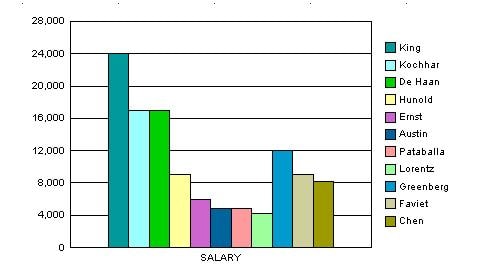
LS_SOLID | LS_DASH | LS_DOTTED | LS_DASH_DOTIn a Bar Graph, how can I increase the width of the Bars?
If the number of bars is reasonably large, the bars will appear thin and close to each other.

There is a workaround using which you can increase the width of the bars and spread them out more evenly over the graph X-axis. R-enter the Graph Wizard and in the Layout tab, drag the Employee Name field into "Groups" from "Bars". This places the data you are displaying into different groups, i.e., each employee name will be a separate group. Choose the location of the Legend as "Bottom". Choose the option of coloring the bars in the graph by group. You do this by adding the following attribute in the Graph.xml:
<Graph ... colorMode="COLOR_BY_GROUP" ...>Now your graph will look like this:

In a pie-chart, I want to reduce the number of decimal places shown in the pie slices. How can I do it?
Since the slice data is shown as a percentage value, some of the values may go beyond the number of decimal places that you need in your graph, e.g.,

If you want the number of decimal places to be restricted to, say 1, include the following element in your Graph.xml
This is how the graph will now appear:

How can I change the scale used on the Y-axis?
To change the scale used on the Y-axis of the Bar Graph shown here:
Add the following element to Graph.xml
<Y1Axis axisMinAutoScaled="false" axisMinValue="0" axisMaxAutoScaled="false" axisMaxValue="32000" majorTickStepAutomatic="false" majorTickStep="4000"/>Your graph should now appear like this:

Can I use parameter values to define certain graph characteristics at runtime?
Yes. As an example, you can specify the maximum value of the Y-axis scale at runtime. Define a User Parameter, say "p_max_scale". You will get the value of this parameter from the user at runtime. This parameter can be used in Graph.xml as:
<Y1Axis lineWidth="1" axisMaxAutoScaled="false" axisMaxValue="&<p_max_scale>" />As another example, suppose you want to use a user parameter or a system parameter or a column value inside the graph title. To achieve this, re-enter the Graph Wizard, and in the Title tab, enter the following:
yourtext &Similarly, you can define other Graph characteristics at runtime by using parameter names in Graph.xml. Note that it is necessary to surround the parameter name with angled brackets (<>).
Can I apply conditional formatting to graphs, e.g., if the amount outstanding is less than 1000, show the Bar in the graph in green?
No. This feature is currently not supported.
How can I change the numeric data labels that appear on top of the Bars to currency values?
You have a Bar graph that shows data at the top of Bars. In order to get a currency symbol with those data markers, include the following in the Graph.xml
Your graph should now appear like this:

Can I generate a Gantt chart using the Graph Wizard?
No. This feature is currently not supported.
How can I make sure that the Date format on the graph is changed when its format is changed in the Report Data Model Property Inspector?
There may not be a direct way to achieve this. However, you can create an extra column in your query as:
TO_CHAR(<date_column>, <format_mask>)You can then use this column to display the date both in both the graph and in the report layout.
How can I display the Bar marker text in the middle of the Bars instead of at the top?
To display the Bar marker text in the middle of the bars: Re-enter the Graph Wizard O n the Plot Area tab select "Show data label on Bars". Under Options, select "Centered on Bars". OR
Add the following to your Graph.xml:
<MarkerText visible="true" markerTextPlace="MTP_CENTER"/>Your graph should now appear like this:

I want labels to appear on the X-axis below every Bar, but I want the labels to be printed for only alternate bars. How do I do it?
Suppose you are plotting Employee ID against Salary:

As the Employee ID's are arranged sequentially, you want the Employee ID's (X-axis labels) to appear for only alternate bars so that the X-axis appears less cluttered. To print labels on alternate bars: R e-enter the Graph Wizard In the X-format tab, select "Show labels for some tick marks on the X-axis". Choose appropriate values for "Start with tick mark" and "Tick marks to skip between labels". If you select 1 for both these properties, your graph will appear like this:

Alternatively, you can add the following element to the Graph.xml
<O1TickLabel tickLabelSkipMode="TLS_MANUAL" tickLabelSkipCount="1" tickLabelSkipFirst="0"/>Use "tickLabelSkipCount" to specify how many labels should be skipped between displayed labels. Use "tickLabelSkipFirst" to specify how many tick labels should be skipped initially (i.e., which label to start displaying from).
I am trying to use some attributes like "wordWrapEnabled", "tickLabelStaggered", "textRotation" etc for Titles and Labels. But the values of these attributes do not seem to have any effect on the Graph output. Why?
Graph has an attribute called "autoLayout". By default the value of this attribute is set to "AL_ALWAYS", which means that the Title / Label placement etc is controlled by the graphing engine. That is why the attributes that you set are ignored. If you want to set all the layout attributes yourself, add the following attribute inside Graph.xml
<Graph ... autoLayout="AL_NEVER" ... >Now you can control the graph layout completely and set the attributes manually. If you are not sure whether you want to control all the layout attributes manually, then you can set "autoLayout" to AL_AS_NEEDED. In this case, graphing engine will take a call on whether to use your attributes or its own default settings.
The tick labels that appear on the Graph X-axis are always staggered. Can I switch off this staggering?
Yes. Suppose your graph loooks like this:

In order to switch off staggering, add the following attributes to your Graph.xml
                       <Graph ... autoLayout="AL_NEVER" ... >

 <O1TickLabel ... tickLabelStaggered="false" ... />
Now your graph should appear like this:

How can I word-wrap long graph titles?
Suppose you have a long Y1 axis title.
In order to word-wrap such long titles, add the following to your Graph.xml
                                 <Graph ... autoLayout="AL_NEVER" ... >
 <Y1Title ... wordWrapEnabled="true" ... />
Now your graph will appear like this:

By default the Y-axis scale in my graph reads as 1K, 2K... Can I modify the scale to read 1000, 2000...?
Suppose your graph looks like this:

Add the following tags and attributes to your Graph.xml
 <Y1Axis>
 <ViewFormat thousandSeparatorUsed="true" thousandSeparator="." />
 </Y1Axis>
You can choose any other value for the scaleFactor attribute from the Graph.dtd. With the above XML code, your graph should appear like this:
How do I change the thousand separator in my graph from a comma (,) to a period (.) ?
Suppose your graph looks like this:
Add the following tags and attributes to your Graph.xml
                                   <Y1Axis>
 <ViewFormat scaleFactorUsed="true" scaleFactor="SCALEFACTOR_NONE" />
 </Y1Axis>
Note that you can use any character as a thousand separator. With the above XML code, your graph should look like this:

To change the graph size in the paper layout, I can just drag the graph object's boundaries. How do I change the size of the graph image in my Web layout?
In order to change the graph size in Web layout, add the following attributes to the report's custom JSP tag
& lt;rw:graph>available inside the Web layout code:<rw:graph id="graph" ... height="500" width="700" > <Graph...> ... </Graph> </rw:graph>Note that specifying only the width or height attribute in
I have created a graph showing daily pollution levels in the city. Can I create reference lines in my graph, for example, for "Alert", "Warning" and "Emergency" pollution levels?
It is possible to create up to 3 reference lines for each (numeric) data axis in your reports graph. In Scatter, Bubble and Polar graph types, both X-axis and Y-axis show (numeric) data. In other graph types like Bar and Line, only Y-axis shows (numeric) data. To create these 3 reference lines for the Y1 axis, add the following element to your Graph.xml:
                                 <Y1ReferenceLine>
 <ReferenceLine index="0" visible="true" lineWidth="2" text="Alert" value="300.0" displayedInLegend="true" lineColor="#ff00"/>
 <ReferenceLine index="1" visible="true" lineWidth="2" text="Warning" value="450.0" displayedInLegend="true" lineColor="#66ff"/>
 <ReferenceLine index="2" visible="true" lineWidth="2" text="Emergency" value="650.0" displayedInLegend="true" lineColor="#ff0000"/>
 </Y1ReferenceLine>
This will create 3 reference lines in your graph as displayed in the following image:

How can I make the graph transparent and show an image as the graph background?
To show an image as the background for your graph, you must use the special effects (SFX) element in Graph.dtd. You can add the following code to your Graph.xml to make use of the special effects element:
This will add the referenced image as background for the plot area of the graph:

Note: The SFX element can be used within several other Graph.xml elements in addition to PlotArea, e.g., Background and LegendArea. Refer to Graph.dtd for more information.
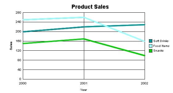
Do Oracle Reports graphs recognize time data on the X-axis?
Yes, Oracle Reports graphs do recognize values of DATE data type and treat it as time data on the X-axis. This recognition of DATE data type results in 2 advantages:
Oracle reports graphs, depending on your data, intelligently choose the format for displaying the dates. For example,
if all your data points fall in the same month and year, the graph shows the month and year only once on the X-axis tick labels. On the remaining tick labels, only dates are shown. If there are missing time data points in your data, the graph recognizes it automatically, and shows appropriate gaps wherever the dates are missing. Here are 2 sample graphs with the DATE data type on the X-axis. Notice the date format on the X-axis and the appropriate gaps for missing data points:

However, the time data recognition feature has the following restrictions:
The time data should be presented to the graphing engine in an ascending order, e.g., by using an ORDER BY clause in your SQL query. The time data should have regular intervals. Oracle Reports graphs can recognize missing gaps in the data and show them appropriately only if the time data is in regular intervals and not more than 20% data is missing.Using the Graph Wizard's Plot Area panel, I can select a color for each of the 3 series. How can I select colors for the remaining series?
Add the following entry to the Graph.xml:
                                  <Series id="3" color="#993399"/>
 <Series id="4" color="#ff9933"/>
where: Series id starts with 0. Use the Graph Wizard to select colors for the Series ids: 0, 1 and 2. Add the XML entries only for the remaining series in your graph. Color is the RGB value for the color of your choice.
Can I create "floating bars" in my graph?
Yes, it is possible to create floating bars. Assume that you have the following graph:

Now suppose you would like to highlight the increase in sales in the years 2000-2002, and show the total sales only for the years 1999 and 2002. This is how you would want your graph to look:
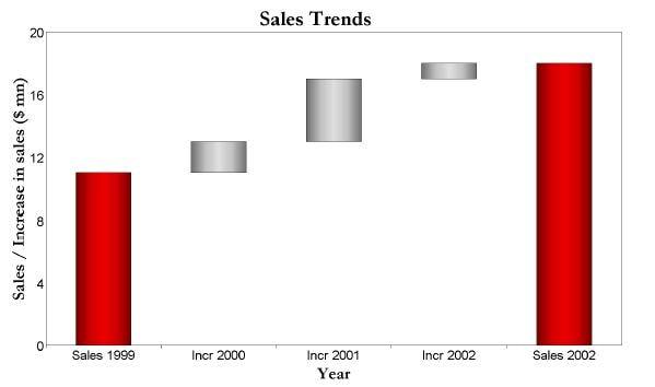
The idea here is to create a transparent bar beneath the main bar for the years 2000-2002. You need the height of the transparent bar to be the previous year's sales. This creates an impression of floating bars. Creating a transparent bar is a two-step process: 1. Add another series that clearly demarcates the increase in sales for the years 2000-2002. Choose a stacked bar graph to show the two series. Your graph will now look like this:

2. Add the following to the Graph.xml
                                     <SeriesItems>
 <Series id="0" borderTransparent="true" transparent="true"/>
 </SeriesItems>
 <O1MajorTick tickStyle="GS_OUT" />
The O1 axis tick mark style is defined so that the floating bars can be identified easily with their respective labels on the X-axis. The above XML entry will make one of the series transparent, and you will get a floating effect as shown below:

In order to show the total sales and increase in different colors, you will need to define exceptional risers. Exceptional risers are data markers that do not share series attributes, e.g., series color. Add the following to the Graph.xml to define exceptional risers:
                                   <ExceptionalRisers>
 <ExceptionalRiser series="1" group="0" fillColor="#6699ff"/>
 <ExceptionalRiser series="1" group="4" fillColor="#6699ff"/>
 </ExceptionalRisers>
This will change the color of the total sales bars as shown below:

The target graph shown above with red and grey bars uses special effects (color gradients). To achieve these special effects, you need to add the SFX element to Graph.xml as shown below:
                                 <ExceptionalRisers>
 <ExceptionalRiser series="1" group="0">
 <SFX fillType="FT_GRADIENT" gradientNumStops="5">
 <GradientStopStyle stopIndex="0" gradientStopColor="#770000" />
 <GradientStopStyle stopIndex="1" gradientStopColor="#cc0000" />
 <GradientStopStyle stopIndex="2" gradientStopColor="#ee0000" />
 <GradientStopStyle stopIndex="3" gradientStopColor="#cc0000" />
 <GradientStopStyle stopIndex="4" gradientStopColor="#770000" />
 </SFX>
 </ExceptionalRiser>
 <ExceptionalRiser series="1" group="4">
 <SFX fillType="FT_GRADIENT" gradientNumStops="5">
 <GradientStopStyle stopIndex="0" gradientStopColor="#770000" />
 <GradientStopStyle stopIndex="1" gradientStopColor="#cc0000" />
 <GradientStopStyle stopIndex="2" gradientStopColor="#ee0000" />
 <GradientStopStyle stopIndex="3" gradientStopColor="#cc0000" />
 <GradientStopStyle stopIndex="4" gradientStopColor="#770000" />
 </SFX>
 </ExceptionalRiser>
 </ExceptionalRisers>
 <LegendArea visible="false" />
 <O1MajorTick tickStyle="GS_OUT" />
 <SeriesItems>
 <Series id="0" borderTransparent="true" transparent="true" />
 <Series id="1">
 <SFX fillType="FT_GRADIENT" gradientNumStops="5">
 <GradientStopStyle stopIndex="0" gradientStopColor="#707070" />
 <GradientStopStyle stopIndex="1" gradientStopColor="#c0c0c0" />
 <GradientStopStyle stopIndex="2" gradientStopColor="#e0e0e0" />
 <GradientStopStyle stopIndex="3" gradientStopColor="#c0c0c0" />
 <GradientStopStyle stopIndex="4" gradientStopColor="#707070" />
 </SFX>
 </Series>
 </SeriesItems>
 <Y1MajorTick visible="false" />
How do I apply 3-D (three-dimensional) effect to my graphs?
3-D effect determines whether you want to display the graph with the appearance of depth.
If you are using Oracle9i Reports or Oracle Reports 10g (9.0.4), you can check the 3D effect check box in the Graph Wizard's Type panel.
If you are using Oracle Reports 10g Release 2 (10.1.2), you need to edit the Graph.xml to apply the 3-D effect to your graphs.For Pie graph type, add the following attributes to your Graph.xml:
<Graph ... pieDepth="30" pieTilt="20" ... >For all other graph types that support 3-D effect, add the following attributes to your Graph.xml:
<Graph ... depthAngle="50" depthRadius="8" ... >Note that you can change the values of the attributes above. For more information on these attributes, refer to the Graph.dtd.
How do I migrate my charts from Oracle Graphics to the new graph format in Oracle9i Reports or Oracle Reports 10g?
Oracle9i Reports Release 1 onwards, Oracle Graphics has been desupported. Oracle9i Reports and Oracle Reports 10g use BI Beans to generate graphs.
Because of the underlying technology, there is no direct migration path from Oracle Graphics to the BI Bean graphing functionality.
As such, the user will need to rewrite all of their graphs using the new Graph Wizard within the Reports Builder.Can I still run my existing Oracle Reports Developer 6i reports containing Oracle Graphics charts in Oracle Reports?
As noted in the Oracle Reports Statement of Direction,
Oracle Graphics is no longer shipped with Oracle Reports. However, as part of the migration path, you can still run Oracle Graphics charts in Oracle Reports if you install the Oracle Graphics 6i engine in a separate Oracle Home. You should only maintain Oracle Graphics 6i as a temporary measure while you redesign your charts using the new Graph Wizard. For further details on how to configure Oracle to use Oracle Graphics 6i,
please see the Graphics Migration section in the Oracle9i Application Server Migration from Oracle9iAS Release 1 (1.0.2.2.x) to Release 2 (9.0.2) manual.Can I modify or add Oracle Graphics 6i charts to my reports with Oracle9i Reports or Oracle Reports 10g?
No. You must have a separate installation of Oracle Graphics 6i Builder in order to modify your existing Oracle Graphics 6i
charts since Oracle Graphics is not shipped with Oracle Reports.
We strongly recommend that you migrate your charts to the new standard in Oracle Reports.
Oracle Reports Technical FAQ
Open all Close all

Fine-tuning the Graph using Graph.xml


