Map Usage Guideline

RCUX Document Version 5.0.0 for Oracle® Fusion Middleware 11g Release 1 Patch Set 1 (11.1.1.2.0)
Last Updated 05-Aug-2010
The Map component can show multiple sets of customer data overlaid onto a detailed map. Users can zoom in and out to see different information.
- General Principles
- Accessibility
- Configurable Elements
- View Menu
- Toolbar
- Pan and Zoom Control
- Map Buttons
- Overview Map
- Information Panel
- Measurement Panel
- Scale
- Themes
- Common Actions
Related Guidelines
| Guideline | Section | For Information About |
|---|---|---|
| Table Information Design | All | Displaying data using Tables. |
| Common Formats | All | Label formatting for different data types. |
| Graph | All | Displaying data using graphs. |
| Search and Query | All | Providing search capability. |
Related ADF Elements
Refer to the ADF Faces Rich Client demos page to find demos and tag documentation for the ADF elements related to this component:
| ADF Tagdoc | Notes |
|---|---|
| dvt:map | Geographic Map component. |
| dvt:mapColorTheme | Color theme. |
| dvt:mapPointTheme | Point theme. |
| dvt:mapBarGraphTheme | Bar graph theme. |
| dvt:mapPieGraphTheme | Pie graph theme. |
| dvt:mapToolbar | Menu and toolbar tagdoc. |
| dvt:mapLegend | Legend tagdoc. |
| dvt:mapOverview | Overview map tagdoc. |
General Principles

Purpose:
The Map component enables users to view data of a geographic nature on a map. By representing data spatially, the Map may provide users with insights that a Table or Graph may not provide.
Description:
The Map component consists of a map which may include data sets, or themes, that appear on the map.
- Users can pan and zoom the map.
- Users can interact with themes and make distance or area measurements.
Map Component Elements
Usage:
- It is recommended to show a title above each map on the page that clearly describes its content. For example, a map of flu outbreaks by country during 2010 might be entitled "2010 Flu Outbreaks by Country". It is recommended to use headline capitalization for Titles. See Capitalization in the Language in UI guideline for details.
- Product teams decide the themes that appear on the map. See Themes for more information.
- Performance tends to decline as more themes are displayed at the same time. It is recommended to display no more two themes at one time.
- The minimum recommended size of the Map is 400px wide by 300px high. However, it is recommended that an application dedicate as much space as possible to the Map component so that users can see and work with the map easily.
- It is not recommended to display more than two maps on a page. If users need to compare more than two sets of data, use a Graph instead.
Accessibility
The Map component is not accessible for users requiring a screen reader. Product teams must provide an alternative component that is accessible, such as Table.
Keyboard Users
The following Map component actions are not keyboard accessible:
- Selection of theme items.
- Showing, hiding, and interacting with Detail Window.
- Showing, hiding, and interacting with Overview Map.
- Measuring distance and area.
- Switching between 'Map', 'Satellite', and 'Hybrid' maps.
To accommodate keyboard users, product teams must provide an additional view that is fully keyboard accessible, such as Table.
Configurable Elements
View Menu
Purpose:
Enables users to change the selection theme, and to show and hide themes and other map elements.
Description:
The View menu contains the following elements:
- The "Themes..." item, which opens the Themes Dialog.
- The "Selection Theme" submenu, which enables users to change the selection theme. The selection theme is the single visible theme whose items may be selected.
- A set of toggle items that enable users to show and hide the Pan and Zoom Control, Information Panel, and Legend.
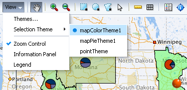
View Menu
Usage:
The View menu is required when users need to be able to change the selection theme, because it provides the only means for accessing the "Selection Theme" submenu and the Themes Dialog.
Themes Dialog
Purpose:
Enables users to show and hide themes and to change the selection theme.
Description:
The Themes dialog is accessible only from the View menu. It contains the following elements:
- A checkbox and select-one list box for Color themes.
- A checkbox and select-many list box for Point themes.
- A checkbox and select-one list box for Bar/Pie (Graph) themes.
- A select-one list box for the Selection Theme.
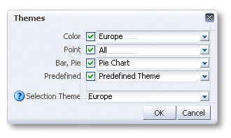
Themes Dialog
Usage:
Because the Themes dialog is accessible only from the View Menu, it is necessary to include the View Menu when enabling users to hide and show themes using the Themes dialog.
Toolbar
Purpose:
Provides tools enabling users to show and hide map elements, select theme elements, and make distance and area measurements.
Description:
The toolbar is optional and includes the following elements:
- Pan tool.
- Zoom tools: Zoom in, Zoom out.
- Selection tools: Rectangular, Circular, Polygon, Point.
- Measurement tools: Distance, Area.
- Legend toggle.
- Information panel toggle.
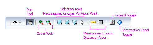
Toolbar Elements
Usage:
- The Toolbar is required when users need to select theme items, because the selection tools provide the only means by which users can select theme items—users cannot select theme items with the keyboard.
Pan and Zoom Control
Purpose:
Provides controls that enable users to pan and zoom the map.
Description:
The Pan and Zoom is optional and appears in the upper left corner of the map by default. Product teams may reposition the Pan and Zoom Control.
Usage:
It is recommended to show the Pan and Zoom Control so users realize they can pan and zoom the map.
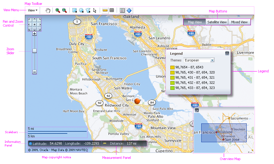
Map Buttons
Purpose:
Enable users to switch between different types of maps, for example, from a road map to a satellite map.
Description:
- Map buttons appear automatically when product teams specify more than one map to display.
- Map buttons appear in the upper right corner of the map. Product teams may not reposition Map buttons.
- Up to three Map buttons may appear. A Map button appears for each map product teams specify.
- Map buttons are labeled 'Map', 'Satellite', and 'Hybrid'. Product teams may not change Map buttons labels nor the order in which they appear.
Usage:
- When multiple maps are specified, each map shows the same geographic area using a different view. For example, one map might show a roadmap View, while another map shows a satellite View.
- Since Map button labels may not be changed, it is recommended to associate a standard road map or political map with the 'Map' button, a satellite map with the 'Satellite' button, and a map that combines several Views with the 'Hybrid' button.
- Assign the map with which users will work most often to the 'Map' button because this map appears first when the page loads.
Overview Map
Purpose:
Enables users to quickly pan the View from one part of a map to another.
Description:
- The Overview Map is optional and appears in the lower right corner of the map. Product teams may not reposition the Overview Map.
- The Overview Map shows a zoomed-out version of the main map, and includes a shaded region showing the visible area of the main map.
- The Overview Map appears expanded by default.
Usage:
It is recommended to enable the Overview Map when users are expected to have to pan the map to see theme data, or to quickly pan the View over great distances.
Information Panel
Purpose:
Shows the latitude and longitude coordinates corresponding to the position of the cursor.
Description:
The Information Panel is optional and appears in the lower left corner of the map, above the Scale. It shows latitude and longitude in decimal degrees.
Usage:
It is recommended to hide the Information Panel by default. Users can enable the Information Panel using the View menu or the Toolbar.
Measurement Panel
Purpose:
Shows the distance, area, or radius that the user has drawn using the measurement or selection tools.
Description:
The Measurement Panel appears automatically when the user performs a measurement or any selection other than a point selection.
The Measurement Panel appears in the lower left corner of the map, above the Scale and at the end of the Information Panel, if present.
Usage:
Product teams can choose to show either US/Imperial units (the default) or Metric units. It is recommended to specify the system appropriate to the locale where users are located. See Weights and Measures in the Common Formats guideline for more information.
Scale
Purpose:
Shows the current scale of the map in both US/Imperial and Metric units.
Description:
The Scale is optional and appears in the lower left corner of the map, above the copyright label.
Usage:
It is recommended to hide the Scale by default. Users can enable the Scale via the View menu or the Toolbar.
Themes
Purpose:
A Theme visually represents a set of related data items on a map. Users can select and interact with individual theme items, which can be map regions, icons, or graphs.
Description:
- A theme may be represented using colors, icons, bar graphs, or pie graphs.
- Multiple themes may be displayed on the map at a particular zoom level—however, the following restrictions apply:
- Only one Color theme may appear at a particular zoom level.
- Only one Graph theme may appear at a particular zoom level.
- More than one Point theme may appear at a particular zoom level.
- Product teams can set the map to automatically zoom to a particular theme when the page loads.
- Users can select items from only one theme at a time, that is, users cannot select items from multiple themes at the same time.
Usage:
- It is recommended to set the map to automatically zoom to the theme with which users are expected to work with most often.
- It is not recommended to display more than two themes on a map at the same time. If users need to see many different types of data on a map at the same time, provide several individual maps.
- It is recommended to associate each theme with the zoom level (or range of zoom levels) appropriate to the level of detail the theme shows, so as not to clutter the map with too much information. For example, it would be preferable for a theme showing state-level data to appear at a zoom level that shows states, rather than have it appear at a zoom level that shows countries, where it may be difficult to see.
- Generally speaking, as the user zooms the map out, themes showing less detailed data should appear, whereas, as the user zooms in, themes showing more detailed data should appear.
- Unless theme information is displayed elsewhere, such as in a label or title external to the map, it is recommended to provide detailed theme names that clearly describe the name of the data set, the time period the data represent, and the units expressed (for quantitative data).
- If more than one of theme appears on a map, include the type of theme in parentheses at the end of the label, so users can tell which theme is which in the View menu and on the Themes dialog. For example, "Air Quality Index (color)". See Theme Types for more information.
Theme Types
Color Theme
Purpose:
Represents data values using colors that fill map regions, such as states or countries.
Description:
- Each data point is represented by a single color that fills a particular region on the map.
- Only one color theme may appear at a particular zoom level.
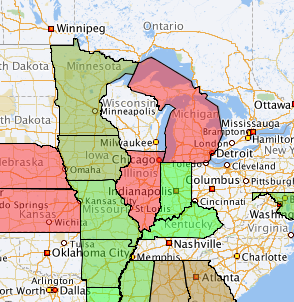
Color Theme Applied to US States
Usage:
- Use a color theme to show a single data value for each region on a map. For example, an election map might apply a red or blue color to US states based on voting results. To show multiple pieces of related data for each region, use a graph theme instead.
Point Theme
Purpose:
Represents data using icons placed either at specific latitude and longitude coordinates or at specific addresses.
Description:
- Each data point is represented by an icon at a particular location on the map.
- The Map component provides more than 60 different icons for use with point themes, and product teams can provide custom icons.
- More than one point theme may appear at a particular zoom level.
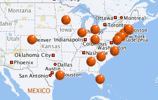
Point Theme Applied to US Cities
Usage:
- Use a point theme to show data values that correspond to specific map locations, rather than to map regions.
- When using custom icons for a point theme, provide an icon for each of the following three states: enabled (default), mouseover, and selected.
Graph Theme
Purpose:
Represents data values using either pie graphs or vertical bar graphs. A graph theme may be associated only with map regions, not with map locations.
Description:
- A set of data points for a particular region constitutes a pie or bar graph for that region.
- A graph theme appears centered within its region.
- Only one graph theme may appear at a particular zoom level.
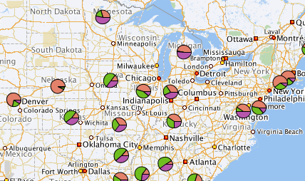
Pie Theme Applied to US States
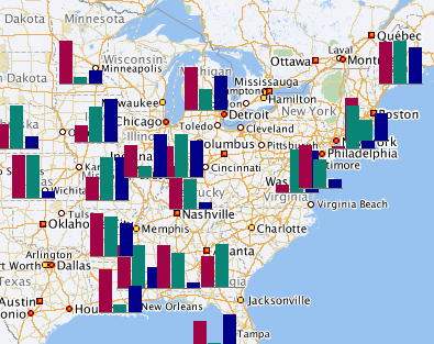
Bar Theme Applied to US States
Usage:
- Use a Graph theme to show multiple pieces of related data for each region on a map. For example, a graph theme could be used to show sales of several products in each region. To show a single piece of data for each region, use a color theme instead.
- Use a Pie graph theme to show how individual quantities add up to a total. Avoid showing more than a few pie slices in the pie.
- The Pie graph is small, so it is recommended to display only the largest four to five slices individually, and to combine the remaining slices into a single slice labeled "Other".
- Use a Bar graph theme to show quantities for different categories or groups. Avoid showing more than a few bars.
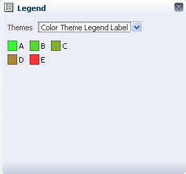
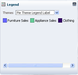
Legend
Purpose:
The Legend is a key that identifies each theme on a map. It shows the user how each theme on a map is represented.
Description:
- The Legend shows graphics and a labels for each theme shown on a map.
- The Legend appears in a small non-modal window.
- Only one theme can be displayed in the Legend at a time.
| Legend for a Color Theme | Legend for a Pie Theme | Legend for a Point Theme |
|---|---|---|
 |
 |
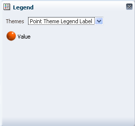 |
Legend Displays for Different Theme Types
Usage:
- It is recommended to show the Legend by default when the page loads and Themes are visible on the map.
- The Legend is required when more than one theme is shown on the map. The View menu and the Toolbar need to be included.
Detail Window
Purpose:
Shows detailed information about a particular map region or location associated with a theme. The Detail Window is not restricted to the selection theme—it may appear for any theme.
Description:
- The Detail Window is optional and appears by default when a user clicks a theme item such as a particular region, icon (point), Pie graph, or Bar graph.
- Product teams may override the Detail Window if desired. For example, a custom popup window could appear instead of the Detail Window.
- Only one Detail Window appears at a time.
- The content of the Detail Window depends on the theme type:
- For a Color theme, the Detail Window shows the name of the region its data value.
- For a Pie graph and Bar graph theme, the Detail Window shows the name of the region and the name, color, and value of each slice or bar.
- For a Point theme, the Detail Window shows the name of the location and its data value.
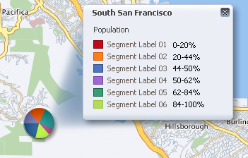
Detail Window Associated with a Pie Graph Theme
Usage:
It is recommended to enable the Detail Window for all themes.
Common Actions
Search
Purpose:
Enables users to search for specific locations on the map. For example, a parts distributor might want to find warehouses in a particular region.
Usage:
- For most search needs, it is recommended to provide Quick Search in an accordion pane adjacent to the Geographic Map. Refer to Quick Search and Search in Accordion Pane in the Search and Query guideline.
- For special search needs, including advanced search, refer to the Search and Query guideline.