HierarchyViewer Usage Guideline 

RCUX Document Version 5.0.0 for Oracle® Fusion Middleware 11g Release 1 Patch Set 1 (11.1.1.2.0)
Last Updated 23-Jun-2010
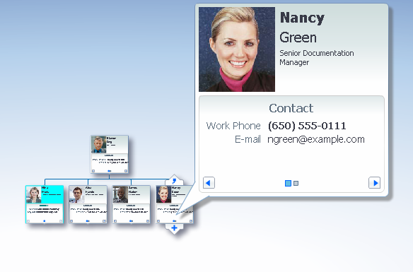
The hierarchyViewer component is an interactive diagram that represents a hierarchy. Users may pan and zoom the diagram, and may interact with elements of the hierarchy.
Related Guidelines
| Guideline | Section | For Information About |
|---|---|---|
| Tree | All | Displaying a hierarchy in a Tree. |
| TreeTable | All | Displaying a hierarchy in a Tree Table. |
Related ADF Elements
Refer to the ADF Faces Rich Client demos page to find demos and tag documentation for the ADF and DVT elements related to this component:
| ADF Element | Notes |
|---|---|
| dvt:hierarchyViewer | HierarchyViewer component. |
| dvt:hierarchyViewer | HierarchyViewer component tagdoc. |
| dvt:node | Hierarchy Viewer nodes tagdoc. |
| dvt:link | Hierarchy Viewer links tagdoc. |
| dvt:panelCard | Hierarchy Viewer node panels tagdoc. |
| dvt:search | Hierarchy Viewer search tagdoc. |
General Principles

Purpose:
A Hierarchy Viewer is an alternative to the Tree and treeTable components for representing a hierarchy. As a diagram, the Hierarchy Viewer enables users to work with hierarchies in ways that Tree and treeTable do not afford.
With a Hierarchy Viewer, users can:
- Visually detect patterns that may not be evident in tabular formats
- Manipulate the shape of the hierarchy by changing its layout
- Rapidly see the relationships between elements of the hierarchy.
Description:
The Hierarchy Viewer is a diagram composed of nodes, which represent the elements in a hierarchy, and links, which represent relationships between elements.
- Users can pan and zoom the diagram and change its layout.
- Users can interact with the nodes and their contents.
- Each node may have only one parent node; the Hierarchy Viewer is not capable of representing a complex network in which a node might have several parent nodes.
Hierarchy Viewer
Usage:
- Product teams decide the content to display in each node.
- In most cases, each node will contain different content. For example, if the nodes represent people within an organization, each node will contain a different person's information.
- Performance tends to decline as more nodes are displayed. Teams decide how many levels of the hierarchy to display at startup, and how many nodes appear at each level. However, it is recommended to display no more than three levels, and no more than 25 nodes per level.
- The minimum recommended size of the Hierarchy Viewer is 300px by 300px. However, it is recommended that an application dedicate as much space as possible to the Hierarchy Viewer— particularly if the hierarchy is large or deep—so that users can see and work with as many nodes as possible.
- The diagram supports several different layouts, and it is recommended to use the layout that most closely matches users' expectations. For example, if the hierarchy is an organizational chart, use the vertical, top-down layout; if the hierarchy is a file system, use the tree layout. Refer to Diagram Layouts for more information.
- When displaying more than a few pieces of information for each node, it is recommended to use Zoom Ranges and Node Panels.
- Zoom Ranges enable users to see different information at different zoom levels. Refer to Zoom Ranges for more information.
- Node Panels enable users to see different types of information one category at a time. Refer to Node Panels for more information.
- To help users see node details when the diagram is zoomed out, a detail window appears when the user mouses over a node. Refer to Node Detail Window for more information.
- Nodes may contain a variety of read-only elements and input elements, and may be square, rectangular, or round—their content, shape, and size should be chosen to match their expected usage. Refer to Nodes for more information.
Configurable Elements
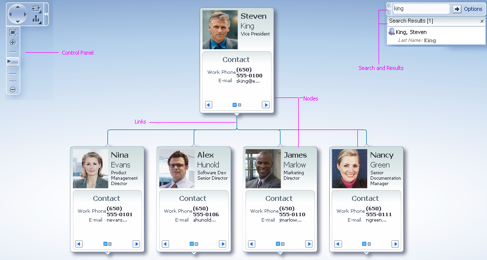
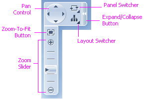
Control Panel
Purpose:
Enables users to manipulate the diagram using the following actions:
- Pan
- Zoom
- Switch layouts
- Switch node panels.
Control Panel
Usage:
The Control Panel appears collapsed by default. It is recommended to show the Control Panel expanded by default, since users may not realize it is available if it is collapsed.
Search
Purpose:
Enables users to search the Hierarchy Viewer using node attributes. For example, when searching an organizational chart, users can search by a person's name, location, job title, and so forth.
Usage:
- Search is not needed for small hierarchies of 20 nodes or less; other than that, Search should be used whenever possible.
- It is recommended to show at least 10 results at a time, but this number may be more or less, depending on the amount of space allocated to the Hierarchy Viewer. The height of the results panel should not exceed 75% of the height of the diagram.
- Search must always be case-sensitive.
- It is recommended to do a "Contains" search on the most common fields for the simple Search. If more specific search criteria are required, Advanced search should be used. Refer to the Search and Query guideline for detailed information.
- The results panel should be wide enough to accommodate all columns without truncating or requiring horizontal scrolling.
- For special Search needs, including Advanced search, refer to the Search and Query guideline.
Zoom Ranges
Purpose:
Enable users to see different node content at different zoom levels.
Description:
Using Zoom Ranges, nodes can display different content within each zoom range.
Four Zoom Ranges are built into the Hierarchy Viewer:
- 10% to 25% zoom level
- 26% to 50%
- 51% to 75%
- 76% to 100%
| 10% to 25% | 26% to 50% | 51 to 75% | 76% to 100% |
|---|---|---|---|
 |
 |
 |
 |
The Same Node Displayed at Four Different Zoom Ranges
Usage:
- Teams may not change the number of zoom ranges or their respective zoom levels.
- It is recommended to display more general information within the first and second zoom ranges (when nodes are smaller), and more detailed information within the third and fourth zoom ranges (when nodes are larger). For example, in the first zoom range (10 – 25%), a node might display only a symbol; whereas, in the fourth zoom range (76 – 100%), it might display a symbol, a label, a button, and other controls.
- Zoom ranges may be disabled; in that case, the nodes will display the same content at every zoom level.
- It is recommended to disable zoom ranges if there is very little node information to display, or if node information is primarily graphical, such as a symbol or image.
Nodes
Purpose:
Nodes represent individual elements in a hierarchy.
Description:
- Each node has a single parent node and may have multiple child nodes.
- Nodes can be any size and may be rectangular, square, or round. See Node Shape and Size for more details.
- Nodes are connected to each other via links. Refer to Links for more information.
- A node can contain a set of Node Panels that displays information one category at a time. Refer to Node Panels for more information.
Usage:
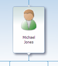
- Each node should contain identifying information such as a name or ID. Users should be able to uniquely identify each node at any zoom level by looking at the node or at its detail window.
- It is recommended to use a Form Layout to display content within nodes.
- Teams configure node content. A node may contain a variety of read-only elements and input elements such as input controls, labels, links, images, buttons, and menus.
- Node content can change depending on the zoom level of the diagram. Refer to Zoom Ranges for more information.
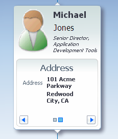
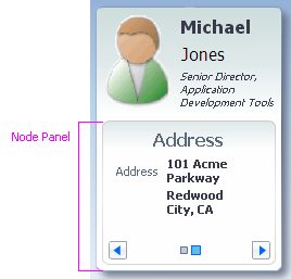
Node Panels
Purpose:
Node Panels are optional regions inside a node that enable users to see different categories of content one category at a time.
Description:
- A node may contain two or more Node Panels.
- Only one Node Panel is visible at a time.
- Each Node Panel may display different content — for example, one panel could contain a person's contact information, and another could contain a person's compensation information.
- Teams define the content of each Node Panel. There is no default panel content.
Usage:
- Node Panels are not necessary if all the node information fits in body of the node. Use Node Panels when there is more information to display than will fit inside the nodes at the 100% zoom level.
- Each Node Panel should include a title that identifies the type of information it contains, for example: "Contact Info" or "Status".
- A node should contain no more than five to seven Node Panels. If the amount of data will require displaying more than seven node panels:
- Remove information that users will not need to access, or
- Consolidate information into fewer panels, or
- Use a Tree or Tree Table component instead of a Hierarchy Viewer.
- It is recommended to use a Form Layout to display content within node panels.
Node Panel
Node Detail Window
Purpose:
The Node Detail Window enables users to see node details even when a diagram is zoomed out.
Description:
- The Node Detail Window appears within the first three zoom ranges when the user mouses over a node.
- The Node Detail Window displays the same node content that appears in the 75%-to-100% zoom range. Refer to Zoom Ranges for details.
Usage:
Although teams may not customize the contents of the built-in Node Detail Window, they may instead display a window containing custom content. If the custom content is text only, it is recommended to use a Note Window; however, if the window displays controls, it is recommended to use a Modeless Dialog instead.
Node Detail Window
Node Shape and Size
Usage:
Nodes may be rectangular, square, or circular. The following table describes guidelines for using each shape.
| Shape | Example | Usage |
|---|---|---|
| Vertical rectangle (default) | 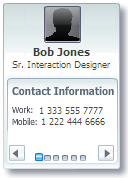 |
Consider this shape when using Node Panels, when displaying an image above or below a node's label, or when using a vertical layout. |
| Horizontal rectangle | 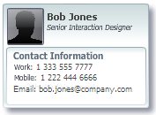 |
Consider this shape when node labels are lengthy, when displaying an image next to a node's label, or when using a horizontal layout. |
| Square |  |
Consider this shape when nodes display only a few pieces of information, such as a label and a single image. |
| Circle | 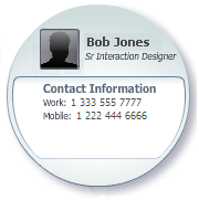 |
Consider this shape when there are fewer than 15 nodes per level, or when using the radial layout. |
Table of Node Shapes and Usage
- It is recommended that all nodes in the hierarchy have the same size and shape, unless the application uses node size or shape to convey additional information to users. For example, a team may choose to use a different size and shape for parent nodes and child nodes.
- It is recommended to use a 1.6:1 aspect ratio for rectangular nodes, as this ratio is known to have a high aesthetic appeal. For example, this would mean that a horizontal rectangular node that is 250px wide should be about 150px tall.
- If nodes contain portraits of people (as in an organization chart), the portrait image files should be sized to have a 1.6:1 aspect ratio of height to width.
- The minimum recommended size of a node is 200px by 200px, at the 100% zoom level.
Links
Purpose:
Links represent node relationships.
Description:
Links are lines between nodes. The Hierarchy Viewer can display relationships between nodes and use different link styles and labels to visually convey particular types of information.
Usage:
- It is recommended to display links as thin, curved lines to make relationships easier to see.
- Visually, links should appear less prominent than nodes, and should have low-to-medium contrast with the background of the Hierarchy Viewer.
Link Labels
Usage:
- Link Labels can be used to provide more information about the links between nodes. For example, the links coming from a decision node in a flow chart might be labeled "Yes" and "No".
- Because labels do not wrap or truncate, use labels sparingly and keep them as short as possible. Otherwise, labels may overlap with nodes and make the diagram difficult to see and interact with.
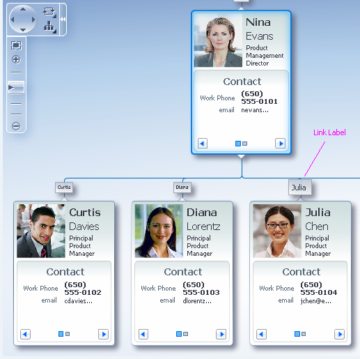
Link Labels
Link Types
Usage:
- Use link types to show special relationships between nodes. For example, full-time employees may show a solid link to their manager, whereas part-time employees might show a dotted link to their manager.
- When the diagram uses more than one type of link, add descriptive text to the page that explains what each type of link means.
Link Types
Link Arrows
Usage:
- It is recommended to use link arrows to indicate the direction of the relationship between nodes. This can help especially when using the circular or radial layout. For example, arrows can be used in an org chart to highlight reporting relationships.
Diagram Layouts
Purpose:
Layouts enable users to see a hierarchy from different points of view; seeing from a different view can lead to new insights about the data.
Description:
- Seven different diagram layouts are provided: Vertical, Top-Down; Vertical, Bottom-Up; Horizontal, Left-to-Right; Horizontal, Right-to-Left; Radial; Circular; and Tree.
- Teams may neither modify the layouts provided, nor create custom layouts.
Usage:
The most effective layout for a given situation depends on the shapes of the nodes, the amount of information to be displayed in the nodes, the complexity of the hierarchy, and the amount of space the Hierarchy Viewer component occupies.
The following table of diagram layouts describes the layouts provided and their recommended usage.
| Thumbnail | Name | Description | Usage |
|---|---|---|---|
 |
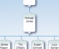
Vertical, Top-Down | Child nodes appear in a row below parent nodes. This is the default layout. |
Consider this layout when displaying an organization chart or hierarchy in which position implies rank.
This layout works well with taller nodes. |
 |
Vertical, Bottom-Up | Child nodes appear in a row above parent nodes. | Consider this layout when displaying a hierarchy for which you wish to de-emphasizes the significance of rank.
This layout works well with taller nodes. |
 |
Horizontal, Left-to-Right | Child nodes appear in a column to the left of parent nodes. | Consider this layout when nodes are wider than they are tall, or when nodes represent steps in a process that flows from left-to-right.
This layout works well with wider nodes. |
 |
Horizontal, Right-to-Left | Child nodes appear in a column to the right of parent nodes. | Consider this layout when nodes are wider than they are tall, or when nodes represent steps in a process that flows from right-to-left.
This layout works well with wider nodes. |
 |
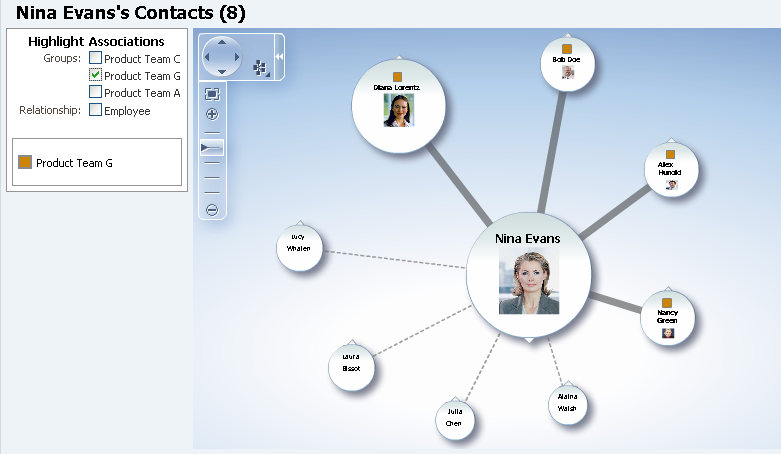
Circular | Leaf nodes (nodes with no child nodes) are arranged in a circle around parent nodes. | This layout is similar to the Radial layout. It de-emphasizes hierarchical relationships by positioning nodes around their parents.
Consider this layout when node positions do not represent rank or order — for example, when displaying a simple network of contacts or peers. This layout works well with circular nodes. |
 |
Radial | Child nodes are arranged in a circle around parent nodes. | This layout de-emphasizes hierarchical relationships by positioning nodes around their parents.
Consider this layout when node positions do not represent rank or order — for example, when displaying a simple network of contacts or peers. This layout works well with circular nodes. |
 |
Tree | Child nodes appear in an indented column below parent nodes. | Consider this layout when users expect to see data in a traditional tree structure — for example, when displaying folders and their contents.
This layout works well with wider nodes. This layout does not use space as efficiently as other layouts. Consider a Vertical or Radial layout if displaying more than 15 items per level. |
Table of Diagram Layouts and Usage