Colored Region
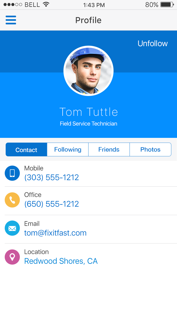
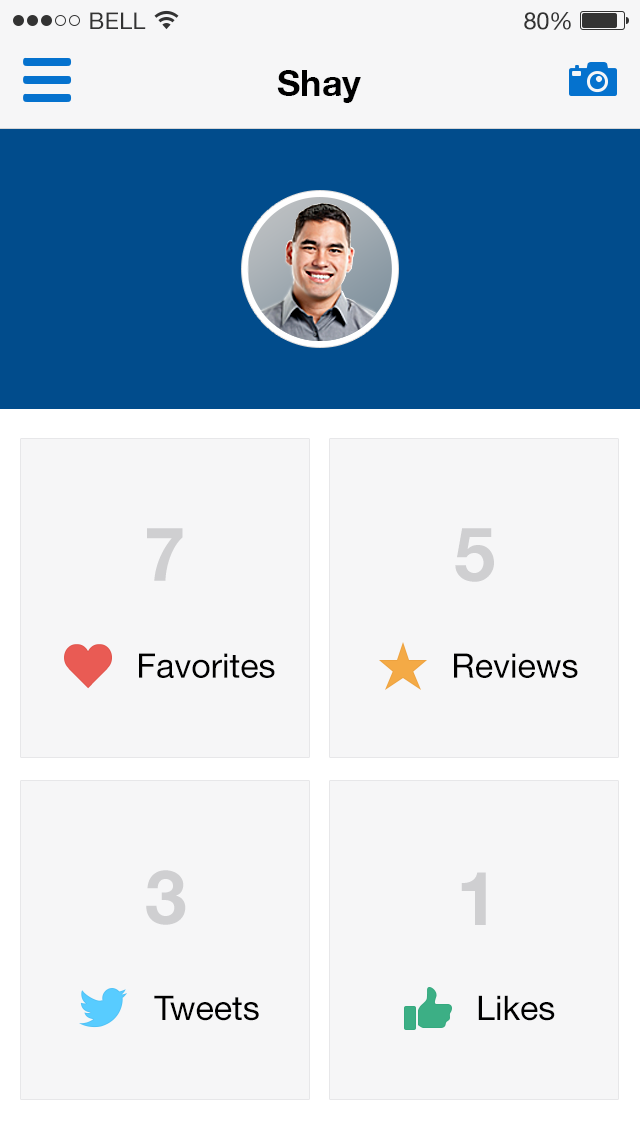
The Colored Region pattern is used to differentiate content on a page to call attention or show prominence. They can be used for hero banners, ancillary areas, content area containers and dashboards.
Appearance
Appearance characteristics for this pattern.
- Solid color: colored regions are typically one solid color that provides adequate contrast for text or images
- Gradients: colored regions can consist of monochromatic gradients but it not widely used.
- Not full-screen: Colored regions typically occupy a portion of a screen, such as behind a graph or DVT or as an application header, rather than full-screen as they could be mistaken for a splash or walkthrough screen.
- Hero banners: typically situated at the top of a screen
- Text color: white text is commonly used on a colored region but darker text can be used if adequate color contrast is employed.
Behavior
Common behaviors for this pattern.
- Interactive: content areas can be interactive allowing for user engagement to display new content. Dashboards are a common example.
- Static: content areas can be static to highlight a photo or showcase content that doesn't change. Hero banners are a common example.
- Opacity: content areas can fade-in or fade-out with changes in opacity.
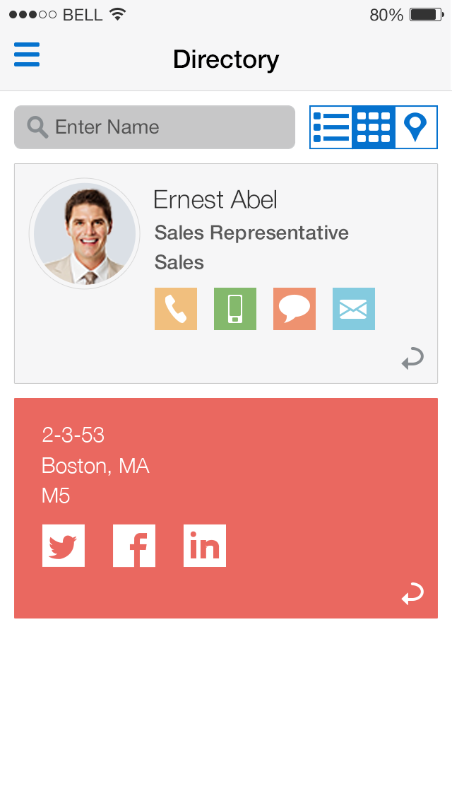
- Dynamic: colored regions can appear on both the front of a card or on the back via a flip control.
Usage
Usage guidelines for this pattern.
- Hero Banner: is a large colored banner prominently placed top and center on a web page. The hero banner is most often found on the Home page of an application. Its purpose is to grab the user's attention and present an overview of the application's purpose. The banner itself is designed to display independently of the balance of the page.
- Ancillary Area: The optional Ancillary Area of a page affords an opportunity to present either a colored region or colored content containers partitioned within the Ancillary Area. The font size and color of text and the background color of a content container should meet the accessibility color contrast criteria. The choice of using either default colors or custom colors is use case driven.
- Content Area Containers: The Content Area composed of content containers can also utilize color, following the same parameters as the Ancillary Area.
- Dashboards: Are composed of regions or tiles. A static dashboard may provide the broadest and least challenging opportunity to create colored regions. Each tile is carefully designed for optimal content legibility.
Related
- Used On: Phone, Tablet
- Also Called: Banners, Cards, Dashboards, Tiles
- Related Components: Image, Masonry, Panel
- Related Patterns: Dashboard, Page Level Message, Profile
- Resources: JET FixItFast Demo

Fig 1. Profile

Fig 2. Profile Dashboard

Fig 3. Fliped Card