Dashboard
The Dashboard pattern is a layout of content tiles often appearing on a single page. The Dashboard supports decision-making and task prioritization. A user can visit any part of the application represented in the tile, by simply tapping the tile. Because of its layout, a dashboard is often used as a Homepage. A well-designed Dashboard will provide: key information at a glance, real-time data, easy to read graphics and clear entry points for exploration.
Tiles are individual containers, which make up the content of a dashboard. Tiles can have a variety of content, but are typically graphically based and visually distinct. Tiles can be re-arranged, resized, or even flipped to provide additional details. The tile itself will have attributes for size, but it will be up to the application to provide UI to trigger the resize and to change the size attributes and swap out the content.
Appearance
Appearance characteristics for this pattern.
- Tile Order: Tiles closer to the top convey importance.
- Tile Grouping: Tile grouping can achieve a focal point.
- Personalization: Provide user the ability to specify a preference, such as control over the arrangement or presentation of tiles.
- Tile Size: Tiles vary by size. Larger tile size convey importance. There are five basic tile sizes based on a basic unit (150 x 150 px) plus padding (16px). Tiles, which are 2x1 and 2x3, also have a reverse orientation (1x2 and 3x2).
Behavior
Common behaviors for this pattern.
- Access: A Dashboard page serves best as a high-level UI destination, appearing at the top of a navigation hierarchy.
- Refresh: Allow user to remain in context and reduce the amount of automatic page load/refresh.
- Resize: In some cases allow a user to expand or shrink a tile on the Dashboard.
- Flip: Allow a user to flip a tile for additional information. The reverse side can allow user to view details or take action.
Usage
Usage guidelines for this pattern.
- Distill and condense the key data using summaries and exceptions.
- Provide high-level summaries of the data. Tell what is happening, not why it is happening, but provide a possibility for the user to drill down deeper into details.
- Focus on changes and exceptions in the most critical data. Often the most important information to the user is unusual changes from normal situation
- Fit the information on a single page.
- The purpose of a dashboard is to provide the key information from different sources quickly and easily to the user. Therefore the data should be shown on a single screen, preferably without scrolling.
- Organize the content into meaningful groups to support its use
- Strive for simplicity. Keep the dashboard clean and simple to make it easy to scan and understand.
- Use visual elements consistently and as little as possible, and highlight only data that needs attention.
- Customize the dashboard for its users and/or role.
- Understanding the users and their goals to be able to select the most important information to them to achieve their objectives.
- You can also allow users to personalize the dashboard further by choosing content and allowing users to order as they prefer.
- Choose the best display visualization for communicating the data clearly and efficiently.
- Use typography, graphs, infographics, icons, images, etc.
- Use “small multiples” that allow users to see related data at once to make comparisons.
- What is the best way to present data depends on several things; the needs of the users, context of use, the type of the data, and etc.
- Keep front of cards clean and sparse while reserving the back for details and actions.
Related
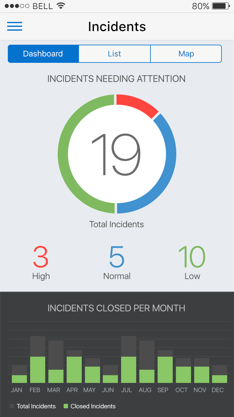
Fig 1. Dashboard
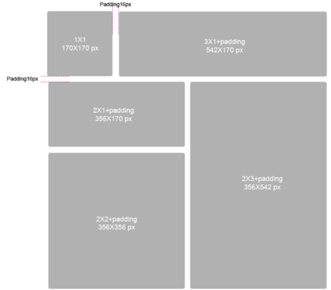
Fig 2. Tile Size
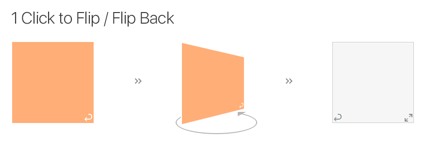
Fig 3. Tile Flip
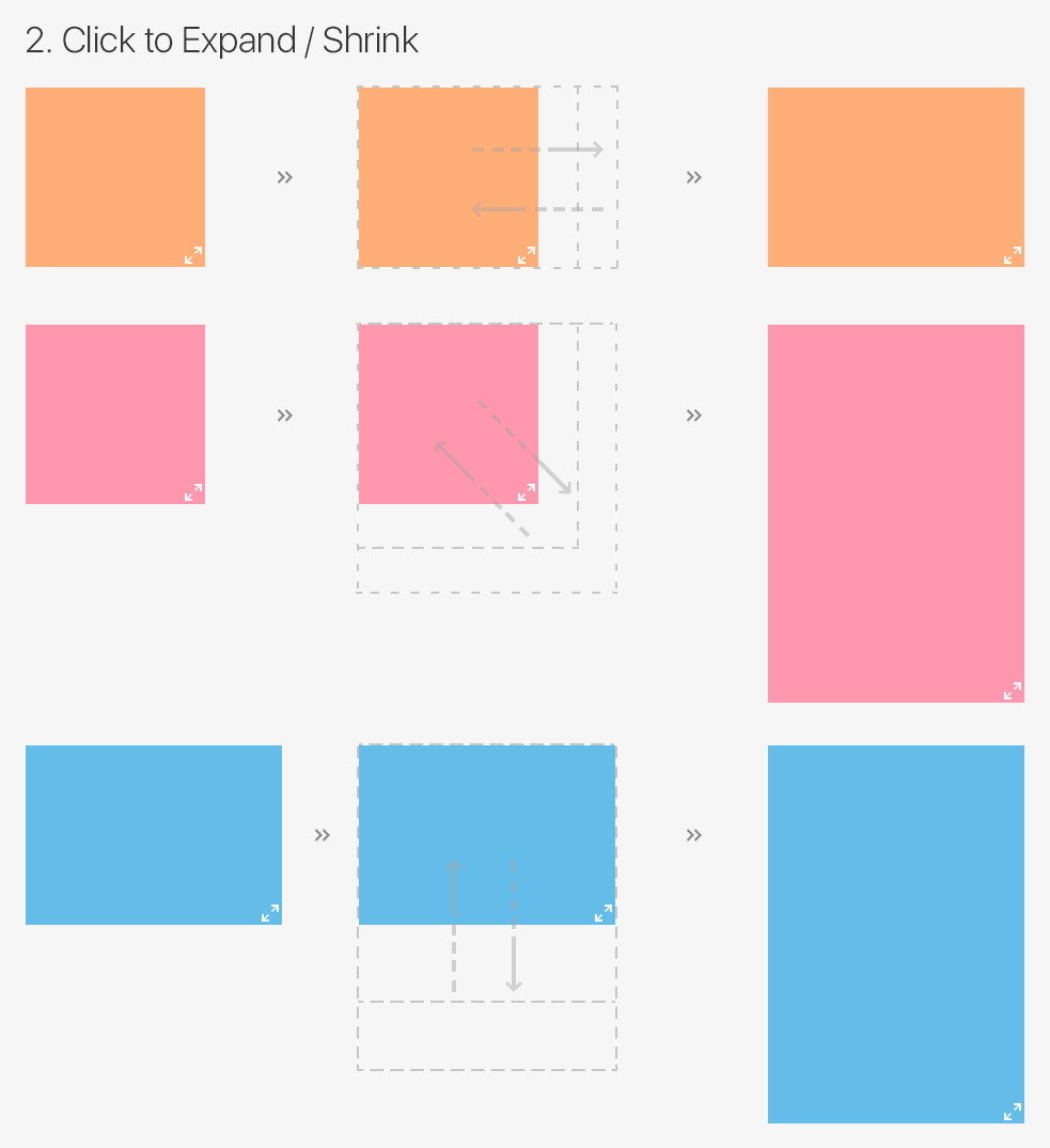
Fig 4. Tile Resize
Fig 5. Dashboard Phone
Fig 6. Dashboard Tablet
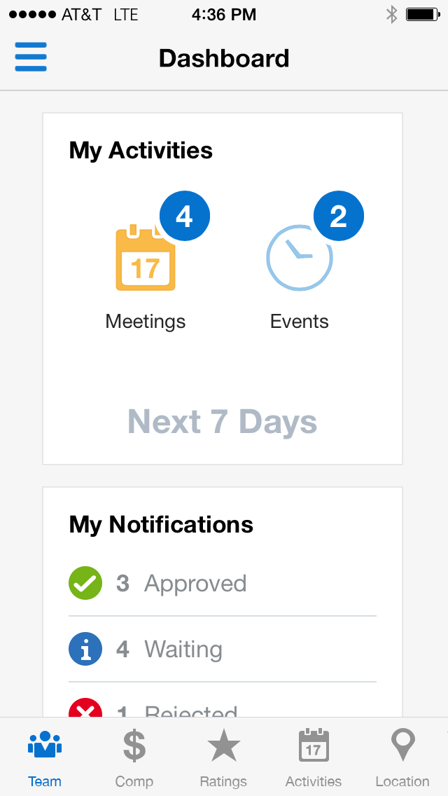
Fig 7. Dashboard