Modal View
The Modal View pattern is a small container for displaying information. Dialogs contain a title, content area, and buttons. Modal Views can appear automatically (alerts, banners) or after a user interaction (modal views, popup menus). Some Modal Views go away automatically after a certain period of time, some require users to take an action in order to disappear. This pattern is common for both phone and tablet.
- Banners indicate change of a status (e.g. download complete, message received, etc.) and go away automatically.
- Alerts request users to take an action (e.g. enable location services) before the app can continue with a task. Alerts contain one or two buttons and appear on a dimmed background.
- Dialogs present self-contained functionality in the context of the current task or workflow and appear on a dimmed background.
Note: Popups can also be used to create menus. For more information see Navigation Menu Pattern.
Appearance
Appearance characteristics for this pattern.
Banner
- Dialog: Semi-transparent background that may or may not stretch over the whole width of the screen.
- Content Area:
- Graphics: (Optional) Icon or image.
- Title: (Optional) Should fit in a single line, if possible.
- Description: Single line or multi-line text. If truncated, shows ellipses.
Alert
- Dialog: The app is dimmed before the alert appears.
- Content Area:
- Title: (Optional) Should fit in a single line, if possible.
- Description: Short and meaningful. Should give users enough context why the alert appeared so they can decide which button to tap.
- Other Controls: (Optional) May contain images or other controls that are necessary for users to make the decision.
- Buttons: One or more buttons with short, logical labels. Usually OK/Cancel for simple decisions with OK on right, Cancel on left.
Dialog
- Dialog: The screen is dimmed before the modal view appears.
- Content Area:
- Title: Identifies the task and fits in a single line.
- Buttons: Short, logical labels. One of them is always called Cancel (usually on left). The default action might be more prominent, e.g. bold.
- Body: Contains text and controls that are necessary to complete the task.
Behavior
Common behaviors for this pattern.
Banner
- Opening: Banners appear at the time of an event. Banners may appear wherever on the screen; usually at the top or bottom of the screen.
- Closing: Banners disappear automatically after certain period of time.
- Changes: Banners can be used to alert users to changes.
Alert
- Opening: Alerts are centered on the screen.
- Closing: Users must tap a button to close the alert.
- Changes: Alerts can be used to alert users to take certain action before the app can continue to run.
Dialog
- Opening: Modal Views are centered on the screen.
- Closing: Users must tap a button to close the modal view.
- Changes: Modal Views are used to allow users to make decisions or set additional information required by the app.
Usage
Usage guidelines for this pattern.
Banner
- Use them if you need to notify users about change of a status in an app.
- Banners should be auto-dismissed.
- If a banner comes from a different app and users tap it, the app should open.
- Keep the messaging short.
- Do not use scrollbars, truncate the text with ellipses instead.
Alert
- Use them if you need users to take an action before the app can continue with a task.
- Do not use single word titles, such as Error or Warning. They are not useful.
- Keep the messaging short and meaningful. Give buttons short, logical labels.
- Try to use max two buttons. Alerts get more complex with three or more buttons.
- Try to avoid scrollbars. Test the alert in both portrait and landscape mode.
- Dim the background of the app when an alert appears.
Dialog
- Use them if you need users to focus on a task that is related to your app's primary function.
- Display a title that identifies the task. Provide the text and controls that are necessary to complete the task as well as dismiss the view.
- Dim the background of the app when a modal view appears.
Related
- Used On: Phone, Tablet
- Also Called: Alerts, Action Sheets, Dialog, Popups, Popovers, Snackbars, Toasts
- Related Components: Button, Text, Textbox
- Related Patterns: Navigation Menu, Notifications
- Resources: JET FixItFast Demo
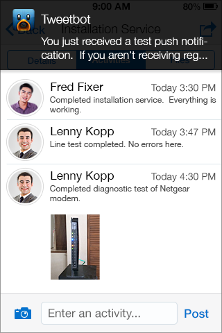
Fig 1. Banner

Fig 2. Alert
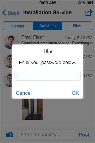
Fig 3. Dialog