Application Navigation Icons Style Overview
Alta utilizes the Application Navigation Bar to provide navigation access to major modules of an application. It is a unique component in that it only performs this function and is the only component intended to provide this function. To further signify this action, Application Navigation icons are only used within this component and have a unique appearance relative to the other Alta icon categories.
Application Navigation icons, like functional icons, have state associated with them. They also either have associated text labels or Alt Text to inform the user what module they traverse.
Color Palette
Application Navigation Icons 24px SAMPLES
Application Navigation Icon States
Application Navigation Bar with icons & text
Size Constraints
Application Navigation Icons are primarily 24x24 pixel size icon with a label.
Functional Icons Style Overview
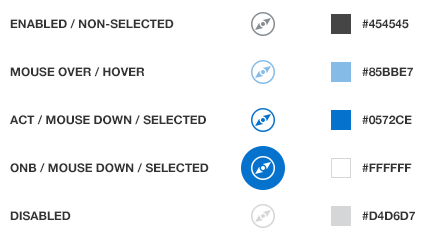
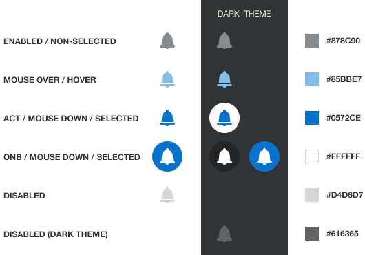
Functional icons perform an action or navigates a user to a page to perform the action. These icons have state: enabled, disabled, hover and selected.
Never use functional icons as a way to beautify a page or uncluttered a form --use qualifier icons instead. By design, functional icons are subdued to give rise to page content over page functions (i.e., chrome). Over-populating the page with functional icons for decorative purposes defeats the goal of functional icons
Color Palette
Functional Icons 16px SAMPLES
Functional Icon States
Size Constraints
Functional Icons are primarily 16x16 pixel size icon with a label.
Functional Icons with Buttons
Please note that the icon samples below are not a reflection of content that would actually be placed in a tool-bar. It's a representation of the various combinations of functional icons that are placed in a menu, button with text and stand alone icons. Iconic buttons can be also used but are not encouraged.