Search
The Search pattern is textbox component that allows a user to search or filter a set of results. Results can be returned as the user types (i.e. auto suggest very common on Mobile) or after tapping a button to conduct a search. Search allows a user to quickly type or speak a search query. It is often used to filter a long list, to quickly bring up the desired item.
The pattern includes the following required elements:
- Search Field: A textbox where a search string can be entered.
- Search Results: A formatted display of results from a completed search. Can be displayed in different formats.
The pattern includes the following optional elements:
- Auto Complete: Displays inside the search field to complete a search string.
- Auto Suggest: Displays outside the search field, typically as a list of matches. Results update as you type.
- Categorized Results: When the results have different categorizes and are separated by section headers. Similiar to scoped search.
- Recent Searches: This is a list or collection of recent searches by a user or other users.
- Result Count: Displays the number of results are found.
- Scope Component: A component that narrows the context of the search being conducted, usually a button set or select.
- Saved Searches: This is a list of searches saved by a user or automatically saved as a search history. Usually related to a Profile pattern.
- Search Processing: An optional indicator informing the user that a search is occurring. Used more often on searches that take a longer time to return.
- Voice Input: Support for voice input into the search field.
Appearance
Appearance characteristics for this pattern.
Required Elements
Search Field
- Width: The textbox width usually spans most of the area it is displayed in.
- Label: No labels are needed for the textbox. Hint text can be used to describe the scope of the search.
- Search Button: No Search button is needed to be displayed. On soft and hard keyboards, the return key, will be used to submit the search query.
- Cancel: When in search mode a method to cancel should be available. In iOS a Cancel button, in Android a Back button.
- Icons in Fields:
- Search Icon: A search icon can be placed at the beginning of the search text field.
- Clear Icon: A clear search icon can be placed at the end of the search text field when a search string is present.
- Hint Text: Also called a prompt or placeholder, hint text is gray text displayed within the field to communicate search scope.
Search Results
- Formats: Results can be presented in many formats: Lists, Grids, Lanes, etc... Lists are the most common on phone and tablet.
- Display: Results are usually displayed on the page for the phone, but sometimes in a popup on tablet.
- Categories: Some results return multiple categories. These are usually separated by a section header.
- No Results Found: If there are no matches to the search, then the display presents a brief message indicating that no matches were found for the search string. The display could also suggest other alternatives for the user besides searching again.
Optional Elements
- Auto Complete: A string of characters usually appears when there is match to what is being typed (not shown).
- Auto Suggest: A list of matching results are returned below the search field. Sometime the matching characters are highlighted.
- Coachmark: If the search has it's own page, a coachmark may be displayed on the page below the search box, before a search has been initiated.
- Empty Page: If the search has it's own page, a watermark may be displayed on the page below the search box, before a search has been initiated.
- Result Count: The result count can be either the number of results fetched or the number of results available.
- Scoped Search: Displays as a Button Set or Select above or below the Search. An item in the Button Set or Select is selected by default. Hint text in the search field describes the scope that is selected.
- Saved Searches: Sometimes before a search is started, when in search mode, a listed of saved searches is displayed.
- Processing: An activity indicator can display on the center of the application page.
- Categorized Results: When the search results are returned by category. This is similar to scoped search, but usually shown on one page at the same time (not shown).
- Trending: Sometimes before a search is started, when in search mode, a list of recent or trending searches is displayed.
- Voice Input: See the Voice Input pattern for more details.
Behavior
Common behaviors for this pattern.
Required Elements
Search Field
- Display: Search field can display by default at the top of a list or collection. It can also appear after you pull to refresh the list or tap a icon or button.
- Search Icon: If a search icon is displayed at the beginning of the search field, it should be persistent.
- Hint Text: As typing occurs in the search field, the hint text should disappear.
- Scoped Search Hint Text: If a scoped search is used, the hint text should be updated to describe the selected scope of the search.
- Clear Icon: When a user begins to type in the search field, a "Clear" field icon may display at the end of the search text field.
- Command Button: It is recommended not to use a command button to conduct a search because of soft keyboards. If it is needed, place the command button to the right of the search field.
Results
- Display: Results can be displayed either as you type or after tapping a return key on the keyboard.
- Result Order: A set of search results based on relevance should be returned.
- Search String: The search string should remain in the search field after the search results are returned or the user returns to the search results. Using the "Clear" icon can remove the search string.
Optional Elements
- Auto Complete: The search string is often completed, by tapping the space bar in the soft keyboard.
- Auto Suggest:
- Results: Suggested results will be displayed in auto suggest.
- Selection: Tapping a result will navigate the user to that item.
- Update: As a user types, the most relevant matches update. The closest match appears at the top of this list.
- Highlight: This maybe used to help indicate matches, for example: Off... Office, Officer.
- Keyboard: Tapping the return key on the soft keyboard will usually close the keyboard, while continuing to show the results.
- Scoped Search: When tapping a scope, the hint text in the Search Field is updated to describe the scope of the search.
- Saved Searches:Tapping the saved search will return results for that search. Conducting a search will usually hide the saved searches.
- Processing: If a search can take some time to return results, an activity indicator may display once the search has started, until the results are returned. See Activity Indicator.
- Header Search: In search mode the search field can replace items in the App Header.
- Recent Searches: Tapping the recent search will return results for that search. Conducting a search will usually hide the recent searches.
- Voice Input: See the Voice Input pattern for more details.
Usage
Usage guidelines for this pattern.
- Provide a single search field for this pattern. If additional filtering is needed use a scoped search.
- In auto suggest consider using a scoped search instead of categorized results, due to limited space when the keyboard is displayed.
- If the search icon in the field is not used, a label or hint text should be used.
- Do not pre-populate the search field with a search string, because the user would need clear it out before entering their search string.
- Do populate the search field with the previous search string, after the results have been returned.
- Use hint text (i.e. placeholder, prompt) to explain the scope of the search, even if there is only one scope.
- On the tablet use a search field that will accommodate the average search string length. It does not need to be too short or too wide.
- Keep the search results in close proximity to the search field.
- When using the Search on a Drawer the navigation will hide when in search mode. Results will be display on the Drawer. When search mode is cancelled, the navigation items will return.
Related
- Used On: Phone, Tablet
- Also Called: Find
- Related Components: Image, List View, Textbox
- Related Patterns: Drawer, Voice Input
- Resources: JET FixItFast Demo

Fig 1a. Android Default

Fig 1b. Android Active

Fig 1c. iOS Default

Fig 1d. iOS Active
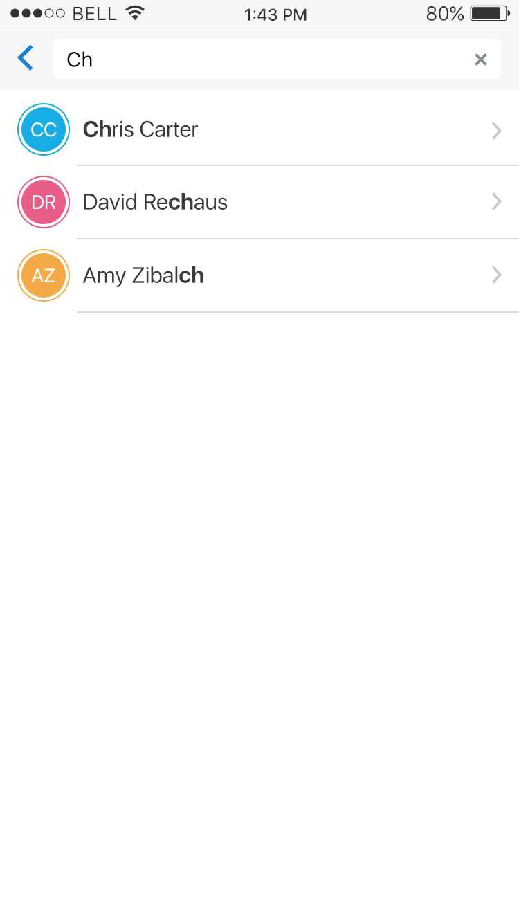
Fig 2. Auto Suggest
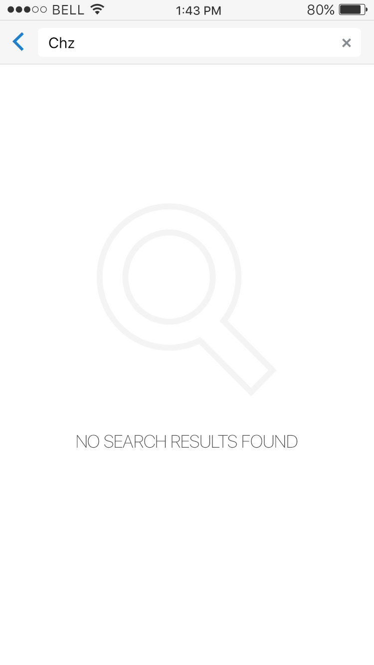
Fig 3. No Results
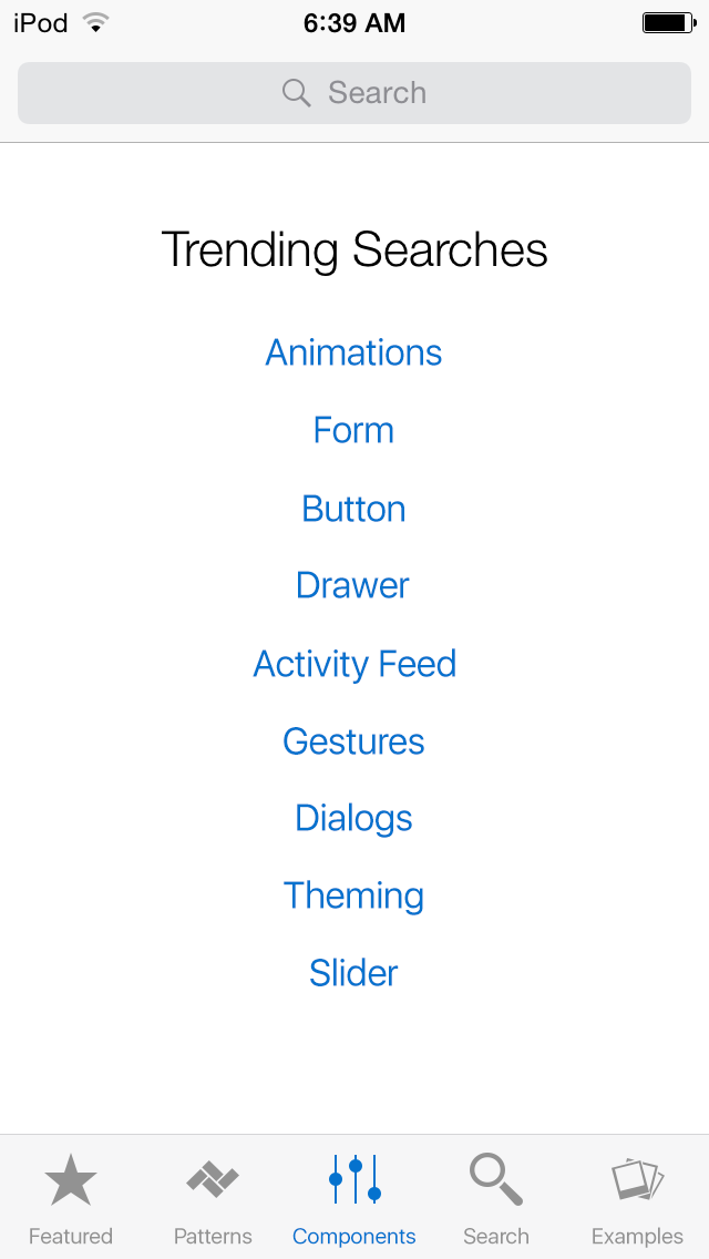
Fig 4. Saved or Trending
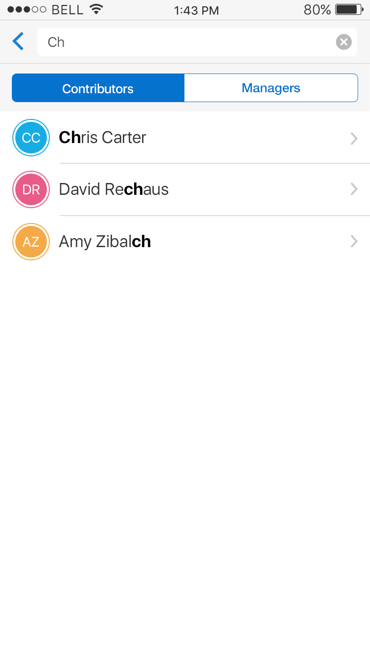
Fig 5. Scoped
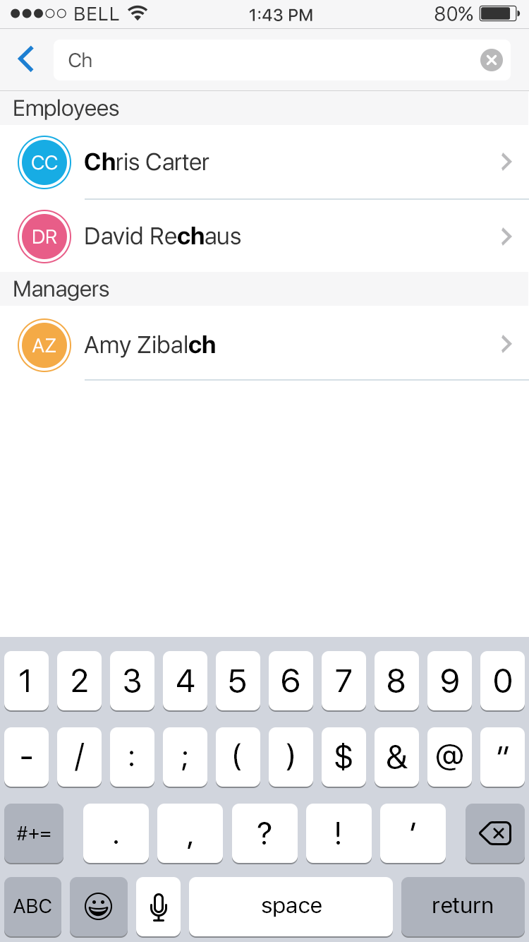
Fig 6. Result Categories
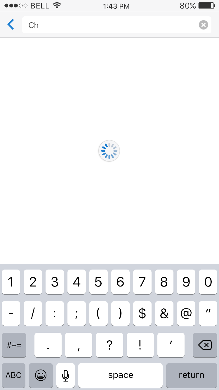
Fig 7. Processing