自助数据可视化
Oracle 助您快速启动分析流程,即时实现数据可视化。您可以使用自然语言处理技术,通过文本或语音进行会话式搜索和分析 — 只需提问就能轻松获得可视化答案;使用自动化图表和图形建议构建引人入胜的可视化叙述;快速上手超过 45 个开箱即用的可视化功能,包括瀑布图/桥图报告、绩效磁贴 Spark 图、热力图层和自定义图像地图等;使用内置和自定义地图图层开展地理空间分析,基于任意图像创建定制化的交互式视觉效果;使用组合可视化在一个视图中展示多个相关度量,构建更完整的数据叙述;上传图像,使用自定义区域和无代码形状定义(与数据绑定)创建地图图层。
经治理的报告和仪表盘
Oracle 助您构建并集中管理报告和交互式仪表盘,实现有效治理和控制。您可以创建静态报表或支持向下钻取和筛选的全交互式参数化仪表盘;确保用户访问基于经验证数据源(采用认证度量、计算和 KPI)的认证报告;只需更新一次数据,即可确保每个人都使用正确版本的数据;设置报告,定时刷新数据并通知业务用户。当获得授权后,用户可以打印、分享和保存报告或导出基础数据。最后,Oracle 还与广泛服务集成,支持用户直接对报告中的信息进行操作。
AI 生成的新闻广播
以熟悉的新闻广播格式呈现数据故事,更有效地吸引利益相关者。Oracle Analytics 使用 Story Exchange 格式与 Synthesia 等合作伙伴服务相集成,使您能够使用 AI 头像将仪表盘和报表转换为动态可视化演示。
像素级完美的高容量报告
Oracle Analytics 提供 Oracle Analytics Publisher(也称为 Oracle Business Intelligence Publisher),它可基于来自任何数据集或语义模型的数据提供高容量报告。您可以编写、管理和交付高度格式化、像素级完美的文档,例如运营报告、电子资金转账文档、政府 PDF 表单、装运标签、支票、销售和营销信函等。
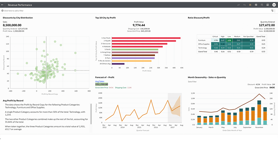
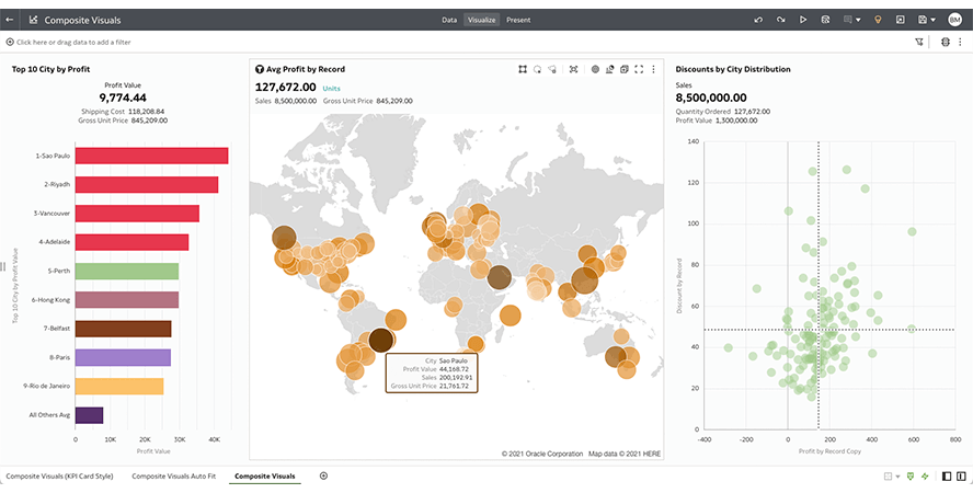
组合可视化
组合可视化旨在在一个可视化对象中更密集地可视化呈现更多度量和维度,提供更全面、直观的数据洞察。通过在一个图表中组合多种可视化(例如条形图和折线图),您可以更深入地了解数据、识别关联并发现趋势 — 这一切都可以在一个视图中实现。组合可视化不仅有助于您识别不同数据集之间的关联,还可以发现可能被忽视的趋势和模式,为业务决策提供依据,提高决策效率。
性能监视
分析人员和开发人员可通过开发人员模式监视可视化视图或完整画布的性能,从而发现表现不佳的对象,确定问题并进行纠正。开发人员还可以检查为分析而创建的逻辑 SQL,观察生成了哪些查询并查看执行日志。
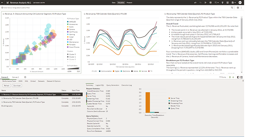
您可以使用开发人员模式获取 HTML 嵌入代码并将任何实时可视化对象放置到其他网页中。
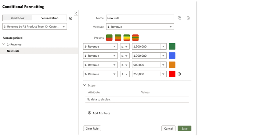
条件格式
您可以为报告、可视化视图、表和数据透视表设置条件格式规则。这些规则可应用于某个特定图表、页面上的所有图表或特定度量。您可以使用复杂的规则引擎来表达复杂的格式逻辑。
注:为免疑义,本网页所用以下术语专指以下含义:
- 除Oracle隐私政策外,本网站中提及的“Oracle”专指Oracle境外公司而非甲骨文中国。
- 相关Cloud或云术语均指代Oracle境外公司提供的云技术或其解决方案。