Icon Stroke Guide
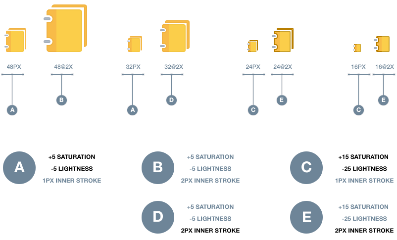
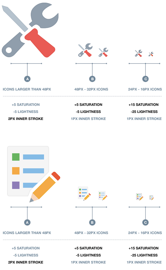
The Alta Icon stroke outline enforces a stylistic brand attribute as well as a function need. The stroke translation differs at various icon sizes. The distinction and variation of the stroke is primarily driven by the need to balance focus, containment, as well as complexity of an icon. At the smaller sizes such as 16 and 24 pixels, the stroke is darker and more intense to ensure that they do not appear disabled and retain the focus needed. As the icons get larger, the stroke lightens and softens to help minimize added complexity that a stroke may introduce while retaining the visual containment and anchor needed to compliment the overall L&F of our Alta chrome. Please follow the guidelines below to ensure a successful and unified user experience as it pertains to our Alta Icon Style.
Icon Stroke Settings
Icon Stroke Settings @2x Retina
The saturation and lightness settings for both retina and non-retina icons are identical, the stroke line weight doubles for the retina icons. Retina icons are scaled by 200%
image_24.png = 24x24 px size
image_24@2x.png = 48x48 px size