Monitoring your portfolios in Oracle Primavera Cloud
In this article, we’ll discuss the ways you can monitor and evaluate the performance of your portfolios in Oracle Primavera Cloud.
Update project or program data
It’s important to regularly update project or program data on the Cash Flow page, so you can evaluate performance using the various tools we’ll discuss in this article. Most Portfolio Managers update actuals and forecast costs, but this varies depending on the needs of your organization.
When updating data, consider creating snapshots so you can review how your projects and/or programs are progressing. You can also use cost curves to see budget, forecast, and actuals over a period of time.
See this article for more information.
Scorecard page
The Scorecard page details key performance indicators (KPIs) that evaluate the health of your approved budget plan.
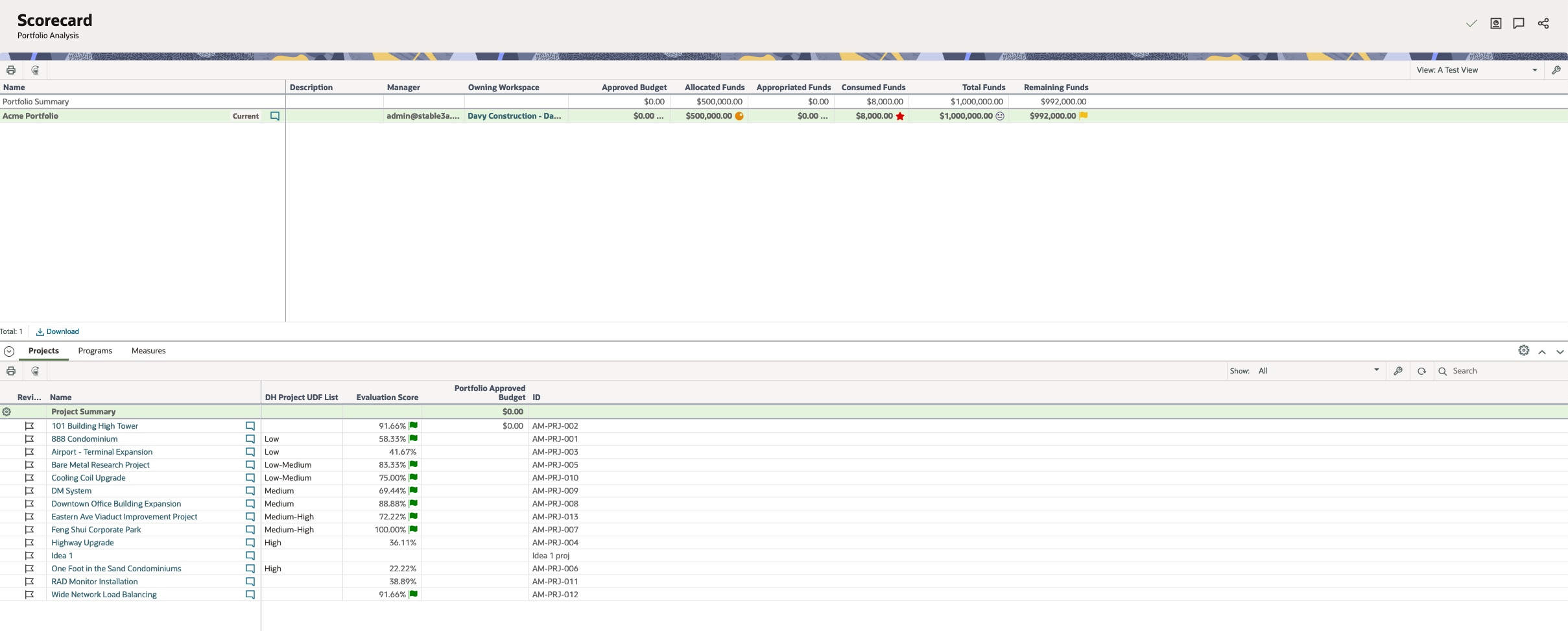
KPIs are defined at the portfolio level. Go to Summary & Settings > Thresholds. Here, you can add KPIs in three categories: use Project for individual project progress, Project Summary for a summary of the projects in your portfolio, and Portfolio for a summary of the entire portfolio.
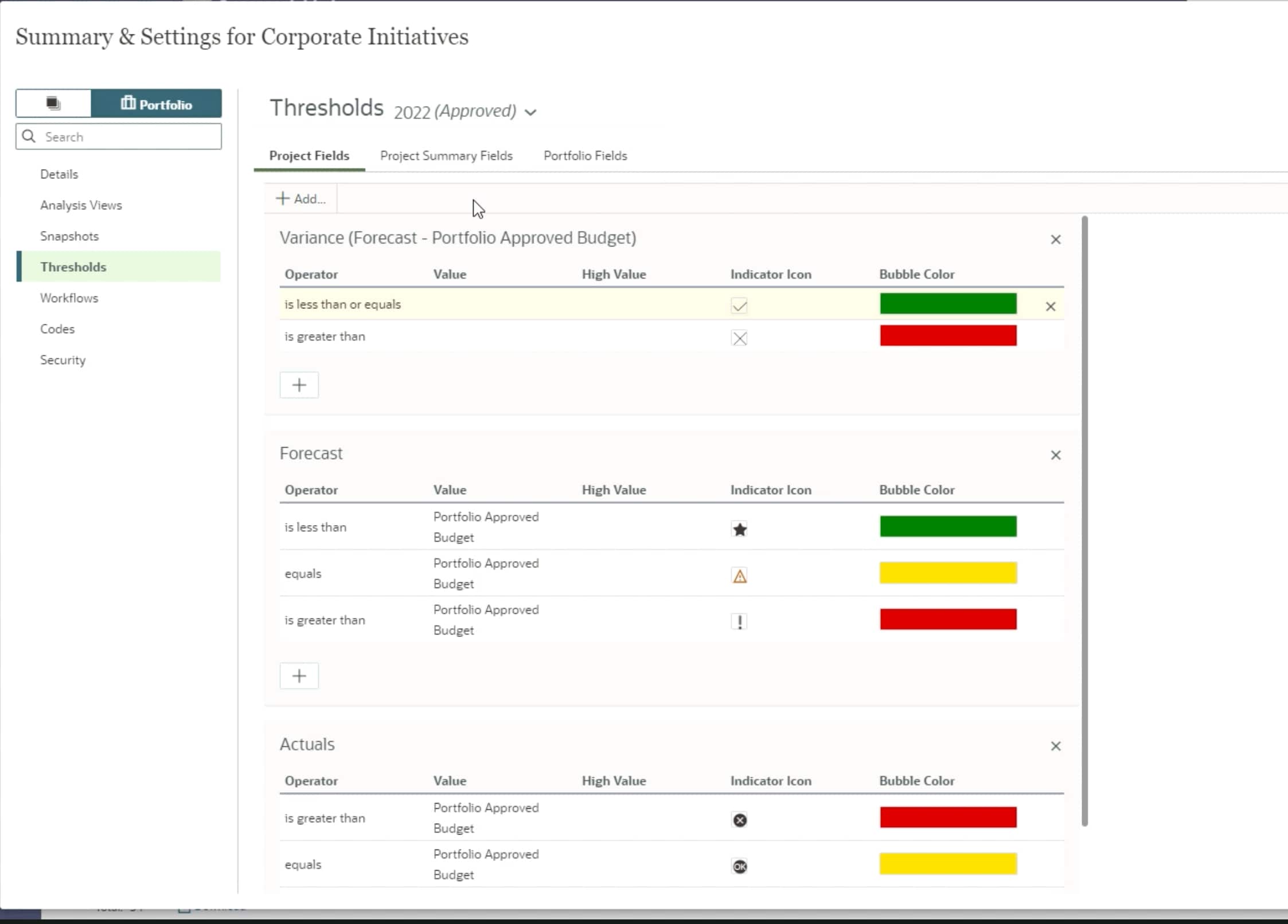
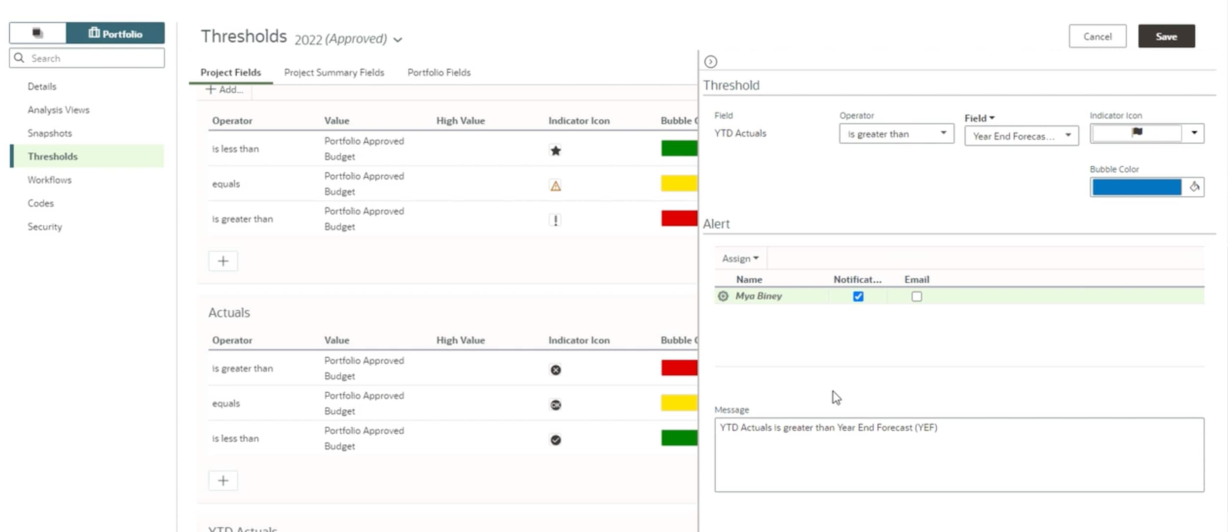
When you add a KPI, you’ll be prompted to set a threshold. This indicates when a project or portfolio is less than, equal to, or exceeds a certain value. You can set up alerts to keep stakeholders up to date when thresholds are met.
You’ll see your portfolios at the top of the Scorecard page, then in the Projects tab below, the information contained within each project. In the Projects tab, use the Show drop-down to select projects you want to see in the budget plan.
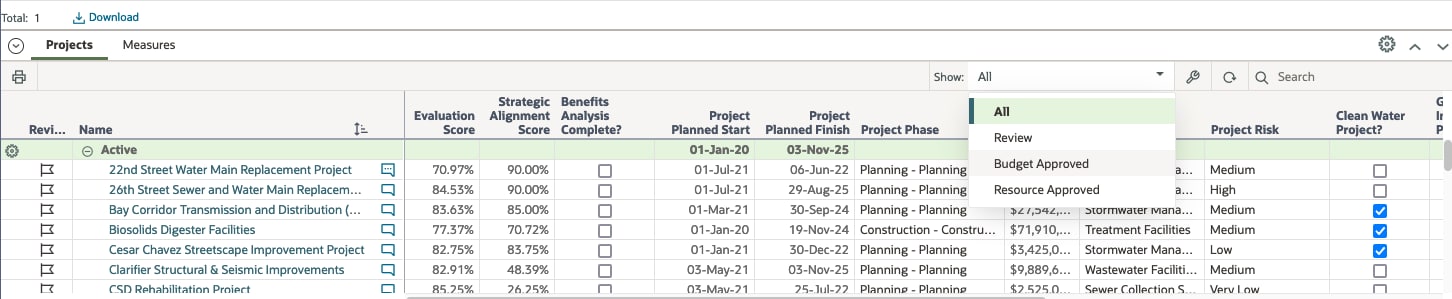
If a project requires further review, you can collaborate with stakeholders and/or create a snapshot of its current value to review its progress over time.
If needed, you can update an approved budget plan and send it through required approvals.
Measures
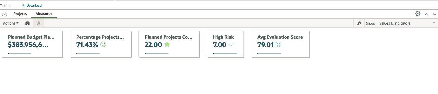
In addition to KPIs, you can add measures to the Scorecard page to capture additional performance details of your portfolios, programs, projects, and/or strategies. Measures capture various attributes, such as the number of active projects in a portfolio, the return on investment of individual strategies, total cost, and more.
Measures are defined at the workspace level by going to Summary & Settings > Dictionaries > Measures. Here, you can use measures that already exist, or add new ones.
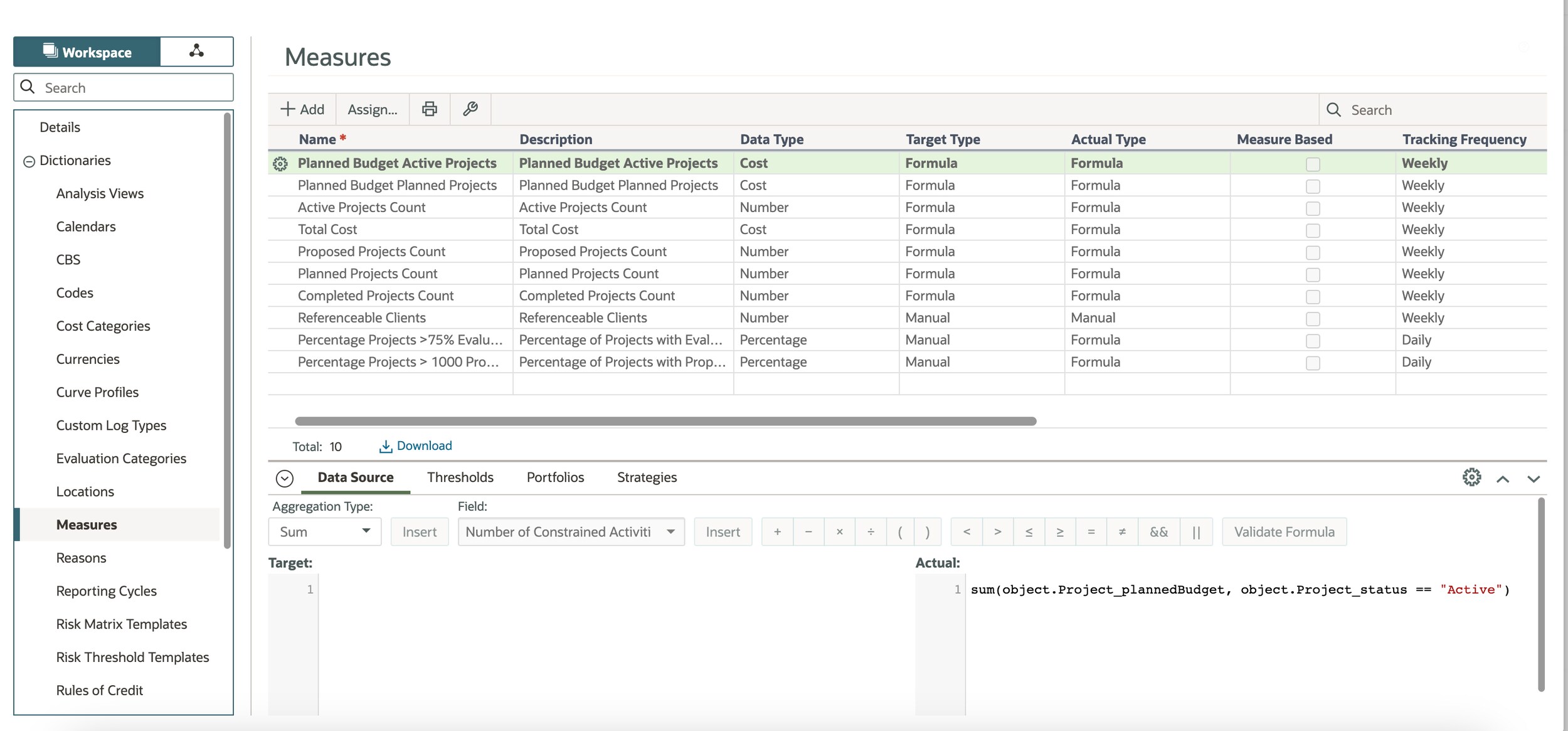
When adding your own measure, you’ll complete a number of fields in the Measures table, including adding a tracking frequency. The tracking frequency is important, as it allows you to see trending history for the measure.
Measures have a target value and actual value. You can enter either value manually, or they can be automatically calculated based on a formula. For accuracy, the actual value is typically based on a formula.
Tip!
For information on creating advanced formulas for measures, refer to this guide.
If desired, you can add a threshold to see the status of the measure using visual indicators.
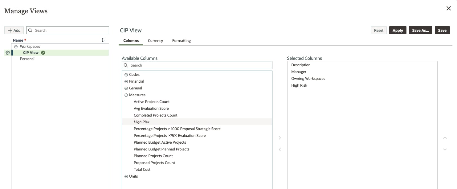
Link the measure to all applicable portfolios and/or strategies.
To use a measure once it has been created, go to a portfolio’s Scorecard page. Select the wrench icon, and then choose the measure to be a part of the view.
Select the Recalculate Measures button to display current values.
Spending page
Use the Spending page to track costs against the approved budget plan. Note that costs from the Cash Flow page roll up to the Spending page, so it’s important to regularly update cash flow data.
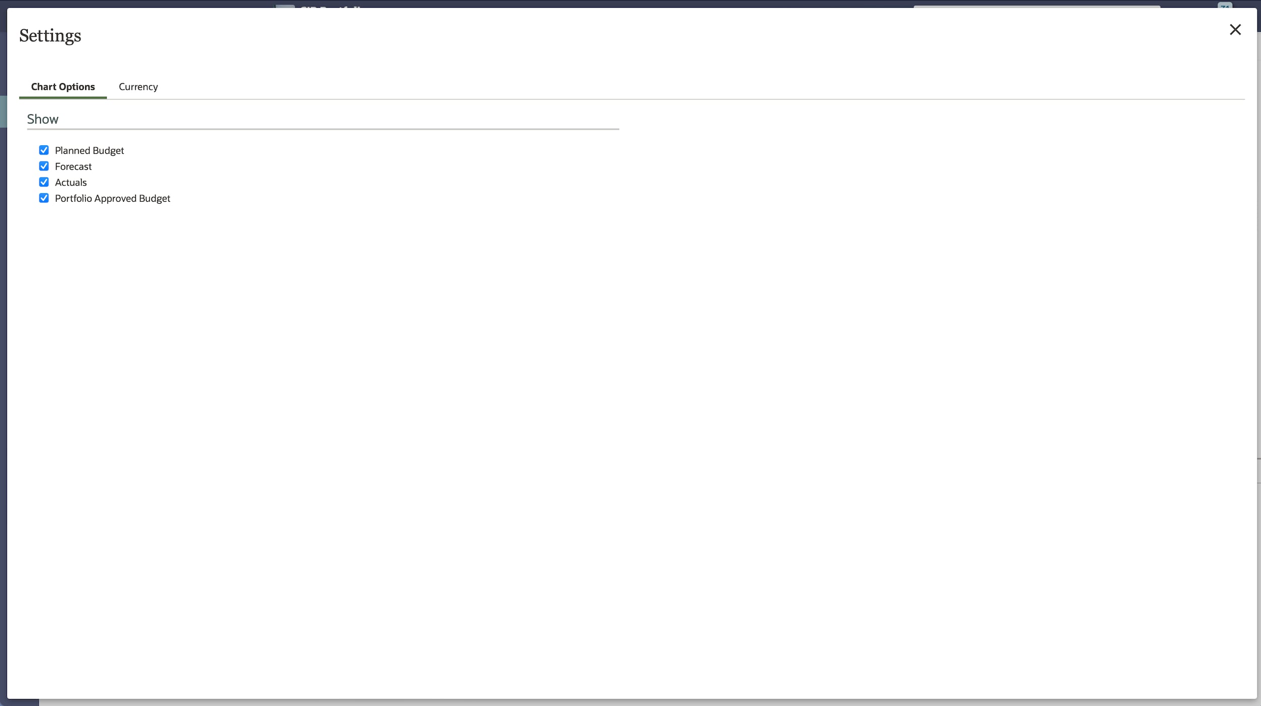
The top half of the Spending page displays a Financial Summary chart that tracks spending over the period of the budget plan.
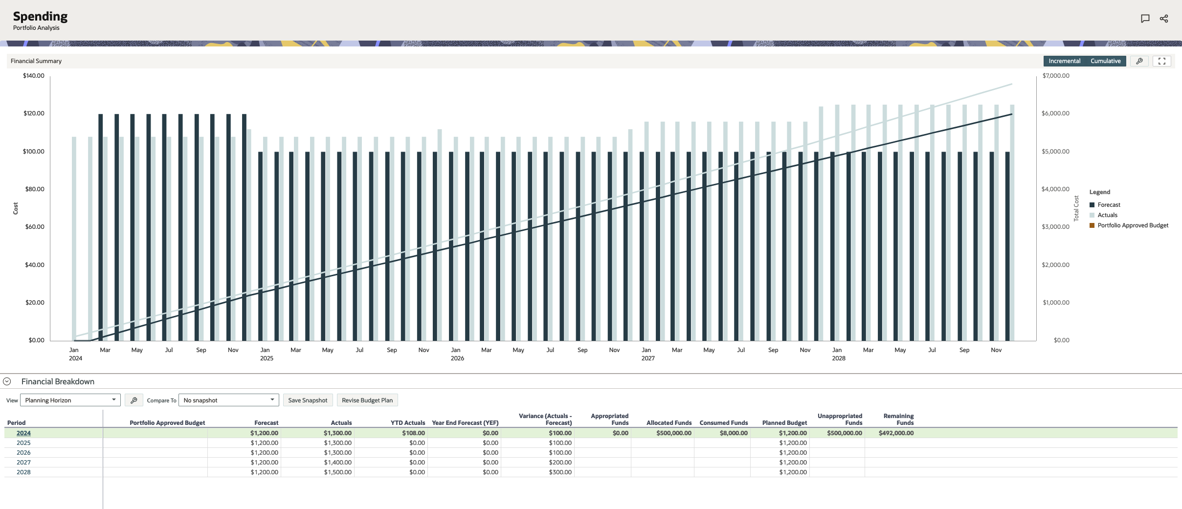
Select the settings icon to choose which costs to display in the chart.
The bottom half of the page includes a financial breakdown of costs over a planning horizon or a specific year. If desired, create a snapshot to see how projects are progressing over time.
In the Period column, select a year to view the projects in the budget plan and their costs. Choose a month to see if any projects exceeded the approved budget. Select the flag icon to denote any projects that require further investigation.
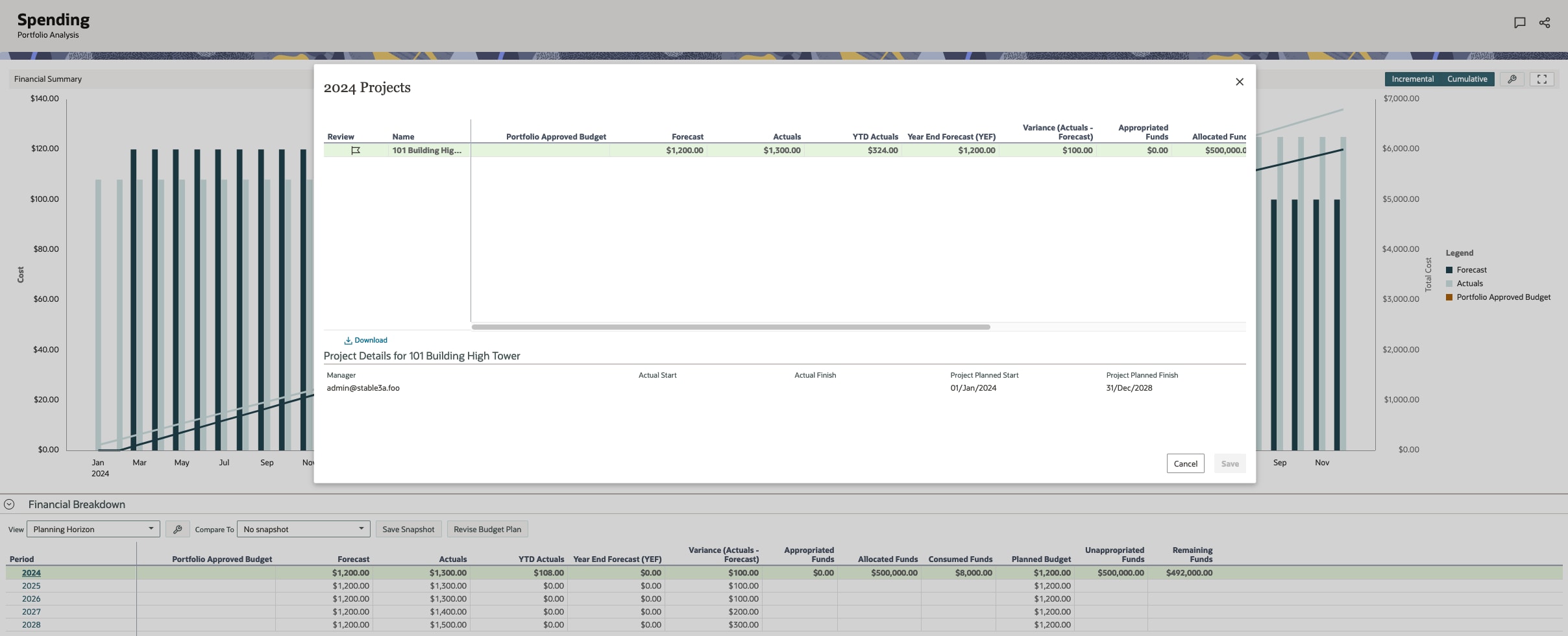
You can collaborate with stakeholders to discuss projects as needed.
You can also update a budget plan by selecting Revise Budget Plan. This will create a new budget scenario that will need to be sent through your organization’s approval process.
Dashboards
Use the Dashboards app to create customized views of your portfolio, program, or project data.
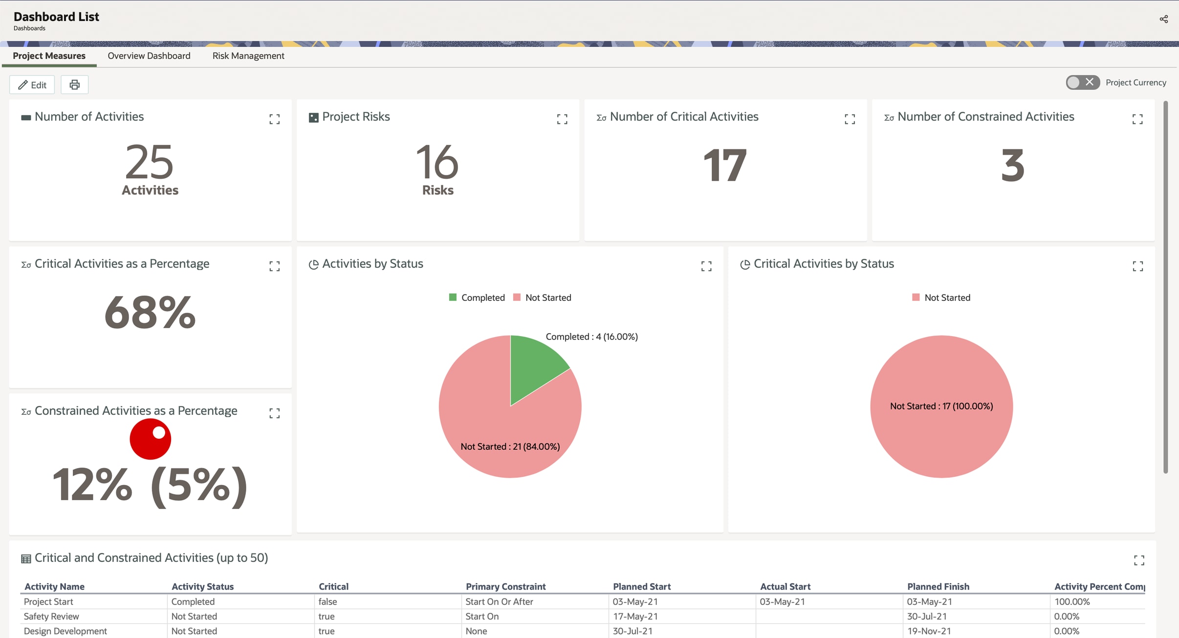
You can create dashboards at the workspace, portfolio, program, or project level. We recommend creating dashboards as high in your workspace hierarchy as needed so you can assign them to desired workspaces, portfolios, and projects. If needed, you can change the owning workspace of a dashboard.
All workspaces, projects, portfolios, and programs have a default overview dashboard. You can’t edit or delete this dashboard, but you can choose which dashboards to display and arrange them as desired.
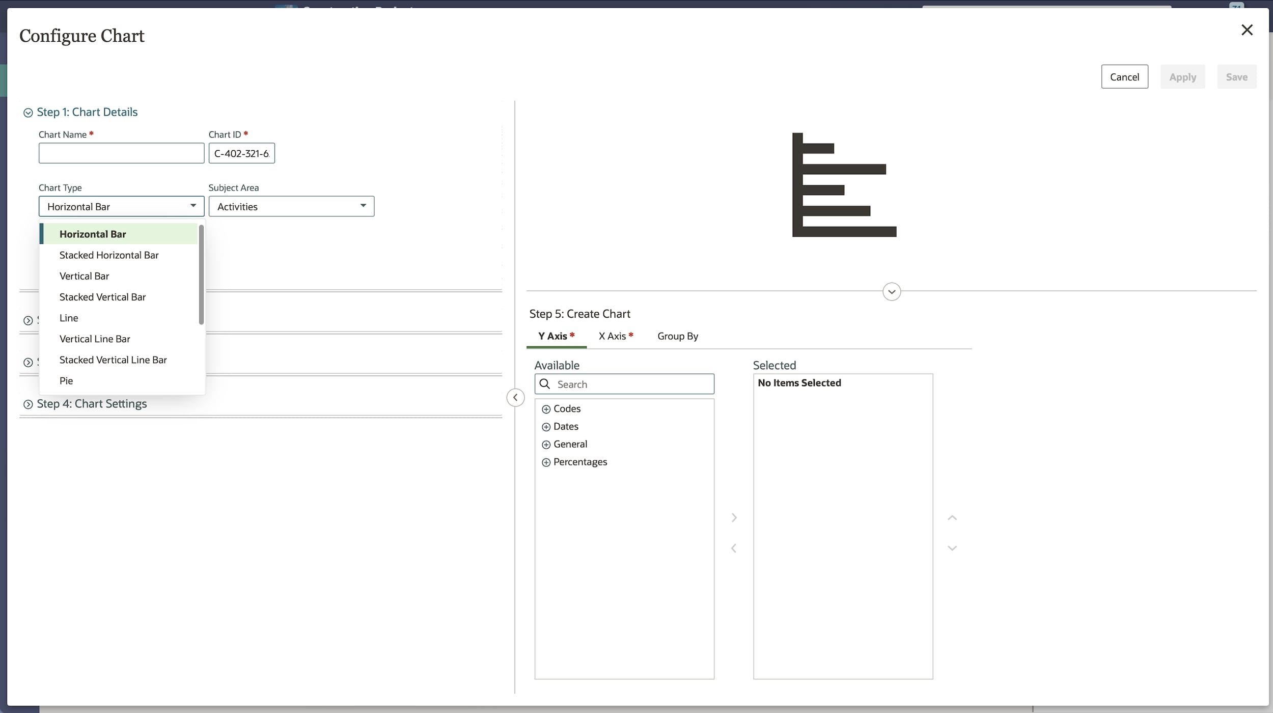
Add tiles to your dashboard to display information. Various tile types are available, including chart, text, list, photo, and more.
Add a chart to your dashboard to represent project costs, budgets, resources, strategies, and other data. A variety of chart types are available, such as bar, line, pie, and pivot table. You can create a chart when adding a chart tile type by selecting Create Chart from the tile settings pane.