Visualiser
La visualisation des données est un composant fondamental de chaque système d'analyse. Sans visualisation, il est difficile de digérer rapidement des informations denses ou des jeux de données volumineux. Les tableaux de bord d'analyse interactifs hautement visuels fournissent des graphiques permettant d'explorer les relations entre les variables, d'identifier des modèles, des tendances, des valeurs aberrantes et des écarts. Oracle Analytics fournit une interface simple d'utilisation qui permet à tout utilisateur de combiner des jeux de données, d'explorer leurs données et de créer des scénarios visuels pour les parties prenantes, sans avoir besoin d'outils distincts.
Visualisation de données en libre service
Visualisez instantanément les données et lancez le processus d'analyse. Le traitement du langage naturel alimente le texte et la parole pour la recherche et l’analyse conversationnelles ; posez simplement une question et obtenez une réponse visuelle. Créez des rapports illustrés convaincants avec des recommandations de graphiques automatiques. Commencez rapidement avec plus de 45 visualisations prêtes à l'emploi, notamment les rapports sur les ponts en cascade, les graphiques sparkline sur les mosaïques de performances, les couches de cartes d'activité et les cartes d'images personnalisées. Créez des visuels interactifs et personnalisés à partir de n'importe quelle image via une analyse géospatiale avec des couches de carte intégrées et personnalisées. Racontez une histoire avec des données grâce aux visualisations composites qui affichent plusieurs mesures associées dans une même vue. Téléchargez des images et créez des couches de carte avec des zones personnalisées et des définitions de forme sans code liées aux données.
Rapports et tableaux de bord gérés
Créez et gérez de manière centralisée des rapports et des tableaux de bord interactifs pour assurer la gouvernance et le contrôle. Créez des rapports statiques ou des tableaux de bord entièrement interactifs paramétrés avec des fonctions, telles que l'exploration et le filtrage. Assurez-vous que les utilisateurs professionnels accèdent à des rapports certifiés à partir de sources de données vérifiées qui exploitent les mesures, les calculs et les KPI approuvés. Réalisez des actualisations à un seul endroit pour que tout le monde utilise la bonne version des données. Planifiez les rapports pour actualiser et informer automatiquement les professionnels. S'ils ont les autorisations, les utilisateurs peuvent imprimer, partager et enregistrer des rapports ou exporter les données de base. L'intégration avec des services plus larges permet aux utilisateurs d'agir sur les informations directement à partir du rapport.
Bulletins d'actualités générés par l'IA
Présentez les récits de données dans un format familier de diffusion de nouvelles qui engage les parties prenantes plus efficacement. En utilisant le format Story Exchange, Oracle Analytics s'intègre aux services partenaires, tels que Synthesia, ce qui vous permet de transformer des tableaux de bord et des rapports en présentations visuelles dynamiques à l'aide d'avatars d'IA.
Rapports prêts pour l'impression avec de grands volumes de données
Oracle Analytics inclut Oracle Analytics Publisher (également appelé Oracle Business Intelligence Publisher) qui fournit des fonctionnalités de reporting à volume élevé à partir de n'importe quel jeu de données ou modèle sémantique. Rédigez et publiez des documents parfaits, tels que des rapports opérationnels, des documents de transfert électronique de fonds, des formulaires PDF gouvernementaux, des étiquettes d'expédition, des chèques, des lettres de vente et de marketing, etc.
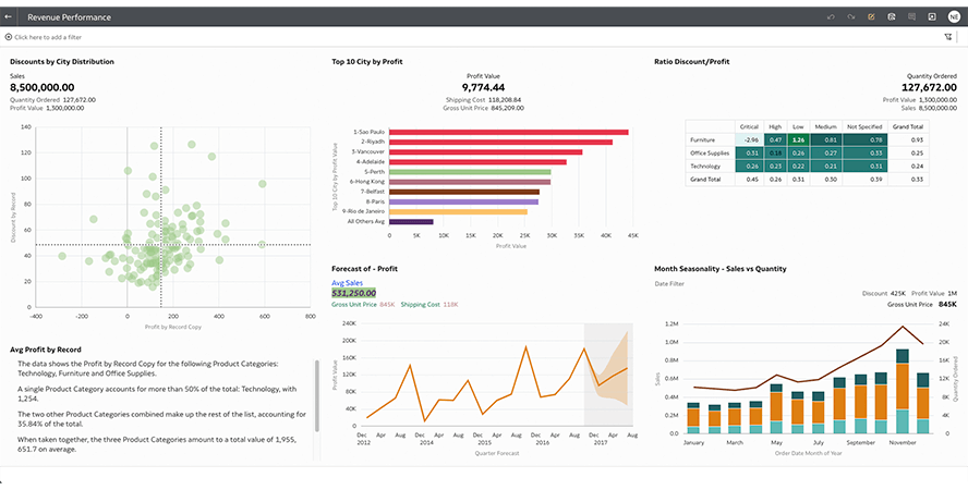
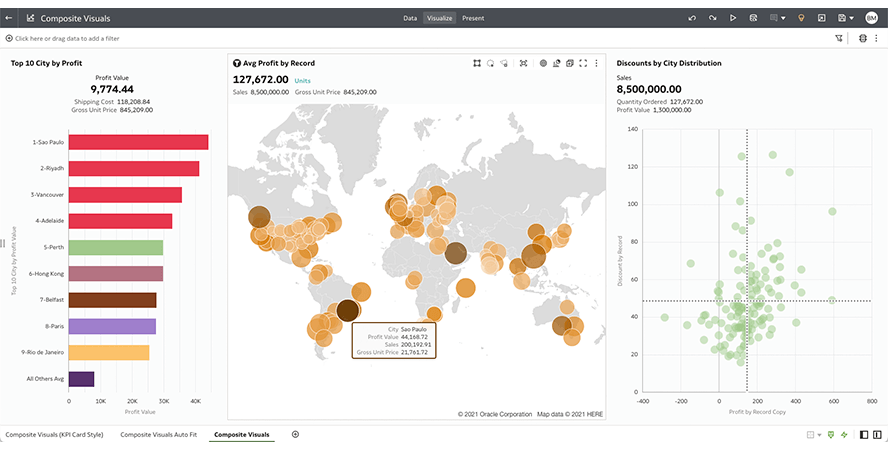
Visualisations composites
Les visualisations composites sont conçues pour fournir des informations visuelles plus complètes et intuitives sur les données en visualisant des mesures et des dimensions supplémentaires plus densément dans un seul objet de visualisation. Ces visualisations sont créées en associant plusieurs visuels, tels que des graphiques à barres et à courbes, dans un graphique. Cela vous permet de mieux comprendre les données, d'identifier les corrélations et de repérer les tendances, le tout dans un seul visuel. Les visualisations composites peuvent vous aider non seulement à identifier les corrélations entre différents jeux de données, mais aussi à découvrir des tendances et des modèles qui pourraient autrement être négligés. Cela peut aider à éclairer les décisions commerciales et à accroître l'efficacité.
Suivi de la performance
En mode développeur, les analystes et les développeurs peuvent surveiller les performances de visualisations individuelles ou d'un canevas complet. Cela permet de rechercher les objets qui ne sont pas performants, d'identifier les problèmes et de les corriger. Les développeurs peuvent examiner le code SQL logique créé pour les analyses, observer les requêtes générées et consulter le journal d'exécution.
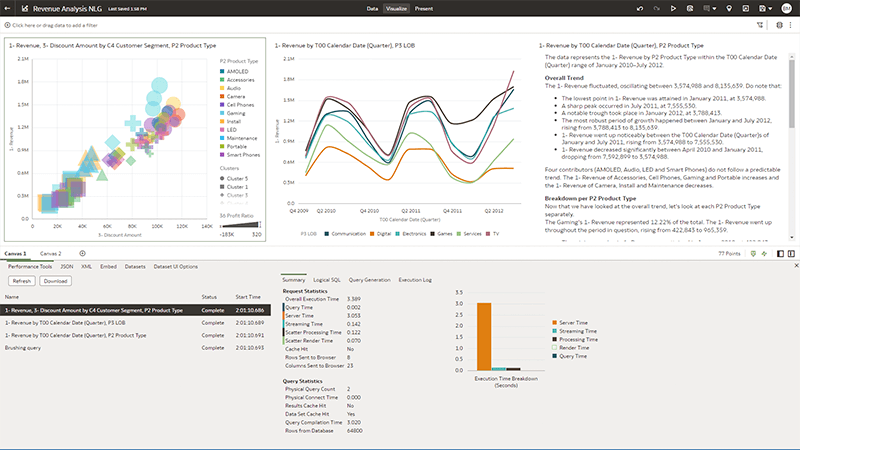
Utilisez le mode développeur pour obtenir le code d'intégration HTML et placer les objets de visualisation en direct dans d'autres pages Web.
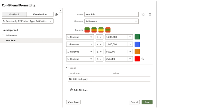
Mise en forme conditionnelle
Définissez des règles de formatage conditionnel pour les rapports, les visualisations, les tables et les tableaux croisés dynamiques. Les règles peuvent être appliquées à un graphique spécifique, à tous les graphiques d'une page ou à une mesure spécifique. Utilisez le moteur de règles sophistiqué pour exprimer une logique de formatage complexe.
Visualisations personnalisées
Oracle Analytics inclut plus de 45 types de visualisations prêtes à l'emploi. Pour tous les cas nécessitant des visuels uniques ou spécialisés, la bibliothèque de visualisation prédéfinie peut être facilement étendue avec des graphiques D3. Faites votre choix dans la bibliothèque d'extensions d'Oracle Analytics ou dans votre source préférée pour les graphiques D3, comme GitHub.