Contents
Overview
The Branding Area provides a location for placement of corporate identity information, product name, the user menu, optional global functions, and optional navigation to major modules of the application.
Elements and Appearance
The Branding Area has the following key elements:
- Oracle signature (logo)
- Optional cloud service product name
- User Menu titled with a user stamp for
the authenticated
user. The user stamp is either an avatar or, if none is available, then the user's initials are used.
- The User Menu is a key part of the Oracle Alta UI navigation.
Before a user authenticates, the User Menu is replaced with a Sign In link at that location.
The following image illustrates the elements of a Branding Area before user authentication.

Once authenticated, an avatar is the preferred headline for the User Menu, as shown in the following image. The avatar is usually a visual representation of the user, such as a photo, caricature, or image, which can appear by default, or is provided by each user through the user profile page.
- If the user did not provide a custom visual image, then the user's initials are used.
![]()
Optional Elements of the Branding Area
Other items that could appear in the Branding Area are:
- Marketing links (unauthenticated state)
- Accessibility icon (unauthenticated state)
- Application Navigation
- This a key part of the Oracle Alta UI navigation. There are two options.
- Application Navigation as a bar.
- The Application Navigation as a drawer.
Application Navigation
Optional Application Navigation provides navigation access to major modules within the application. It appears within the Branding Area.
The essential elements of Application Navigation are as follows:
- Navigation items, whose labels represent distinct modules of an application.
- A Home navigation link appears first, if the product has the concept of a suite.
- A Dashboard is the second navigation item, if there is one in addition to a Home item. In the absence of a Home item, Dashboard appears as the first navigation item.
Application Navigation should not present more than seven items in the Branding Area. More than seven can overwhelm users and are counter to the simplicity of the Oracle Alta UI lightweight design. When the number of application navigation items grows beyond seven, it is time to reconsider the application design and combine those additional options under the first seven or fewer.
All navigation items must resolve to another page destination. Any Application Navigation item which is not a navigation destination, but an action, is best presented in the User Menu.
Two Was to Present Application Navigation
Application Navigation items are presented in a bar or in a drawer.
Application Navigation Bar
- When presented in a bar, navigation items appear as tabs. The tabs are presented either as icons and text, or icons only.
- The tab with focus shows an underline beneath the navigation item.
- If the tab supports a dropdown menu, the items within are always presented as text. The selection of any child item navigates to the designated location and the parent is shown as selected when the menu closes.
If the number of application navigation items is four or fewer and the navigation icons are highly salient (such as for home, dashboard, tasks, or search), then the Application Navigation Bar may present icons only, as shown in the following example image. This approach works best when the User Menu is headlined with an avatar and the application name is sufficiently short, since all occupy the same horizontal plane.![]()
If there are more than four items on the Application Navigation Bar, or if the icons themselves may not clearly convey their meaning, then present the icon-and-text option, as in the following illustration.
![]()
Application Navigation Drawer
- When presented in a drawer, navigation items appear as a list. The list items can show either icons and text, or text only.
- When a list item has a child (a second-level navigation option), that child item is always presented as text.
- Other navigation choices may also appear in the Application Navigation Drawer, including:
- Favorites, which points to one or more user-defined destinations in the current application.
- Most Recently Used (MRU) list, which points to one or more destinations recently visited by the user.
- The application may set a limit on the number of favorites or MRU items.
- The "hamburger" icon
 is used exclusively to trigger the Application Navigation Drawer.
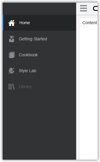
The following image shows a closed application Navigation Drawer.

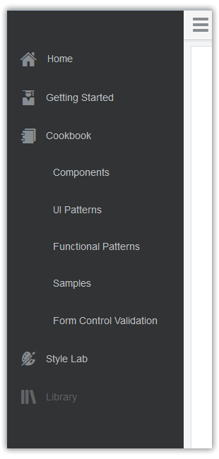
When an Application Navigation Drawer is open, it is preferred that the drawer not overlay content to the right. The following image shows example of an open Application Navigation Drawer.

This image shows an Application Navigation Drawer with child items. Only the top level items have Icons.

The drawer may close either explicitly or implicitly, as discussed in the Drawer pattern.
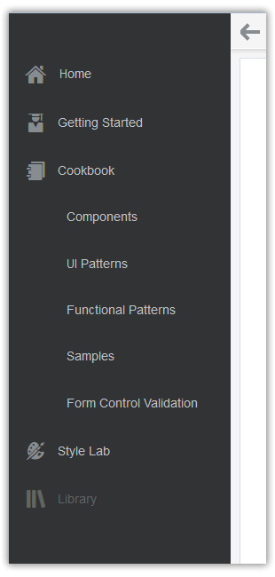
When the Application Navigation Drawer is implemented to close explicitly, the "hamburger" icon changes to a left-pointing arrow when the drawer is opened. It is preferred that an animation is used to signal this change so that users are more likely to notice it.

After the drawer is closed, the icon changes back to the initial hamburger icon.
Try to present Application Navigation either as a bar or as a drawer, but not both. However, if both are presented, then:
- Use the Application Navigation Bar to present quick access to navigation choices.
- Use the Application Navigation Drawer to present all of the application navigation choices in the Bar, plus any other optional application navigation choices (such as Favorites). That is, the Application Navigation Drawer would contain a superset of all navigation choices.
User Menu
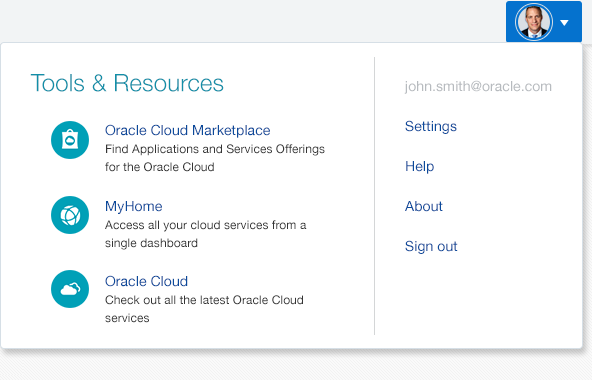
The User Menu in the Branding Area is laid out in two sections: one for menu items within the service, and one for menu items outside the service. The presence of menu options outside the service is optional.
- Inside the service, the User Menu points to such items as Settings, Help, and About, which always open in the same browser tab or window as the current service.
- Outside the service, the User Menu points to such items as the Marketplace, MyHome, or Oracle Cloud; these open in a separate browser tab or window from the current service.
The User Menu is often referred to by other names, most often Global Menu, and Help Menu, because of user familiarity with those other menu items.

Additional Resources
Demos: