Contents
Overview
First-Item Help applies best to use cases where the user is faced with a new page or in the use case where a feature is infrequently used. It also applies in optional use cases where the user is presented with an empty page. As soon as the page is populated, First-Item Help disappears from the page. In this sense it differs from Inline Text UA method, which persists. If your users are already familiar with the cloud service but may need to learn more detailed information about a task or feature, use one or more of the Everyday User Assistance patterns.
Elements and Appearance
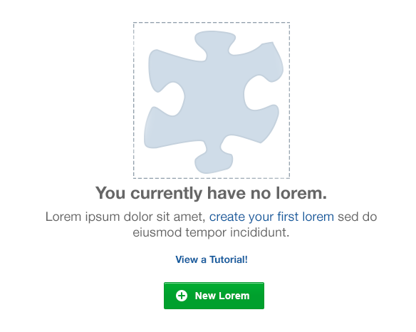
A First-Item pattern appears on an empty page or section of a page in the place where an item will appear if the user chooses to create it. This pattern can have some combination of the following elements, which are arranged horizontally or vertically on the page:
- Place an icon at the left for horizontally-oriented First-Item UI layouts, and at the top, for vertically-oriented First-Item UI layouts.
- Provide a brief sentence to inform the user of the current context, such as "You currently have no [artifact]" followed by a succinct sentence instructing the user about required next steps, such as, "To get started, click on the Create button."
- Optionally, add a link for the user to learn more, such as Watch a tutorial.
- Follow with a call-to-action button to draw the user to complete a required action.
Following is an example First-Item Help pattern presented in a vertical orientation.

The following image shows a First-Item Help pattern in a horizontal orientation.

Additional Resources
Demos: