Contents
- Overview
- Alta UI Page Characteristics
- Example Alta UI Layout Configurations
- Principle Areas of an Oracle Alta UI Page Layout
- Optional Auxiliary Content
- Additional Resources
Overview
The Oracle Alta UI is both a visual design and a page layout approach. As a consequence, pre-Oracle Alta UI applications and services (such as those built on the ADF framework) should not attempt to merely auto-migrate to this new look-and-feel.
Prior to the Oracle Alta UI, all Oracle ADF 11gR1 applications could change their skin values (for example, between Fusion, FusionFX, or Skyros) without any other modifications to the application. This is not the case for the Oracle Alta UI.
Attempts to simply change the skin value to Oracle Alta UI without a rewrite will result in application pages that will not lay out properly. Key components, such as buttons, text fields, and body fonts, are larger in the Oracle Alta UI than in previous skins, which is one of several reasons that a complete rewrite is necessary.
Create new pages to use the Oracle Alta UI.
Characteristics of the Oracle Alta UI Page Layout
- The entire page scrolls vertically when the page content is taller than the browser viewport.
- The layout relies on the browser scrollbar to provide vertical page scrolling, rather than using component scrollbars as was done with previous Oracle skins.
- The Page Display Width is the width of the UI from left margin to right margin.
- The Page Display Width is set at a max display width, such as, 1024px, 1280px, or 1440px.
- When the width of the browser viewport is wider than a chosen Page Display Width, the background color of the branding bar, the footer (optional), and the decorative background will fill the space.
- There is always a 20px left and right margin for the Page Display Width.
- The page UI is centered within the Page Display Width.
- Iterated data, such as in a list, flows continuously down the page. The list grows taller as more
rows are fetched when the user touches a More button. This is referred to as high water mark pagination.
- Iterated data is sometimes displayed within a fixed table height that utilizes pagination controls. Here, "pagination" refers to all forms of scrolling for iterated data: paging, scrolling, and high water mark. It is a design choice which pagination control to use. This design choice is used particularly when content, such as a form, is vertically aligned below the table. See Master-Detail pattern for more information.
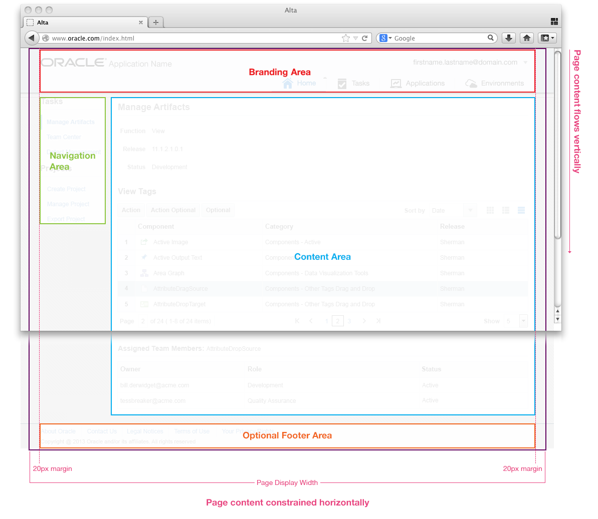
The following image presents the Oracle Alta UI Page Layout schematic.
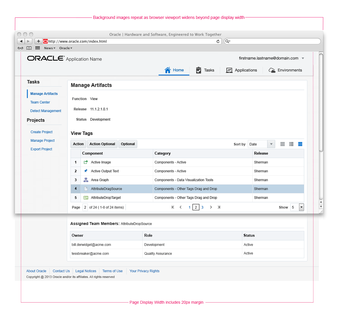
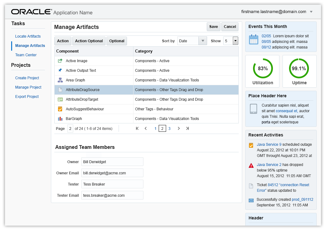
The image below shows example content within an Oracle Alta UI page layout.
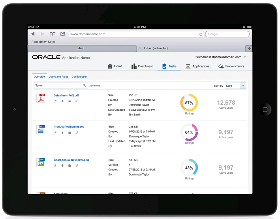
This image presents example content in an Oracle Alta UI page layout on a tablet device.
Example Layout Configurations
An Oracle Alta UI page layout can take on a number of different configurations, based on the use case a service aims to support.
The following image provides various page layout configurations; in each, the outer gray borders represent the browser viewport, and the inner blue lines represent key areas of the page layout.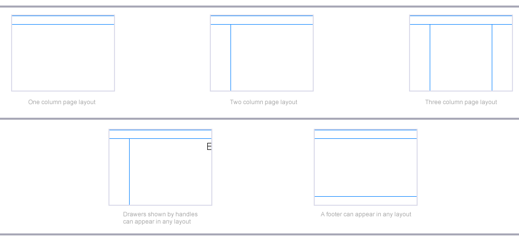
Principle Areas of an Oracle Alta UI Page Layout
The key areas of the page layout are:
- Branding Area
- Optional Application Navigation
- Navigation Area
- Content Area
- Optional Ancillary Area
- Optional Footer
Each area of a page can contain specific
Oracle Alta UI patterns, as illustrated below. No "Area" of a page has a fixed dimension but can accommodate any dimension options that is part of the pattern associated with it (such as Branding Area or Navigation Area). Note that the label in each area of the image provides a link to more details.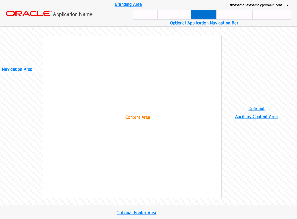
Optional Auxiliary Content
What is often referred to as auxiliary content is presented in the Ancillary Area of the page. The Ancillary Area is the third column in a three column layout; the first two columns belong to the Navigation Area and the Content Area, respectively.
Auxiliary content falls into two categories.
- Context-driven
- Task-driven
Context-driven content is specific to a selected object within the Content Area. For example, selecting a customer name that appears in a table row may show related information about that customer in the Ancillary Area. This information often supplements the information that may appear as details of the selected record in a master-detail layout with in the Content Area. For example, in an order entry task flow, the details of the customer's record are most likely the items ordered, and they are shown in the Content Area. The auxiliary content could include the account balance, a list of customer representative log entries, or a list of prior orders.
Task-driven content is content which is relevant to the overall task and not limited to the currently-selected record. For example, in an order entry task flow, the auxiliary content, might include a list of promotions to mention to all customers, the current sales quota for the account representative, or a list of other available sales representatives to chat with about sales questions.
Both context-driven and task-driven content may appear together in the Ancillary Area. It is a good practice to locate different types of data in different sections of the Auxiliary Area. For example, all task-driven content could start at the top of the Ancillary Area, whereas, context-driven content would follow below.
If auxiliary content could appear to be miscellaneous information to the user, then it is best to clearly demarcate content. For example, task-driven content related to a sales event (such as "all orders placed today are 10% off") should be immediately distinguishable from context-driven information, such as a product promotion targeted at the currently-selected customer.
- Consider using content containers to help set a visual distinction between the two different types of content. Content containers may appear as colored regions on the page. The following image is an example of auxiliary content in colored content containers.
Additional Resources
Demos: