Contents
Overview
Oracle Alta UI navigation is the method by which users access tasks within and across modules of a service, and locate ubiquitous features of the service, such as their settings.
Navigation has two main elements: the component a user activates to initiate it, and the navigation path.
Navigation Methods
There are two methods by which a UI provides a user with navigation options: UI content, and UI chrome.
- UI content navigation originates from data, such as in tables, lists, or social media streams, to a destination.
- UI chrome navigation originates from controls, such as menus, buttons, and tabs, to a destination.
UI Content Navigation
Although both navigation types can appear within a service, the Oracle Alta UI patterns advocate UI content navigation.
The following image provides a schematic of a service with both UI content (object) navigation and UI chrome navigation.
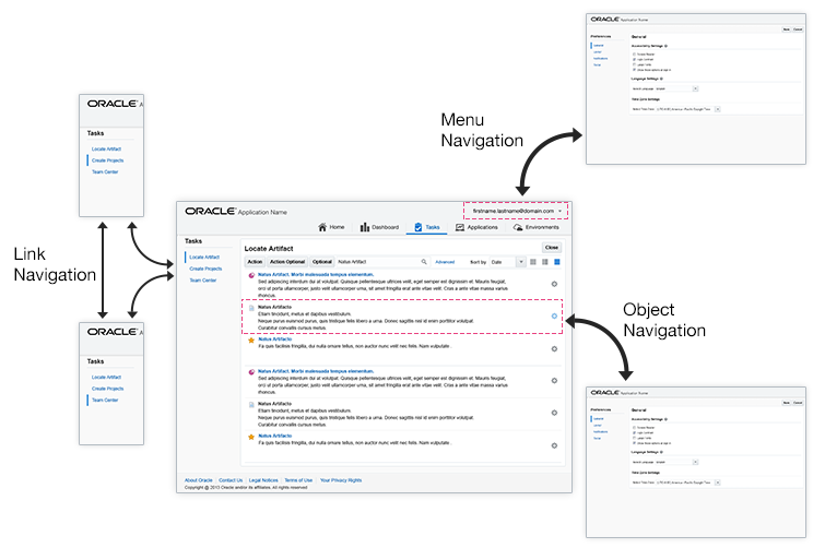
UI content navigation is best suited for a mobile-friendly service. The following image shows how UI content navigation works. In the illustration below, for example, the user clicks or taps onto dashboard content, list content, or table row content to navigate.
UI Chrome Navigation
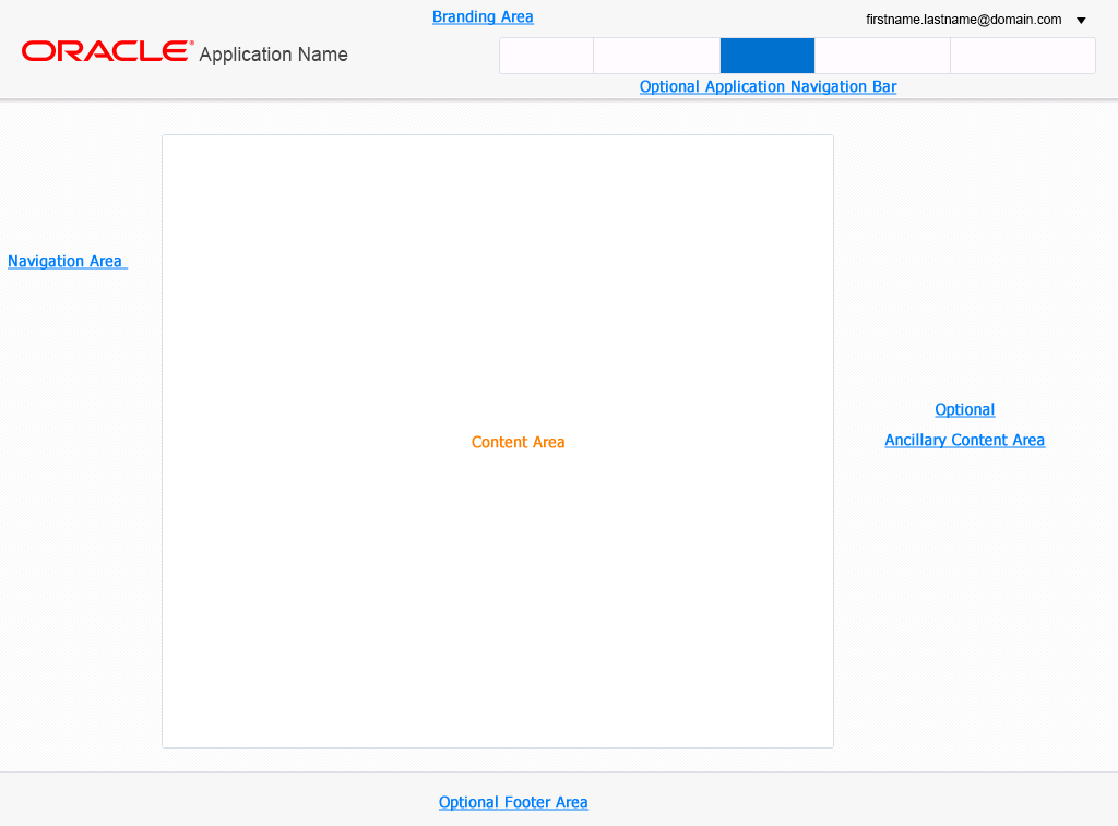
UI chrome navigation appears predominately within two areas of an Oracle Alta UI suite: the Branding Area and the Navigation Area.
Within the Branding Area, there are three distinct locations for chrome navigation:
- Application Navigation
- Global Links
- The User Menu
The following illustrates the Branding Area and the Navigation Area in an Oracle Alta UI page.
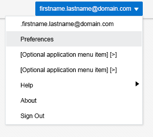
The User Menu provides ubiquitous access to suite features. The following image shows UI chrome navigation accomplished through the User Menu.

The User Menu also provides ubiquitous access to custom features inserted between Settings and Help.
UI Chrome Navigation Components
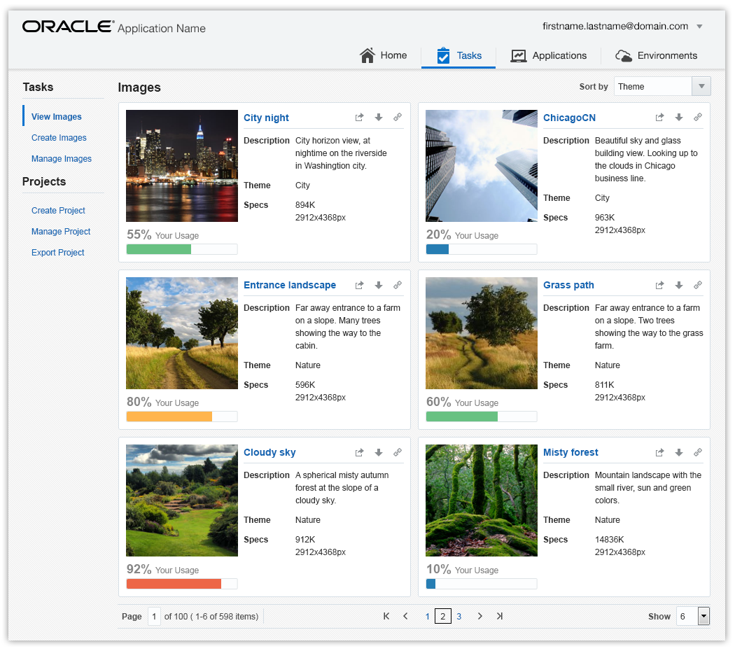
When necessary, Oracle Alta UI services can use a variety of UI chrome navigation components. Most commonly, they appear in the Navigation Area. The following image is an example of a page displaying links as the UI chrome navigation component.
In the following image, finger tabs are the UI chrome navigation components.

Horizontal tabs are shown as the UI chrome navigation component in the following image.
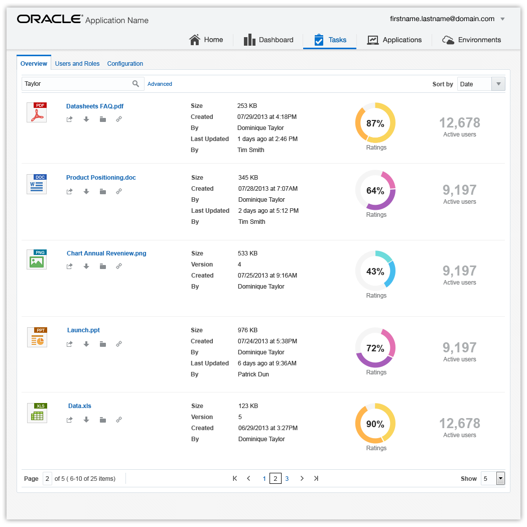
The following image shows InfoTiles as a UI chrome navigation component.
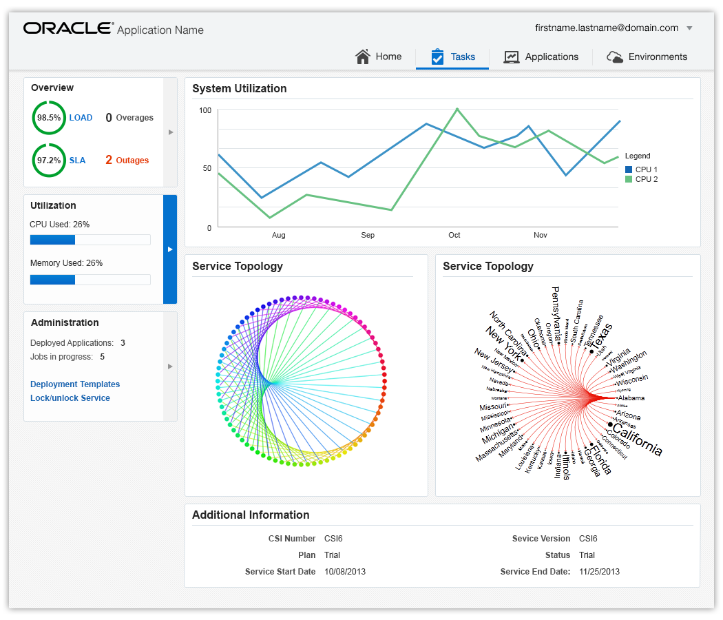
Navigation Paths
There are two types of navigation paths: linear and non-linear.
- A linear navigation path presents a clear end-point destination, from which the user typically cannot deviate. After completion of a task or exit from the called page, the user is returned to a predetermined page, such as the calling page, for example.
- A non-linear navigation path presents a number of equally viable end-point destinations to which a user can navigate. After completion of a task or exit from the called page, the user has the option to navigate to any other page, including the calling page.
Linear Navigation Paths
There are three main linear navigation paths: call and return, intervening page flow, and hub and spoke.
-
The most common linear navigation path is a call and return. That is, when the user completes a task, the return is automatically to the calling page.
- For example, when a user accesses Settings from any page, exiting Settings by clicking Done, or Cancel, for instance, will always return the user to the calling page.
- An extension of call and return navigation contains an intervening page flow. Whether the page called is an intervening wizard or a page, once the task completes, the user automatically returns to the calling page.
- Another example is hub and spoke. From the hub (such as, the Home page), the user can call any page. However, upon exiting the called page by clicking Done or Save, the user automatically returns to the hub. Hub and spoke is an elegant, easy to learn navigation path for users.
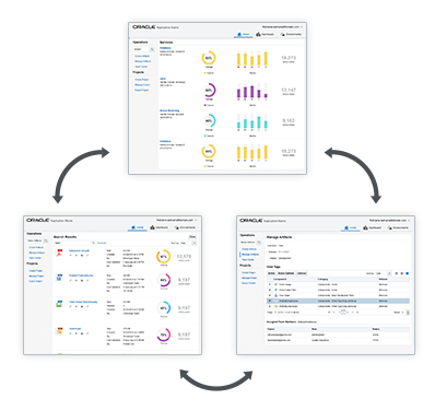
The following image is an example of a call and return linear navigation path.
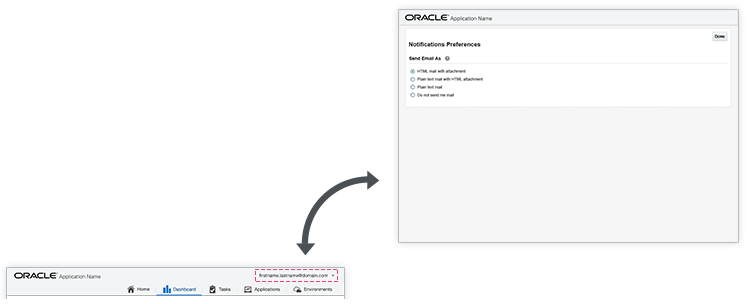
This image demonstrates a linear navigation call and return with intervening wizard or page flow.
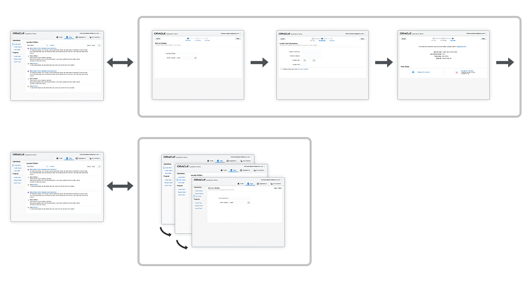
Following is an example of a hub and spoke linear navigation path.
Non-Linear Navigation Paths
Non-linear navigation is used within and most frequently between service modules in the Oracle Alta UI.
Network Navigation
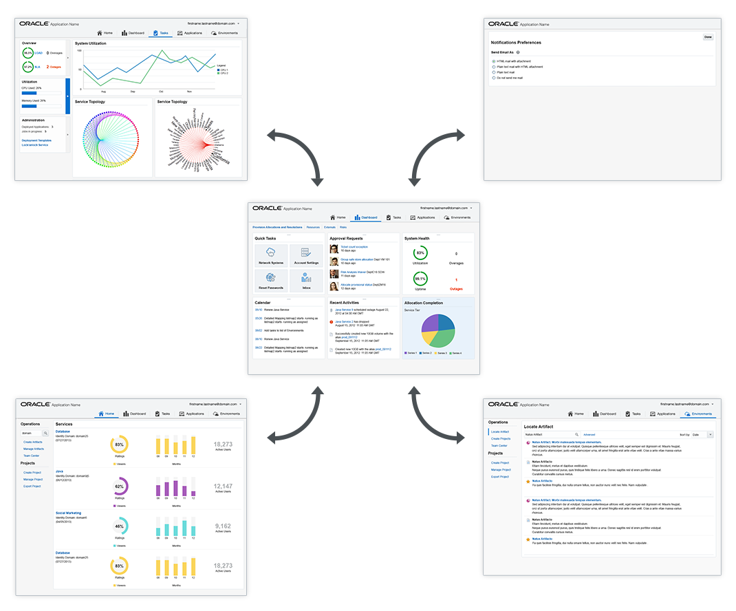
The most common non-linear navigation path is a network. When users complete a task on a page, they can navigate to any other available page. A non-linear navigation path is initiated by Application Navigation or tree navigation, for example.
The next image is an example of a non-linear network navigation network.
Application Navigation
Application Navigation is a ubiquitous navigation feature that provides the user with immediate access to any service module.
In the following figure, the heavy arrows illustrate non-linear navigation via Application Navigation.

Hierarchically-Linked Lists: Tree Navigation
Hierarchically-linked lists are the mobile-friendly alternative to common tree navigation. Hierarchically-linked lists are preferred over legacy tree navigation.
In hierarchically-linked lists, a leaf node is any node in the linked lists. The hierarchy traverses upon click or touch of a leaf node in a replace-in-place fashion. The user may scroll the list items using the page scrollbar or a finger swipe.
Essential elements of hierarchically-linked lists:
- Back button navigation — to traverse up the tree
- Node title link — driven by the data model — followed by a child indicator such as a pointer or chevron
- End node link
The following diagram demonstrates navigation using hierarchically-linked lists.
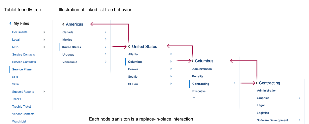
Because of their replace-in-place behavior, hierarchically-linked lists consume less horizontal page "real estate" upon traversal than a legacy UI tree. A deep tree is usually accommodated with a horizontal scrollbar.
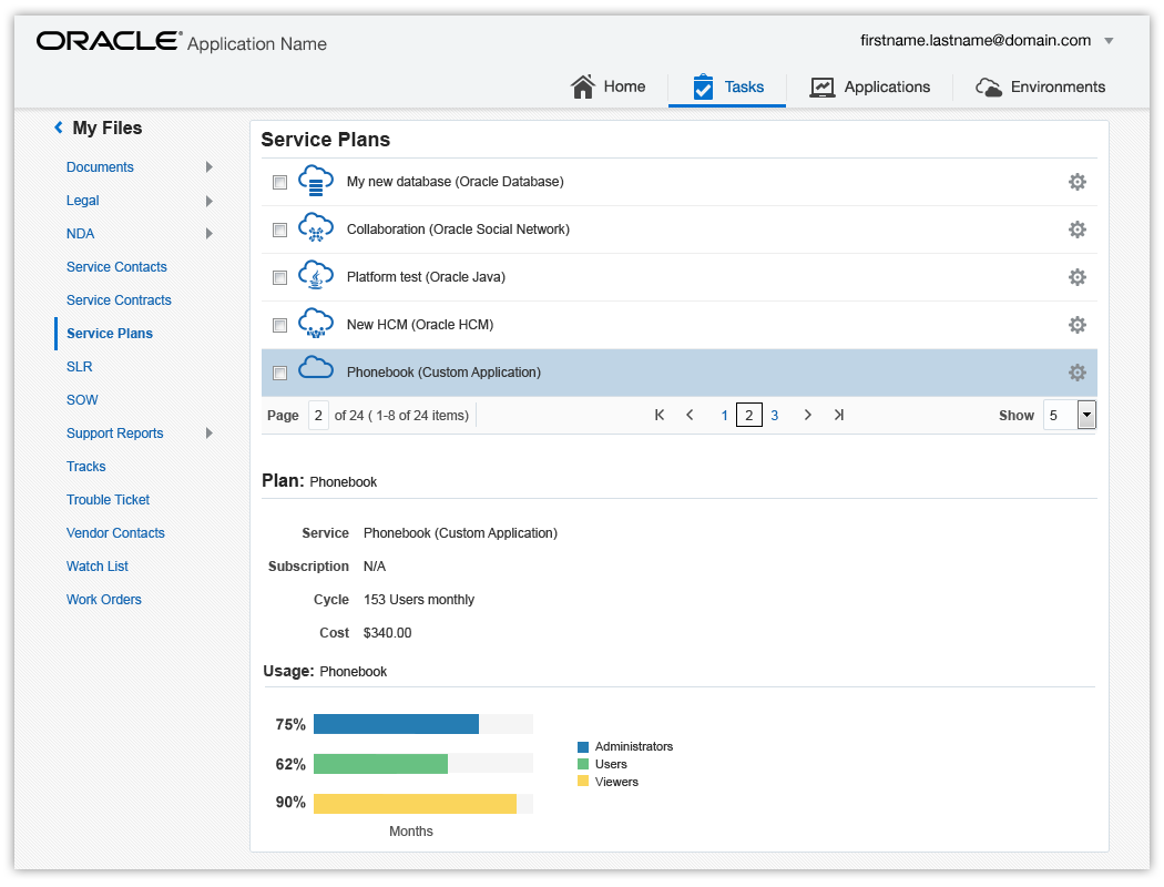
In legacy UI design, tree navigation was used frequently, particularly in administrative products. Hierarchically-linked lists are a more appropriate and mobile-friendly navigation model to use.
In the following image, hierarchically-linked lists are used in lieu of a tree for navigation.
Additional Resources
Demos: