Contents
Overview
A dashboard is a rectilinear layout of content tiles from one or more cloud services, all appearing on a single page. The chief purpose of a dashboard is to support user decision-making and prioritizing of tasks. The user can visit any part of the service represented in the tile by simply clicking the tile. Because of its purpose, a dashboard is often used as a Home page.
Each tile presents an overview of pertinent information about that particular service's content. A tile may also support very high level functions. For example, a tile may allow the user to accept or reject task flow requests, or switch the display mode of its content into a chart, table, or list.
Elements and Appearance
A dashboard typically occupies an entire page and is comprised almost entirely of tiles. Any other UI components on the page are there in service of the tiles, including filters, customization buttons, and drag handles. The presence of other UI components is driven by the dashboard use case.
Dashboard Tiles
The content of dashboard tiles, when taken together, is either broadly or narrowly focused.
- A broad range of content among the tiles on the dashboard provides information important to the user but not related to the same subject matter (for example, a VP might see tiles relating to sales, procurement, marketing, and project status all on a single page).
- A narrow range of content among the tiles on a dashboard provides information important to the user and all related to the same subject matter (for example, a sales person might see tiles related to sales leads, sales promotions, and sales quota).
Each tile needs an identifying title, but the tile's content should also adequately communicate its context. See the following image for an example of tiles in a dashboard.
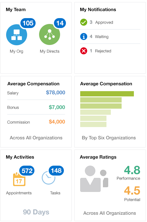
A dashboard can optionally filter the data shown in each tile by a single parameter— such as by date, geographic region, or organization.
Personalization
Personalization is the the ability of a user to specify a preference, such as control over the spatial arrangement or presentation of content in a page.
- A dashboard may implicitly save a personalization. For example, simply changing the spatial arrangement of tiles can implicitly save that personalization for the user across browser sessions.
- Dashboards can also require an explicit action to save personalizations, such as a Save button. How personalizations are performed, such as adding or removing a tile, is governed by the implementing technology of the dashboard.
- Implementing an implicit save of personalization is preferred over an explicit action if personalization is supported at all.
Personalization support is desirable, although not required.
When personalization is not supported, don't give users an ability to enact a preference within a session. For example:
- Don't give users the ability to move tiles around on a dashboard if they can't save that arrangement from one session to the next.
- Don't give users the ability to add or remove tiles from a dashboard if they can't save their configuration from one session to the next.
Accessing the Dashboard
A dashboard page serves best when it appears at the top of a navigation hierarchy.
The following image shows a dashboard accessed from the Application Navigation Bar.
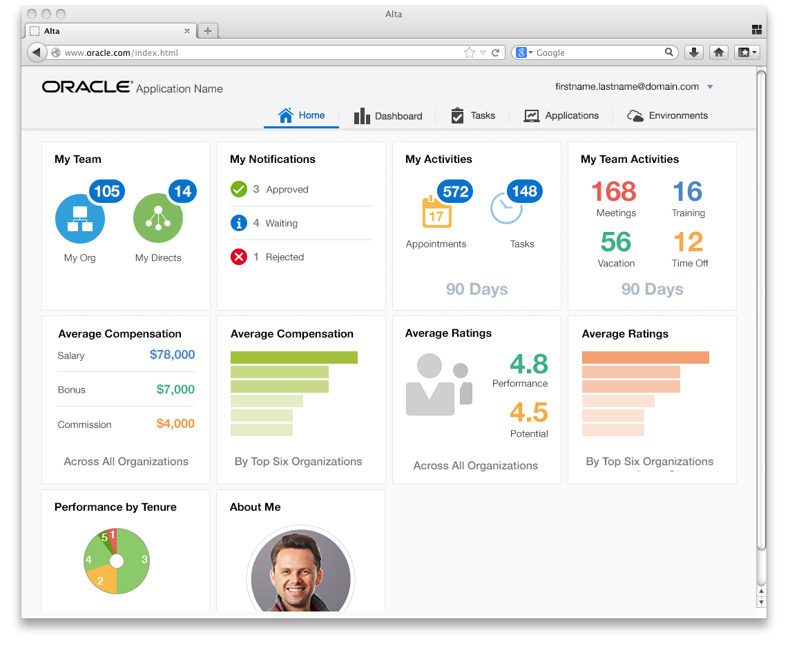
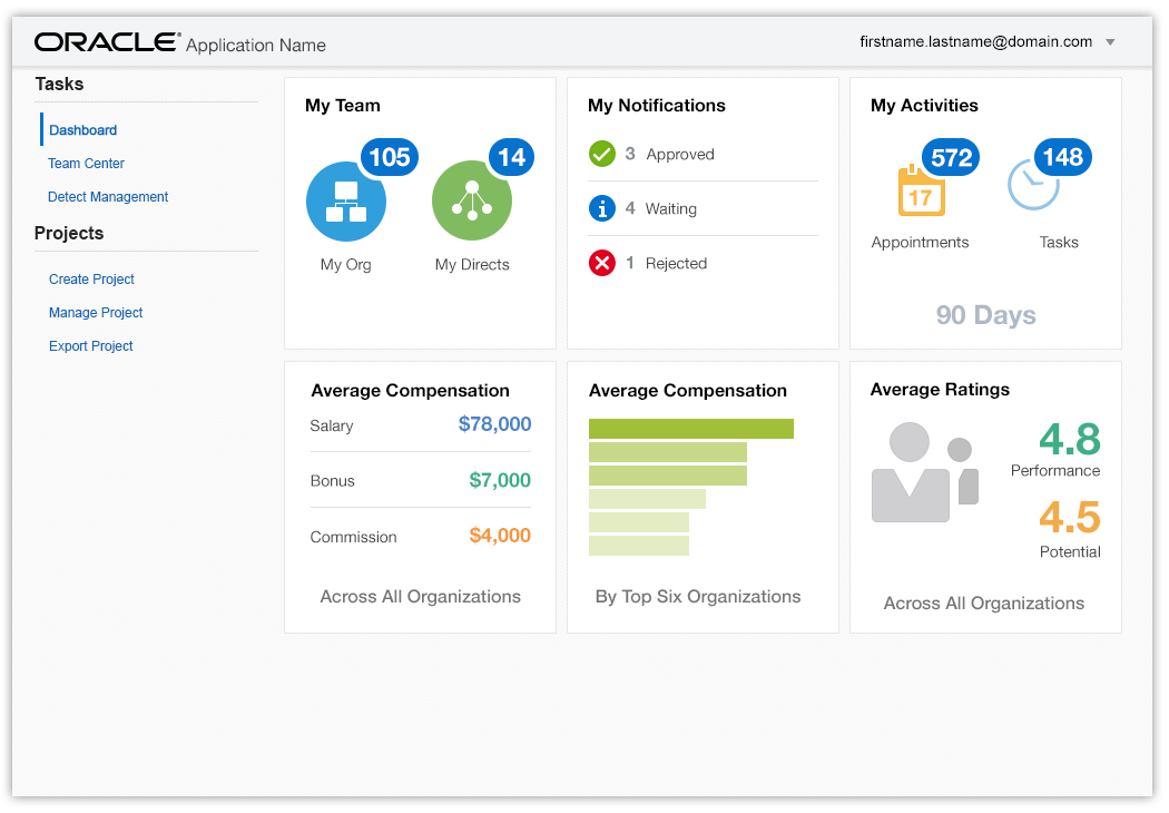
Following is an example of a dashboard accessed from the Navigation Area.
Multiple Dashboards
Sometimes a user needs access to multiple dashboards. In that case, the dashboards are collected and accessed as a single Application Navigation item in the Branding Area. The user may access each dashboard from the navigation area.
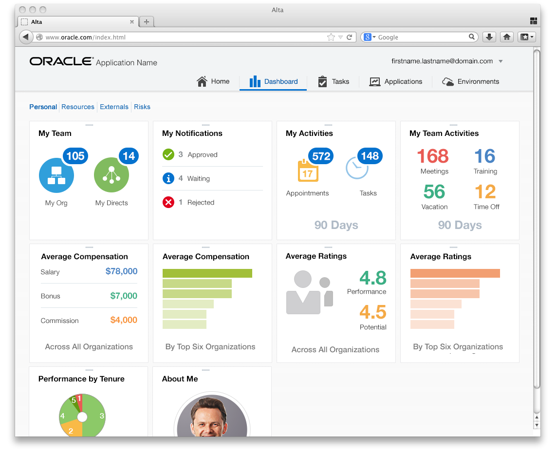
The following image shows a dashboard with horizontal links to access other dashboards. Drag handles appear when there is an option to rearrange dashboard tiles. The image suggests that personalizations are implicitly saved.
In the following image, other dashboards are available through finger tabs in the Navigation Area.
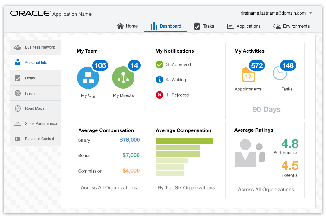
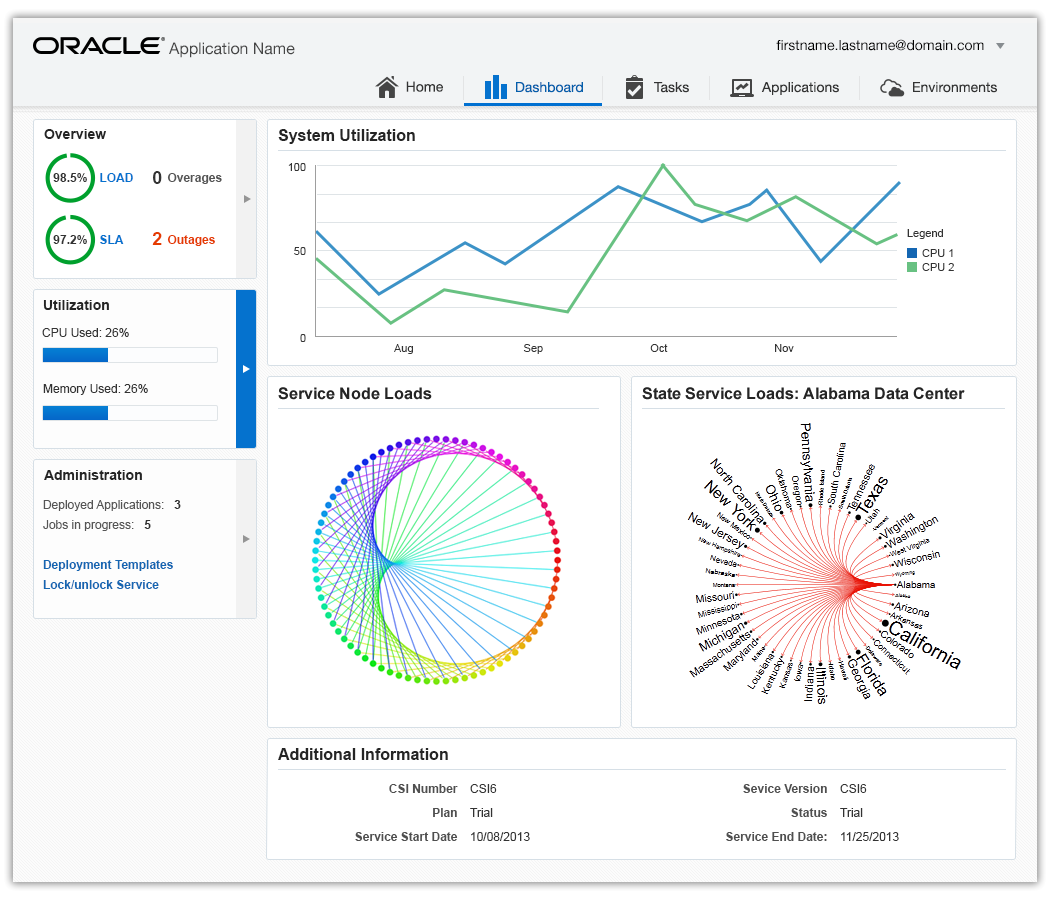
In the next image, other dashboards are accessed by Info Tiles in the Navigation Area.
Additional Resources
Demos: